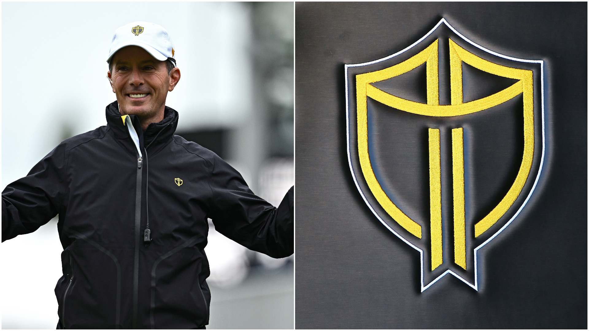
Since its introduction by former captain Ernie Els in 2018, the Presidents Cup International Team logo has given the side a fresh identity and rallying point.
Ahead of this week’s Presidents Cup at the Royal Montreal Golf Club in Canada, the International Team logo popped up in a variety of locations around the world in the form of posters, graffiti and murals.
The black and gold shield appeared in cities like Tokyo, Cape Town and Melbourne under the motto “The Shield Unites Us”, and was a rallying cry for golf fans to unite behind the International team, according to the PGA Tour.
The shores of Melbourne showing off the shield. #IntlTeam pic.twitter.com/Z3r4bDNDRwSeptember 26, 2024
But the logo is not just a form of guerrilla marketing, and also represents a new identity for the International Team following a run of disappointing results against the Americans.
After taking over as Internationals captain from Nick Price following the 2017 Presidents Cup, Els commissioned a new logo for the team with the hope of inspiring his side to bounce back from an embarrassing 19-11 defeat to Team USA at Liberty National Golf Club.
While the Internationals failed to break their drought against the Americans in 2019, Els’ logo stuck and has been embraced by the team.
The Internationals have had a range of logos at the Presidents Cup, and previously used a light-blue flag with five gold stars, representing the five continents that make up the team.
But Els felt that it was too similar to the European Ryder Cup logo and wanted a more unique identity for the Internationals.
“It felt very much like the European Ryder Cup logo,” Els’ manager Rob Goulet said in 2019. “He didn’t feel like it was powerful enough for us to take forward.”
Taking inspiration from military shield patches, Els and artist Jeff Costa – who has designed logos for various sports teams – looked to come up with a fresh identity for the International Team.
According to a PGA Tour report in 2019, they wanted a logo that had three elements: “flags that symbolized both golf and patriotism”, “a shield to represent strength, security and defense”, and a “Celtic knot representing unity, faith and loyalty”.
They ultimately landed on the black and gold design, with Els unveiling the logo during the week of the 2018 US Open.
“When it gets down to the heat of the battle, you want to really pull from something,” Els said. “Something that’s official for our team. Something we stand for … Guys are playing for one another. Our identity is our logo.”
The logo was a hit among the players, with International Team veteran Adam Scott saying: “Obviously we needed something we could start to embrace. We needed something that came from one of us, and Ernie is as good as anyone for that. He’s been involved with the Cup since the very first one … Hopefully, this is the start of a new culture for the International Team.”
Current Internationals captain Mike Weir said this week that the logo continues to inspire the team.
"We are under no illusion as to how tough our challenge is this week, but with fans across the world uniting behind the International Team and the shield we are going into the Presidents Cup with confidence," Weir said.
“Seeing the shield appear in Tokyo, Seoul, Montreal, Cape Town and Melbourne has united us all and given the whole team a boost. We can't wait to ride that energy into Montreal this week."
The Internationals are hoping to break a run of dominance by the Americans at the Presidents Cup, with their first and only victory coming in 1998. Aside from a tie in 2003, Team USA have won every other Cup since its inception.

