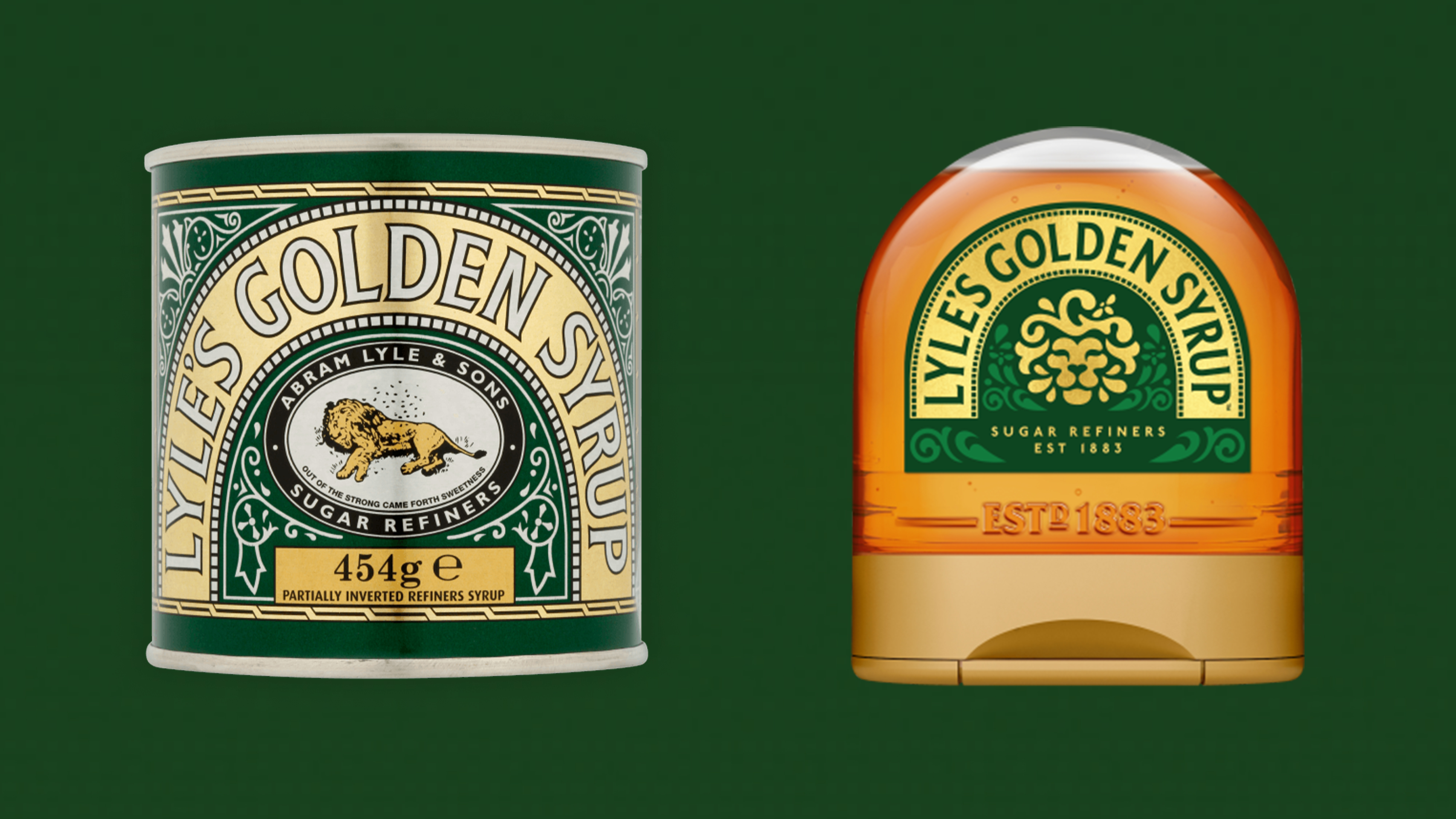
It's one of the most ubiquitous logos in the UK, but many won't have looked closely enough at the Lyle's Golden Syrup lion to notice that it's dead – and swarming with flies. The macabre design has been taking social media users by surprise for years, but it's finally getting replaced – and, somewhat surprisingly, igniting a syrupy culture war in the process.
Lyle's has replaced the logo on its squeezy syrup bottles with a simpler image of a lion's face. The animal looks much happier - but some are displeased that the design, a Guinness World Record holder for longest running branding, has been changed at all.

In a press release, Lyle's said the branding has been “revitalised for the modern UK family” in a move to “refresh the brand’s legacy to appeal to a 21st century audience”. The new logo will be rolled out across the entire product line. “Our fresh, contemporary design brings Lyle’s into the modern day, appealing to the everyday British household while still feeling nostalgic and authentically Lyle’s," the brand added.
As for why the brand had such a gruesome logo in the first place, the key is in the tagline, "Out of the eater, something to eat; out of the strong, something sweet." The phrase comes from the Biblical tale of Samson. The story goes that Samson killed a young lion with his bare hands. When he goes back a few days later, he finds bees have made a hive in the carcass, so he helps himself to some honey. Asked by his parents where the bounty came from, he utters this line.
Unbelievable! @TateLyleSugars Why did you give into this nonsense? The woke brigade probably don't even buy your product. Idiotic.Woke brigade forces Lyle kitchen staple Lyle's Golden Syrup falls victim to woke https://t.co/8bPtRO4i7SFebruary 20, 2024
But some, including the Daily Express, have accused Lyle's of pandering to the "woke brigade" by changing its logo. Which, let's face it, is ridiculous. Lyle's made no reference to the original design in its announcement, let alone anyone being offended by it. And let's be honest – the previous design was a tad grim. It doesn't take a member of the "wokerati" to find a literal swarming cadaver slightly unsavory.
Time will tell if the rebrand will prove successful – in the meantime, if you're looking for more design inspiration, check out the best logos of all time.


