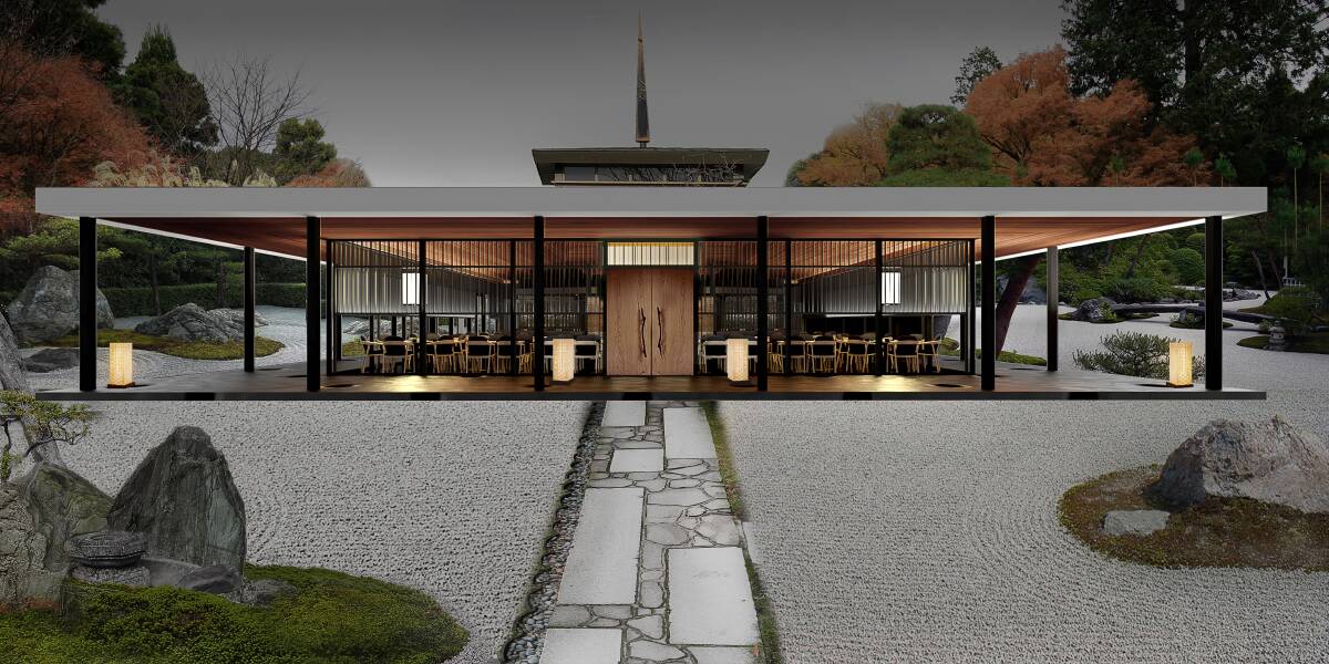
It's not that much of a leap to reimagine The Lobby as a Japanese pavilion, it's low-slung, spire-topped roof, walls of glass, and raised position reminiscent of an ishidoro garden lantern.
And with the opening of Koto restaurant in the iconic Canberra location, the transformation will be complete.
Koto will be an integral part of the Lawns of the Lobby precinct. Canberra marketing outfit The Mark Agency announced this week it was overseeing the revitalisation of the site to include a flagship restaurant alongside a multi-purpose area set among the rose gardens outside Old Parliament House.
Set to open in May, Koto is the latest venture from Adam Elchakak, who was also integral in the opening of Inka in 2021.
"This is a special building and I wanted to get the best people involved in this project," he said.
"I love Japanese food and I love Japanese culture and I wanted to bring an authentic experience to the people of Canberra."

Every aspect of the experience is being designed with the precision of a sashimi master; from the menu, to the building outfit, even the gardens which are being transformed using traditional Japanese design principles.
Shinya Nakano will lead the kitchen. He trained in Kyoto with a fifth-generation sushi master, later working his magic at Nobu and Kisume in Melbourne, where he was awarded two-hats in the Good Food Guide for his 18-course omakase-style menu.
At Koto, Nakano is promising a Western/Japanese co-production, following a Japanese kaiseki philosophy.
"Kaiseki is one of the most prestigious dining experiences, following a deep-rooted set of guidelines including that your food must represent the area that surrounds you," he said.
His philosophy is all about seasonality and locality, with an admiration for Australian ingredients from land to sea. Among his favourites are Tasmanian sea urchin, Fremantle octopus, NSW bluefin tuna, finger lime and saltbush, all of which you'll find on the menu.
Chief landscape designer Shinya Ueda is employing the same principles in the garden. Using locally sourced materials, he's turning the entrance of the restaurant into a space that wouldn't be out of place in Kyoto, from which the name of the restaurant has been derived.

"The Lobby reminded me of the Hama-Rikyu garden in Tokyo, which has a teahouse perched on a lake with bridge access similarly to Capitol Hill," Ueda said.
"These two pictures guided my design of a kare-san-sui dry gravel garden to symbolise Lake Burley Griffin."
He said his approach to landscape architecture reflects that of a chef's food philosophy.
"In the culinary world, choosing the right ingredient is step number one. Similarly, the deciding factor for a great Japanese garden is choosing the right materials," he said.
Black granite boulders were collected in South Australia and painstakingly transported to the capital to emulate an installation of stars, planets and unity.
He sourced eight tonnes of light-reflecting gravel from the Riverina to enhance the zen-like garden.
Plantings include new Japanese maples to complement the mature ones already on site and a Japanese black pine which is 30 years old.
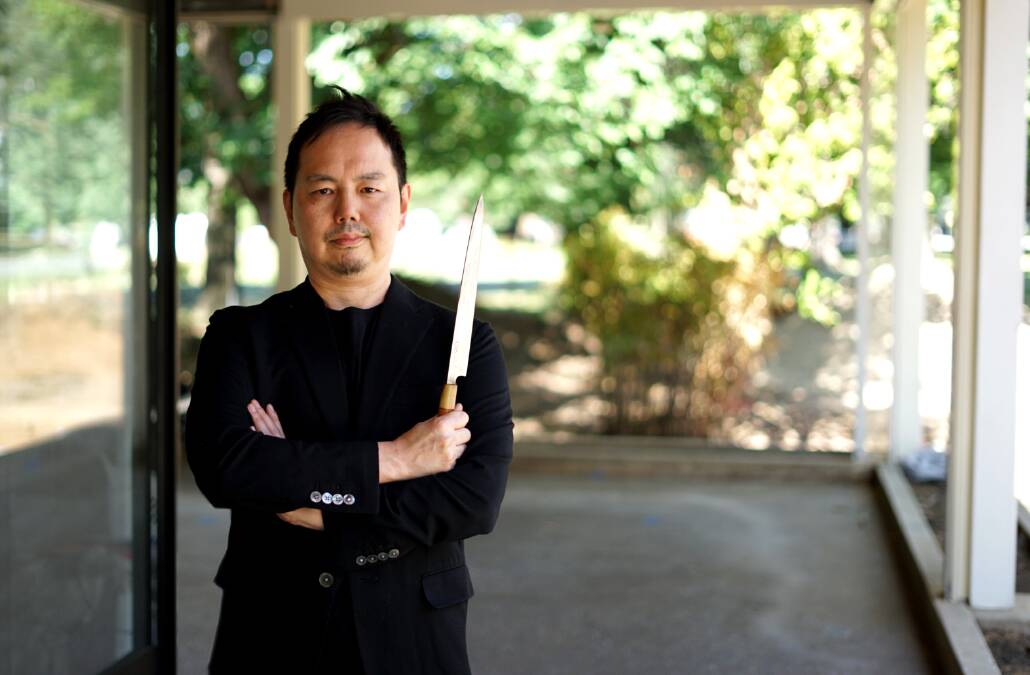
Odd Design has been responsible for the overall architectural design. Co-founder Keizo Okamoto said he wanted to preserve and revitalise the original site, taking advantage of the strength and symmetry of the 50-year-old building.
"The decorative design language is derived from the phenomena of nature such as water flow and the flicker of fire," Okamoto says.
"The juxtaposition of the processed and raw materials expresses Japanese aesthetics wabi-sabi; the acceptance of transience and imperfection."
Although the central colour of the space is black, the overall atmosphere is not dull nor dark, as the design uses rich materials, such as rammed earth and stone, soft lighting and textured patterns to make the space feel more abundant.
- Koto is opening in May, seven days, noon-3pm and 5.30-10.30pm. 1 King George Terrace, Parkes.
- kotodining.com.au / @kotodining
We've made it a whole lot easier for you to have your say. Our new comment platform requires only one log-in to access articles and to join the discussion on The Canberra Times website. Find out how to register so you can enjoy civil, friendly and engaging discussions. See our moderation policy here.


