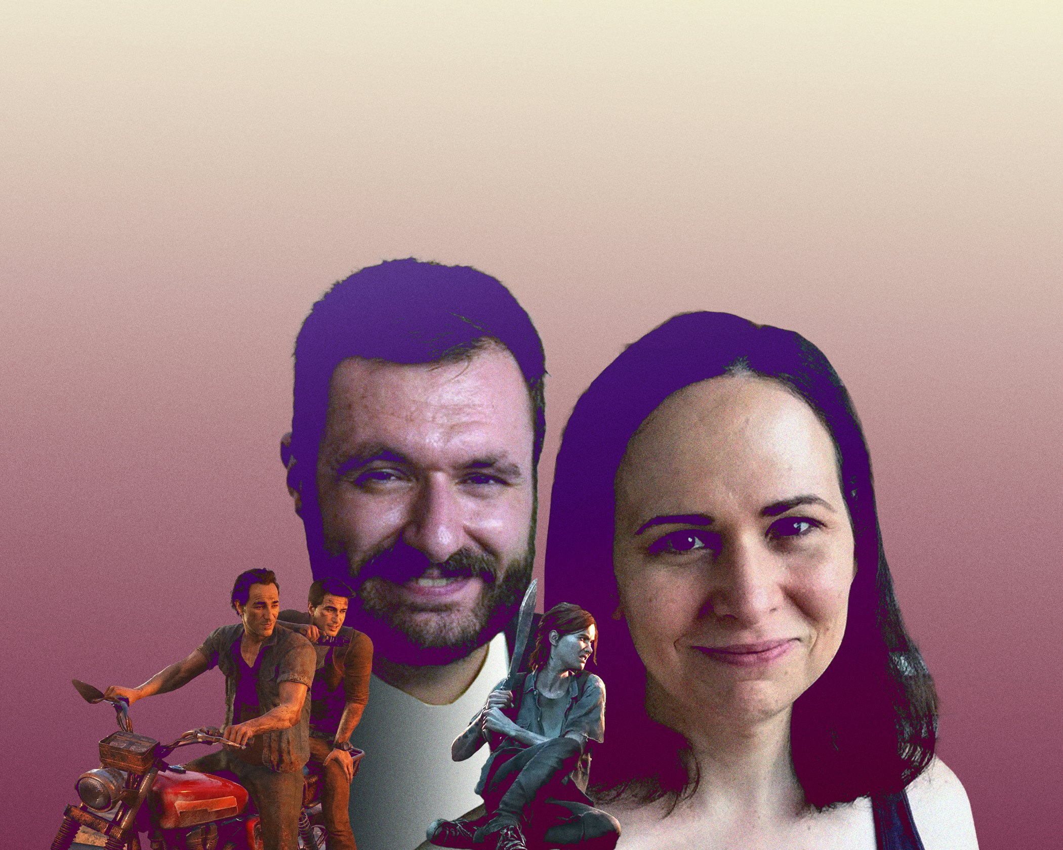
A game development conference is an unlikely setting for an epiphany.
During Emilia Schatz’s 2016 panel on motor accessibility features in developer Naughty Dog’s Uncharted 4, blind gamer Brandon Cole had a question about the studio’s next game, the highly anticipated sequel to 2013’s The Last of Us.
”Would you ever be able to see features for people like me?” Cole asked. “Could I ever play The Last of Us 2? I'm blind, and I would love to be able to play these games.”
Schatz and her co-design lead Matthew Gallant didn’t set out to make a triple-A action game that was playable from start to finish by a blind person. They weren’t even sure it could be done.
“I had never really thought about it before because it just seemed kind of impossible,” Schatz tells Inverse. But she was riding the high of Uncharted 4’s successful launch. “I was in very much a mood of, like, we can do anything.”
After the panel, Cole told Schatz about a variety of games with “unintentional” accessibility features that made progression easier for blind players. For instance, after entering and exiting the inventory menu in Resident Evil 6, the game reorients the camera back to the “golden path,” a developer term for the optimal direction a player is supposed to go at any given moment. Along with environmental audio cues, this menu trick helped Cole navigate Resident Evil 6 more easily.
After this meeting, Naughty Dog enlisted Cole as a consultant and playtester throughout the development process for The Last of Us Part II. His feedback, along with that of other disabled playtesters, proved invaluable to the game’s watershed innovations in motor, visual, and audio accessibility.
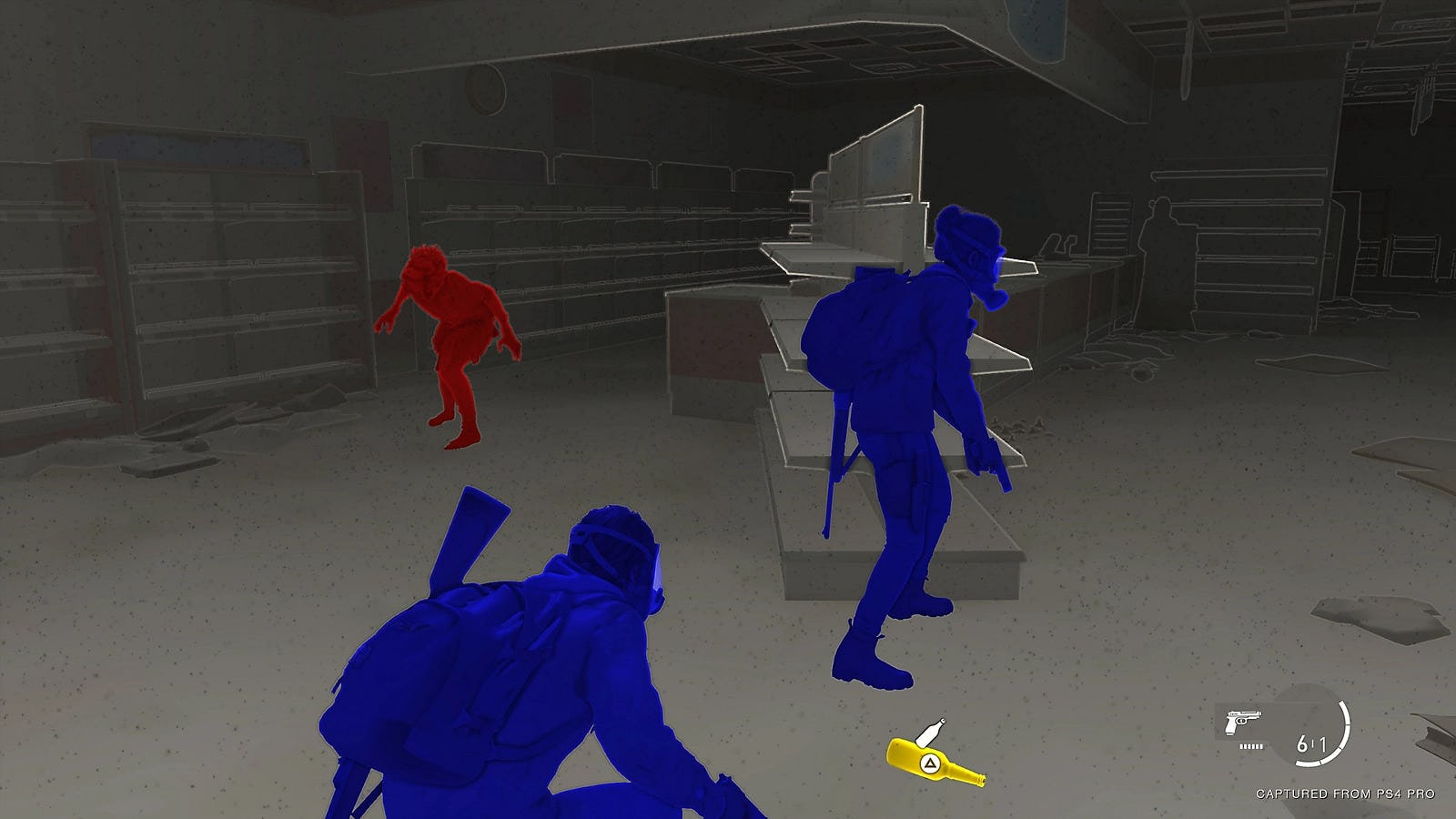
“Watching Brandon play Resident Evil 6 blew my mind. It was unbelievable. Not only that he could do it, but also just how little he needed,” Gallant tells Inverse. “One of the reasons I was drawn to this idea of making a game accessible to a blind player is that he made it look so easy.”
Turns out, making a triple-A game fully accessible to a blind player was a lot harder than it looked.
“We want to remove barriers, but we don't want to remove fun.”
But thinking about accessibility early on helped the project enormously. Adding game-spanning features late in development can be prohibitively complicated and costly. Thankfully, The Last of Us Part II was only in pre-production when Schatz and Gallant first began hatching a team-wide plan for making the sequel approachable to as many players as possible.
“A big advantage for us is that started early in the project, meaning the story hadn't been figured out. We didn't know what levels we were going to do. We were doing just a bunch of prototypes,” Schatz says. “That gave us the bandwidth to talk about game-wide features. They don't necessarily need a story — we can make progress on accessibility without those things.”
Even the most careful and deliberate planning, however, didn’t allow the team to avoid the knock-on consequences of seemingly small decisions.
“A game is an incredibly complex system. Anytime you want to add a new feature, you will always be surprised by ripple effects,” Schatz says. “When you make the subtitles bigger, does that mean you can't fit as many words on-screen? Just ‘making it bigger’ and not planning for it from the beginning means you're probably going to break something.”
Throughout development, the team at Naughty Dog had to balance streamlining certain mechanics with maintaining excitement and enjoyment for all players. One optional feature, which allowed players to become invulnerable to enemies while in a prone position, was criticized by disabled playtesters for minimizing challenge. So the team tweaked the feature by adding a time limit.
“It’s not just about making it easy, or just making something the player can get through. We want players to really enjoy the experience,” says Schatz. “We approached all of these all these features from that sort of perspective. We want to remove barriers, but we don't want to remove fun.”
Adding robust accessibility options to The Last of Us Part II was rooted in a desire to make the game welcoming to a wider audience — according to the CDC, roughly one in four adults in the United States lives with some form of disability.
“These are features that can help anyone.”
The team also looked to appeal to players who might be less fluent with the action and stealth genres. There are countless ways to approach a given scenario in The Last of Us Part II, and help is always readily at hand should you need it. If you get lost in a maze of corridors in an abandoned hospital, a simple button press will point you toward your objective. If you’re having trouble taking down a challenging boss, you can adjust the amount of damage your character can sustain, or toggle on a slow-motion mode to ensure your aim is true. These options make it less likely players will abandon the game because they got stuck partway through. At any given moment, a meaty challenge is there if you want it, and avoidable if you don’t.
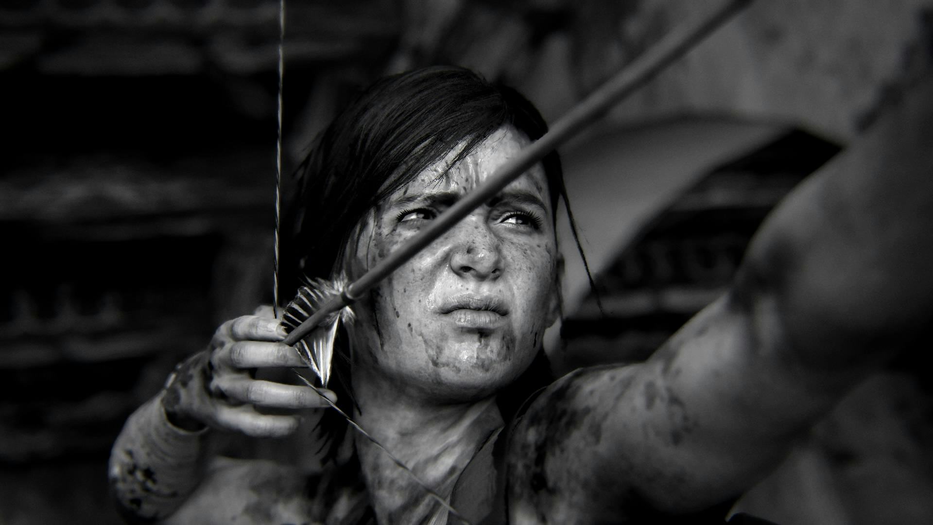
“We've seen tons of evidence that non-disabled players are using these features to adjust the game to their preferences and eliminate frustration,” says Gallant. “Accessible design is good universal design. The work that was done here served everyone who played The Last of Us Part II and made it a better game.”
“Accessibility features aren't only for people that you think of as needing accessibility features,” adds Schatz. “These are features that can help anyone.”
The team at Naughty Dog approached accessibility in The Last of Us Part II as an investment in the studio’s future. There wasn’t a set goal in mind — the team added additional features on a piecemeal basis if they were helpful to playtesters. Since most of the studio’s games hew to the action-adventure genre, many of these features can be reused or improved upon in future titles.
“The technology and features of one game are often very easy to port over to another game,” says Schatz. “So some of our biggest tasks, like text-to-speech — we've done it now. So that investment in our future is now paying off in that way. We can put those features into The Last of Us Part I.”
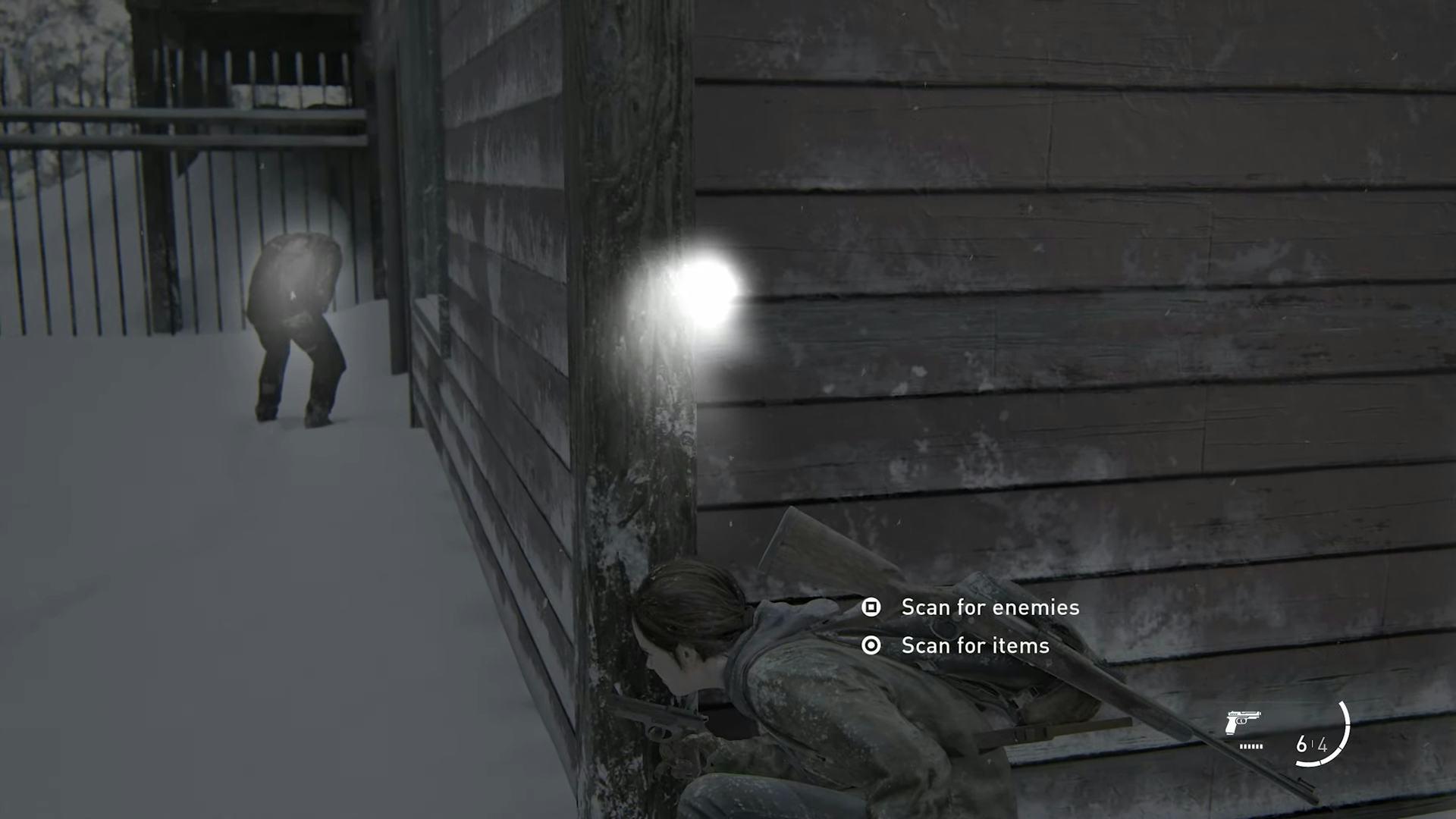
The top-down remake of The Last of Us Part I, which comes to PlayStation 5 on September 9, will include nearly all accessibility features from the 2020 sequel. (Those omitted, such as Alternate Boat Controls, are specific to plot elements in the sequel.) Part I will also include several new additions, including full audio descriptions for cinematics. The team enlisted the aid of Descriptive Video Works — the same team used by Netflix — rather than trying to master the subtle art by themselves.
“Audio descriptions are very hard to get into — you need a lot of expertise,” Gallant says. “It is not an endeavor to be done by amateurs.”
The Last of Us Part II shifted the minimum expectations among developers and players for accessibility options in games. Both Schatz and Gallant see innovations in the space as a new frontier of game design in the years to come.
“It was like a completely blank canvas when we were thinking about approaching a level as a blind player. It has been comparable to the switch to 3D with PlayStation 1 and Nintendo 64 when designers had to figure out how to let players control the camera. Now that's the industry standard,” says Gallant. “Accessibility feels like a comparable frontier. Everyone's trying something new. There's such wide-open space to try new things, to experiment and prototype. The level-two conversation is: How do we make this even better?”
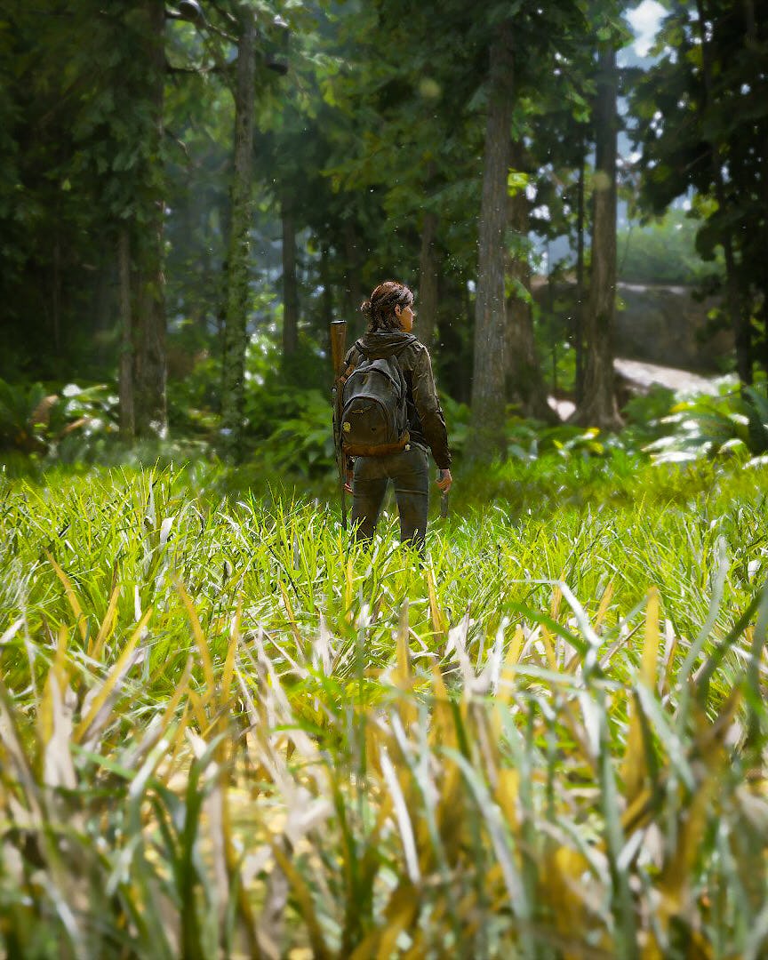
Looking ahead to future games, the team at Naughty Dog is thinking about ways to scale complexity by offering options for more streamlined interactions. Gallant notes that while a blind player can clear The Last of Us Part II, they still need to feel comfortable using a complex input device.
“Even if you play with all our options, you still have to use every button on the controller,” he says. “It's not like I could tell someone who's never used a dual-stick controller before to just pick it up and play.”
“What do we get out of a minimalist experience?”
But developers are beginning to step away from the impulse to use every button. Gallant points toward Playground Games’ racing game Forza Horizon 5, which allows a player to control the gas with a single button while automating other inputs such as turning, braking, and camera position. He also cites Capcom’s upcoming brawler Street Fighter 6, which offers a simplified control scheme that eliminates the need to input rapid-fire combos, as an example of a broader trend toward more inclusive game design.
In Schatz and Gallant’s view, the most innovative games in the coming five to 10 years will likely take more of a less-is-more approach, refining a more personalized approach to interaction rather than focusing on flashy visuals or superfluous embellishments.
“We've reached a point in game design where everything is maximal. I think there's a lot of innovation in the future in paring that down,” says Schatz. “Do we really need to use all these controls? What do we get out of a minimalist experience, where we're just pressing one thing? I'm really looking forward to evolving toward more intentional design in all sorts of ways.”
Inverse Luminaries profiles the most innovative and exciting people in and around the games industry for their insights on the future of the medium.


