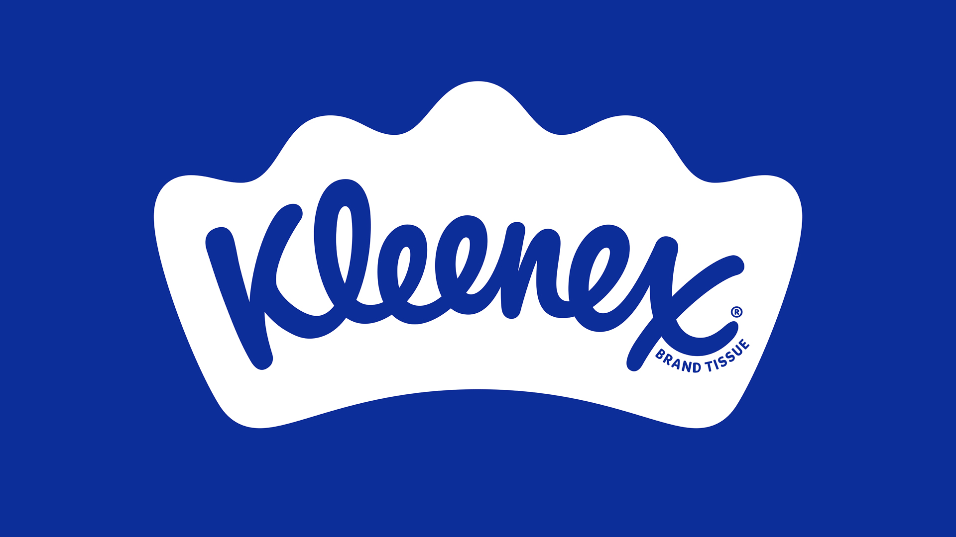
Kleenex is such a strong brand that in some parts of the world, the word 'Kleenex' is used interchangeably with 'tissue'. It also has a powerful legacy, and is celebrating its 100th birthday this year. To mark the milestone, it has partnered with Turner Duckworth to reinvent its brand, futureproofing it for years to come while bringing cohesion to what had become quite a disparate brand – with different variations across markets.
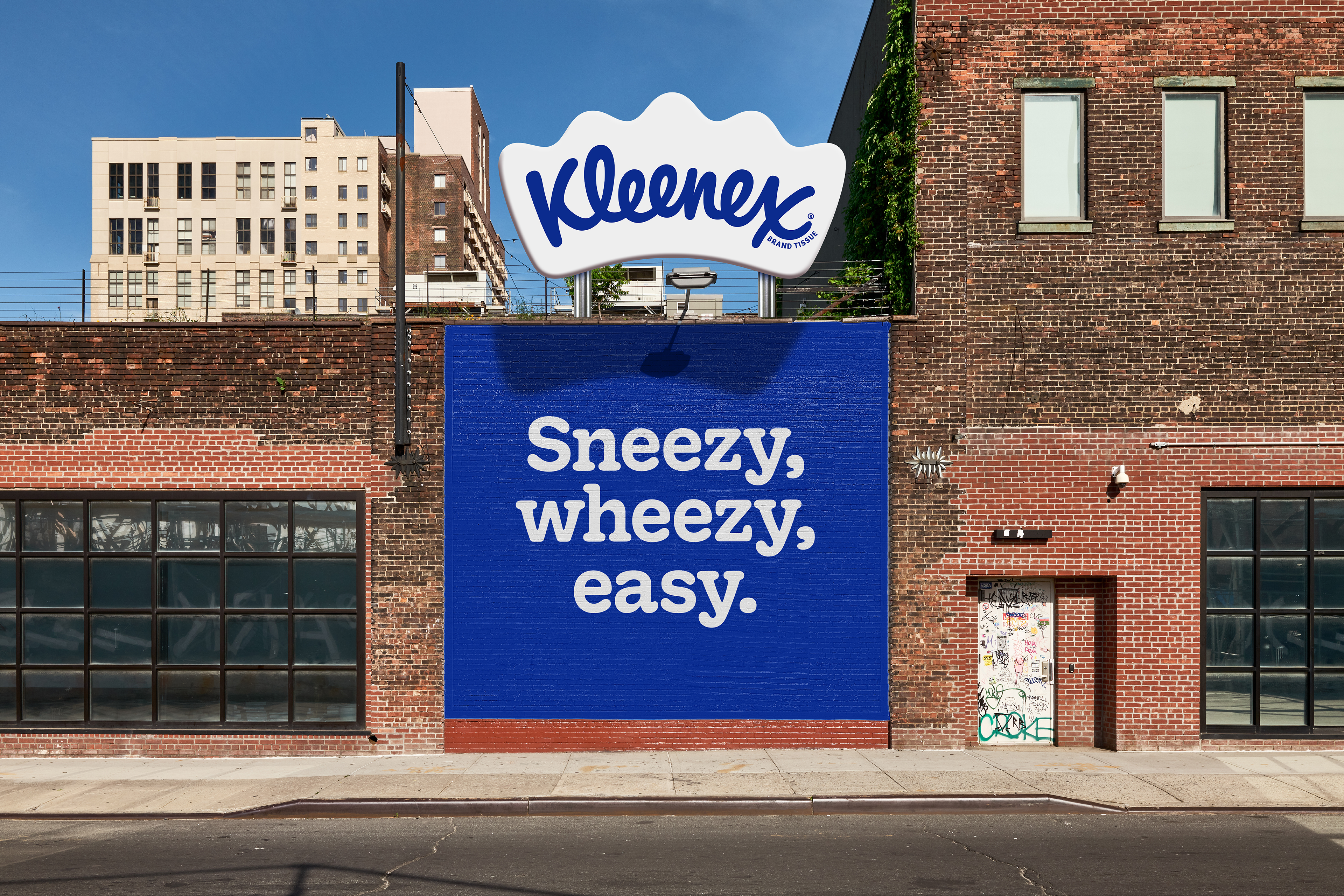
The new look, which feels like a potential contender for our best rebrand of the decade series, centres around a crown, which houses the word 'Kleenex' and positions Kleenex as a leader in this space. Its soft curves also hint at Kleenex's use. The wordmark itself has taken various forms since 1924 – Saul Bass' 1961 iteration is perhaps the most famous – but prior to Turner Duckworth's work there were several versions in rotation that were housed within a variety of shapes. The new logo is designed to be used everywhere.
In terms of colour palette, there were also previously different colours for different markets. The new Kleenex Blue brings the brand together, making a bold and memorable statement. This navy blue also feels like a perfect fit for the brand, and like a colour that the brand can 'own' (see our other examples of when brands own colours). Paired with the bespoke typeface Kleenex Serif, developed with type designers Alex Tear and Lewis Macdonald, it feels like Kleenex has the makings of a powerful brand that will stand the test of time. It also oddly feels like this brand has always been there, which I think is a good sign.
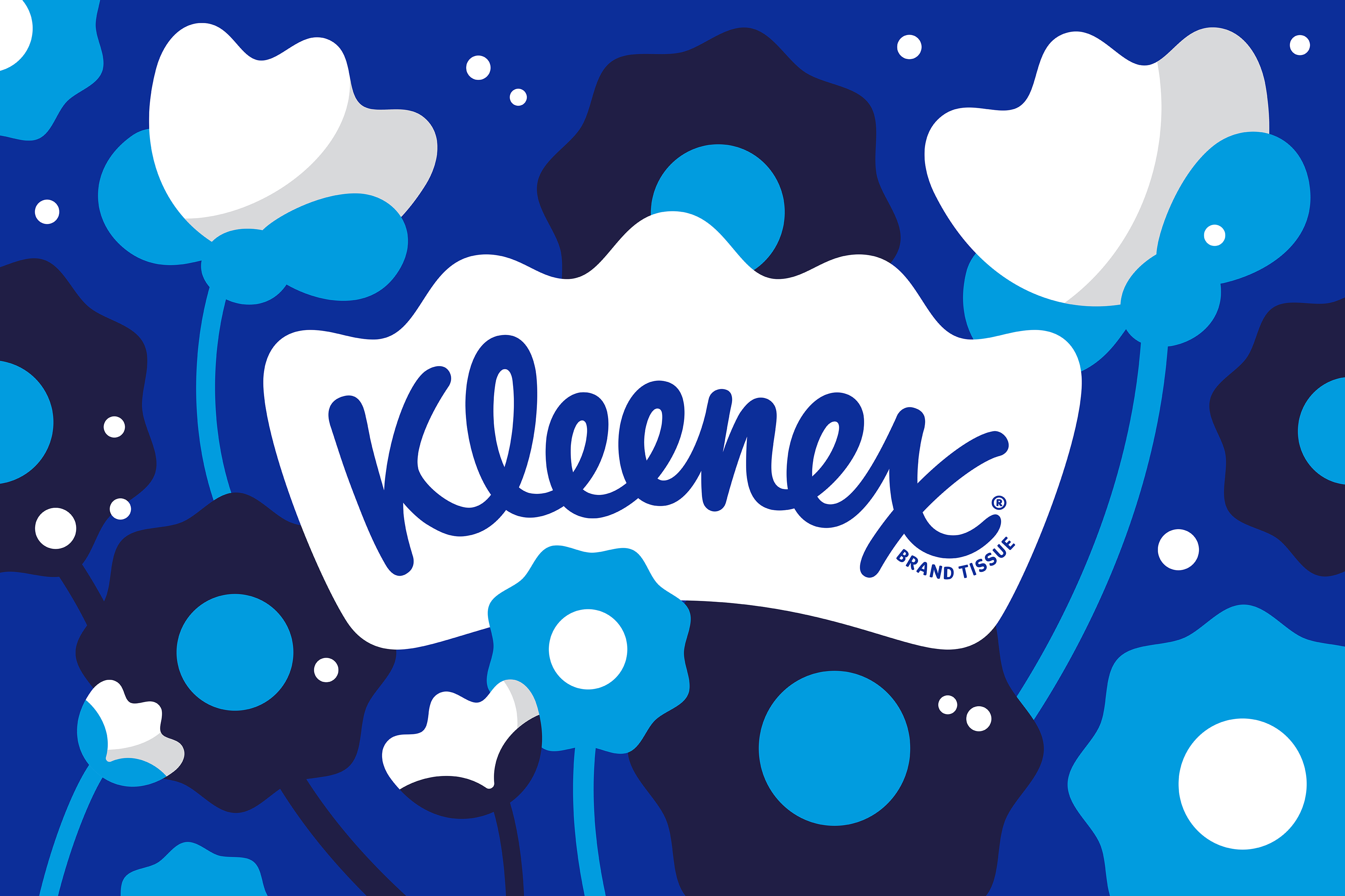
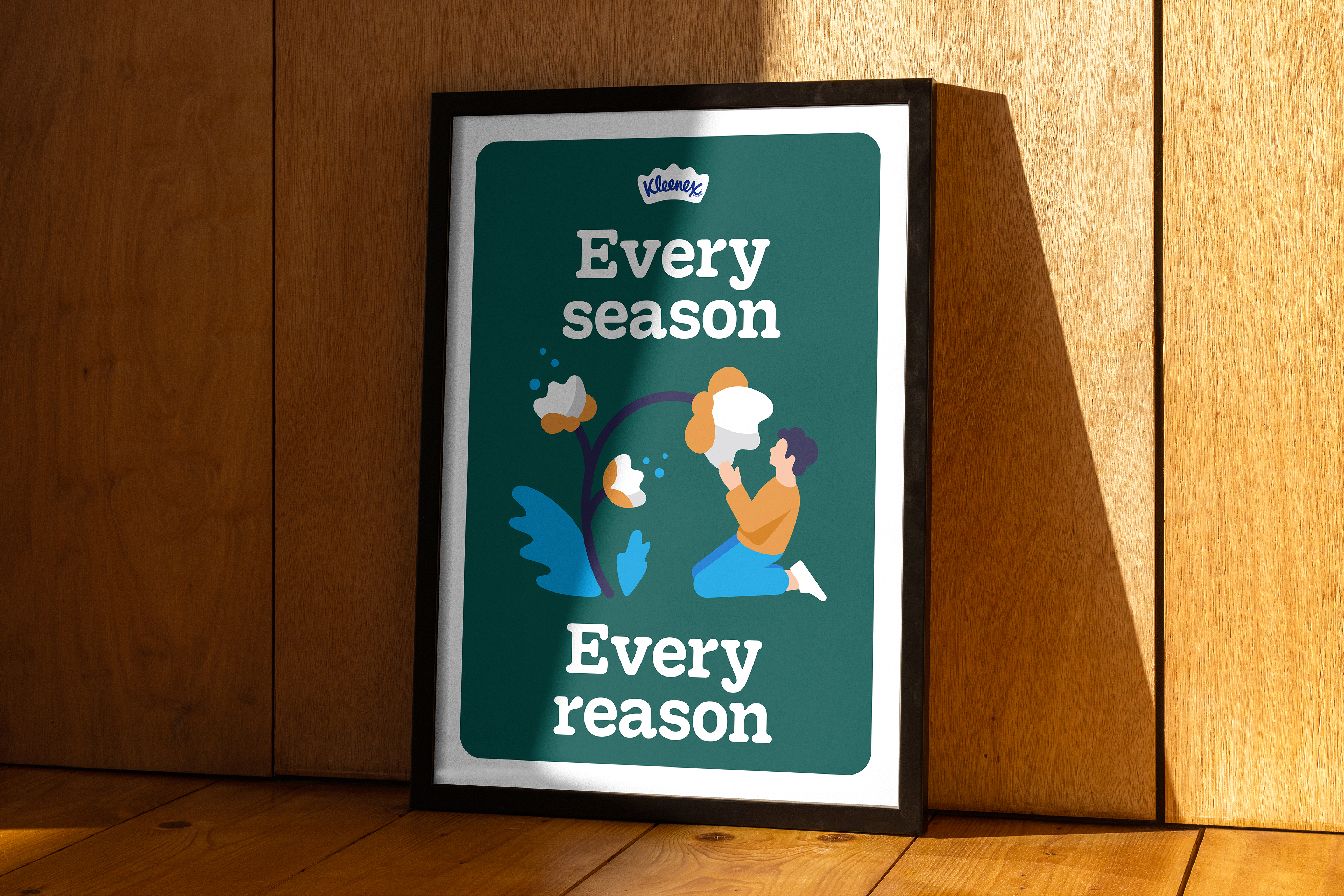

The illustrations are perhaps the least exciting part of the rebrand. It feels like the style is fairly ubiquitous at the moment. However, they get across the messages they are trying to convey well, and give the whole identity more personality.
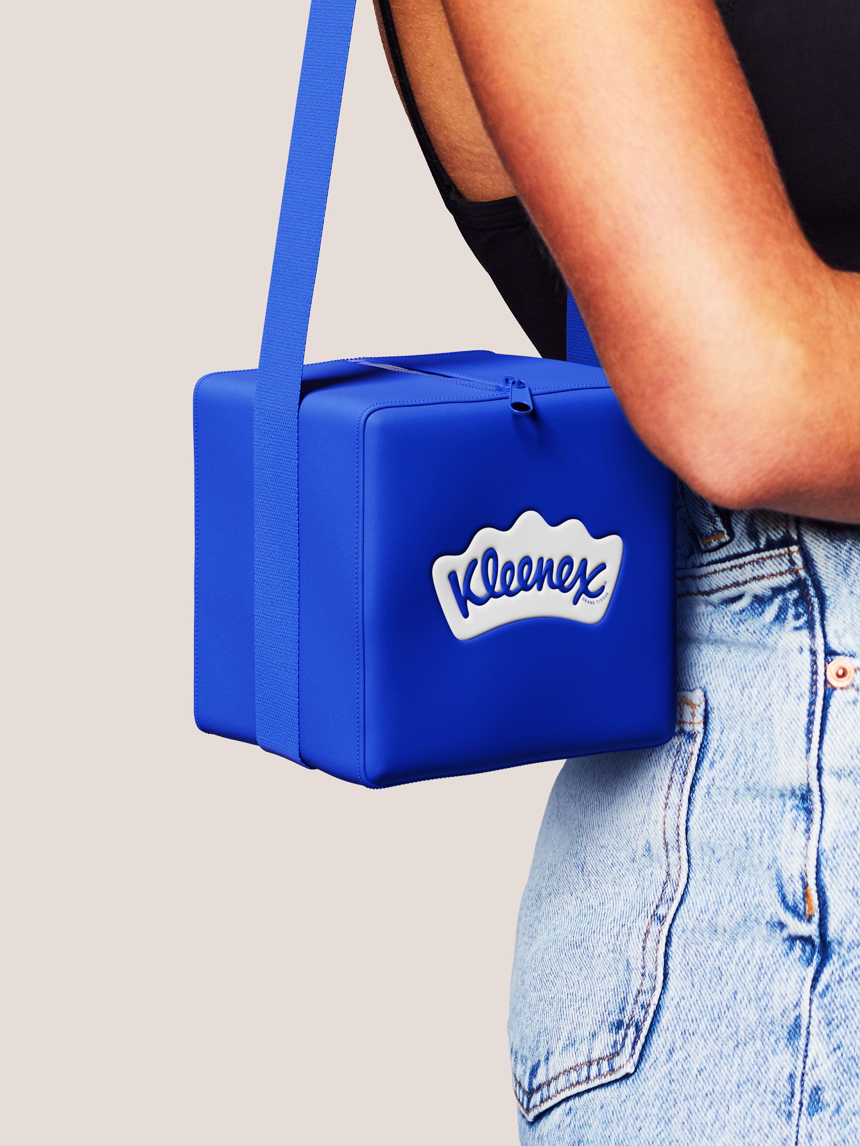

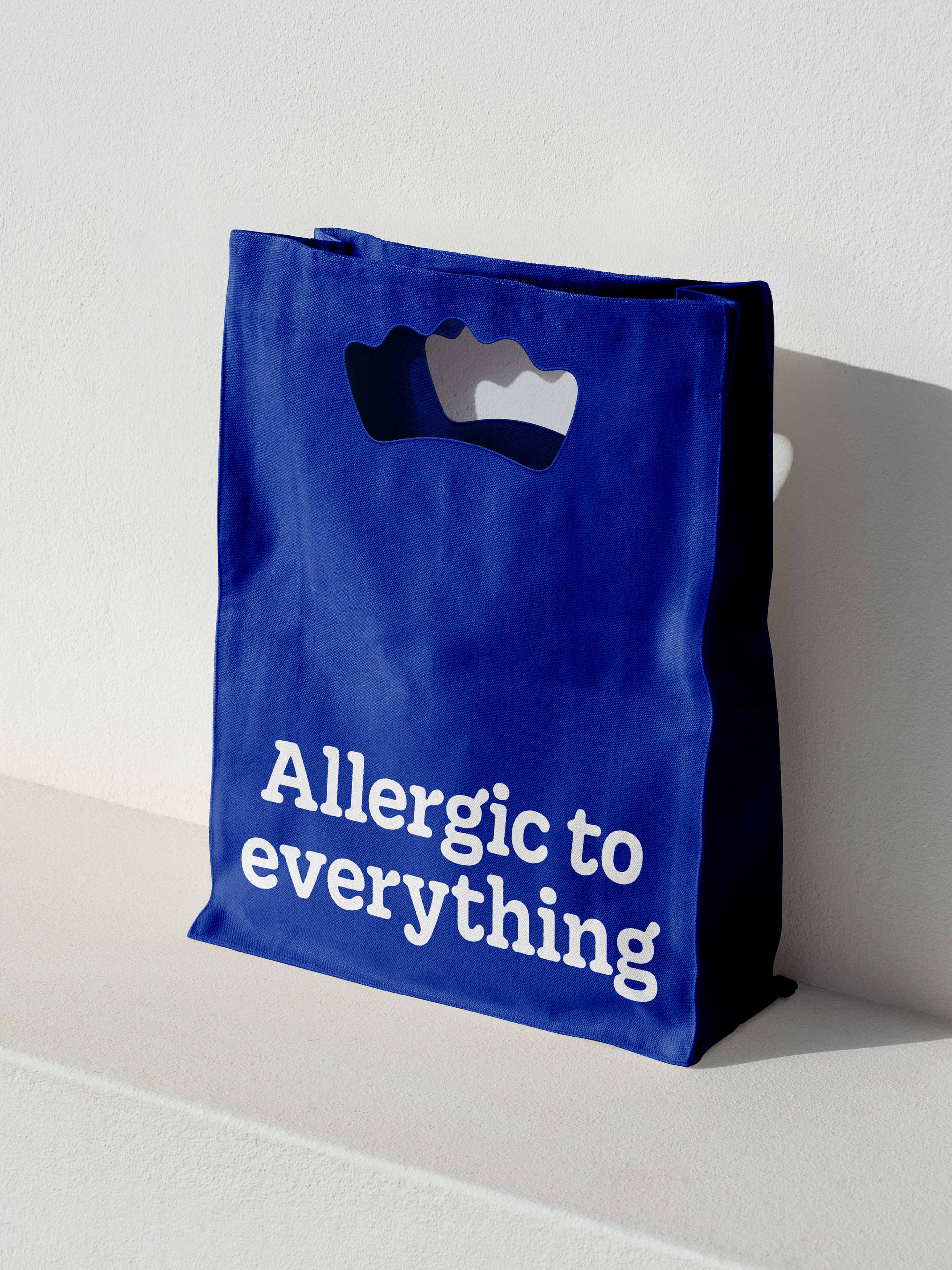
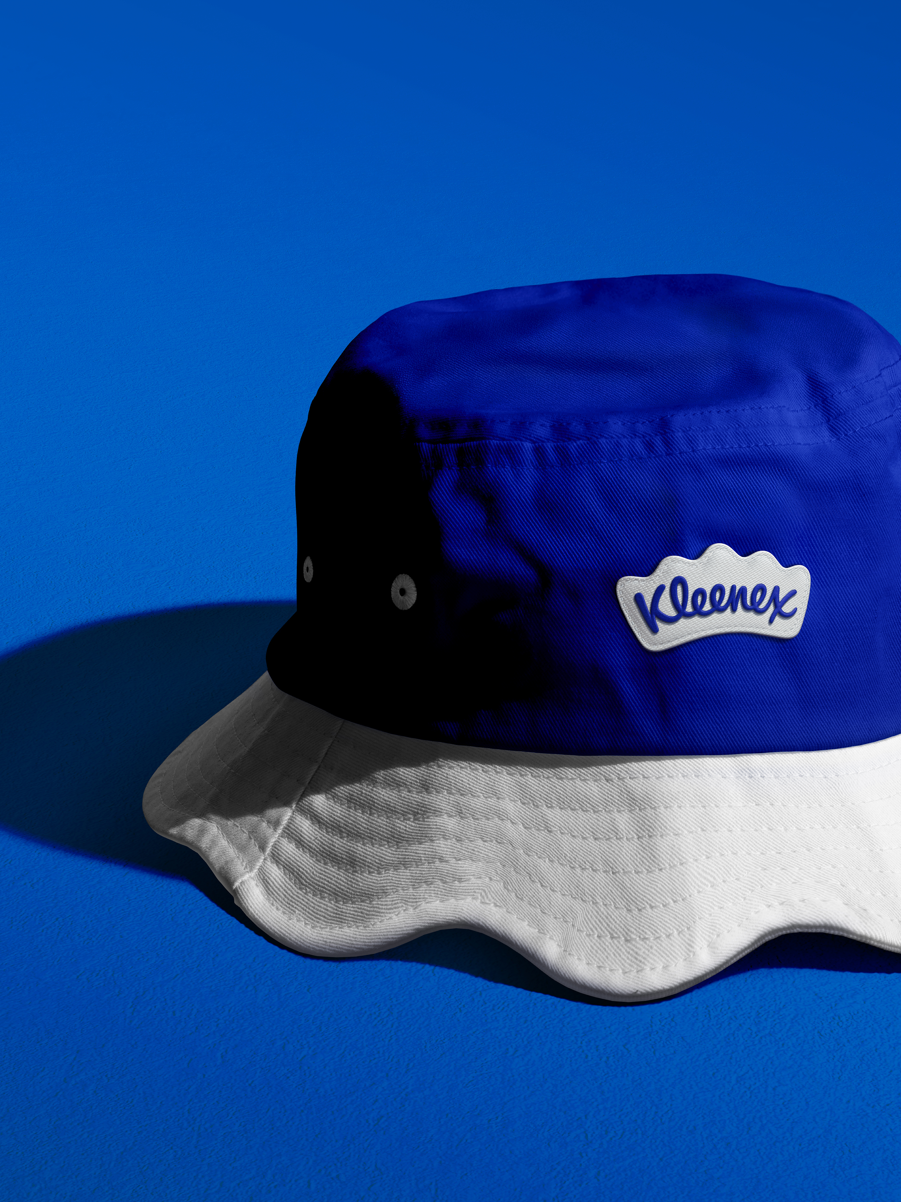
"While many competitors far and wide claim to make facial tissues, there is only one Kleenex,” says Andy Baron, executive creative director at Turner Duckworth. “Every square inch of the new visual identity is designed to reinforce the brand’s category leadership (and invention, for that matter) through a suite of carefully designed distinctive assets, and a system that brings them together.”
Overall I think this is a really strong rebrand and I look forward to seeing more iterations of it as it is rolled out.
For more rebrands that have caught my eye lately, see the China Now identity, which is one of my favourites of the year, or explore the winners of the 2024 Brand Impact Awards, which include Turner Duckworth.


