When designing my own kitchen, extractor hood ideas were one of the first things I looked for — in my opinion, no matter which way you go with your cabinetry and countertops, it's this design element that really tells you what you need to know about a kitchen's design.
They can take a standard Shaker cabinet door and direct it more towards traditional or contemporary; it can be a standout centerpiece for your kitchen, or be designed to specifically fade into the background (that comes with its own charms if you're yearning for a minimalist kitchen).
Whatever the case, the extractor hood shouldn't be an afterthought, and spending a little time on it is the kitchen trend we didn't know we needed. To prove my point, I found 11 of my favorite approaches designers have taken to this all-important feature of a modern kitchen to inspire you in your own remodel.
1. Source reclaimed materials
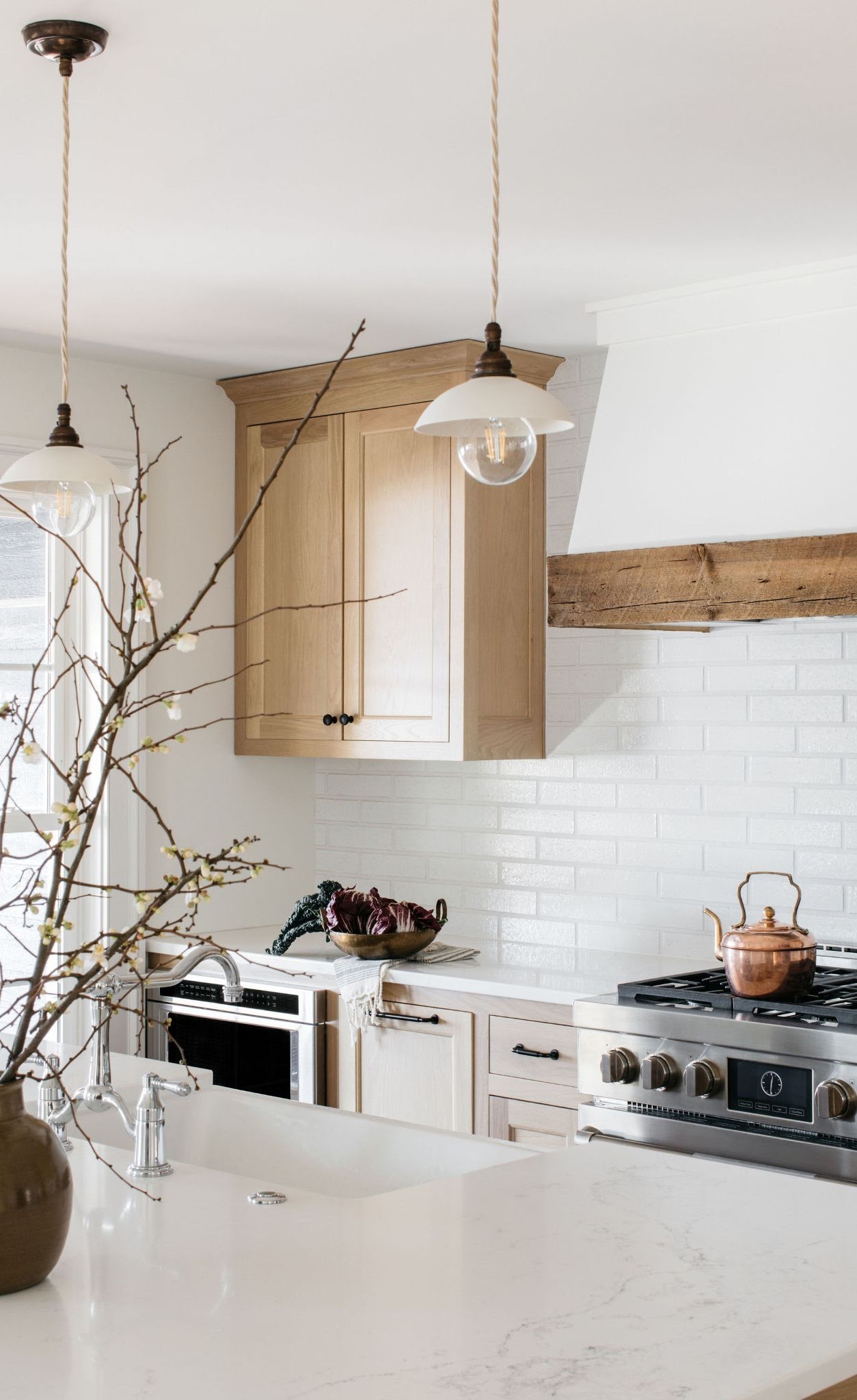
If you're looking for an extractor hood design that adds a little heart and soul to a kitchen, you can't do much better than looking at reclaimed materials. For designer Corey Lohmann, founder of Corey Lohmann Design, it was this detail which really elevates the classic kitchen in this lakehouse and gives it a specific point of view.
'Since this is a family lakehouse that my client has had for years, we wanted the details to feel really authentic and special for our client,' Corey tells me. 'We sourced the wood at the hood from a reclaimed lumbar yard and also used the same piece at the fireplace mantel.'
It's the design element that feels like it really ties this transitional-style kitchen together.
2. Consider a metal finish
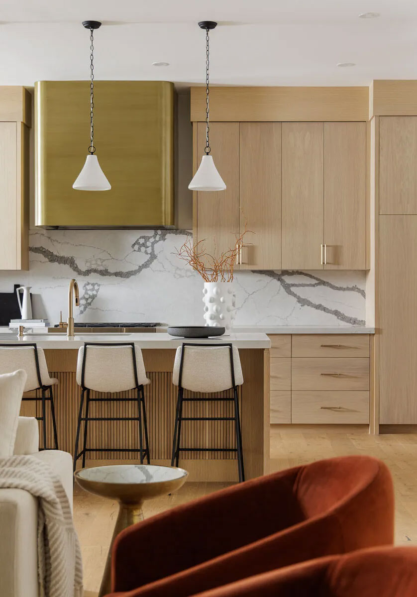
Metallic finishes are a classic way to elevate a kitchen, and are a fall back when it comes to ideas that make a boring kitchen more exciting. Whether you want a cooler, industrial metal like stainless steel, or something that feels a little more luxurious like brass, all options add a subtle gleam.
Yes, you might think that a design that looks like this one by Alykhan Velji Designs is going to be a bit of an investment, but as the designer proves, there's more than one way to get the look for your extractor hood. 'We knew that we wanted to create a focal point in the kitchen and the hood fan for this kitchen was the perfect way to do this,' Aly Velji, founder of the studio explains. 'The original plan was to go with a custom curved brass metal to cover the hood however, budget came into play so we had to think about something else.'
'We cam across a company that applies metal finishes on materials to give us the look and this worked with the budget and we loved the look,' he says. 'The brass is a perfect addition to this kitchen because it helps to create warmth and the curve is soft.'
3. Try Venetian Plaster
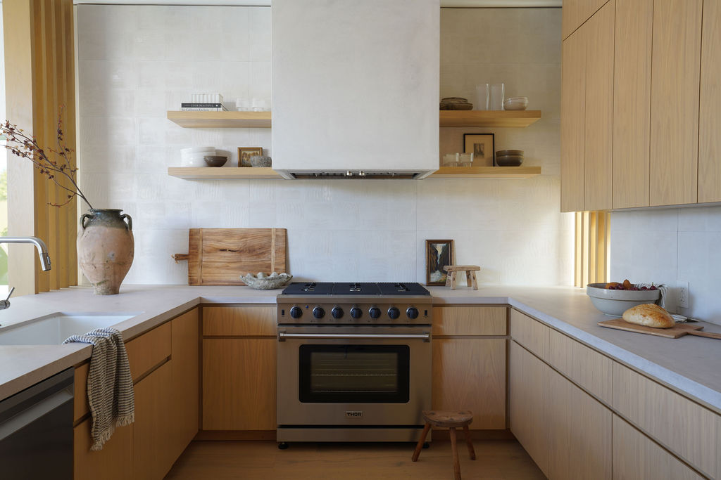
The "plastered-in" look for extractor hoods is a kitchen trend you can't overlook right now, especially in more minimalist kitchens where you don't want your hoods to clash with upper cabinets or other finishes.
However, given the nature of a cooking space, your standard painted plaster isn't necessarily going to be up to the job in this instance. For designer Kristin Hilderbrand, the answer was simple for this small yet perfectly appointed kitchen. 'This is a venetian plaster finish beautifully executed by one of our builders craftsmen, she explains. 'We're thrilled with how it turned out!'
Venetian plaster is much more hardwearing than standard plasters because of its stone content, meaning it will be more than capable of handling whatever you throw at it (sometimes quite literally) in your kitchen.
4. Choose a tapered design
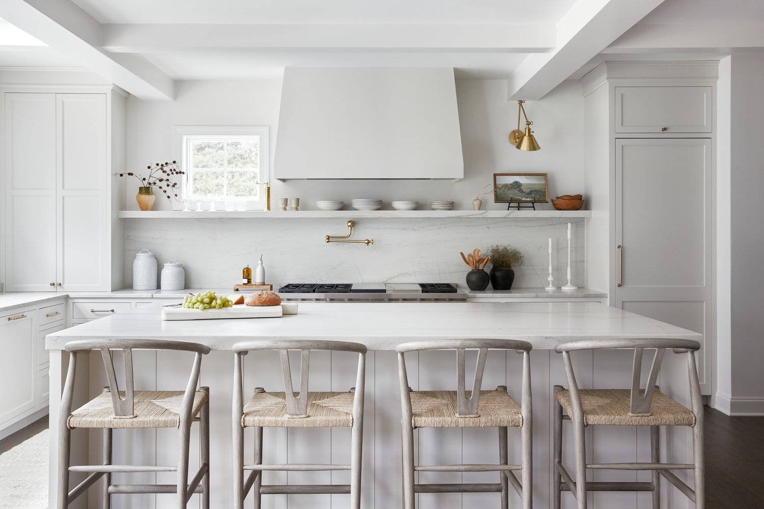
Hand in hand with the plastered hood look is a specific shape trend that bring a new dimension to what can feel like a boxy space at times, and it's one that's not as complex to create as curves.
Tapered cooker hoods, like this one created by kitchen designer Gabrielle Fabbri are a clever way of breaking up the uniformity of a kitchen. 'I think these look great on their own,' Gabrielle says, 'and they can certainly feel more organic in the space.'
However, if you want this look, there's a trick to know to make your design work, according to Gabrielle. 'I'm not a huge fan of placing wall cabinets next to a tapered hood,' she says. 'I think the spaces compete a bit too much and take away from the charm of the hood.'
5. Mix matte and gloss materials
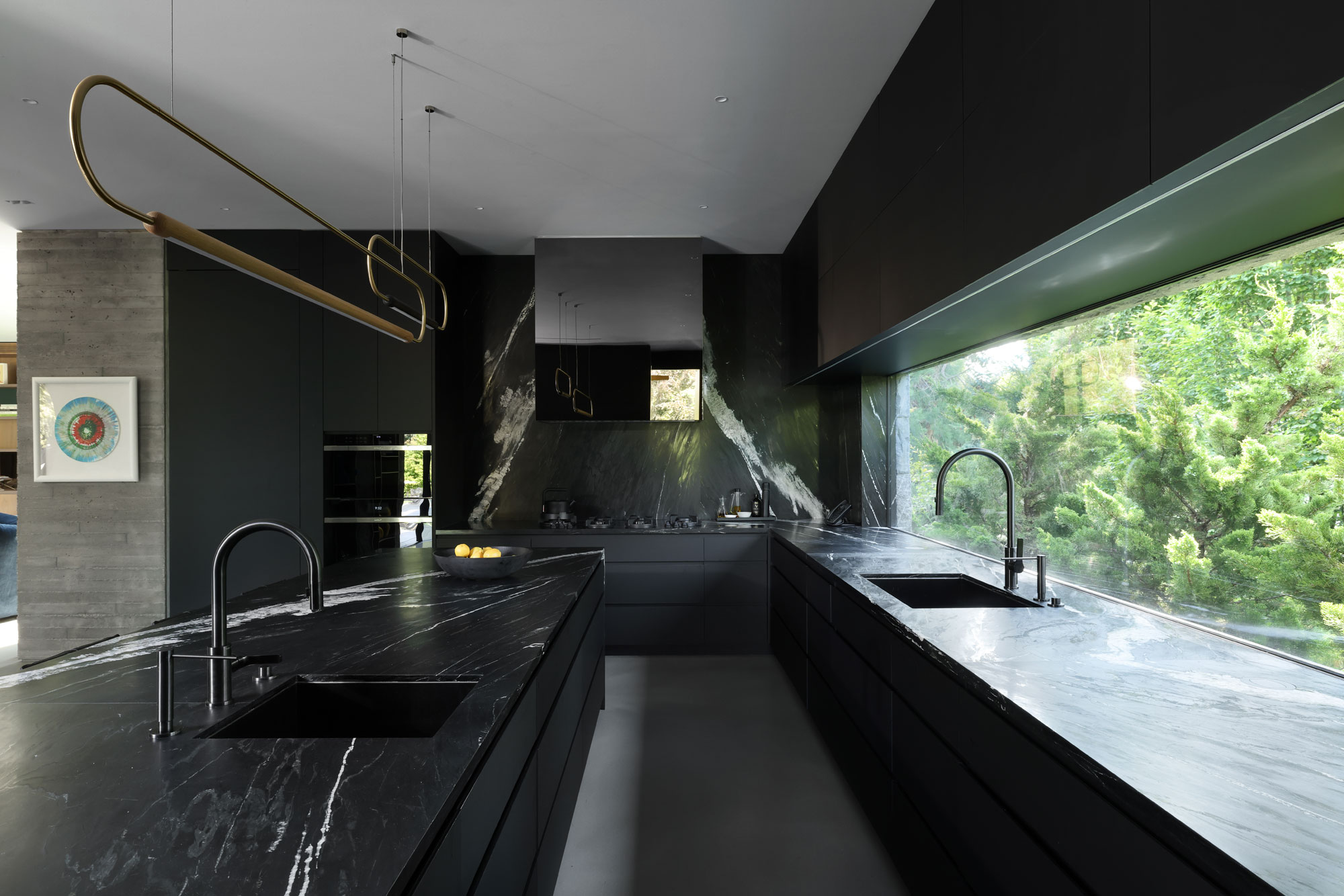
When choosing a material for your extractor hood, it's worth considering it as part of the wider mix. Pairing the rough with the smooth, the shiny with the matte; this brings dimension to a space even if you want to use a monochromatic color scheme.
For interior designer Kelly Keay's own kitchen, the cooker hood is a standout, but is also a sum of the parts of the whole space. 'The kitchen countertop marble was selected first for its life and body, so I then wanted to emphasize that with having a matte black backdrop to make the countertop pop,' Kelly explains. ' The hood fan is clad in bronze, this was chosen to incorporate the champagne accent in other areas throughout the residence as well some subtle background color.'
6. Match in with your cabinets
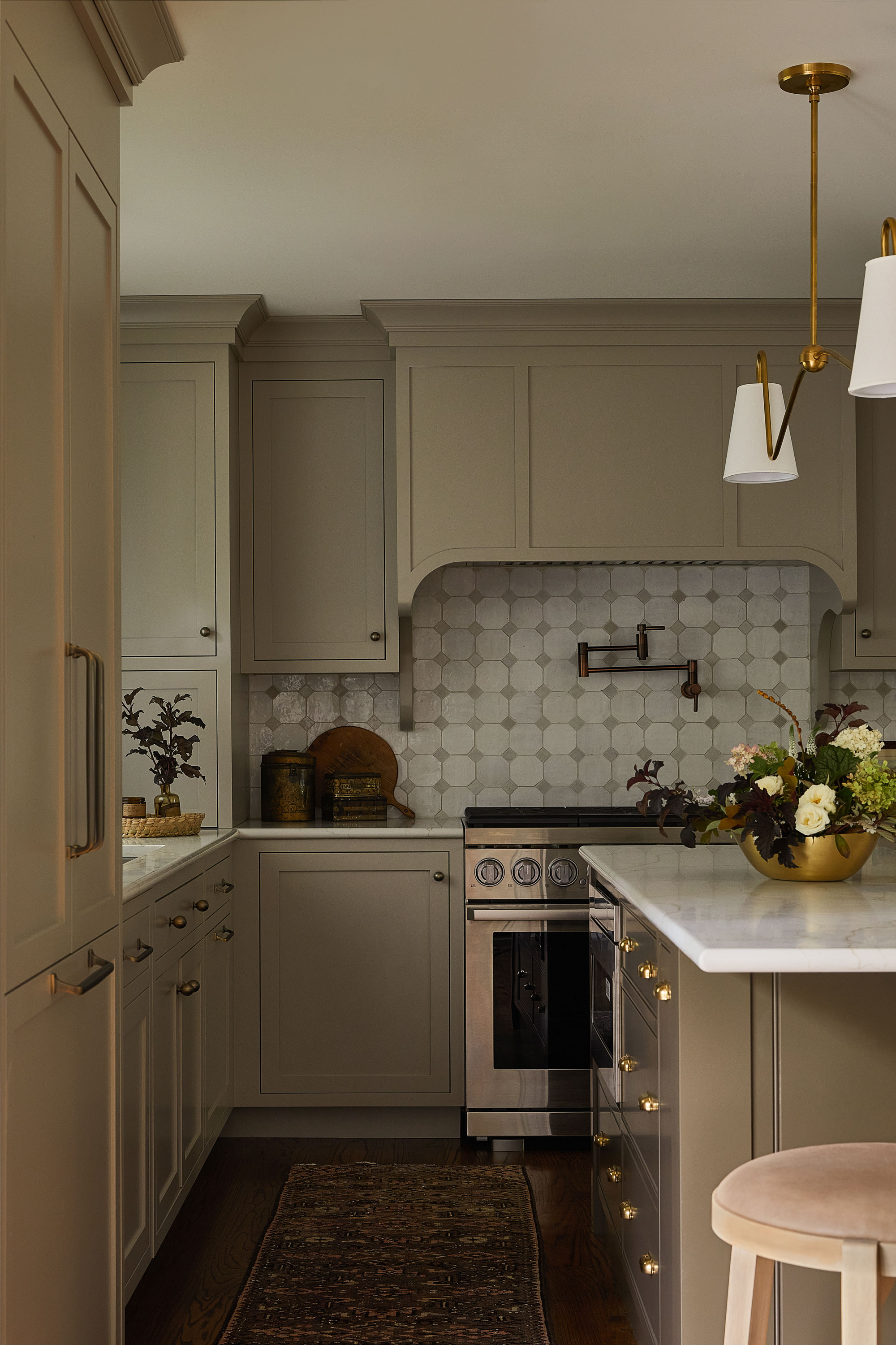
This kitchen designed by interior designer Johanna Lyle, founder of Jo Lyle & Co, sees the extractor hood meld into the cabinetry. For a small kitchen, it's a great way to keep the visual clutter to a minimum, but Johanna's take on the hood still makes it feel like a special part of the design.
'The hood is my favorite part of the cabinetry design,' the designer tells me. 'The scale of the hood helps balance the tall, heavy fridge cabinet on the opposite wall and makes it super functional for capturing all the cooking grease and steam, and it provides a beautiful backdrop for the special island pendant.'
A small detail stops the scheme feeling too boxy, too. 'The curved corbels add softness and to what otherwise might feel like a large, imposing rectangle,' Johanna explains.
7. Do something bold
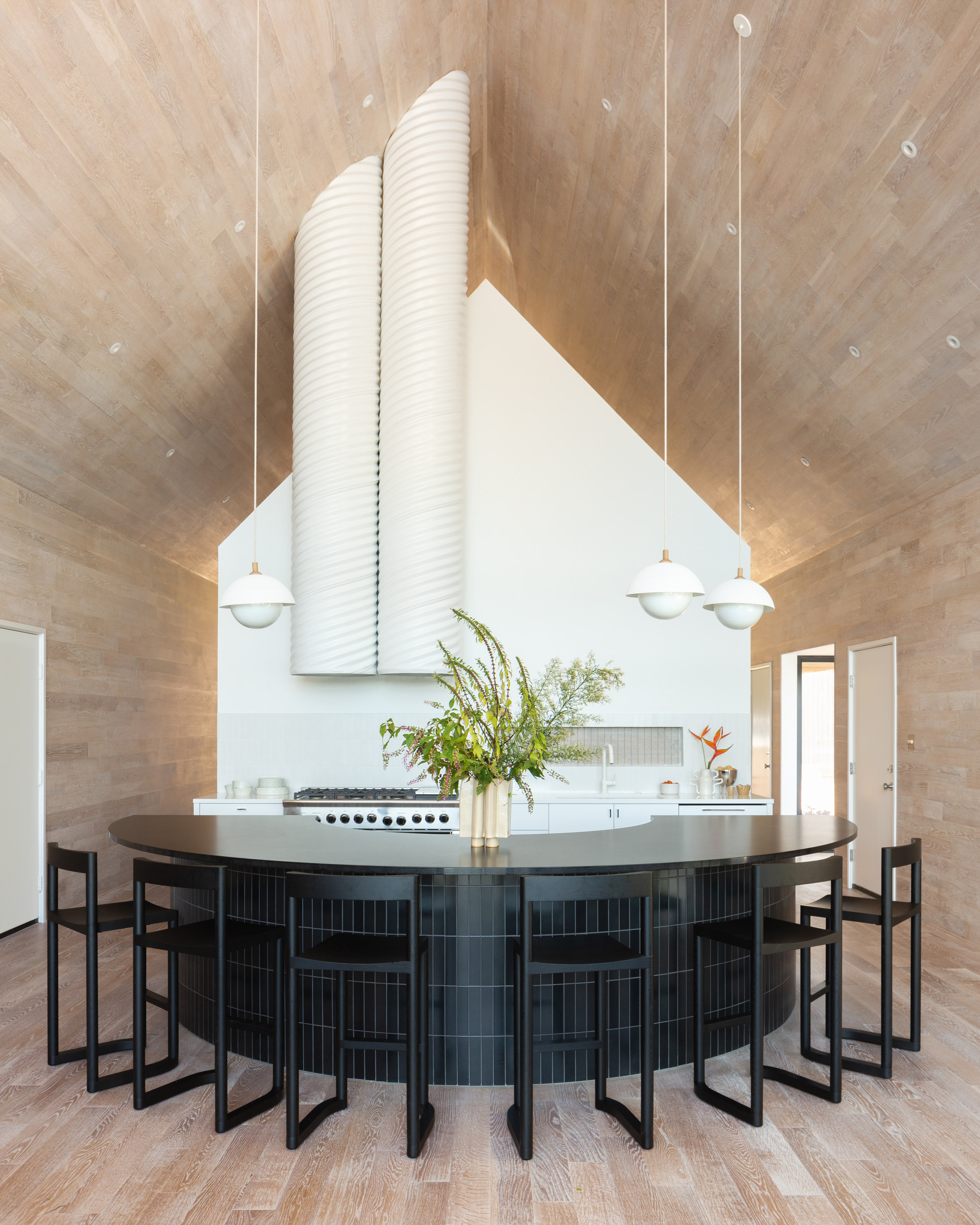
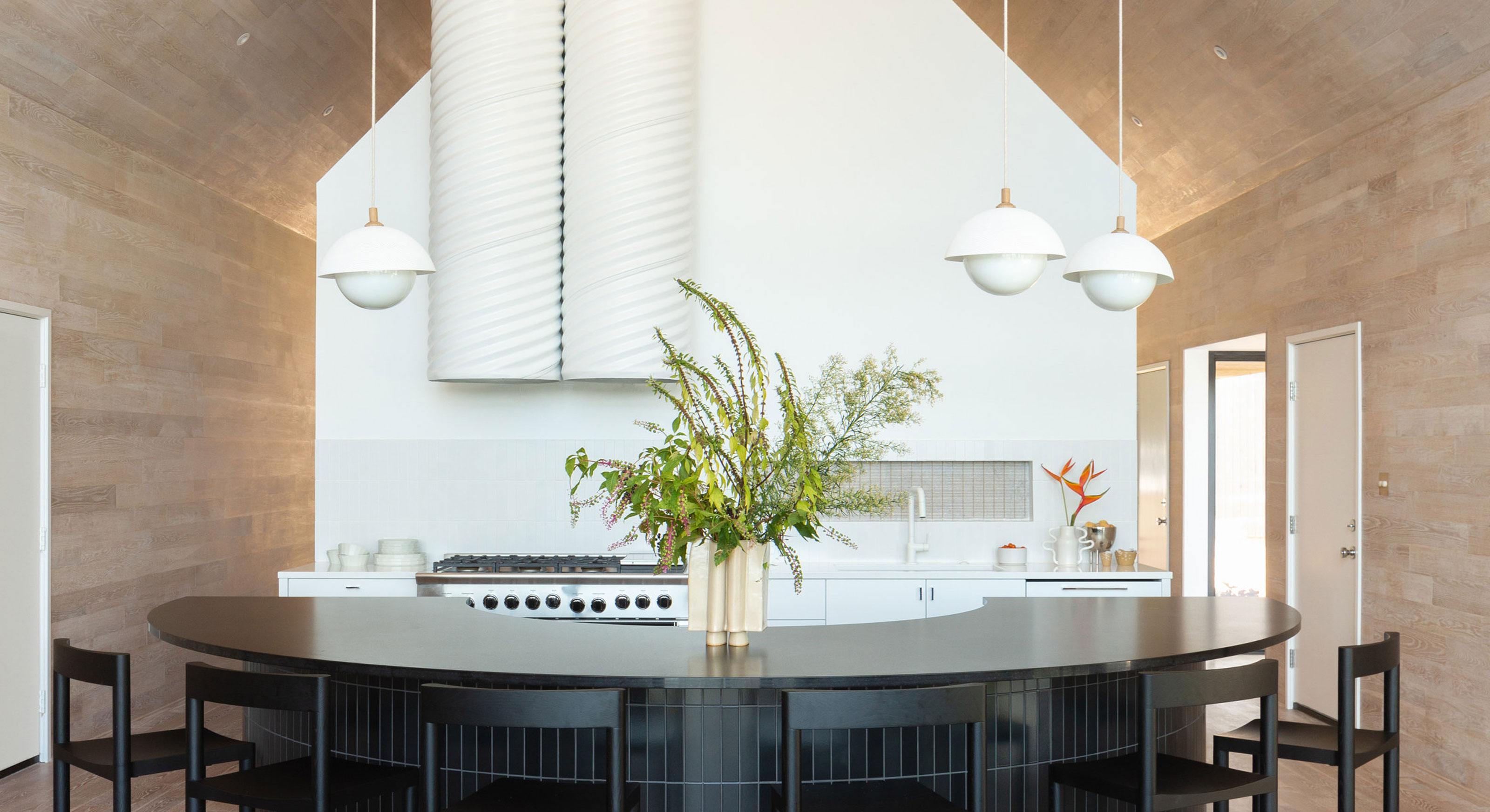
A special project calls for a special extractor hood, and this design by KLH Homes was one such home that deserved something of interest to highlight its brilliant architecture.
'Our focus on this project was celebrating form in the purest way that we could - beginning with the inner 'house' on each end of the home,' explains Liz Hoekzema, creative director of KLH Homes. 'In order to keep the classically identifiable 'house' shape as clean as we could, we worked to hide the fussier functional details of plumbing sewer pipes, and electrical connections, and this led us to the idea of a chimney-like cylindrical aesthetic, which would also conceal the extractor or ventilation for over the range.'
'We accomplished this by playing with raw materials — corrugated spiral steel pipe or 'culverts' that would be sturdy enough for the ceiling span, that we powder-coated to match the interior white used throughout the house. It was quite a process just raising them into place,' Liz explains. 'With such a clean design, I love the softly ribbed texture this added to the final scene.'
8. Introduce a scalloped edge
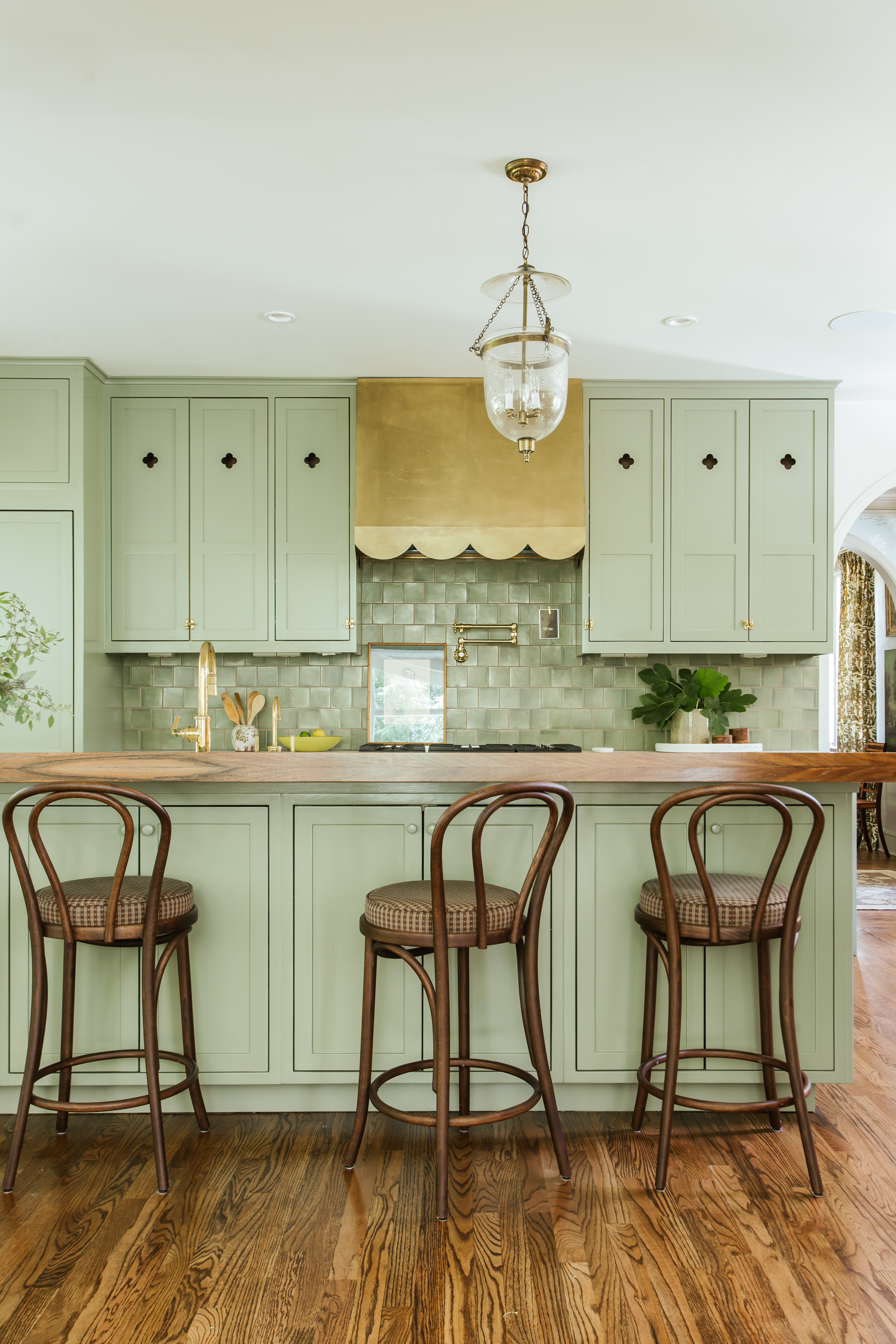
For something with a little bit of whimsy, this scalloped extractor hood designed by Monica Stewart of The Misfit House has both the qualities of being on-trend, yet surprisingly timeless in my opinion.
It's a small detail that really helps set this green kitchen apart, and as Monica says herself: 'I always look to incorporate something unique in each project to set it apart from the next. It’s a great way to make new cabinets feel original to an old house.'
9. Match the backsplash
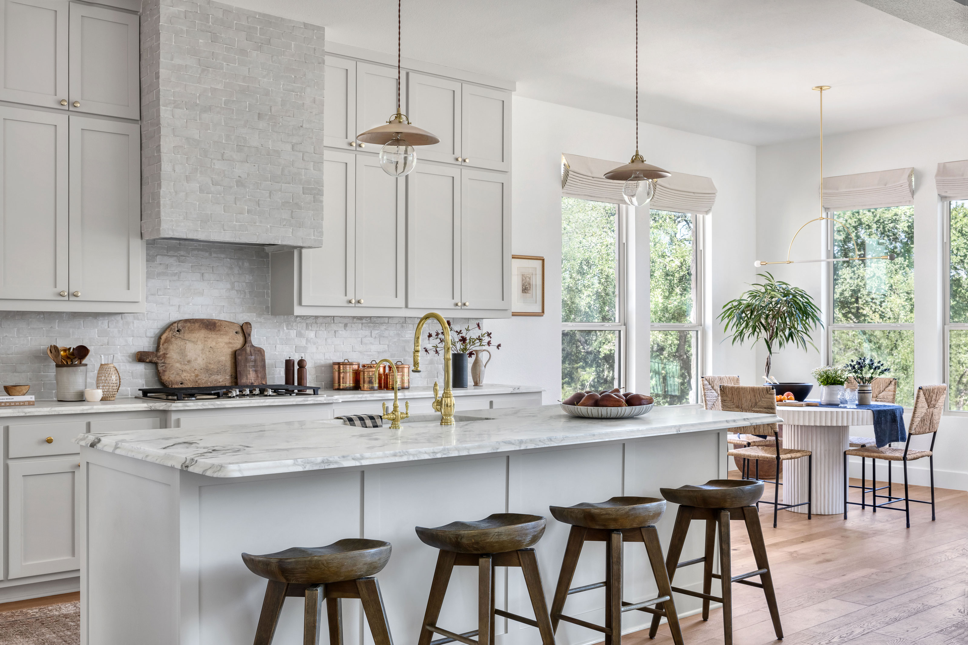
Though a extractor hood can be an opportunity to create a contrast, in some kitchens it's a great place to highlight a material you're already using elsewhere.
In this design by Audrey Scheck, the zellige tiles bring a lot of texture and movement to the design. Yet, where they feel like part of the backdrop used for the kitchen backsplash, when continued up onto the extractor hood they take on a leading role.
'We love capitalizing on the vent hood as a design opportunity in the kitchen through the use of materials such as plaster, wood, or tile, and here we played up the tonal color scheme by running the backsplash tile up the vent, adding depth and visual interest to the space,' Audrey tells me.
10. Add a contrast timber

There aren't many kitchens that don't benefit from having a touch of wood in them, and if you've found your design wanting in this area, how about adding a warming wood contrast for your extractor hood?
That was the solution for this kitchen by Audrey Scheck. 'We wanted to find a unique way to add warmth to the kitchen to balance the heavily veined quartz,' Audrey says. 'To achieve this, we partnered with local millworks to create a custom reeded vent hood that was hand crafted of white oak. Each reed was crafted by hand here in Austin, and it’s an extra bonus that the kitchen now has a touch of local talent incorporated into the design.'
11. Be inspired by this angular design
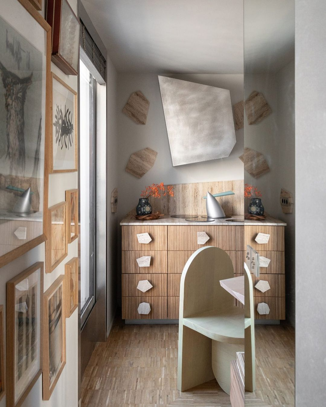
Okay, we've seen curves and tapers, scallops and cylinders, but let's end this collection of incredible extractor hood ideas with something a little bit different.
Created by French designer Jules Brisson, this angular extractor hood is something a little out of the ordinary. 'It's the range hood of the Flintstones family kitchen,' the designer tells me. 'I started from the inspiration of a stone pattern in opus incertum that's existed in antiquity, but also in buildings that are references for me like in the villa Necchi in Milan. This form is worked as a pattern for this project, it is found on the floor, for the handles, the sockets, the lights, the decorative paintings, the tables and the hood.'
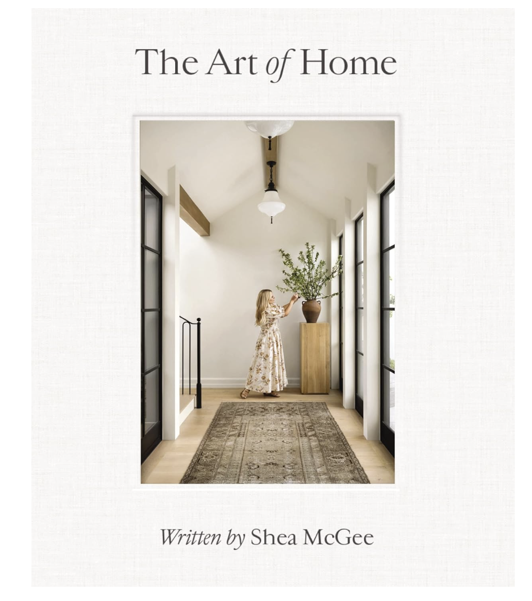
Price: $19.86
Livingetc favorite Shea McGee published this book late last year, and if you like these elevated ideas in the feature above, you'll love this, too. She has a natural way to take each corner of the home that many of us just live with and turn it into something to love.


