The US and Israel's war in Iran has caused global disruption in many sectors, and the there are already signs of an impact on branding, graphic design and packaging design. Some companies are accelerating the hunt for alternatives to plastic, including the use of glass or recycled materials for packaging.
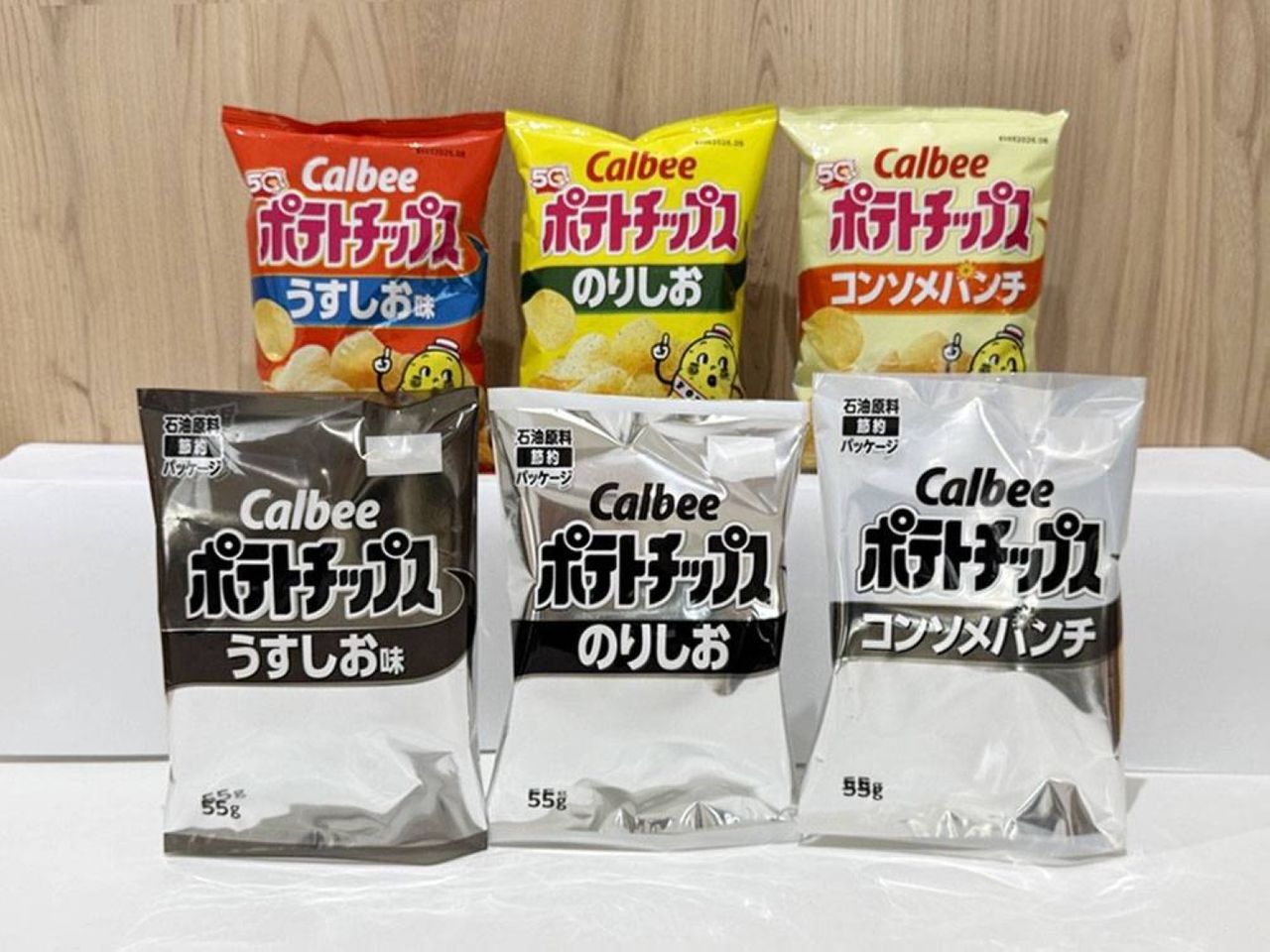
But the clearest examples of the potential impact on brand design have been in Japan, where the snack giant Calbee is ditching its brand colours to try to prevent supply interruptions. If more companies follow the same route, the crisis could end up becoming an unexpected test of good brand design.
カルビーからプレスリリース出ましたねインクの調達ができなくて パッケージを白黒にしたのじゃなく商品供給を途切れさせないために 事前にパッケージを白黒に変えるという判断のようですインクがなくなってから切り替えていては間に合わない真っ当な企業判断ですhttps://t.co/xm49j8MDaA https://t.co/oqPUCqrUZo pic.twitter.com/6RPc5BSq5nMay 12, 2026
Calbee announced this week that it will temporarily remove the colours and illustrated mascots from the packaging of 14 flagship products, including potato crisps, granola and its popular shrimp-flavoured snacks. From 25 May, customers will start to see the usual vibrant designs replaced with black-and-white packaging that Taiwan's Central News Agency describes in the video below as "a dismal monochrome print" that looks like it's had the "soul sucked out" of it.
In its statement, Calbee said the design change is a response to "supply instability affecting raw materials". Printing ink is becoming harder to procure due to the shortage of naphtha (crude gasoline).
Itoham Yonekyu Holdings has said it may follow suit, and Kagome, another Japanese food giant, is reducing ink usage by making the bottom portion of its tomato ketchup packaging design transparent. Nisshin Seifun Welna has said it plans to use plain paper bands instead of coloured plastic packaging for its spaghetti.
First potato chips, now ketchup. Japanese food companies redesign their packaging as a war-related naphtha shortage makes colorful printing a challenge. https://t.co/QCXLN0iUbtMay 15, 2026
There are ways brands could make this more fun. Some Calbee fans have suggested the company invite customers to decorate packaging themselves or hold colouring competitions. But the sudden enforced minimalism could be an interesting stress test for brand design.
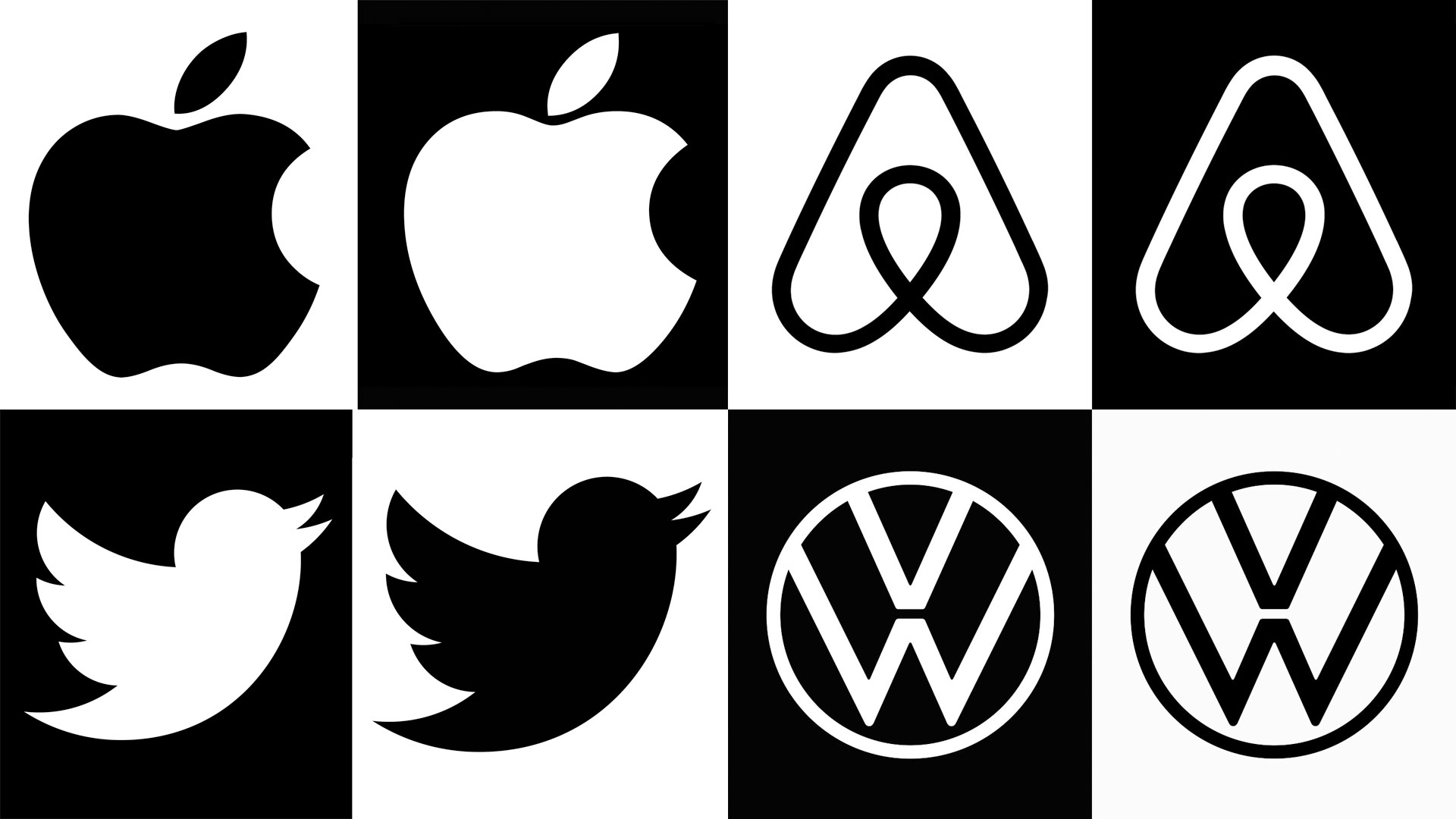
Every design student is told the rule that a logo should work in black and white. Famous graphic designers from Paul Rand to David Airey have stressed the importance of prioritising shape over colour.
The silhouette test is held up as the ultimate proof of clarity, adaptability and memorability for a logo. Many of the most recognisable logos are primarily used in black and white anyway, from iconic marks like Nike's swoosh and the WWF panda to the New York Times' blackletter logotype.
Most logos will appear without colour at some point in their lives, whether it's stamped on cardboard or engraved in glass or metal, but it's not often that brands have the obligation to pass the test in the real world in an application as important as a flagship packaging designs.
The current crisis could show that there's something to be said for packaging passing the silhouette test too – or rather the monochrome test.
Obviously, colour is a powerful tool in packaging design, as the best examples of colour in branding show. It reinforces a brand identity and can make products look more appealing to the target audience or more striking on a shelf.
But good packaging design can look better in black and white than bad packaging. Take the disastrous Tropicana rebrand of 2009, which was cancelled soon after launch due to the customer backlash. Compare how the rebranded packaging (right below) would look in black and white compared to Tropicana's previous (and subsequent) packaging design. Which one would you be able to pick out on a shelf full of similarly monochrome competitors?
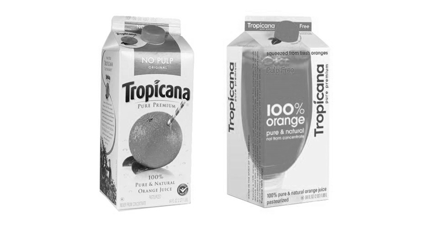
The failed Tropicana redesign looks even worse in black and white. Without the colour orange, it's hard to even tell what the illustration is supposed to represent. The original loses a lot of its life, but it's still recognisible.
I'm not aware of any major brands in the west that have announced plans to desaturate their packaging yet, but there's no knowing how long this crisis will go one for. Whether it's because of shortages or price rises, it could be a good time for all brands to stress test their design and consider how they'll maintain recognition in different possible scenarios.