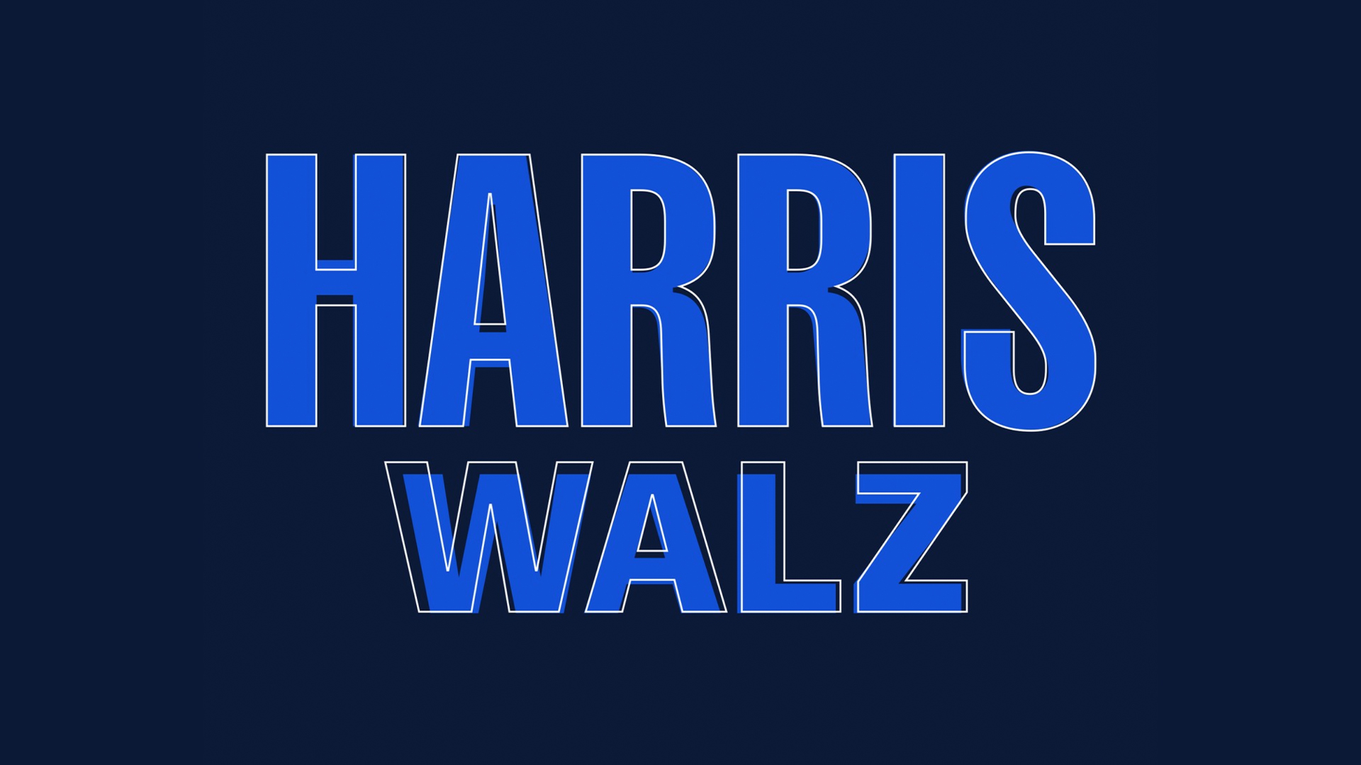
The new Harris x Walz logo is arguably a fairly unassuming design, but beneath the surface, it's a symbol of unity and heritage in an uncertain political climate. Those who were on the fence about the logo design might be grateful to know that it's just had a (very subtle) makeover – a harmonious visual treat that hasn't gone unnoticed by design fans.
While the update appears minor, it manages to refine the logo without losing the powerful nuance of the original design. It's a testament to the power of composition, with the subtle tweaks adding a revitalised authority to an already strong, visually commanding design.
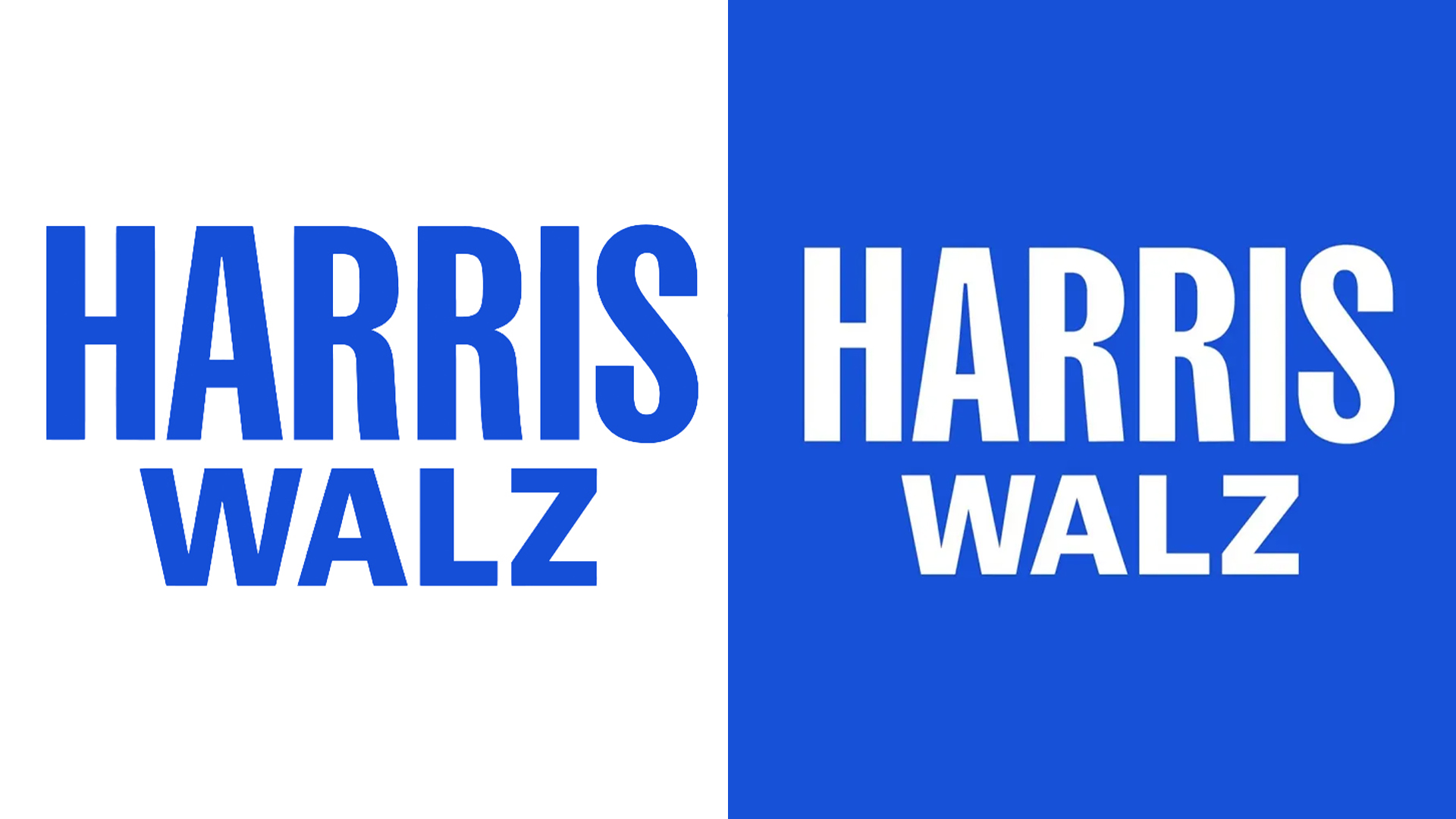
According to Fast Company, design team Wide Eye had no forewarning of Kamala's new running mate, conceptualising eight individual designs for each potential candidate. With tight deadlines in an already chaotic presidential campaign train, some design hitches were only natural.
The revised design has a bolder, more authoritative feel thanks to a humble bit of kerning. Highlighted by Type designer Jonathan Hoefler on Threads, the new logo irons out visual impurities like letter height and centring, balancing the crossbar of the letter 'H', making subtle amendments to the 'R's and harmonising the height of 'Walz' to complement the Harris wordmark.
Post by @jonathanhoeflerView on Threads
"Campaign typography is *completely* unlike graphic design: it’s a strange and fascinating agility sport, marked by limited information, a ticking clock, unimaginable pressures, and serious consequences. It’s Iron Chef, but in Adobe Illustrator," Jonathan writes.
Had it not been highlighted, I may not have even noticed the minor design tweaks, but now I can't unsee how unbalanced the old logo was. It goes to show that simplistic design benefits from precision and refinement – making an already strong logo into a powerful, scaleable and iconic design. For more campaign news, check out Kamala Harris' Brat summer branding and the remarkable story of how she built a presidency-ready brand in 24 hours.


