It's less and less often that a new website design grabs my attention. I mean really grabs my attention, in that way that stops you from working and keeps you on the site for potentially hours because you want to explore every part of it. But the new Minimoog website is one of those rare gems.
The site invites us to step inside a fantasy Minimoog Factory where we can explore rooms full of delights. We can even make our own music, and that's where it gets really addictive (see our pick of the best 404 pages and best parallax scrolling websites for more web design inspiration).

Designed by Pentagram London partner and experiential design artist Yuri Suzuki with web development team Counterpoint and illustrator Rob Pybus, the online Minimoog Factory celebrates the 70th-anniversary re-release of Moog's legendary analogue synthesiser, the Model D. And it draws heavily on retro video games and websites for a highly engaging interactive experience.
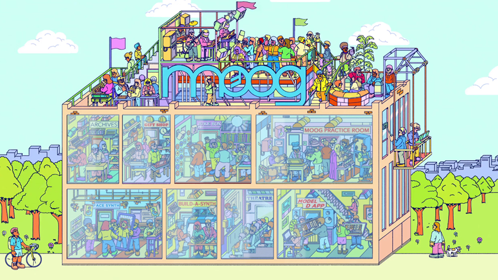
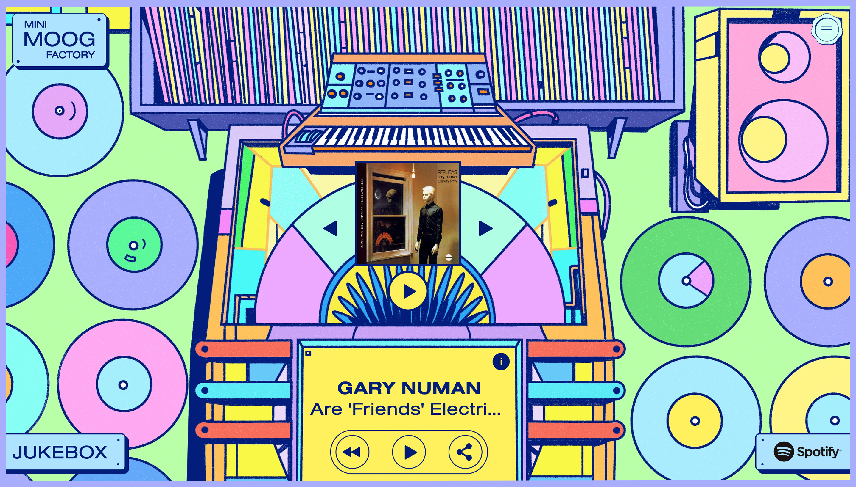
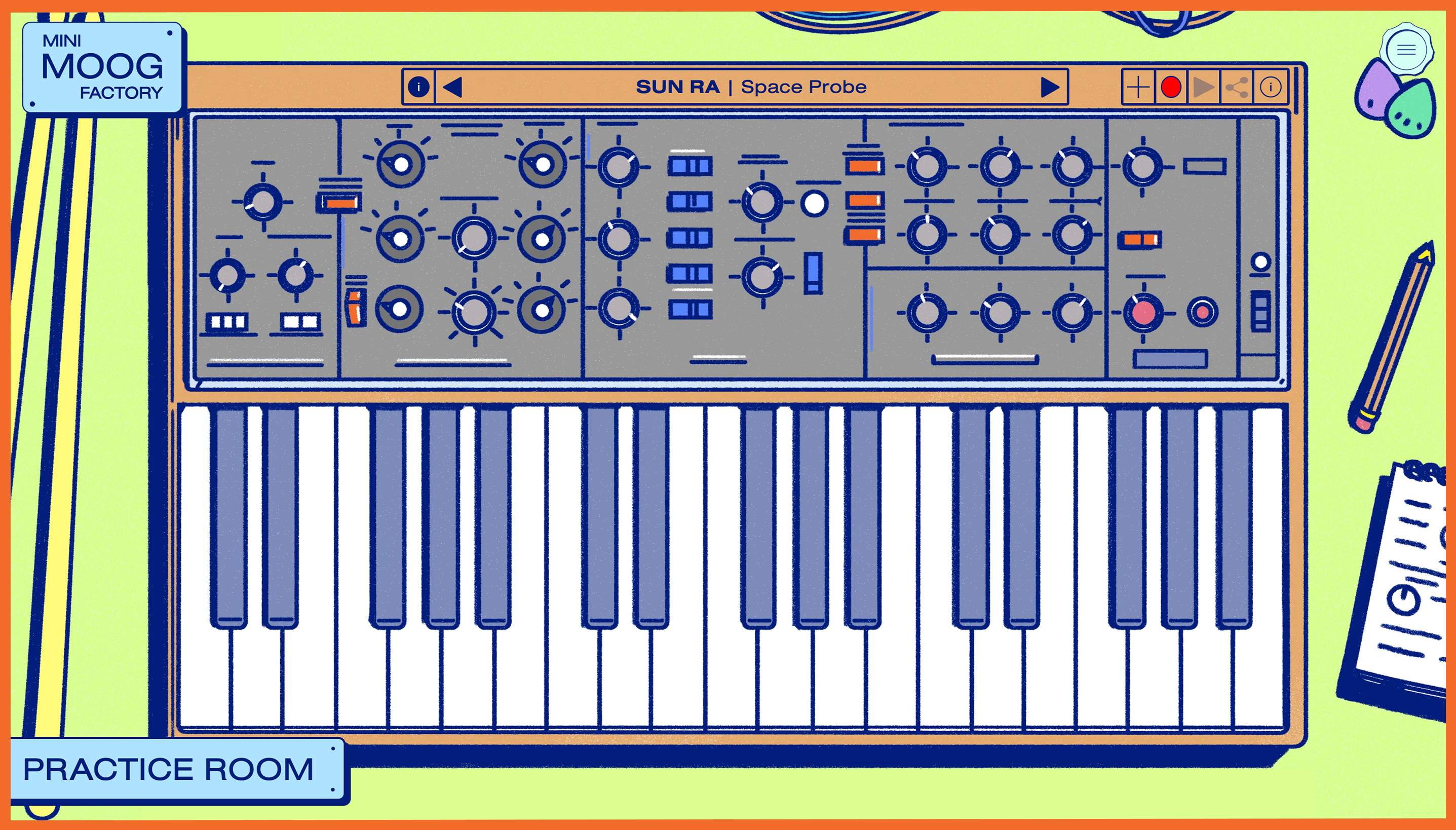
The colourful homepage shows a factory with a party in progress on the roof and eight rooms to explore. You can discover the history of the Model D in the theatre and explore tracks recorded using the synth via Spotify integration in the Juke Box room, but the highlight is the practice room.

The Model D was used by musicians from Parliament-Funkadelic's Bernie Worrell to Kraftwerk, Gary Numan and Dr Dre. Through the artistic rendition in the practice room, you can play the instrument online using over 45 presets, from Devo's "Whip It” to Bob Marley's "Stir It Up," and you can record and share your own short compositions (warning: this could eat up the rest of your day).
There's also a gift shop, and you can print and build your own synth. There's even a Face Synth – an Instagram filter that allows you to use your facial expressions and body movement to trigger a Minimoog. Exploring the house reminds me of Denton Design's legendary Frankie Goes to Hollywood computer game for the ZX Spectrum and Commodore 64. It creates the same beguiling mix of intrigue and delight, and Pybus's illustrations perfectly fit this vibe.
In the days of streamlined UX journeys and simplified UI, the site feels almost like something from another age, and it's all the more delightful for it. Taking an older approach to web design but giving it a modern sheen and performance, it's a site you can be happy to waste a few minutes, or hours playing with.
Working on your own web design? See our pick of the best web design software and the best website builders.


