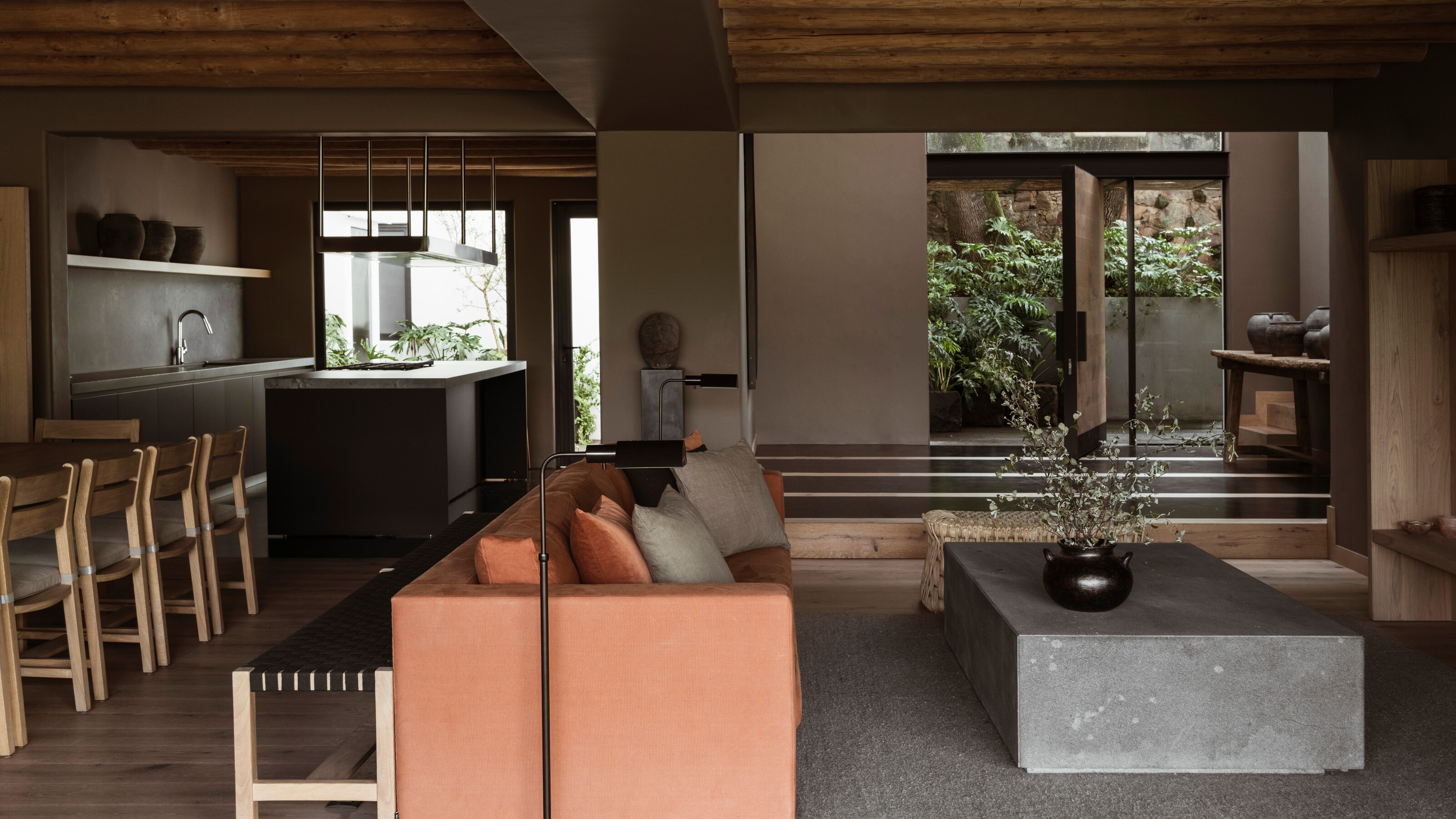
Located in the popular lakeside location of Valle de Bravo, a two-hour drive west of Mexico City sits Casa Tres Árboles, a two-story home that has been transformed by Mexican design studio Direccion. Briefed by the clients to create a sense of refuge and retreat, the aim was to emphasize the home's purpose as a weekend getaway destination.
The home is now a cocooning and tranquil space of meditation, where natural materials, that sumptuous earthy brown paint and wall texture, and clever use of light and shadow create a feeling of 'monastic sanctuary'.
'The intention of the project was to bring as much light as possible to the house and to open windows from every room to enjoy the beautiful view to the lake of Valle the Bravo,' says designer Mariana Morales, founder of Direccion. We speak to the designer to find out the pillars of the modern home that give it that restful and tranquil feel.
Cocooning walls
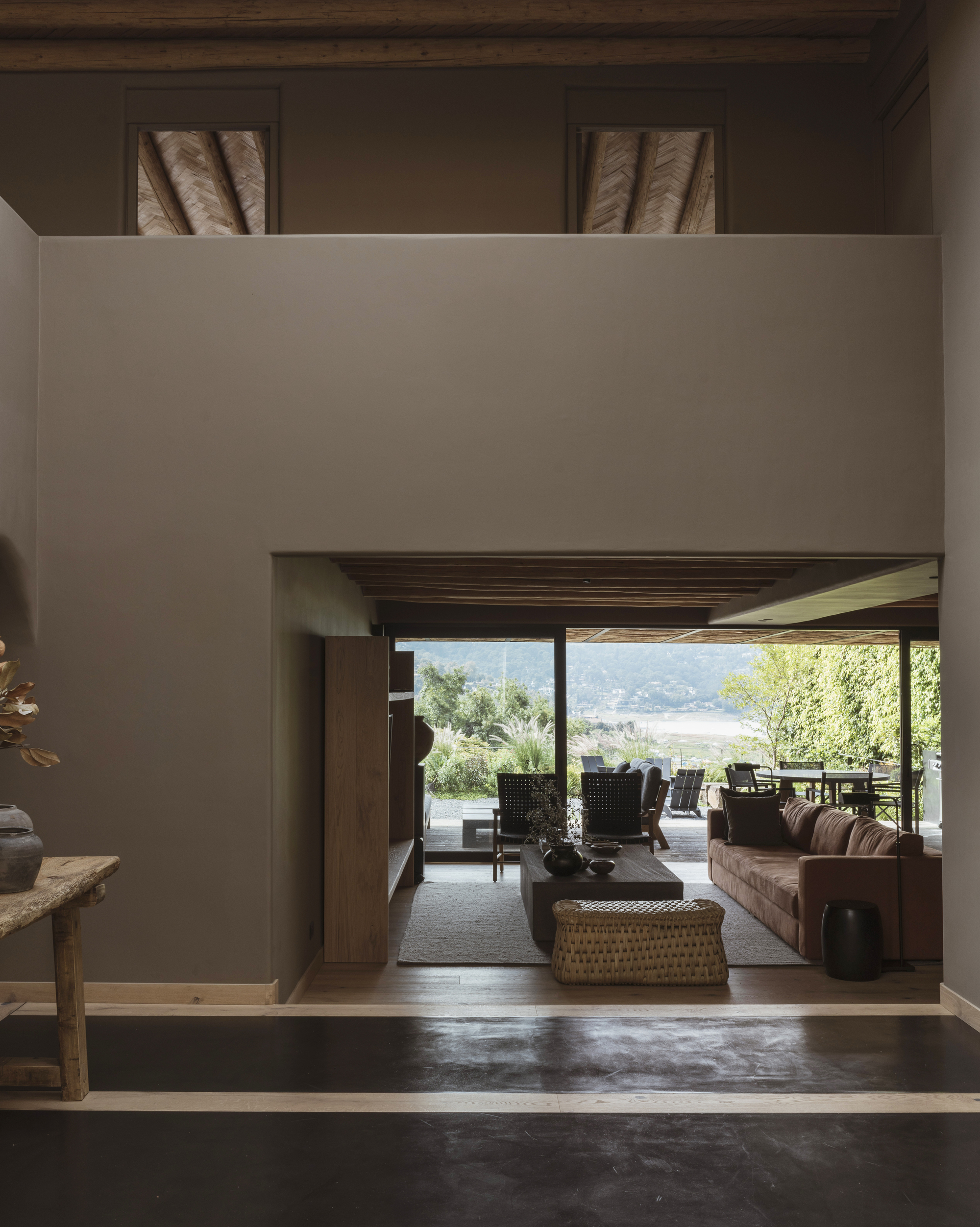
First up, the wall color is the standout that runs throughout the entirety of the home. Sherwin Williams color Virtual Taupe SW7039 was used over stucco to create the effect. 'The client wanted their house to feel serene and introspective,' explains Mariana.
'Since we had light wood floors and ceilings and a lot of light in the house, we choose a dark color scheme for the walls and micro cement [like used in this double-height entrance hall] on some floors and bathrooms.'
'A lot of people misinterpret dark colors with moody states of being. I believe that darker colors create a perfect canvas to make a space feel cozy, nurturing and serene when used in the right way.'
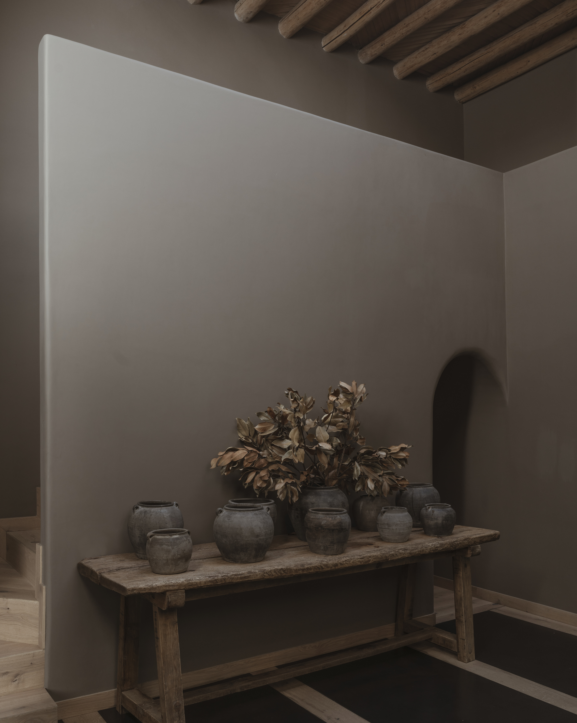
The Sherwin Williams tone is taken up a new wall with a arched doorway leading through to a bedroom. A wooden table flanks the wall, used as a surface to showcase a collection of pottery that is in keeping with the color palette.
Natural light

Despite the monochromatic color scheme, the wall is color is far from flat, with natural light bouncing sunlight and allowing the filtering of light into the home that creates different shades of light and shadow.
'The natural light is the reason we could use darker earthy tones in the house,' explains Maraiana. This is seen in the large open-plan living and dining area that opens out onto the tropical backyard. 'Before the intervention in the house, the spaces felt separate, dark, and small,' Mariana adds. 'Pre-existing walls were removed to create a more open-plan living space.
'With the remodeling, the living and dining rooms are now open to a new sundeck integrated with floor-to-ceiling openings, and they blend into one single living space. This joint common area becomes the center of energy of the house, where most of the home activities take place.'
In the living area, texture is added to the space with wooden oak beams. A rust-red sofa is a splash of color that beckons visitors to take a seat in the snug, sunken living room space.
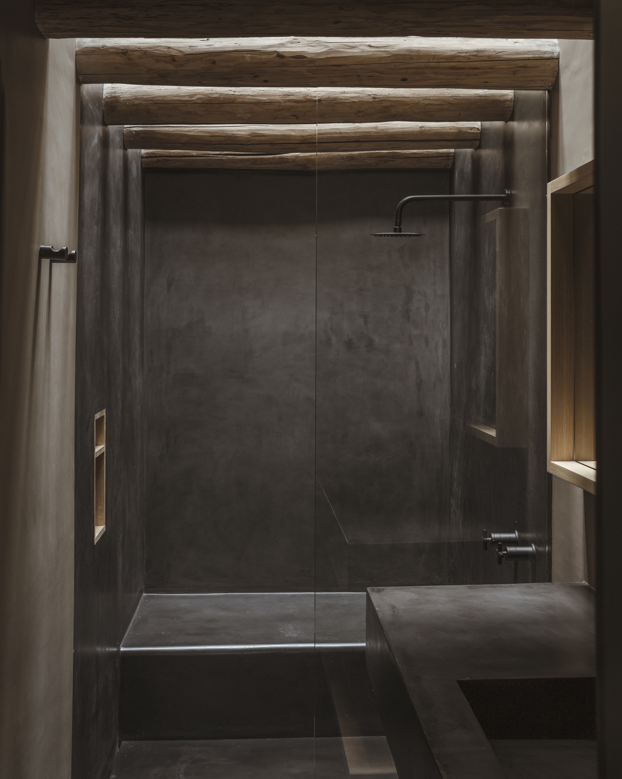
In this modern bathroom, natural light filters through the beams and into the shower area, giving that coveted indoor-outdoor moment that brings a spa feel to the space.
Use of natural wood
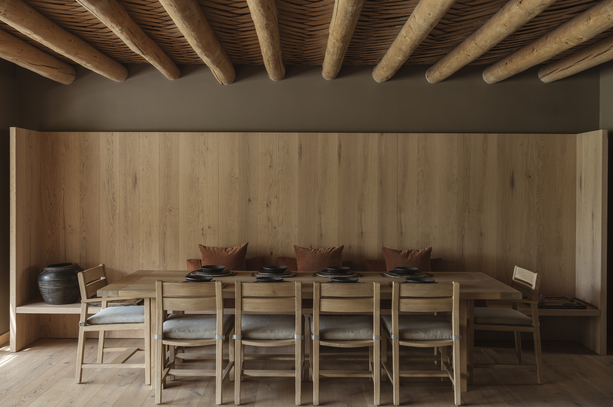
Hardwood is another pillar of design seen throughout the home, linking the natural surrounds with the interior. Froom wooden beams in the living area and bedrooms to the wooden seating bench running alongside the 10-person dining table, the natural touches bring a calming quality to the space.
'In the living room and dining room, we choose the wood panelling for a bench for the dining table and in the living room we used wood for the bookshelf that surrounds the TV. We used the same wood panelling from the floor up in the walls to create a sense of containment and warmth from the wood,' explains Mariana.
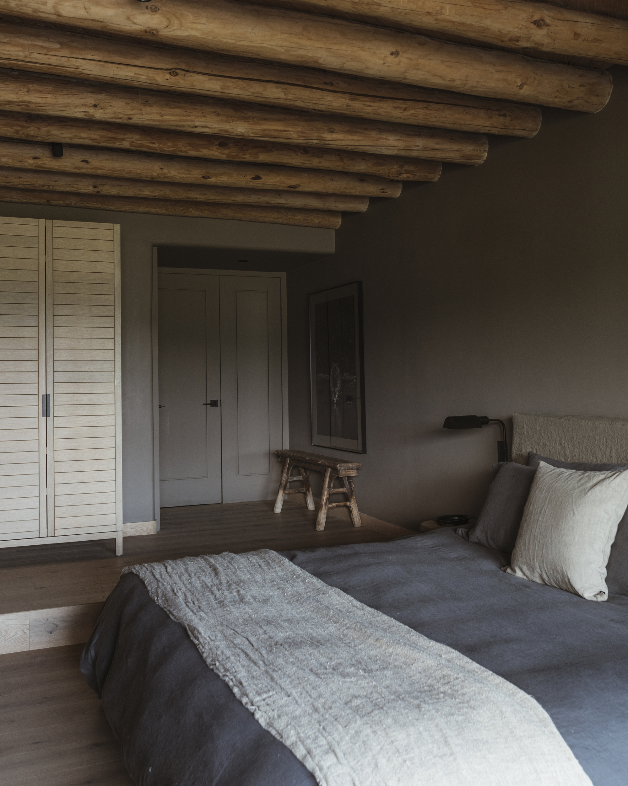
The natural wood and micro cement is complemented by the soft materials and furnishings used throughout the space, particularly in the living areas and the three en-suite bedrooms. 'Besides the oak wood we choose for the floors and ceilings, we selected natural materials like linen for the upholstery,' explains Maraiana.
The color of the upholstery and fabric was important in the decision-making process too. 'The terracotta color on the sofa and for the cushions in the dining room were chosen to evoke the robes of Tibetan monks,' she says. 'Overall, we chose an earth-tone palette.'
The backyard
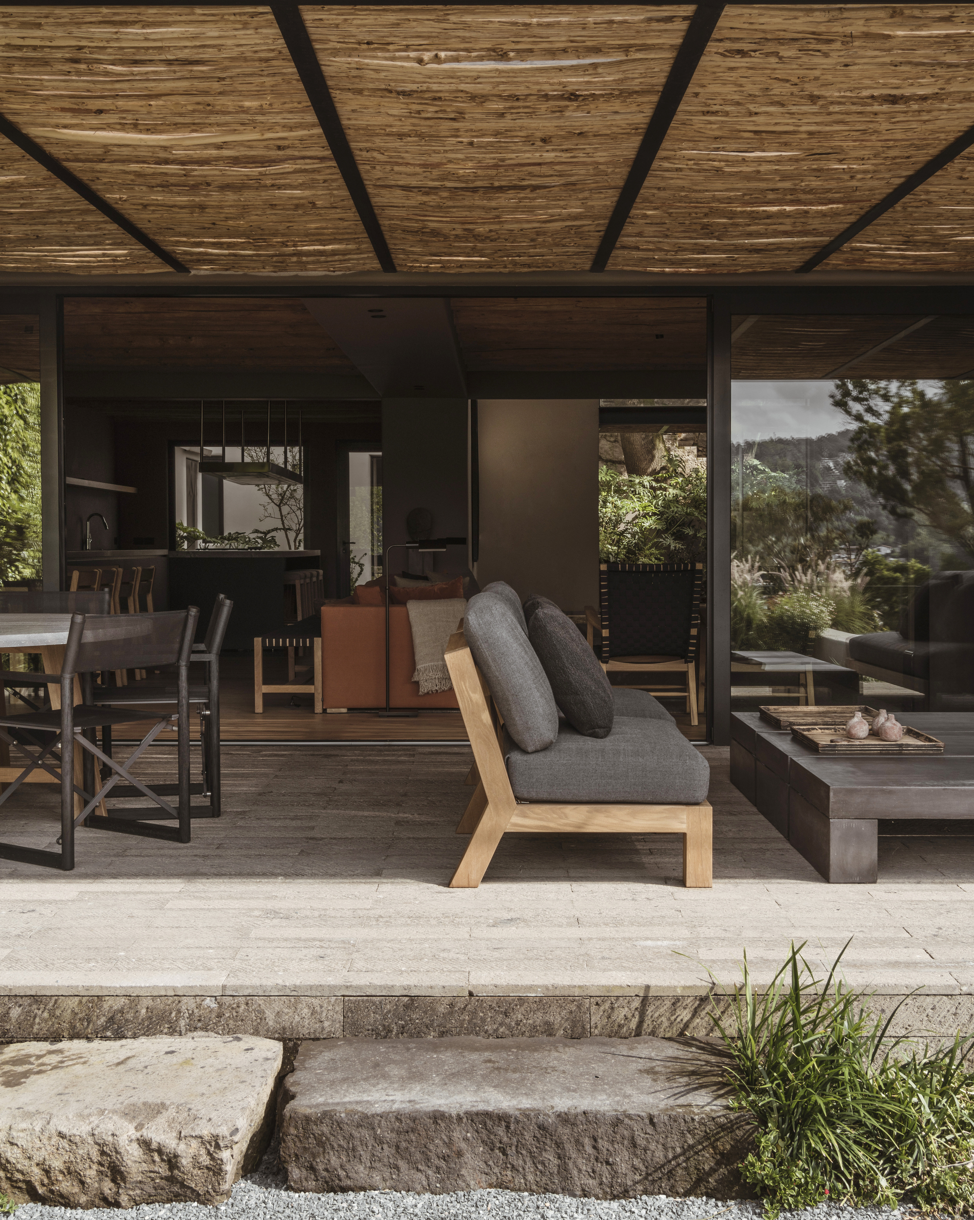
The interior design spills onto the backyard deck - a cohesive extension of the living space with comfy outdoor seating and a coffee table. The earthy palette and natural material blends seamlessly with the natural surrounding fauna.


