The Dynamic Island was the centerpiece of the iPhone 14 Pro and Pro Max announcement, at long last the notch was dead, and in its place we were getting an engaging and interactive design element to bring the iPhone into a new era…
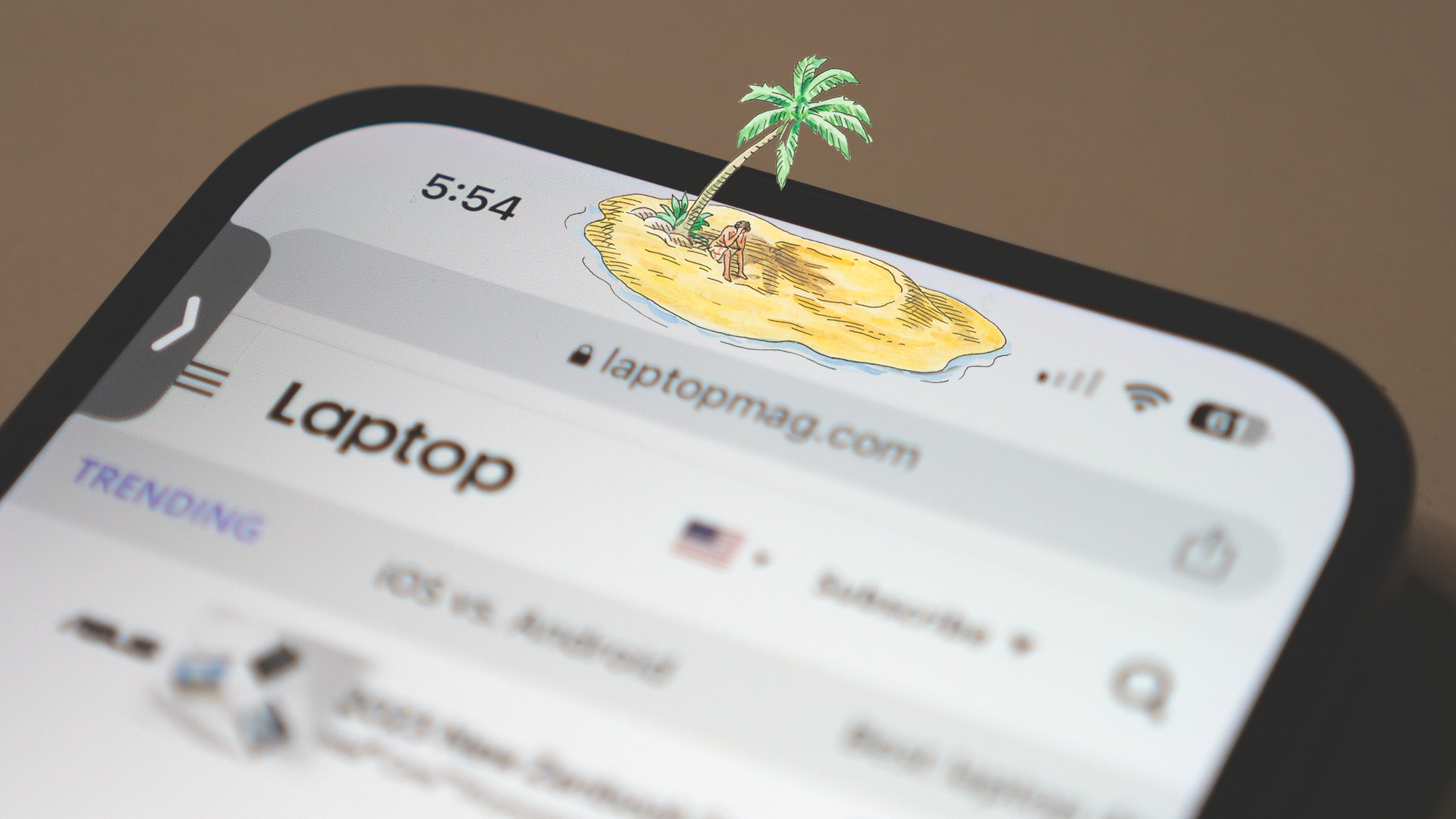
Fast forward to today and after about six months living on Dynamic Island, it still feels awfully deserted. That amazing future of interacting with elements popping up from the capsule at the top of the iPhone 14 Pro display has failed to materialize and more often than not I’m still looking at a large hole in my display that is now just a little lower and more prominent.
I still think Apple made the right decision, the notch needed to go, but with rumors suggesting that our stay on Dynamic Island may last another four years and the standard iPhone 15 will adopt it this year as well, I wanted to reflect on its current state and what’s coming next.
A notch by any other name
Sure it has a cool new name and snazzy animations, but the Dynamic Island is still basically a notch that took a trip a few millimeters south on your iPhone display. In some ways the fact that it’s now an island in your display makes it more intrusive, whereas the notch was just dark territory that I didn’t consider part of my display.
The apps that do a “good job” with the Dynamic Island are those that fade to black toward the top of the screen so you aren’t forced to think about it, which means you are losing even more of your screen real estate for the sake of ignoring the hole in it. For apps like Netflix or YouTube, this isn’t a big deal, particularly once you are watching a video both sides would be clipped anyway, but in many apps and games, it’s impossible to ignore.

Having a hole at the top of the feed on Twitter or Facebook, or potentially obscuring elements in a game like PUBG, isn’t the end of the world, but it’s irritating. Now Android phones have this same issue, but hole-punch cameras on phones like the Galaxy S23 Ultra or Pixel 7 are virtually invisible by comparison, about 1/8th the size of the iPhone’s Dynamic Island.
So in general these are all complaints that have been lodged about the notch in the past, and while part of my point is that they still exist with the new design, let’s move beyond that and look at just what the Dynamic Island does offer.
What would you say you do here?
Apple did a great job in its initial launch video for the iPhone 14 Pro and Pro Max of making it look like the Dynamic Island would be involved in tons of onscreen activity and the animations were also on point. The latter is completely true; the animations for the Dynamic Island always look slick, but there’s a serious dearth of them.
The biggest compliment I can pay to the Dynamic Island is that Apple uses it to reduce the size of incoming notifications, but that’s a UI design choice that doesn’t have anything to do with the new hole in the display. Apple could have done this when the notch was the only game in town.
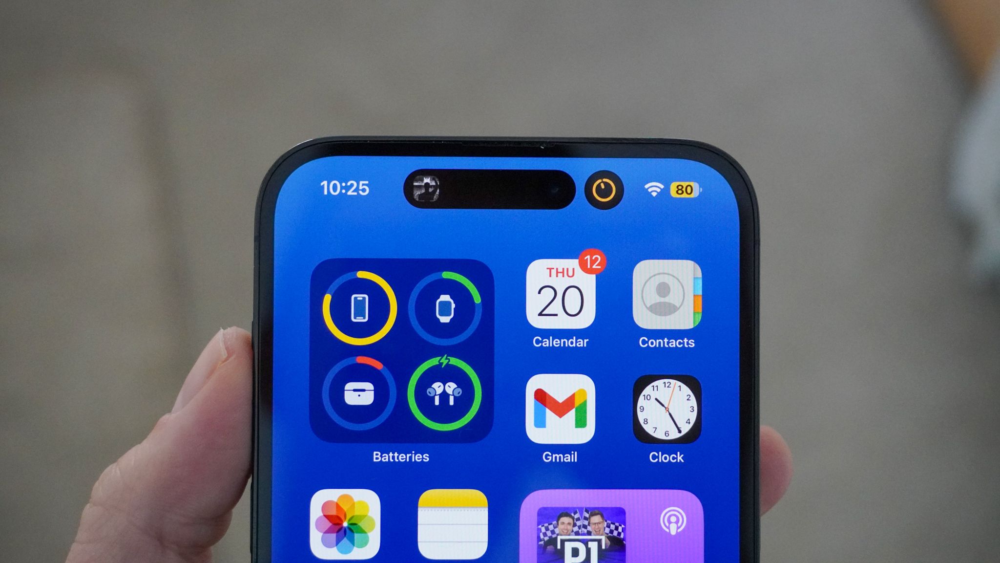
Other clever tricks like swelling the size of the Dynamic Island in order to show you the album artwork and a waveform for audio content that you are listening to, or the time you’ve spent on a call, or that you have a timer running all look good, but this is wallpapering over a problem, even if it’s pretty wallpaper.
While some of my most used apps, like Pocket Casts, support the Dynamic Island with the pop-up mini player to control my content, it still feels like these experiences are few and far between. To be fair to developers, with the Dynamic Island still exclusive to the iPhone 14 Pro and Pro Max, it’s hard to justify putting much time into it, but at the same time, it makes for a poor experience for the most diehard of Apple fans that upgrade to the top-of-the-line iPhones.
Here’s hoping that iOS 17 and, perhaps more importantly, the addition of the Dynamic Island to the standard iPhone 15 models will change all that.

Return to Dynamic Island
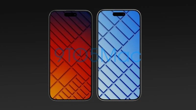
While it doesn’t look like it will be getting the red carpet treatment in the iOS 17 release, the Dynamic Island does have some upgrades coming according to the latest rumors.
The most prominent of these rumors is that Siri will be relocating to Dynamic Island, which makes sense. However, given Siri’s perennial struggle for relevance, I don’t know that it’s the revitalization effort that the island needs. This leak originated from analyst94 on Twitter, and even they were unsure if this would make it into the final release of iOS 17, so we’ll have to wait for WWDC 2023 to find out.
The other piece to this leak centered around expanded notification support for the Dynamic Island. Again that doesn’t sound like a game-changer, so hopefully it also indicates expanded capabilities for interacting with notifications in the Dynamic Island. Perhaps we see some innovative use cases emerge if developer support grows thanks to the expanded user base with iPhone 15.
Ultimately, I’ll credit Apple with making lemonade out of the lemon that is having a large hole centered at the top of your display. But here’s hoping they find a way to sweeten it up with iOS 17, because right now it’s still leaving a pretty sour taste in my mouth.


