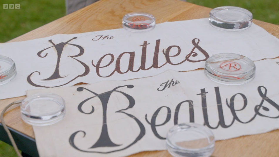
Last night's Antiques Roadshow served up a piece of brilliant logo design history we didn't know we needed – initial sketches of an early The Beatles logo from 1962. The designs are complete with small alterations from "John or Paul", and look very different indeed from the dropped-T logo that came to be so well known.
A guest brought the sketches onto the show, explaining that he was asked to create the design around the time Ringo Starr joined the band. With the "B" made to look like an actual beetle and a beautiful handwritten cursive font, the logo was meant to adorn the drums. But, said the guest, Starr didn't want anything on his drums so the logos were never used and consigned to history (as we're sure first drafts of many of the best logos have been).
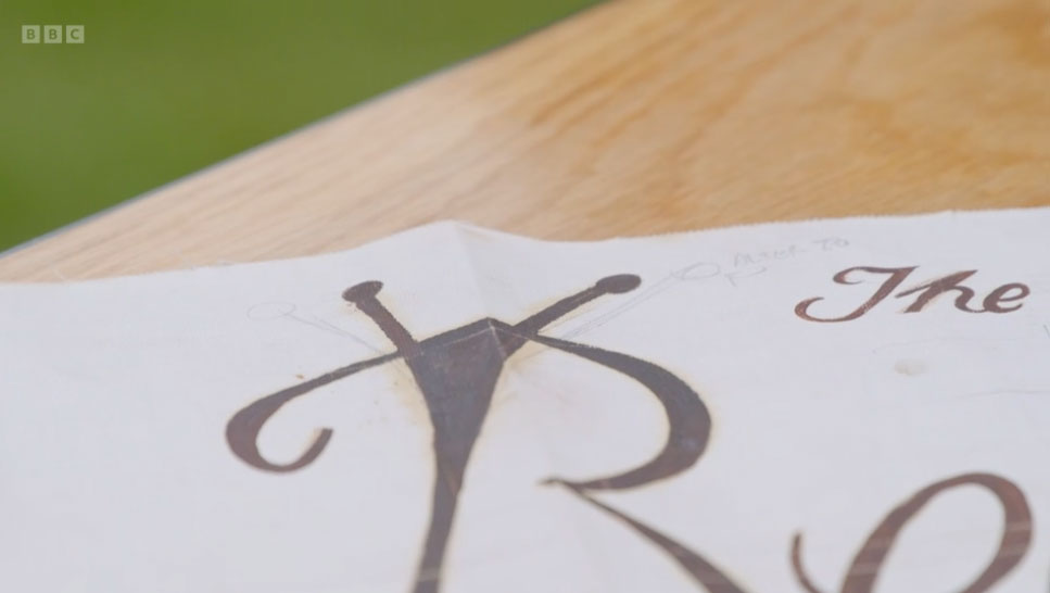
John Lennon or Paul McCartney's annotation on the first sketch (above) moved the antennae to a wider position with the note "alter to". The second sketch (below) shows the amended version, with the antennae moved into position.
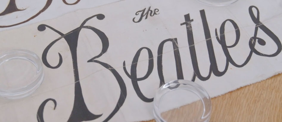
The guest revealed he was never actually paid for the logos but that he didn't mind as he was "unbelievably busy" at the time, and he was surprised to find out the value of the logo sketches – a very-nice-indeed £15,000. Better that payment comes late than never, we guess, though he did also say he wouldn't want to part with them just yet.
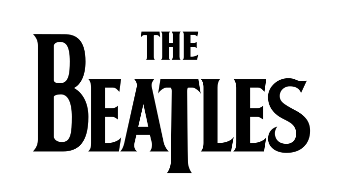
We've reported before on the surprising history of the Beatles logo, and this chapter is another twist in the tale. Music band logos are an integral part of a band's personae, and super-important for fans, as the Pink Floyd logo drama from last year proves. Poring over the detail is as interesting for designers as it is for music fans, and we were delighted to get a peek behind the curtain of the design history of one of the world's most successful bands.
You can watch the Antiques Roadshow episode on BBC iPlayer right now.


