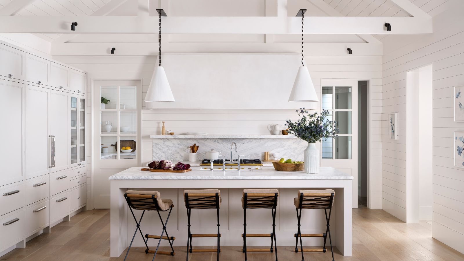
This subtle little oasis of calm in Austin, Texas, might have looked very different if its first-time owner hadn't gone looking for architectural and interior design advice. The house design is very recent, an appealing modern farmhouse in an urban neighborhood, with the original build completed in 2017.
There were some major flaws with the layout and interiors, however, and what interests us here is how the architects and design team worked together to produce a stylish reincarnation of the space.
Working closely with Christopher Sanders, founder of Sanders Architecture, interior designer Viki Chupik came up with an ambitious plan to update and harmonize the living space and meet their client's brief for a comfortable and cozy home that felt light and bright without being too contemporary or cold.
'I think the home turned out to be exactly what she wanted and more,' says Viki, who shares the highlights of this special home, which is a lasting testimony to the skill and vision of her much-missed architect colleague, Christopher Sanders who passed away in 2023.
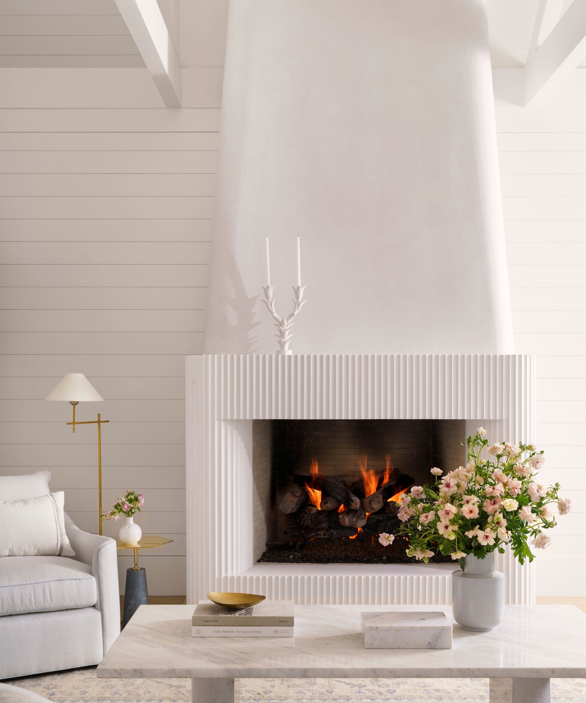
The challenge in the living space is that it is all open plan with sightlines to all the well-used public areas of the house.
'How could we delineate spaces in a very long linear kitchen, dining, and living space and create flow from room to room without being boring or competing?' says designer Viki Chupik.
The solutions turned out to be all about including more traditional focal points in the living room ideas to draw the areas together, as Viki explains, 'Sanders Architecture and I chose to anchor the living room with a soft and sculptural fireplace made of plaster. At the opposite end of the room, in the kitchen, we designed an equally compelling and sculptural plaster vent hood. These two elements help move your eye through the space and make you stop and linger for a moment giving time to notice the details in between.
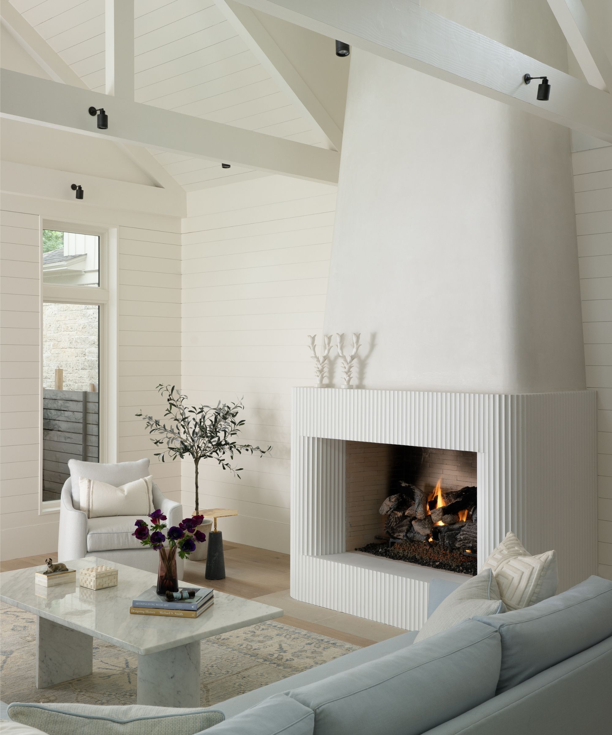
Coming up with the right fireplace ideas was crucial to getting the right look for the whole of the downstairs living space. 'The original fireplace was massive and out of scale. The entire mass was clad in limestone and had a very modern exposed metal flue. Everyone hated it when they walked into the room. It was the number one thing that had to change. We designed a smaller, more elegant fireplace and removed the clerestory windows that flanked the flue. The result is a softer, and more sculptural solution,' says Viki.
'We also removed the built-in bar and placed the television on the adjacent wall giving the fireplace the artistic presence it deserves,' she adds. 'The furniture we selected for the space is soft and subtle and incorporates the client’s favorite blue.'
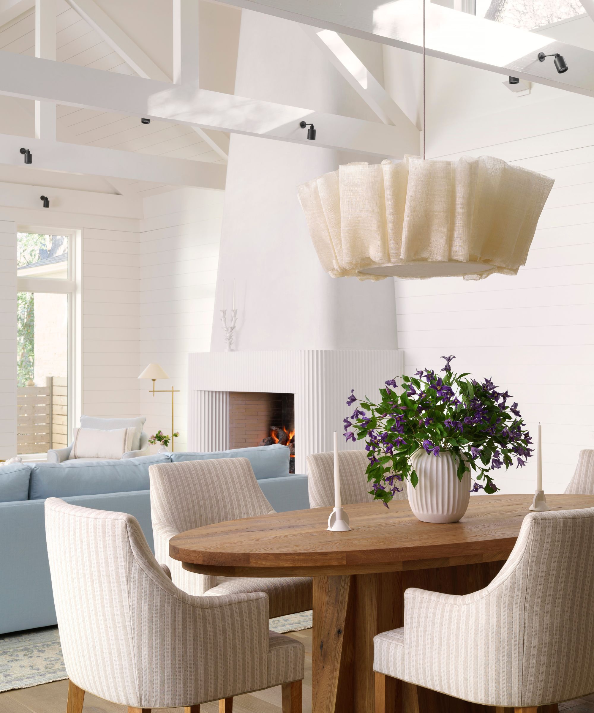
The dining room ideas had to work well in the reconfigured space, positioned between the living room and kitchen areas. A natural European oak table, from Rose Uniacke, and custom dining chairs, upholstered in Elizabeth Eakins Venice Stripe fabric, make a gentle statement that doesn't overpower the surrounding elements of the room.
'The client wanted a comfortable and cozy home that felt light and bright without being too contemporary or cold. I think the home turned out to be exactly what she wanted and more.'
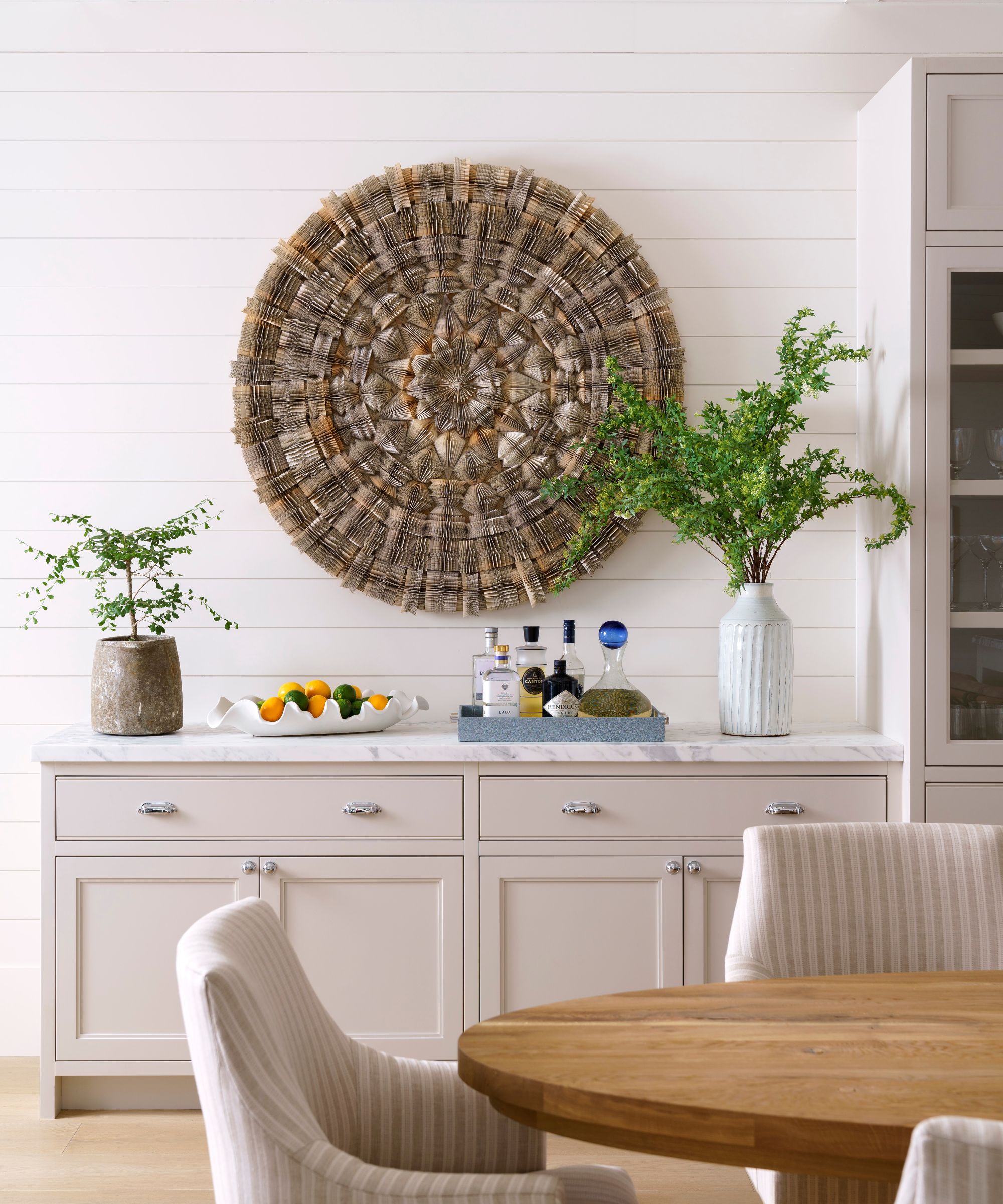
The striking 48'' Mandala artwork is by Karen Hawkins, made from vintage romance novels. The marble top on the sideboard echoes the kitchen countertops and cabinets.
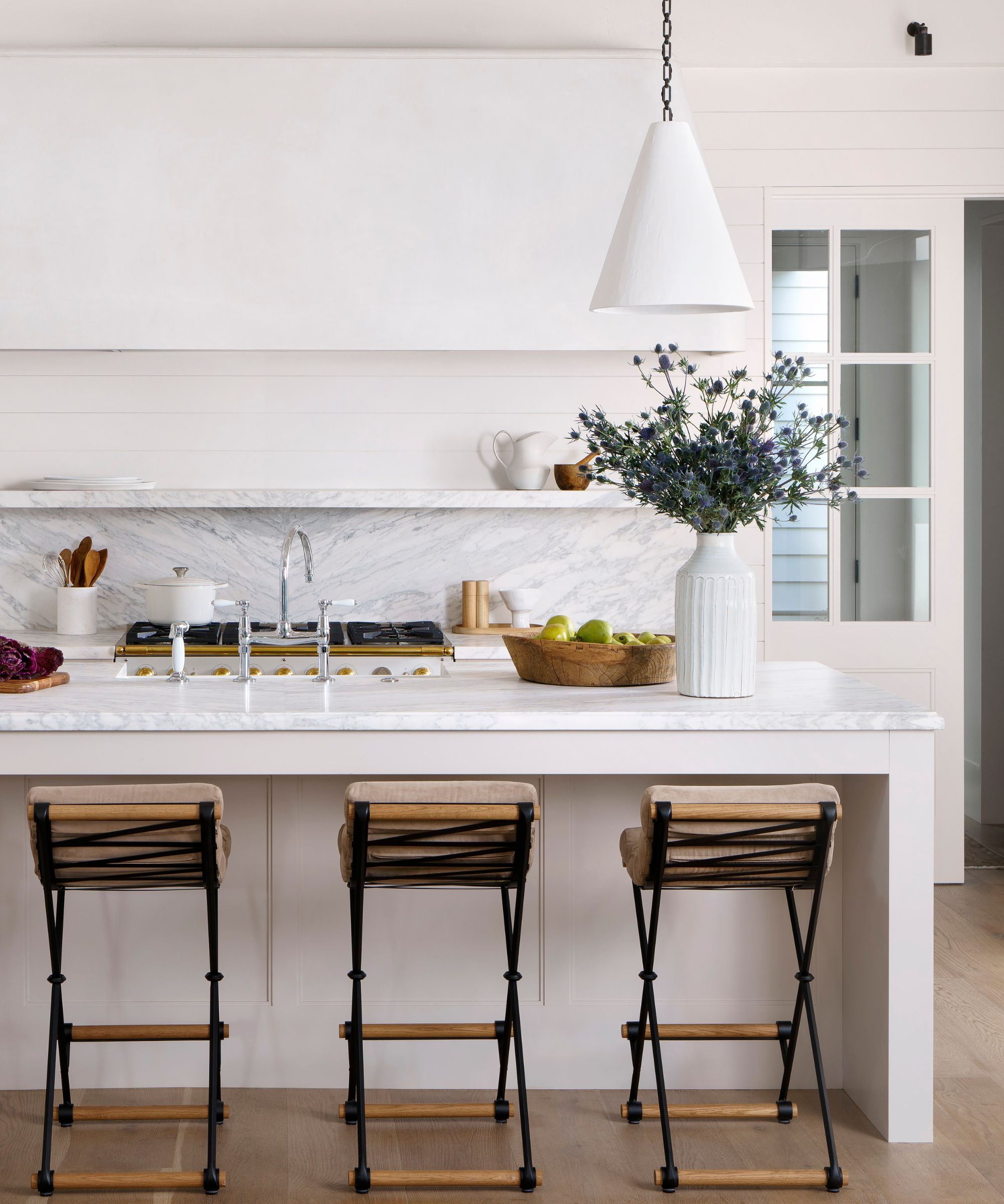
Kitchen ideas needed to incorporate the plaster vent hood and, with this as the kitchen's main design feature, all the other elements quickly fell into place. The plaster pendants over the island are by Rose Uniacke, picking up on the white plaster extractor hood. The slim profile bar stools are from Thomas Hayes
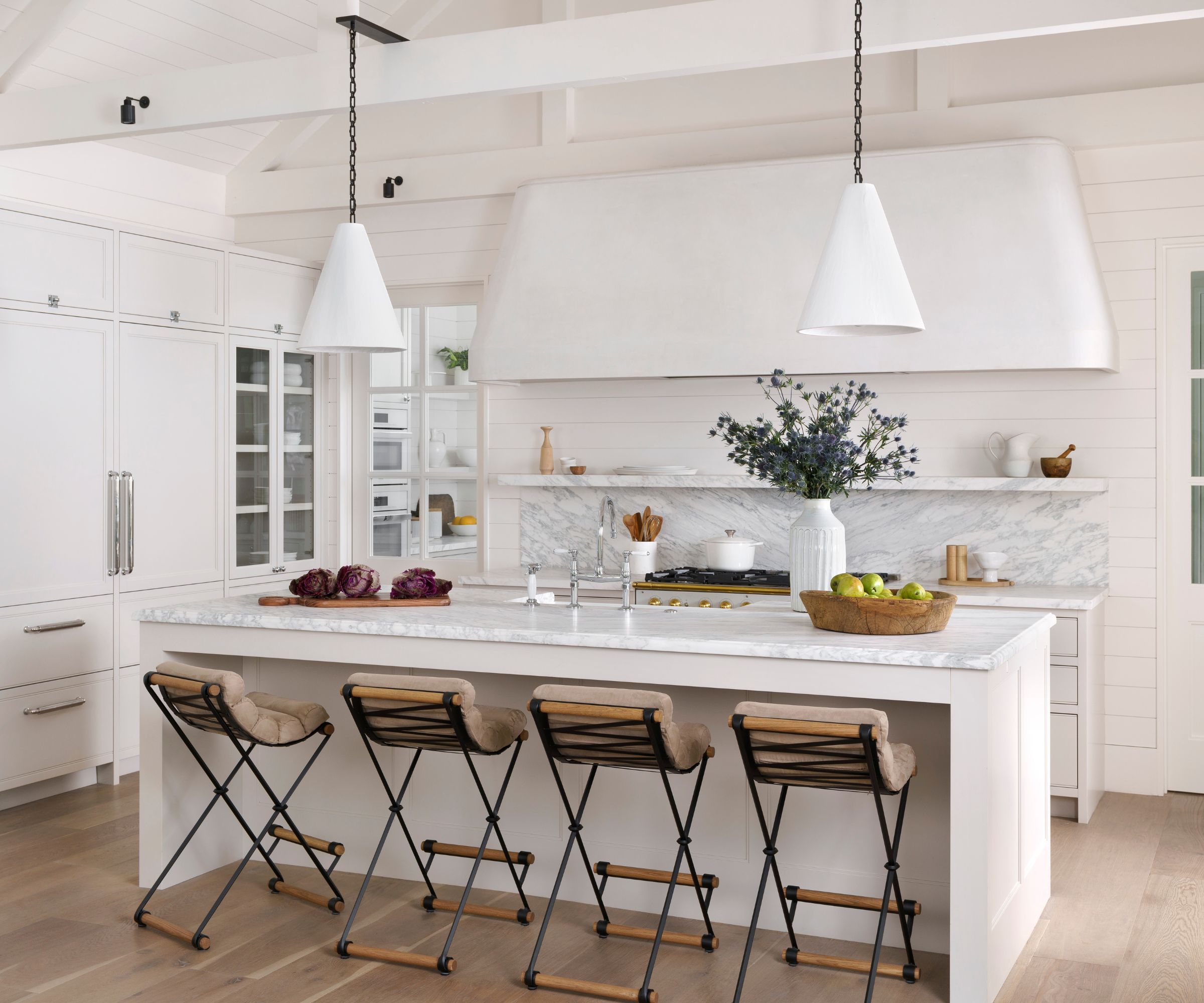
Designer Viki chose a combination of two paint shades from Benjamin Moore for her painted kitchen ideas, AF-15 Steam, and 972 Alaskan Skies. Both give a sophisticated lift to this pale and interesting scheme.
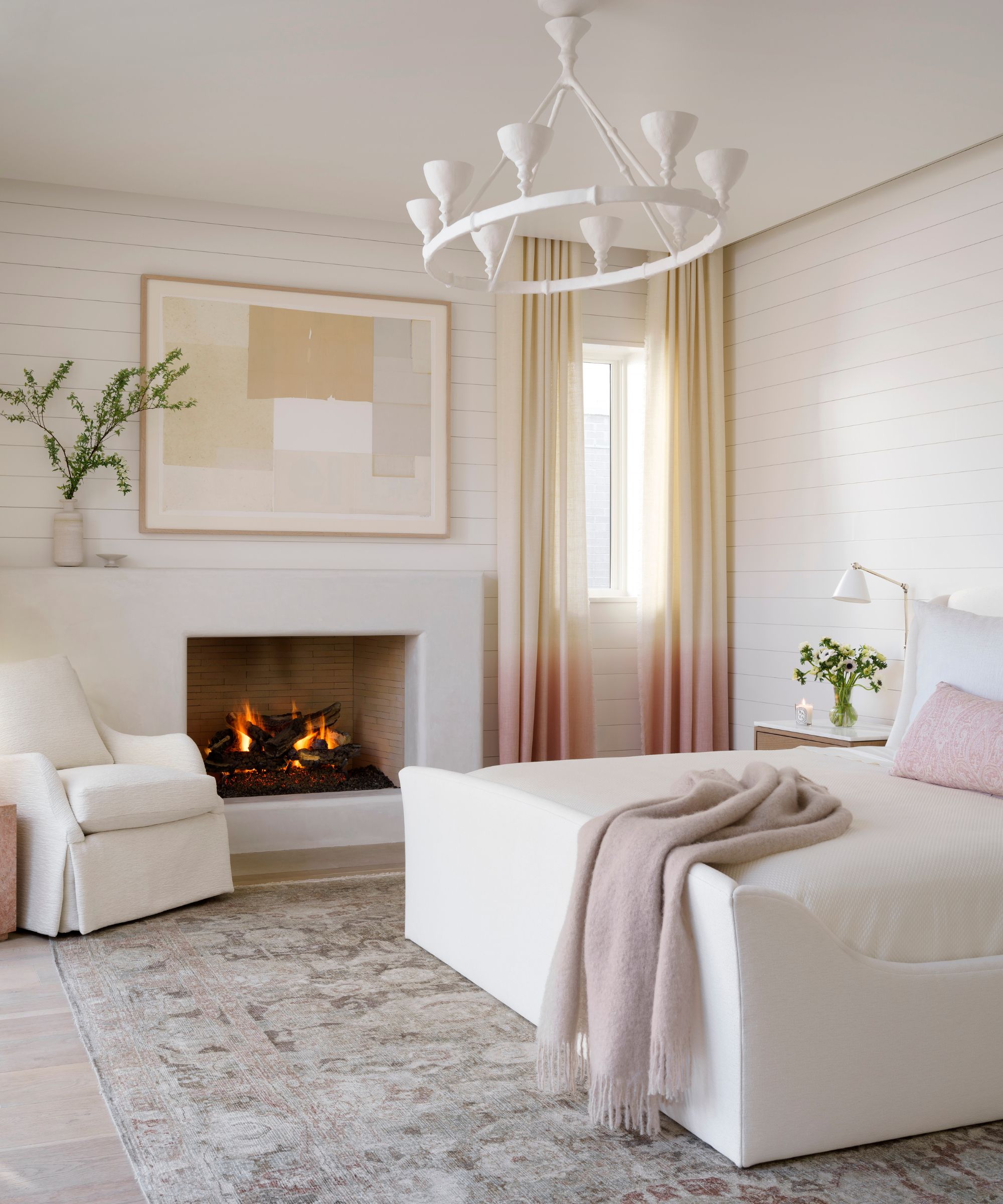
There are so many luxurious bedroom ideas here that we think are well worth copying. Where shall we start? Well, Viki's inspiration and starting point was the area rug from Black Sheep Unique. Next came the bed from Dmitriy & Co, a Stephen Antonson chandelier from The Invisible Collection, and a sumptuous ombre alpaca drapery from Rosemary Hallgarten. The collage artwork from Amy Berlin puts the finishing touch to this quietly curated space, which now has the sanctuary feel designer Viki had in mind.
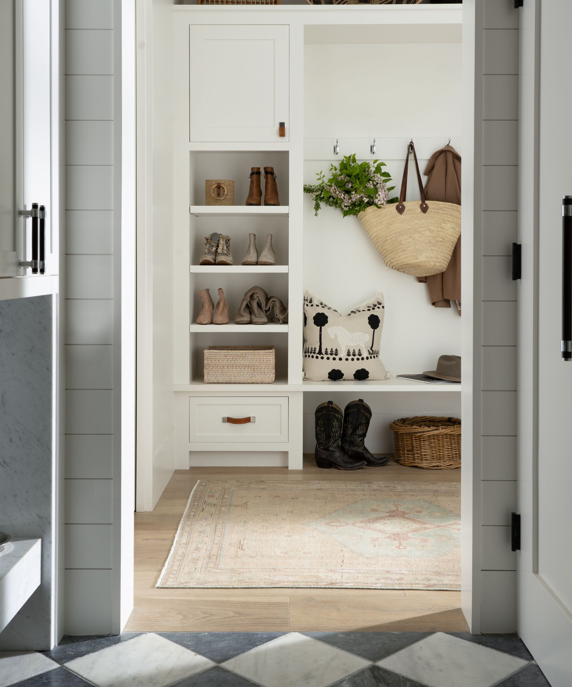
The mud room is a modern day essential, especially with two Instagram famous pampered pups in the house (@thebernegirls). Mudroom tile ideas feature a black and white marble floor by Exquisite Surfaces. The rug is from Black Sheep Unique. Custom built-ins provide organized storage and hanging space for shoes and coats.
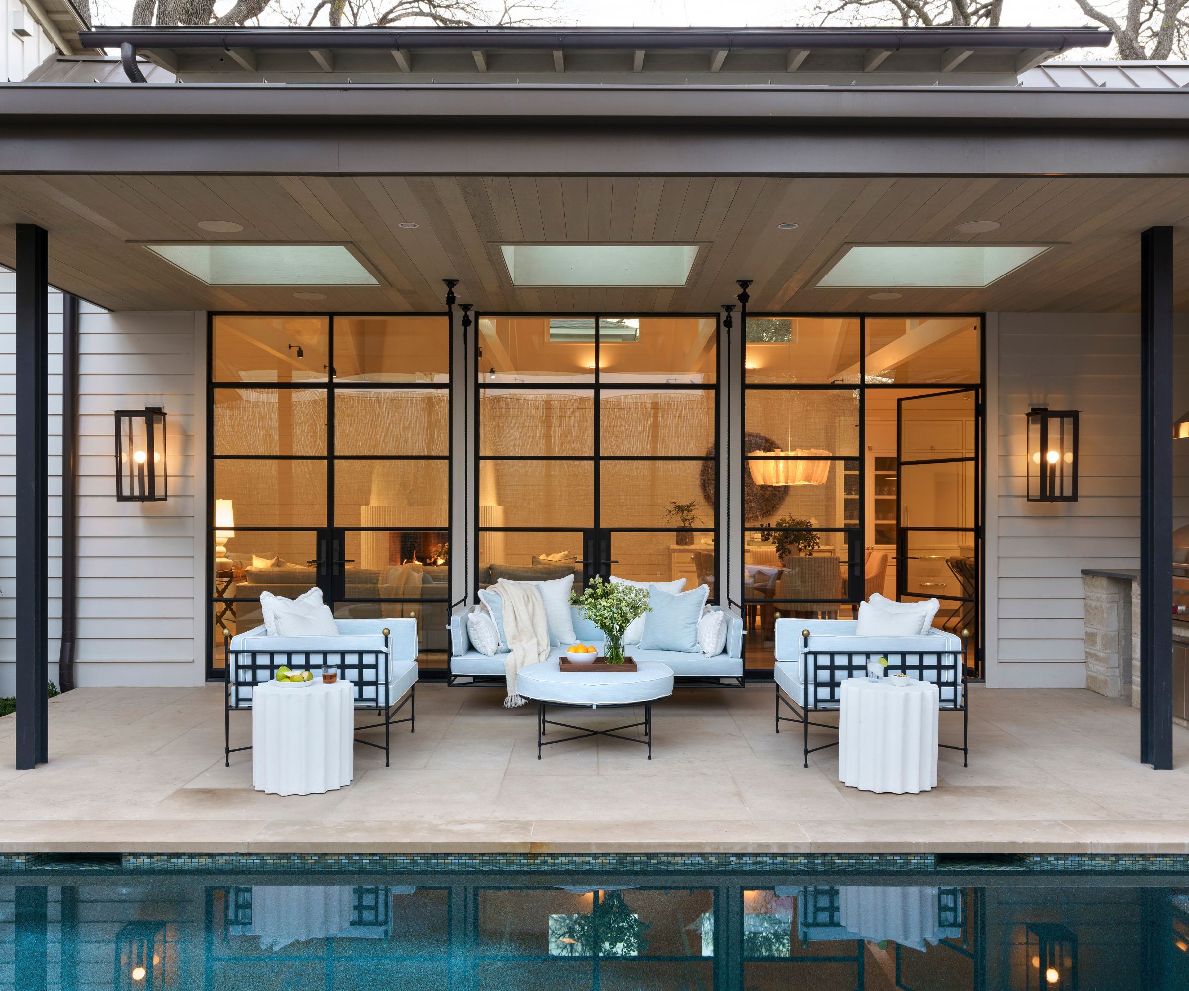
The exterior patio was integral to the design of the house. A full steel window wall looks out at the pool and covered patio from the open-plan living space so the pool patio ideas had to relate to everything the architect and designer did on the inside. 'The client wanted to incorporate a daybed swing into the design,' says Viki Chupik. 'We reached out to Amalfi Living and had them create a custom iron daybed swing that we love, to match their two custom daybeds, all upholstered in Kravet Inside Out fabric in light blue.'
Reflecting on the project, completed in 2022, Viki says: 'When we started working together my client jokingly told me that her favorite colors were light pink and light blue and that she had the taste of a grown up toddler,' says Viki. 'I laughed and told her, “challenge accepted!” My goal was to create a home that embraced her style preferences while pushing her to consider more sophisticated and subtle concepts that would grow with her as her tastes matured.
'My hope is that she feels just as comfortable in the home 5-10 years from now as she did the first day she moved in. Every time I go back into the house I feel a sense of peace and calm. It is hard to explain but every room instantly puts you at ease.'
Interior design: Chupik Design
Architecture: Sanders Architecture
Photography: Ryann Ford and Jeff Jones


