After moving into a four-bedroom 1930s house in southwest London with their two children, the homeowners soon realised that the typical thirties layout of rectangular bathroom with a separate toilet down the corridor really wasn’t working for them.
‘The bathroom was badly laid out with the bath and basin underneath the window and there was also a large cupboard with an old boiler in it that took up lots of space at the entrance to the room, says the home owner, ‘plus the toilet was separate too.’
‘So as part of a larger renovation project, we extended to the side and rear of the property, added a downstairs shower room, master bedroom ensuite and then made plans to change the current bathroom to fit in a shower bath, toilet and vanity unit.’

‘We were keen to respect the history of the house, with the work we had planned. The house itself is one of the architect-designed Berg houses, which were described as “two estates of exceptionally fine artistic houses, chosen for their position surrounded by low hills and a beautiful expanse of Surrey countryside”.
‘They were all freehold detached houses built by E and L Berg and I’d always been interested in owning one. They don’t come onto the market very often, and many of them have had their insides ripped out sadly, but we’ve tried to stay true to the ethos of the houses.'
'I mailshotted this particular road and said we were keen to buy and preserve the features, and we managed to get one. Then it was a question of how we could improve the house and the only existing small bathroom.’
The bathroom before
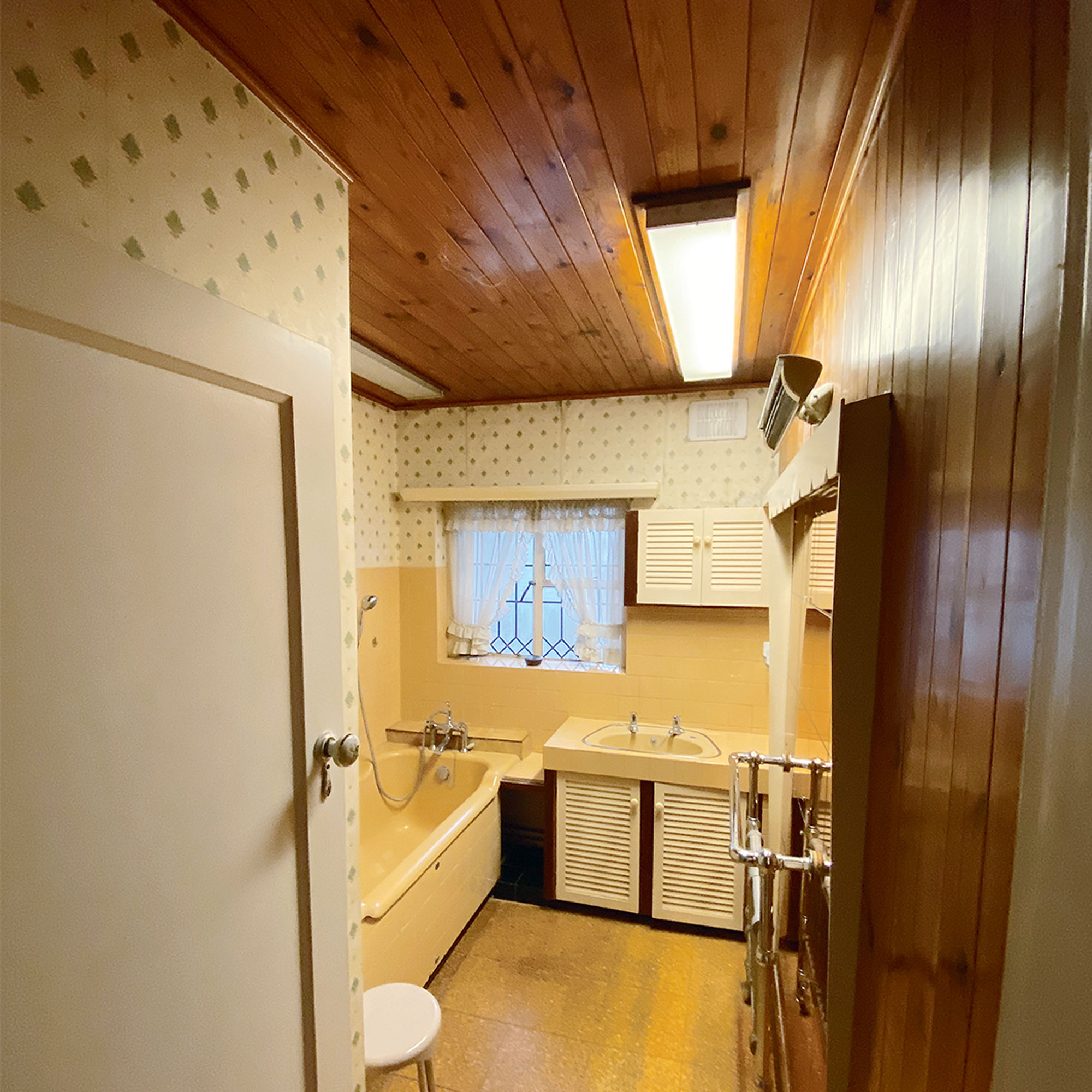
‘The original bathroom was badly laid out and the bath felt crammed in, with a chunky vanity unit squeezed in at the end and a large cupboard with an old boiler taking up lots of space at the entrance to the room. There was also lots of dated pine panelling everywhere, which all had to go.’
‘We realised we could reduce the size of the cupboard by two thirds and just make it into a shelved airing cupboard accessed from the landing and we re-sited the new boiler in the office-come-playroom, which was the old garage. This gave us a lot more room to play with.’
The reworked layout
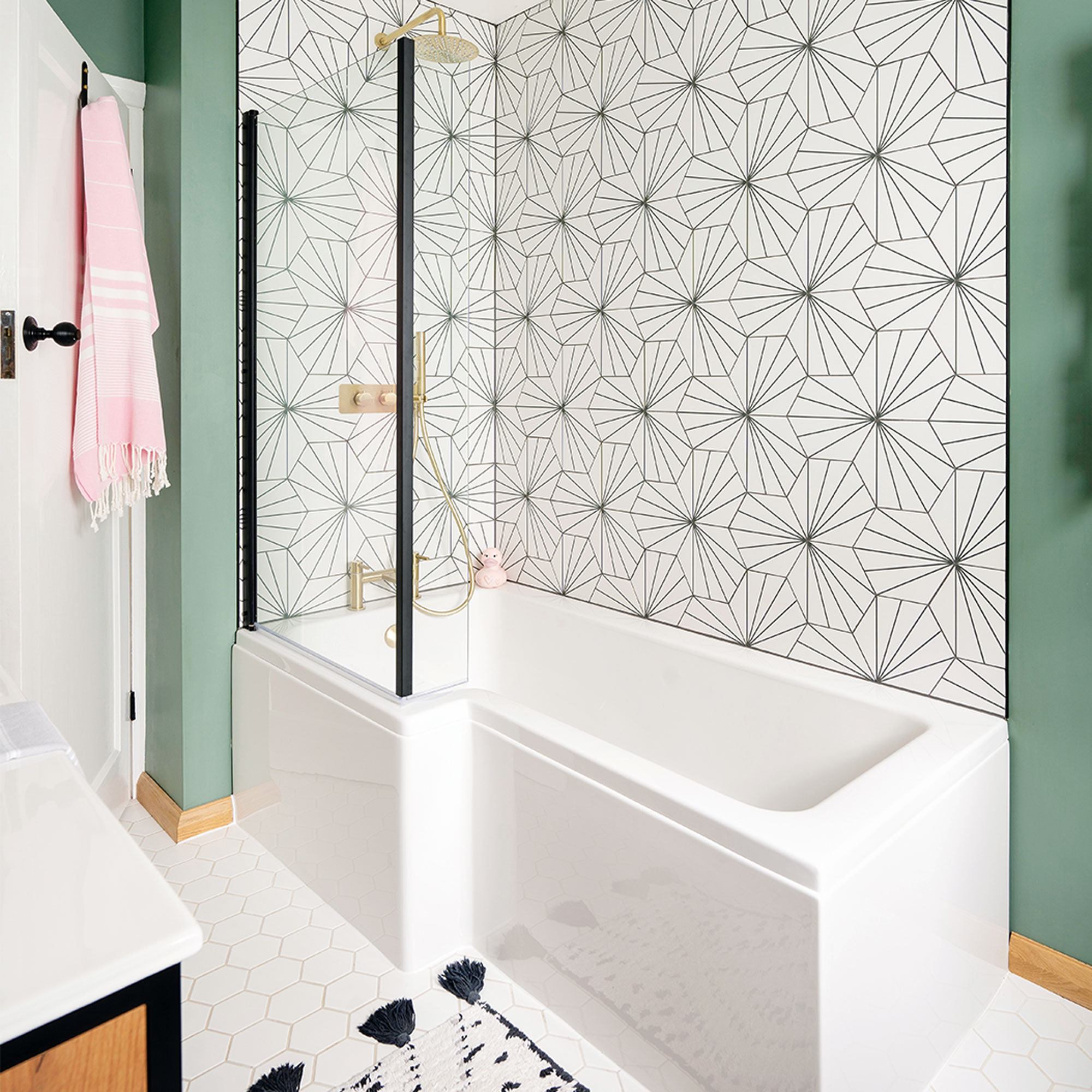
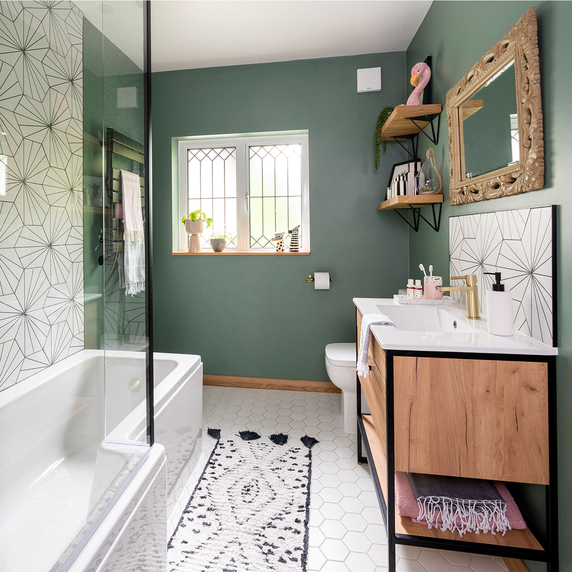
‘When it came to the bathroom planning, there wasn’t really room for a separate shower, but by hugely reducing the boiler cupboard we could easily fit in a shower bath, with a screen, which works really well. And by putting a new vanity unit on the opposite wall, with a compact toilet, the other side of it, we freed up space down to the window, which makes the room look so much bigger.’
‘It wasn’t possible to save the original window, as it was beyond repair, but the new window is a like-for-like replacement, double glazed rather than single. We drew out the original lead pattern for it to be replicated.’
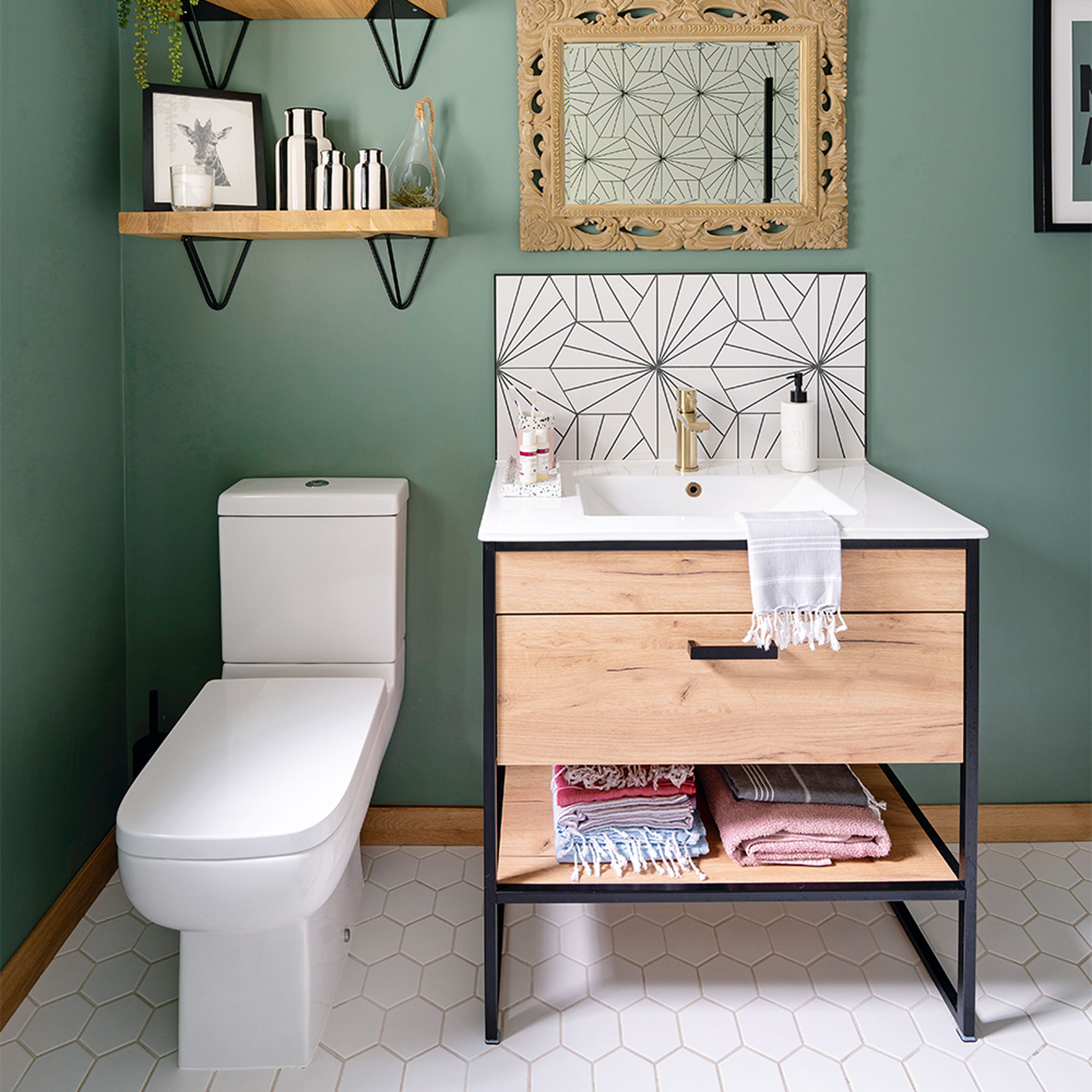
‘The toilet, from Drench, has been relocated within the bathroom room rather than down the corridor, which is so much better. The biggest cost was the stack pipe and drainage due to relocating the toilet from the back of the house to the front.’
‘With the basics in place, we started to make decisions on bathroom decor and thinking about colours and styles. We wanted very much to stick with a thirties vibe and looked at paint colours from that era before choosing a luxurious green for the walls called Green Smoke from Farrow & Ball.’
‘We also wanted to bring in some geometric shapes and found these fabulous Art Deco-look Pod Mono wall tiles from Mandarin Stone, as well as bringing some wood and metal into the scheme with the vanity unit and shelving.’
The bathroom in detail...
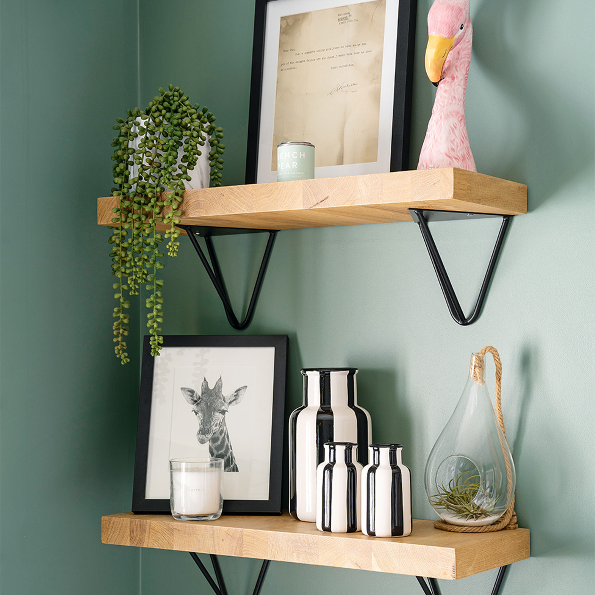
‘Once we’d found the black and white bathroom wall tiles, we carried on the monochrome theme with a bathmat and gathered together black and white vases I’d collected over the years. I wanted to add in a little bit of another colour, so some of the towels are pink, and we have a pink ceramic tooth mug, and a fun flamingo vase.’
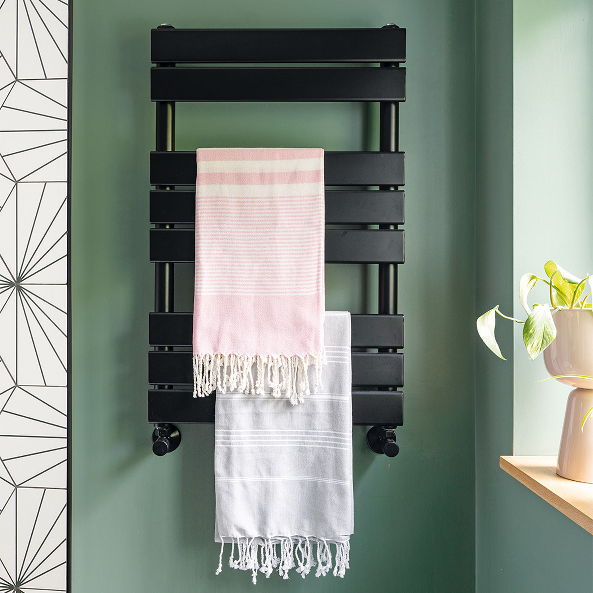
When it comes to a wall radiator, I’d always advise choosing a spot with a bit of space around it. This free-section of wall was perfect and we chose a black finish rather than chrome so it would blend in with the decor.’
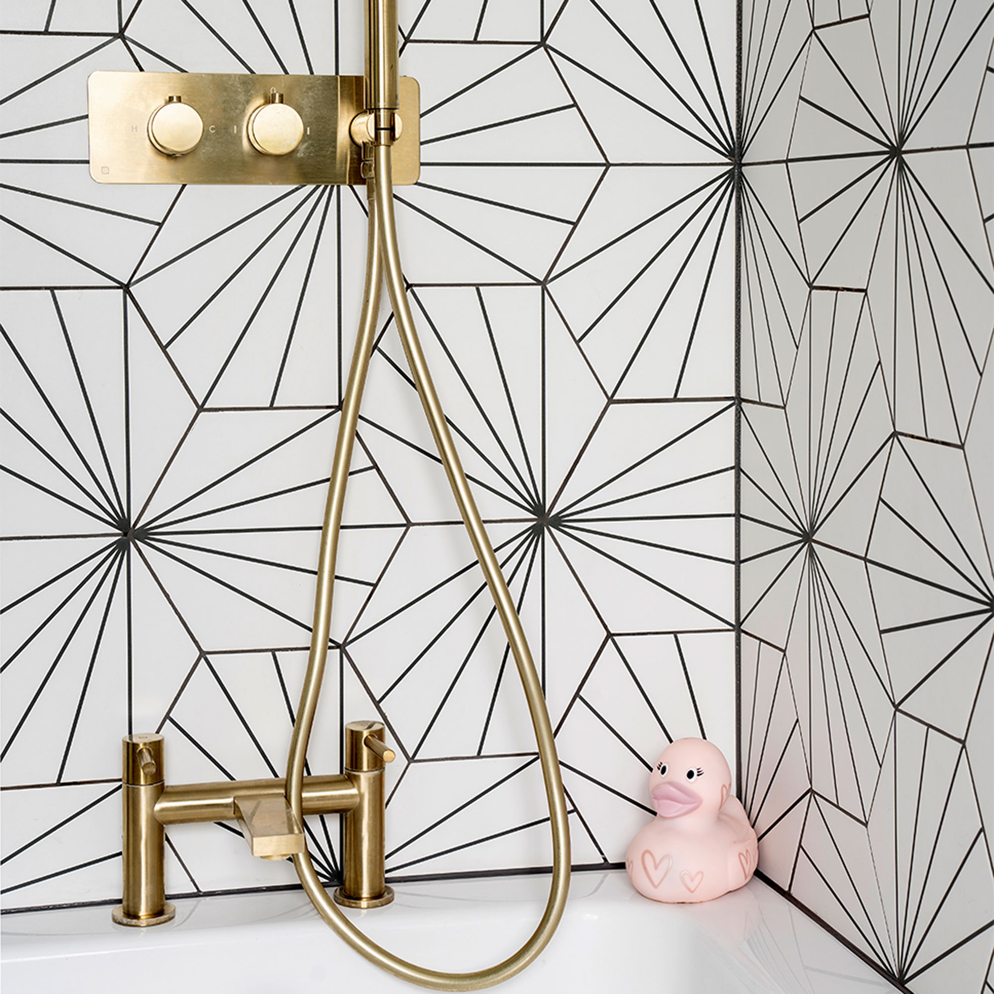
‘Adding a hand-held shower as well as a fixed shower head makes it easier for cleaning and washing hair. Rosie the pink bath duck lives in that corner!’
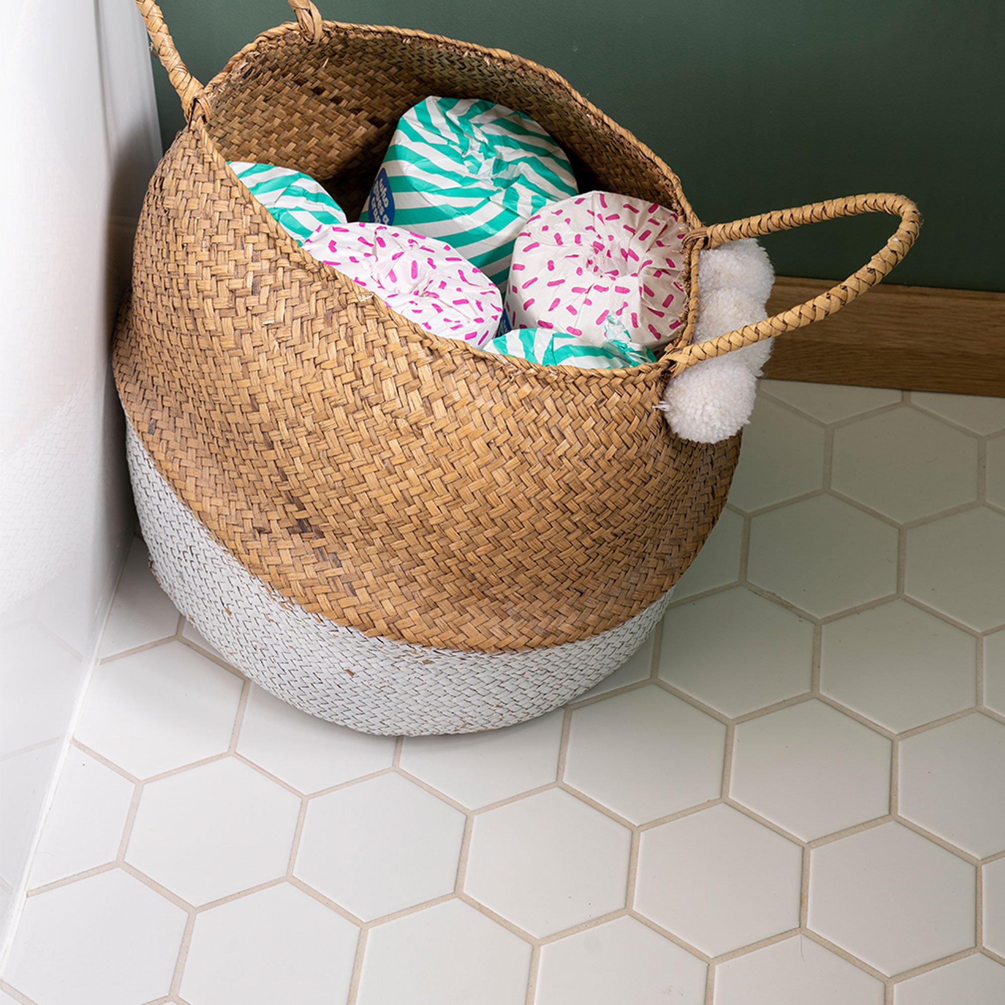
‘The Hexagon gloss white bathroom flooring worked really well with the black and white wall tiles.’
‘The eco-friendly toilet paper is on subscription from Who Gives a Crap, so you never run out, plus the colours of the wrapping fit in with my scheme and they look neat stashed in a basket.’
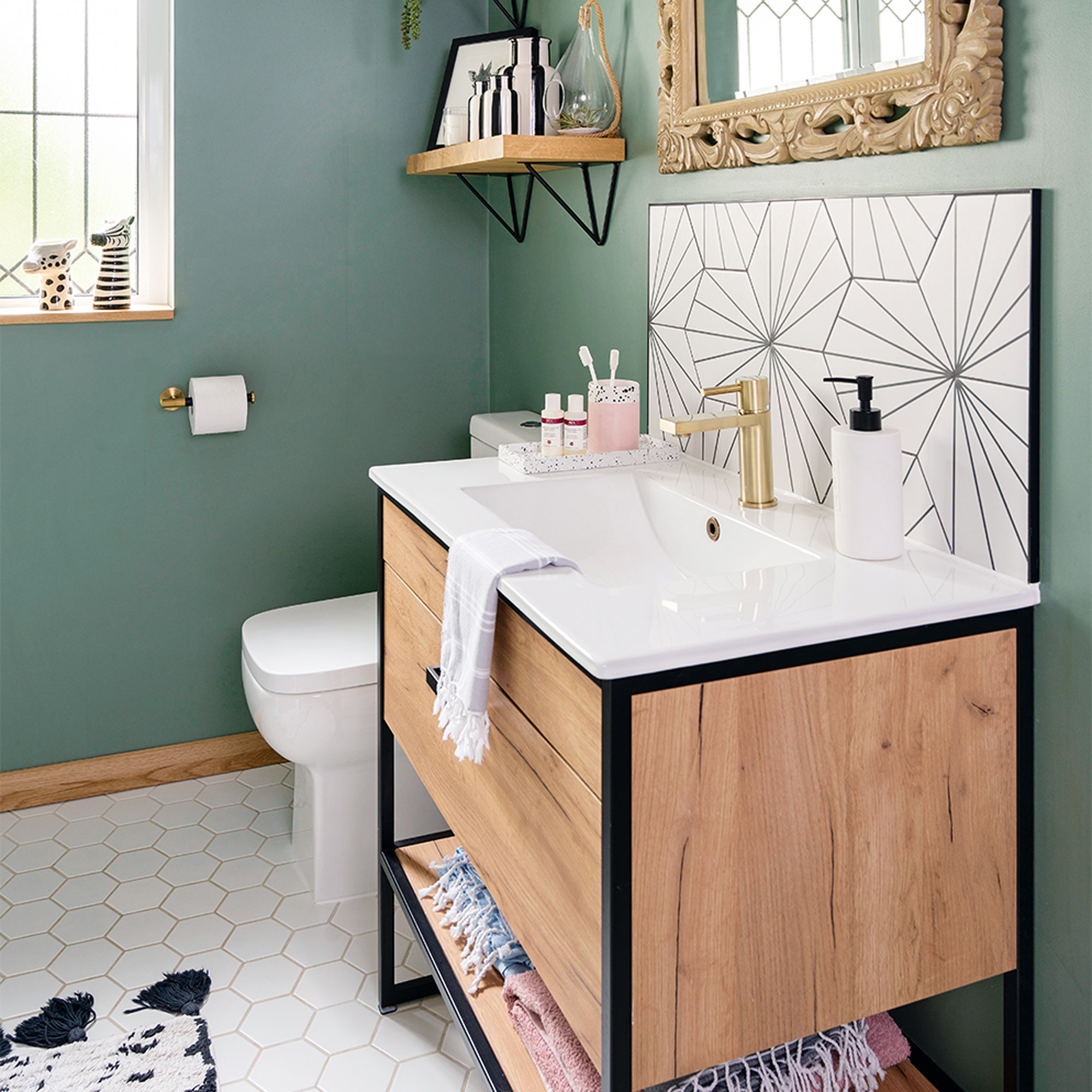
‘With the base of black, white and green, it means we can easily change it up with the accessories if we ever want to. We’re thrilled with the result, and instead of people not being keen to go in the bathroom, it’s become very popular!’


