The end of the year is a time to ruminate on things soon to be past and newness that will soon be part of the present. It’s also the time when paint companies and trend forecasters anoint their “chosen one”, that one colour that they believe will rule in the new year.
Be it as a main room colour, an accent wall, an invigorating pop, doors, or exteriors, these colours can help create a look that’s unique, on-trend, and new. These choices can work for modern, classic, casual, retro, or boho chic spaces, when paired with other colours, finishes, designs, patterns, and textures.
There’s a reason we don’t see the world in black and white; the colours are what make things interesting! So, even as the colour countdown clock ticks at Pantone Color Institute and Asian Paints, here’s a roundup of all the Colours of 2024 announced so far:
Dulux: Sweet Embrace
Dulux has chosen a delicate, soft pink as its Colour of the Year. Sweet Embrace, described by Dulux as a delicate and modern tone, was chosen for its ability to “bring a sense of stability and softness to a space”.
Marianne Shillingford, colour expert and creative director at Dulux, said the colour stood out on account of its “soothing subtlety”. “While being a beautiful standalone colour, it’s a hue that matches perfectly with so many other shades so that decorators can use it as a backdrop to build a totally individual space upon,” she said in a press release.
Dulux has also created three colour palettes — Warm, Calm, and Uplifting — to provide designers and architects with colour inspiration for creating stylish spaces with its Colour of the Year. Warm offers a range of earth tones (ideal for bedrooms, living and kitchen areas), Calm includes blues and greens (for relaxing spaces), and Uplifting offers a range of yellows and lilacs that aim to promote positivity.
Dulux Trade senior colour designer, Dawn Scott said Sweet Embrace and the palettes can be used to “evoke a wide range of emotions for building occupants and are suitable for use across a wide range of sectors”.
Benjamin Moore: Blue Nova
American paintmaker Benjamin Moore made an unusual choice, Blue Nova, a galaxy-inspired colour, introducing its Colour of 2024 at a live stream press conference from aerospace company Blue Origin’s orbital launch site in Cape Canaveral, Florida. The sumptuous colour — a blend of blue with a bit of violet — aims to encourage adventure and new experiences.
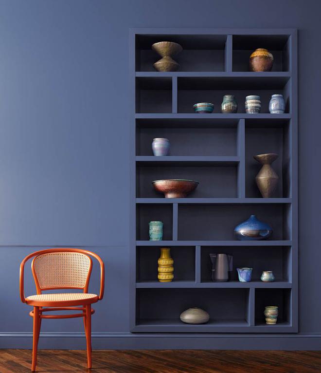
Sharon Grech, who is a part of Benjamin Moore’s colour marketing and development team, said during the live stream that the colour was selected for its balanced nature and undercurrent of reassurance. “[Blue Nova] is a midtone, so it’s not too dark and not too light,” she said.
Blue Nova works well with neutrals as well as contrast colours. The company recommends juxtaposing it with dynamic colours like orange to “create an ethereal atmosphere” or to use on the ceiling or all over in a small space for “a statement-making pop”.
Sherwin-Williams: Upward
A breezy, blissful blue is Sherwin Williams’s pick for 2024. Upward, which sits in the blues and greens palette of the brand’s 2024 Colormix Forecast, is a light, airy cool blue that aims to be the backdrop for natural, healing spaces.
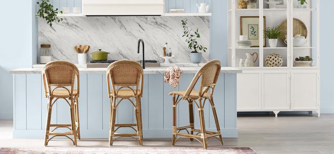
Sue Wadden, Sherwin-Williams’s director of colour marketing, said the emergence of a “soft, beautiful colour” like Upward signifies a potential shift in the relationship between colour and wellness, following the bright earthiness of 2023’s Redend Point and the leafy neutral of 2022’s Evergreen Fog.
“We wanted to go in a harmonious direction after Redend Point, which was really warm, to show that healing colours can also be cooler and undertoned,” Wadden said in a press release. The focus on Scandinavian slow living principles and a transition from the modern farmhouse towards coastal vibes also played a role in the selection. “Health and well-being are still top of mind, but now it’s more on the positive side than running away from sickness.”
Glidden: Limitless
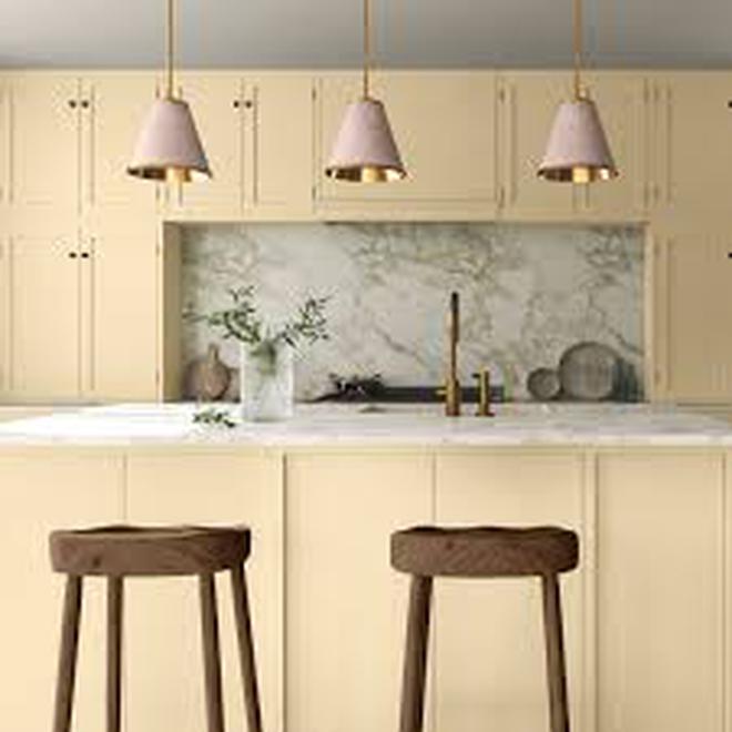
PPG Industries believes its Colour of the Year with Glidden will cancel grey, the world’s favourite neutral. Limitless, a fresh warm hue that combines the power of a primary colour and the essence of a neutral, offers “limitless applications” across design industries.
Ashley McCollum, PPG colour expert, Glidden brand, said as we enter a new era of explosive creativity and change, consumers are using colour in even more unconventional ways than ever before and need a palette that offers versatility to work with new and existing décor.
“Limitless understands the assignment and embodies this perfectly. This modern neutral is as adaptable as its name implies and is taking the place of cool neutral tones that are so last year,” McCollum said. “With the selection of Limitless, grey is officially cancelled. What can we say — warm neutrals just hit different.”
The “anything but yellow” colour pairs equally well with warm and cool tones, and Glidden recommends using it “anywhere and everywhere” to give your space a glow. Warm neutrals are here to stay, replacing cool tones like grey, McCollum added.
Behr: Cracked Pepper
Taking a completely different route, Behr Paint Company announced that Cracked Pepper, a dusty charcoal shade, was its Colour of 2024. Behr called its choice a “timeless and modern hue that awakens the senses and exudes confidence on every scale”.
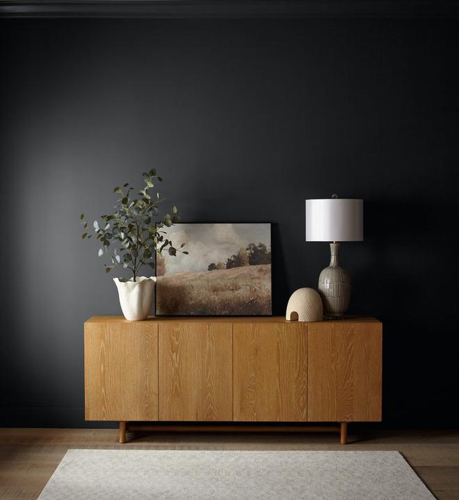
“As we look into 2024, creating a sense of comfort and belonging will continue to drive design decisions — but now, as life returns to its more familiar rhythms, it’s time to allow our senses to come alive,” says Erika Woelfel, Vice President of Color and Creative Services. “From heightening the aromas of a dining room to feeling the softness of a living area, Cracked Pepper enhances the natural expression in any space.”
The choice backs results from a Behr survey: 54% respondents feel black tones in the home create a new energy and vibe, 64% believe black tones make a space feel bold, and 61% millennials agree black tones instantly give the home a fresh look.
Recognising the growing desire for using darker colours throughout spaces, Behr feels that a soft black like Cracked Pepper evokes “a sense of confidence and individuality”.
Graham & Brown: Viridis
Nature is the inspiration for interior brand Graham & Brown’s design and colour for 2024. Viridis, a gorgeous, muted green, represents the fertility and calm that greenery offers and is ideal for creating a soothing, restful ambience.
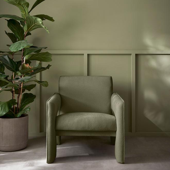
The company has designed the colour to pair perfectly with its New Eden wallpaper in an emerald shade, which takes its cues from Japan’s Omotenashi art to offer an intense hand-painted forestry motif.
Maryanne Cartwright, Head of Design at Graham & Brown, said the company wanted to continue the theme of the Utopia trend and began looking into colour psychology and hues that bring calm and peace. “Viridis, a soothing mid-green hue, reflects harmony and stability, enabling those in its vicinity to relax and revitalise,’ she said.
The company called Viridis the colour of growth and health, one that mirrors nature, expresses life and renewal, and creates a feeling of abundance and a plentiful environment whilst providing a restful and secure feeling. “We see our homes as a haven, a place to spend time with family and friends, and this is the perfect hue to create a welcoming colour palette,” Cartwright said.
C2 Paint: Thermal
New York-based paintmaker C2 Paint has chosen a fluid, refreshing blue as its Colour of 2024. The invigorating and calming colour, which encompasses elements of air and water, showcases our connect with nature and emphasises the importance of sustainability in our daily lives.
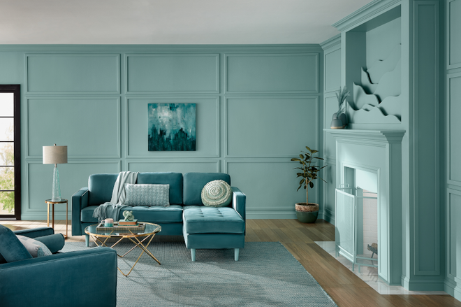
Philippa Radon, Interior Designer and C2 Paint Color Specialist, said, Thermal reminds us of a vast blue sky and the infinite array of blue hues nature offers to help restore and redefine our mood. “This bespoke pale yet punchy blue is poised for adventure and brimming with hope, evoking feelings of loyalty, trust, and confidence. Its contradictory nature has the dual ability to uplift us and provide a sense of calm and tranquillity.”
The company, which believes that colour is never seen in isolation, has released an annual capsule where “our colours become the characters”, with Thermal playing the lead and Brulee, a blend of soft apricot and honeyed vanilla, and Marshland, a mid-olive green shade, playing supporting roles.


