
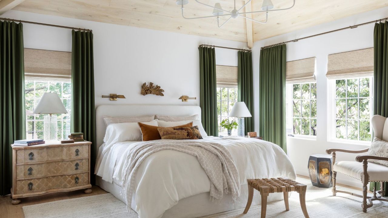
White is the lightest of colors; some say it shouldn't even count as a color, and yet it's the one that sparks the most debate in interiors. That's because when decorating with this timeless, universally loved color, the wrong shade can totally throw off a room and make it feel cold, uninviting, and, in 2026, dated.
Thankfully, the fix to a much warmer and welcoming space is simple. From white paints with subtle warm undertones to light, earthy neutrals that add depth, designers are all saying the same thing: ditch the cool-toned, brilliant white paints for a design-led space. Here, you can find out exactly why bright whites have fallen out of favor among designers, and how to fix this common color mistake with more flattering paint shades.