Every web browser has features that seek to set it apart from its competitors. Arc, meanwhile, is speaking an entirely different browsing language.
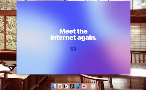
When you first open up Arc’s installation file, you’re greeted not with basic setup instructions — import your bookmarks, sign in to your account, set it as your default browser, etc. — but instead with a multi-step tutorial rendered in lush colors and intricate detail. Setup finishes with a personalized Arc “membership card.” You’ve completed the training; you’re in the club.
This is The Browser Company’s “unboxing” experience. Browser created the unboxing first and foremost for practical reasons, designer Kristina Varshavskaya says. “We’ve been manually onboarding until recently,” she tells Input. “Literally scheduling a call with someone on our team to show them how to use the product.” This wouldn’t work at scale, the team knew. The solution: “Let’s let people set up the browser themselves.”
This process is necessary because using Arc for the first time is like hopping on a motorcycle after riding a manual bike your entire life. Unboxing gives you a tour of all the extra knobs and buttons in such a way that, by its end, you have an idea of both how to use Arc and what to expect from Browser’s general design philosophy.
“It’s in the name ‘browser’ — they’re designed to be passive consumption vehicles for looking at the internet. We want users to participate in it, creating alongside it.”
Arc’s functionality is underpinned by its design; neither would function properly if the other wasn’t considered in tandem. Both rely on inspiration outside the tech world because, as Varshavskaya puts it, “we’ve pretty much figured out good UX as an industry.” So the team looks to other industries, like film and video games, for motivation.
For the unboxing experience, Browser took some deep-rooted lessons from game design theory. A foundational aspect of game design is skill-level pacing. You want the player to feel accomplished even at the beginning of the game before they’re actually skilled. Beginning your browsing experience with “little wins” completing a slick gradient-picking experience lets users see results immediately.

“It’s in the name ‘browser’ — they’re designed to be passive consumption vehicles for looking at the internet. We want users to participate in it, creating alongside it,” Varshavskaya says.
Karla Cole, another of Arc’s designers, wants the unboxing experience to set the tone for the browsing experience in general. Like when you pull the ribbon on a gift and that new shoe smell hits you in the face, Cole wants that first opening to be special. This is The Browser Company pulling a neatly wrapped box from behind its back when all you really expected was a nondescript, minimalist browser setup window.
Though it’s the user’s first interaction with Arc, the unboxing was designed after the bulk of Arc had been completed. For this reason, the design team ended up working backward to best understand what material should be covered in the tutorial. Varshavskaya says many times it boiled down to figuring out “which parts of the browser are logical and which are not.”
Color is a pivotal aspect of the unboxing experience. This is the first sensation you’re hit with upon opening Arc for the first time: bold, frenetic color. The color isn’t in stasis because Browser wants Arc to feel like it has life — like your experience can grow and evolve.
“We wanted to play with the feeling you get as a movie opens,” Cole tells Input. “This radiating blast of colors becomes a through-line for the entire unboxing experience.”
The thing about color, Cole explains, is it can feel very personal. This is another reason why the team designed Arc to be so color-forward. They wanted it to feel like you can “kick your feet up on the coffee table.” They want it to feel not just like a tool but like a home; a place where you’re comfortable that also makes you feel like you can be better if that’s what you want — or a place to throw your clothes on the floor, if you’d prefer.
Of course, the unboxing is really just the prologue to using Arc, but it’s a savvy one, with plenty of foreshadowing for what using Arc will be like. Color — and its inseparable twin, lighting — are even more important to the browser than they are to its unboxing.
“Other browsers have tried to be a window to the internet — but the room matters, too. What else is around that window?”
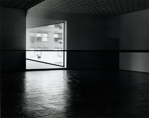
Lighting, too, proved to be inescapable to Varshavskaya while designing Arc. During the design process, Browser co-founder Josh Miller introduced her to Robert Irwin, a visual artist who played around with using scrims — drop cloths traditionally used to change lighting (and therefore denote time or mood) in the theater — for other artistic purposes. Irwin used scrims to change the look and feel of a space, to draw the viewer’s attention to things they might normally overlook.

This is how Arc came to have a gently lit frame around its entirety. It’s a scrim of sorts in its own right, a backdrop upon which you can conduct your work and fool around on the internet’s weirdest corners. Like Irwin’s scrims, it draws your attention to the space you’re using, rather than taking it for granted, as is the case with most web browsers. The hope is that you’ll want to remember Arc is there, rather than forgetting about it.
“It felt like there was space to show up with a bit more of an opinion,” Dustin Senos, Arc’s design lead, tells Input. “Other browsers have tried to be a window to the internet — but the room matters, too. What else is around that window?”
This gentle framing carries through the entire Arc experience — and it really is an experience. In its mission to reinvent the way we think about accessing the internet, The Browser Company has neatly rewritten some of the standard browser’s most important creeds. Arc doesn’t automatically close all your tabs when you leave a window, for example.
“Arc has more memory than so many other browsers. You’re not surfing millions of URLs every day, you’re usually looking at a consistent set of tabs,” Senos says. “Arc remembers what you’re doing and shows up for you in that sense.”

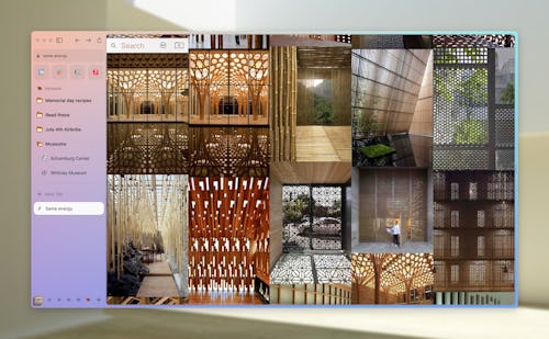
Arc’s colors extend to its sidebar, where users will find each tab they’ve opened, an address bar, pinned sites, and access to a variety of other tools. Presented in a vertical format, your list of tabs appears more like a file explorer than a lineup of actual tabs. That list is the same across windows; all your tabs will stay at the ready until they’ve been untouched for 12 hours by default. You can pin as many as you’d like to stay forever, organizing them into folders for quick access.
This memory, Senos says, is also a way for Arc to grow with the user. The project is ultimately about making web browsing more personal, so Arc is built to assist in simplifying both your work and leisure. As you continue to use Arc, it’ll make suggestions. “We’re trying to mold to the user, rather than being an agnostic window,” Senos says.
Arc’s insistence on persistence is one of its greatest strengths; it’s how, as Senos puts it, you’ll come to feel like it’s a home. (This, of course, complements Arc’s early focus on color and aesthetics.) This persistence exists in just about every tool Browser’s packed into Arc: The Easel, for example, allows users to effortlessly collect bits and bobs from around the internet on a canvas. Arc’s memory becomes your memory.
While Senos thinks of Arc like a home, Varshavskaya likens the browser to her desk. Every inch of her desk is filled with something, she says: parking tickets, stacks of papers, notebooks, writing utensils, you name it. The chaos of her daily life is organized here, though, in a way only she can understand. And that personal organization system can grow as she moves through life. She doesn’t have to keep her desk tidy-looking, exactly, but she can find exactly the sheet of paper she needs at a moment’s notice.
As personal as it is to build your own browsing experience, Browser knows the internet is better when we experience it together. The Easel feature is for this reason entirely collaborative — just a few clicks and you can share your Easel with another Arc user. If Arc is your new home, Easel lets you open the doors so you can give your friends a little tour. (Maybe not the most personal rooms, like your pinned tabs, but the living room and kitchen, at least.)
Browser’s design team has spent many, many hours constructing Arc’s foundation (though they assure me all that work was fun); now its first beta testers are moving in, choosing a few fresh coats of paint and gradually figuring out how to best make use of their new space. Even so, the team is constantly examining its handiwork to watch for cracks they may have forgotten to fill. There’s plenty of creativity to expend yet.
“I think we’re getting there,” Varshavskaya says. “We’re almost ready to let people reclaim the internet.”


