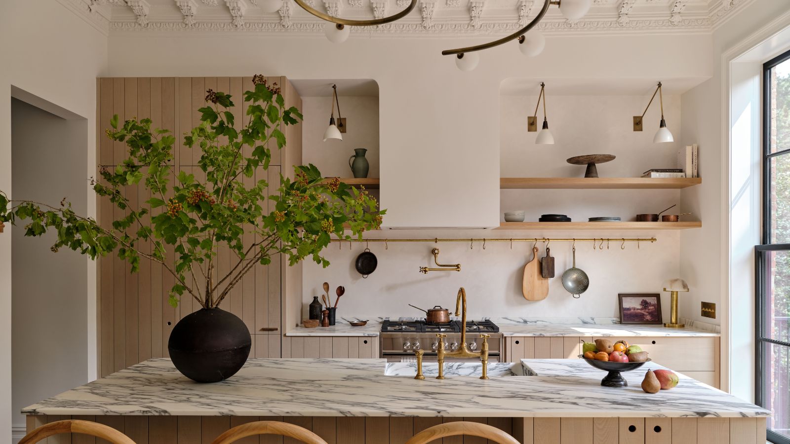
Barry Bordelon and Jordan Slocum know their way around a Brooklyn brownstone – their specialty is converting these historic spaces into functional and stunning modern-day homes. Also known as the Brownstone Boys, the couple has combined their DIY, renovation, and design expertise on more than 20 projects over the past several years.
The pair recently tackled a triplex residence in Fort Greene, transforming the 4-story townhouse into a luxurious family home. And arguably the focal point of the entire home, the kitchen truly shines – a testament to Barry and Jordan's skills, and to a bit of help from deVOL.
Barry and Jordan sat down with Homes & Gardens to share the inspiration behind the kitchen, how they honor a brownstone's history, and why deVOL was the perfect choice for this kitchen makeover. This is what they had to say.
Take a tour of the Brownstone Boys' deVOL kitchen
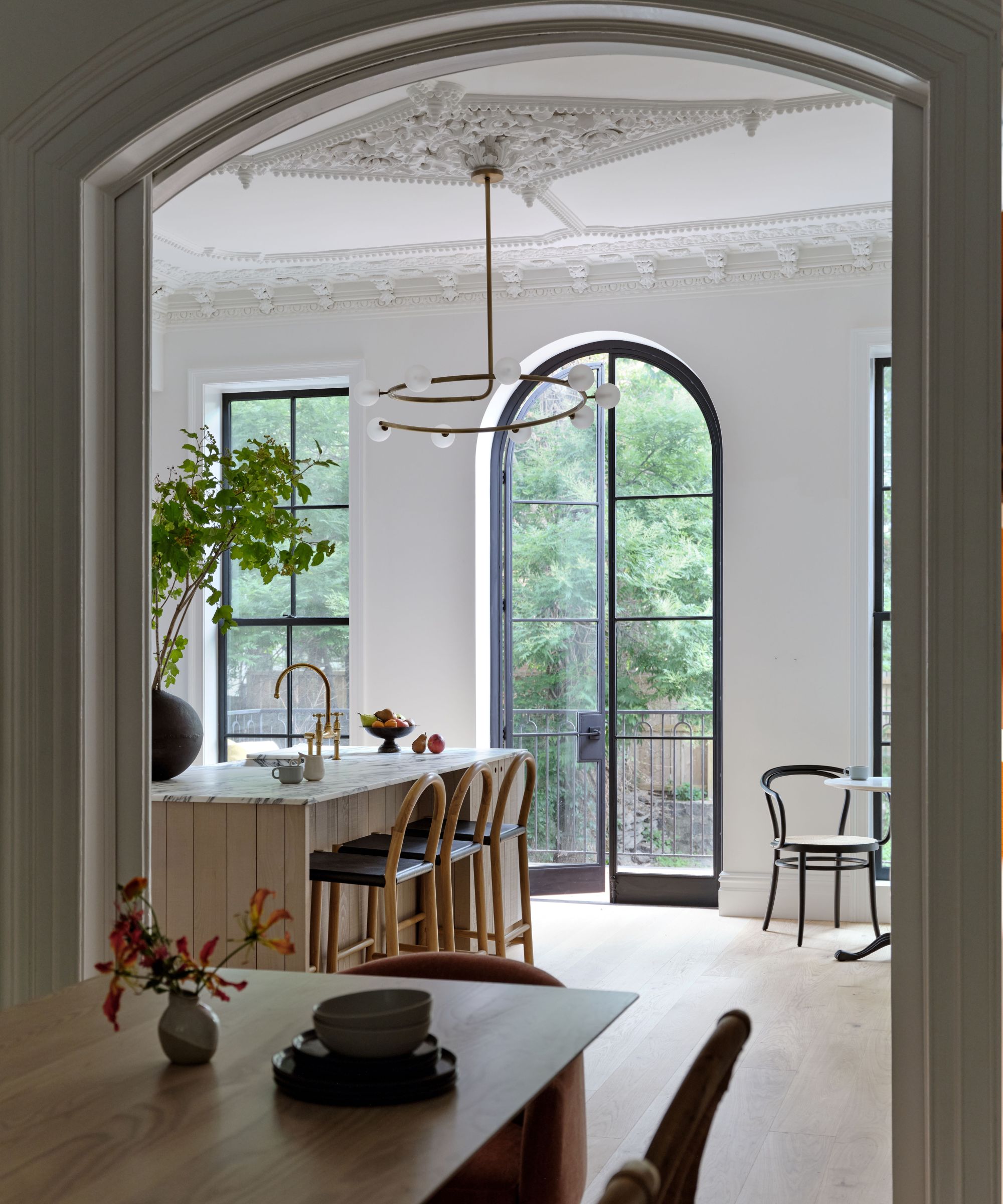
The Brownstone Boys aim to find the perfect balance between modern and historic within Brooklyn homes, and this kitchen renovation was no exception. Barry says this involves intentional choices – finding the line between historic and museum-like can be difficult.
The room's intricate, original crown molding simply had to stay, while the large, arched door leading out onto the home's patio is a new addition that lent itself well to the home's original foundation. The key to finding the middle line? Letting the new features be just that – new.
'We always have the pleasure of working in these buildings that have all these beautiful, original details... but we always have the challenge of modernizing the house, too. And I always say that we're not trying to build a period piece. Even though we restore all those original features, and we want them to be beautiful, the kitchen isn't an 1800s kitchen – we're, of course, building a modern kitchen,' Barry tells H&G.
When it came to furnishing the kitchen, Barry says deVOL was a standout choice for its 'classic and timeless look and feel.' Jordan adds that they knew deVOL was the perfect fit immediately after a visit to the brand's New York City showroom.
'It was going to be another statement piece within the home, but also blend in beautifully with all the design that we're kind of incorporating into the overall space,' says Jordan.
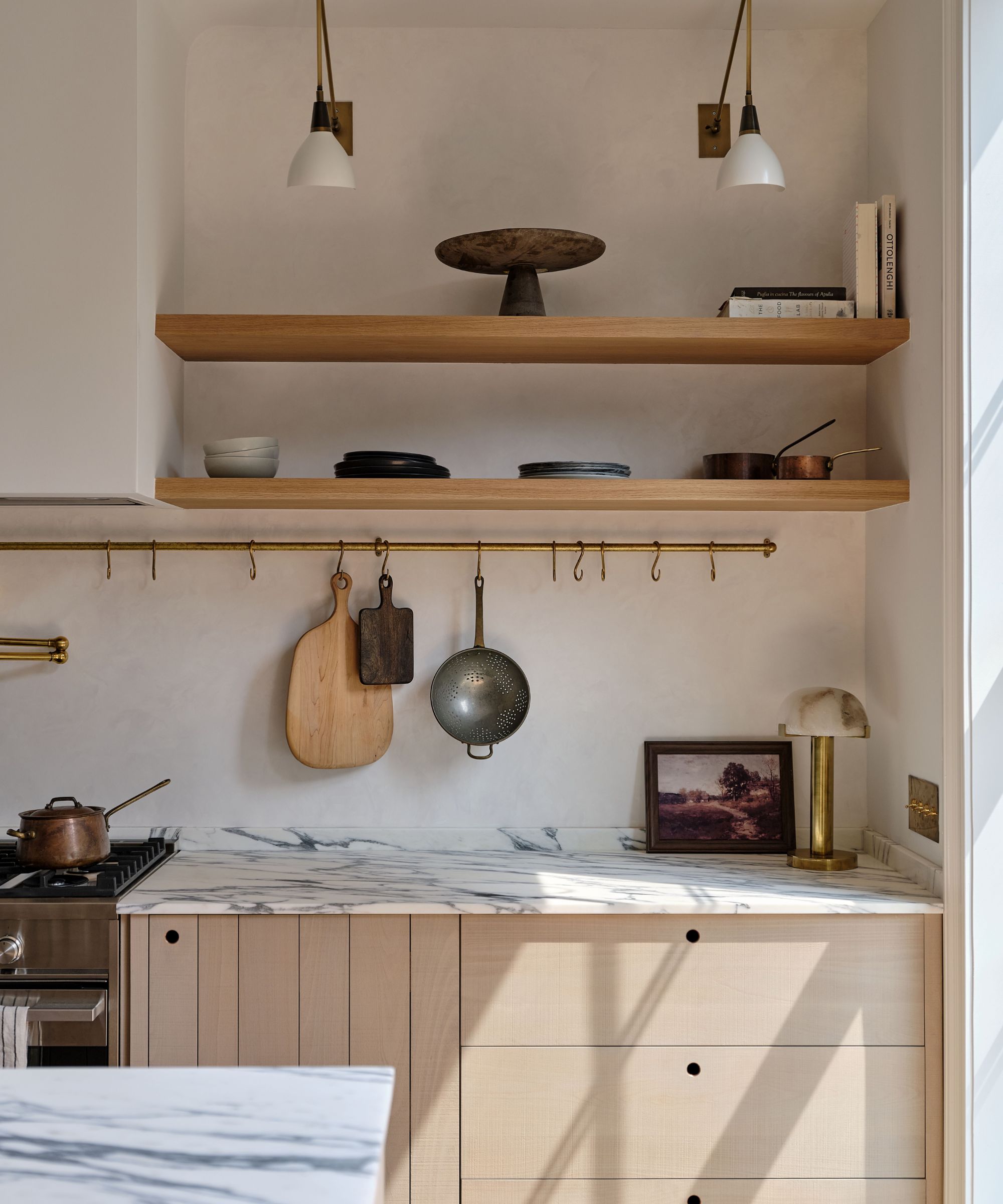
deVOL's products toe the line between contemporary and historic beautifully, says Barry, adding that they feel 'modernized for 21st-century living, but [with] those classic lines and classic details.' The couple went with the brand's Sebastian Cox Kitchen line because it felt unique and fresh.
'We love all of their stuff, but we were attracted to it because it is a little more casual-feeling than the traditional English kitchen,' says Barry.
Jordan says the light finish and sleek defining lines featured in the wooden cabinetry drew seamlessly from the black grid of the large steel windowpanes. Though sometimes he and Barry opt to open the entire back wall of a brownstone home, adding steel and glass, they opted for a 'special design moment' here, bringing in the arched glass door.
'Incorporating that with the cabinets was important for us to achieve a more modern look because the structure of the steel and glass door was going to be a very modern design. We needed something to blend with that, and that's what excited us most about the Sebastian Cox line – it really fit in seamlessly with steel glass door,' says Jordan.
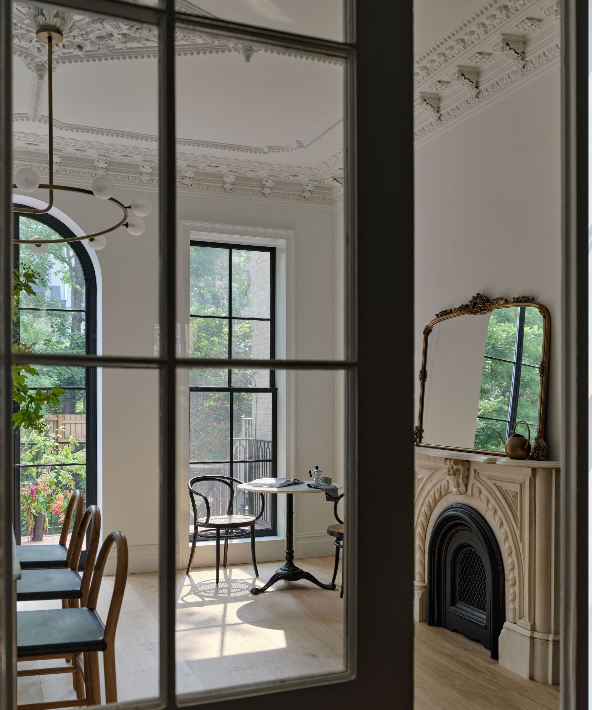
The streamlined architecture also accentuates the kitchen's lighting scheme, contributing to one of the Brownstone Boys' main goals for the space: to pull natural light throughout the entire home, starting at the front doorway.
'You have that beautiful natural light blending through the entire long and narrow space of the brownstone,' says Jordan.
The classic English kitchen hasn't always meshed well with American kitchen styles, but Barry says deVOL played a large role in bringing attention to the look's benefits. Now, even those living in historic brownstones can have a taste of English kitchen design in their own spaces.
'I think that deVOL was a perfect partner for this project, because they do something very similar to what we do – taking something that is classic, timeless and has been done for many years, hundreds of years, and they modernize it in a way that it fits into 21st-century living,' says Barry.
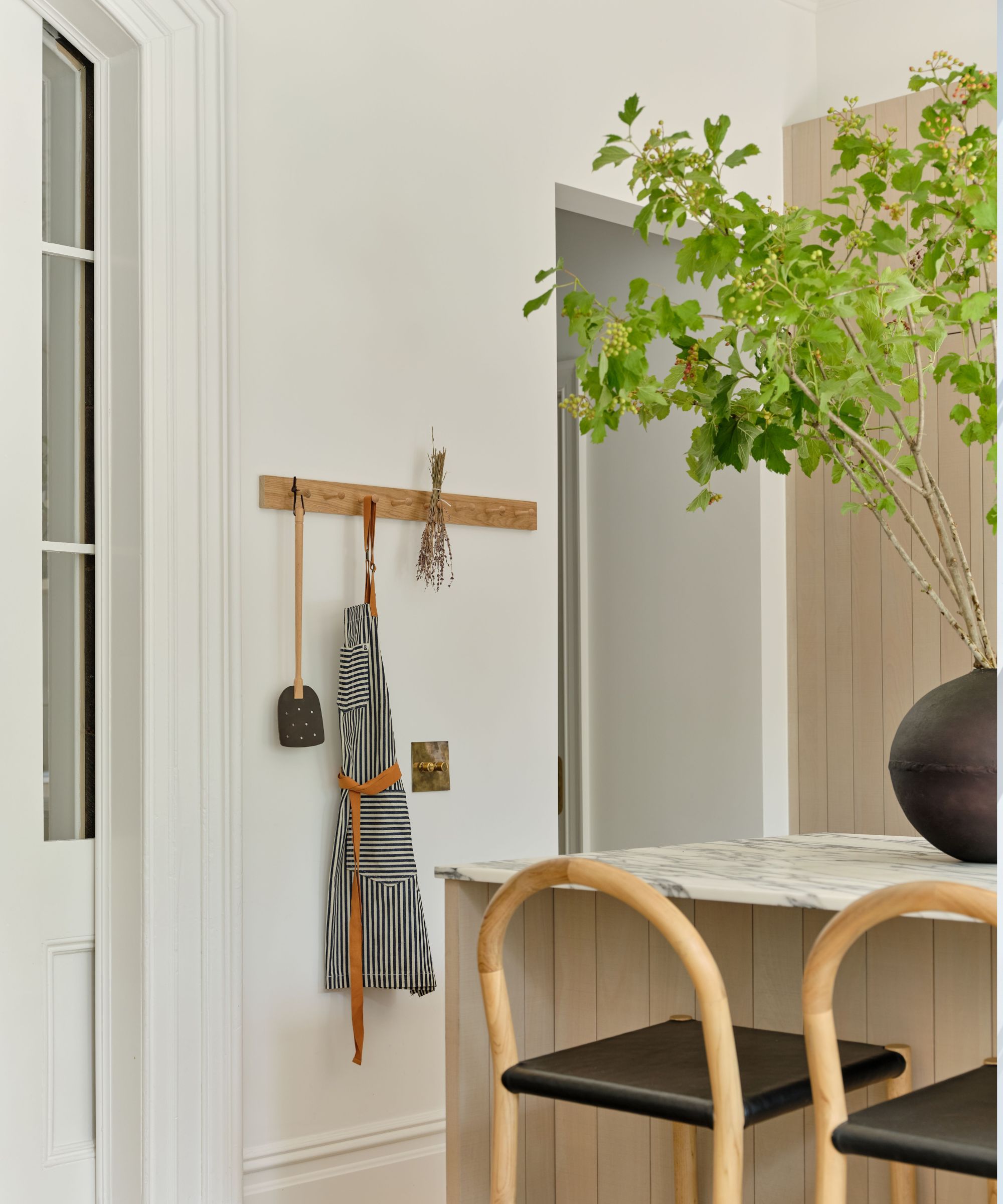
When deciding on a kitchen color scheme, Barry and Jordan kept the home's challenges with natural light in mind – with a tall school building restricting light flow from the front, creating an airy space didn't come easy. Aside from installing the expansive, arched doorway, they decided to counter the darkness by decorating with a 'light and neutral' color palette throughout the whole home. The white paint coating the walls and ceiling. Pure White from Sherwin-Williams, was the first step.
'White paint is definitely one of the hardest for us to source, just because there are a million different options out there, and they all give off different tones and textures. But Pure White, for a space that is long and narrow and has high ceilings, really reflects the tones that we were putting into that project,' says Jordan.
Though Pure White gave the crisp, natural tone they were after, Jordan says they were on the hunt for a creamier, warmer shade that lent a bit more beige to balance it out. With the help of Michelle Kole, they installed stunning tadelakt plaster in an inviting creamy shade over the backsplash. The addition lends subtle texture to the kitchen space.
From there, they added impactful pops of black throughout the room for contrast and visual interest – the barstools, sconce light fixtures and an arched hutch opposite the kitchen island make the white walls shine even brighter.
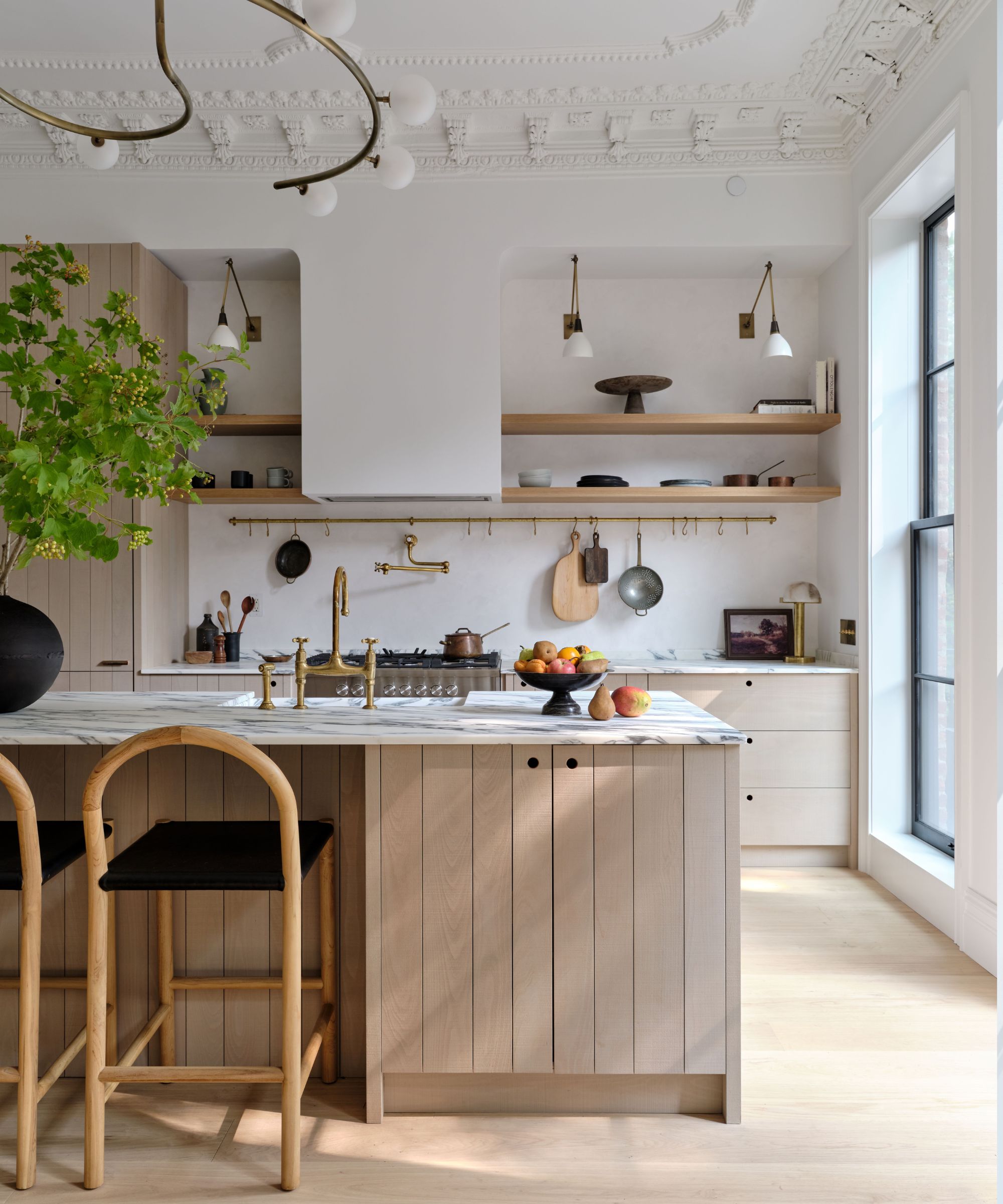
While this kitchen's ultra-high ceiling lends itself well to a light and airy space, Jordan notes that brownstone kitchens haven't always had that benefit. In fact, brownstone kitchens were originally located on the garden level, fitted with utilitarian design schemes.
'Back then, the parlor floors were used for entertainment, and it kept all the smells from the cooking down on the garden floor.'We had the fun, exciting challenge of designing this big, grand kitchen with those high ceilings and the ornate plasterwork,' says Jordan.
The ceiling's intricate molding and medallion make the whole room, but the ceiling proved quite a challenge at the start. When they did their first walkthrough of the space, Barry and Jordan say they were confused – the towering ceilings and beautiful plasterwork were accompanied by a tiny '70s or '80s-style flush mount light fixture.
'We were like, "What is that? Who would put that on this massive medallion in this huge room?" It just looked so ridiculous, and we all laughed at it – we thought it was so funny,' says Barry.
Turns out, the light fixture was there for a reason – structural damage to the ceiling meant it likely wouldn't have held a heavier fixture. After shoring up the damage and restoring the ceiling to its original glory, the team added a sleek, sculptural gold chandelier from Blueprint Lighting. The contrast between contemporary and historic on the ceiling is to die for.
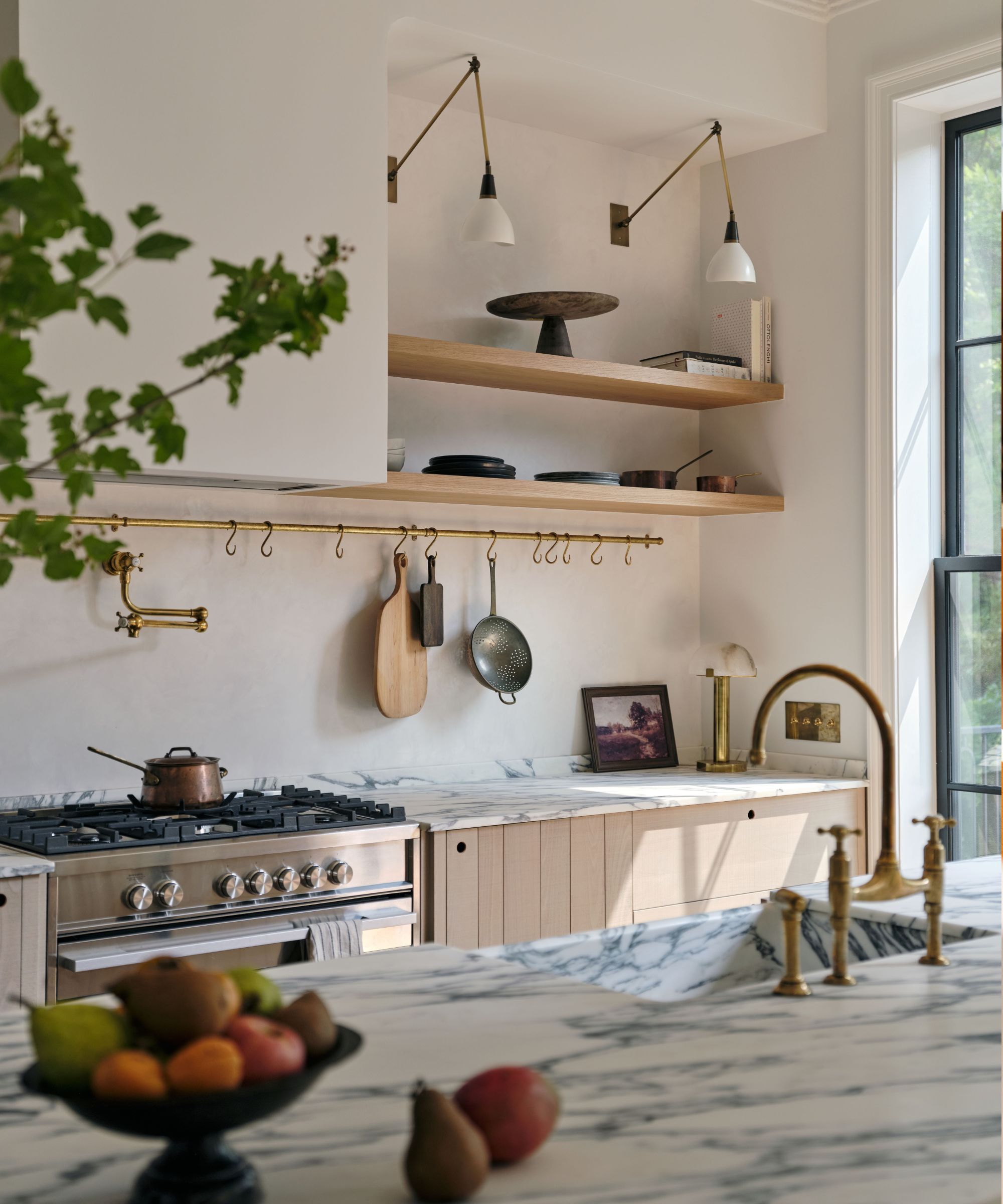
The cabinetry isn't the only deVOL influence found in this space, and Barry says that the couple's visit to the New York showroom inspired a central, yet unexpected, feature of the kitchen: the marble. After seeing the space's gorgeous arabescato marble sink, Barry and Jordan decided to match the stone across the whole kitchen countertop. The stone is now a defining feature of the room.
'It wasn't something that we or the client really thought of, or had as an idea for the house, but we just all fell in love with it so much. It was one of the biggest takeaways from that visit, was how gorgeous that sink is and how much of a statement it would make in the space,' says Barry.
And though Barry says the sink is the space's 'biggest showstopper,' beautiful brass hardware from deVOL can also be found across the kitchen, from the faucet to a storage bar lining the back of the counter. 'All of those accessories just do so much to anchor that kitchen in that original, beautiful space,' he adds.
Jordan says he loves that the brass faucet will patina over time, 'constantly evolving and changing' just like the kitchen's overall aesthetic. The pair noted that the hardware fits into the unlacquered brass found throughout the whole home, adding that the fixtures have already taken on slightly different tones.
Kitchen storage can prove quite difficult – easy access, functionality and aesthetics all come into play. In this space, crafted for a young family, they were open to displaying kitchen items on open wooden shelving. Barry and Jordan also installed a pantry and a trash pullout, and brought in a wooden hutch for additional storage. Jordan says the pantry is 'a secret space saver,' not immediately obvious, but full of clever storage hacks.
'The other thing that gave them a little more storage is on the backside of the island, there's an extra cabinet. Instead of having seating go all the way across, there's that extra little cabinet that just gives them just that little bit more storage that you know you might need,' says Barry.
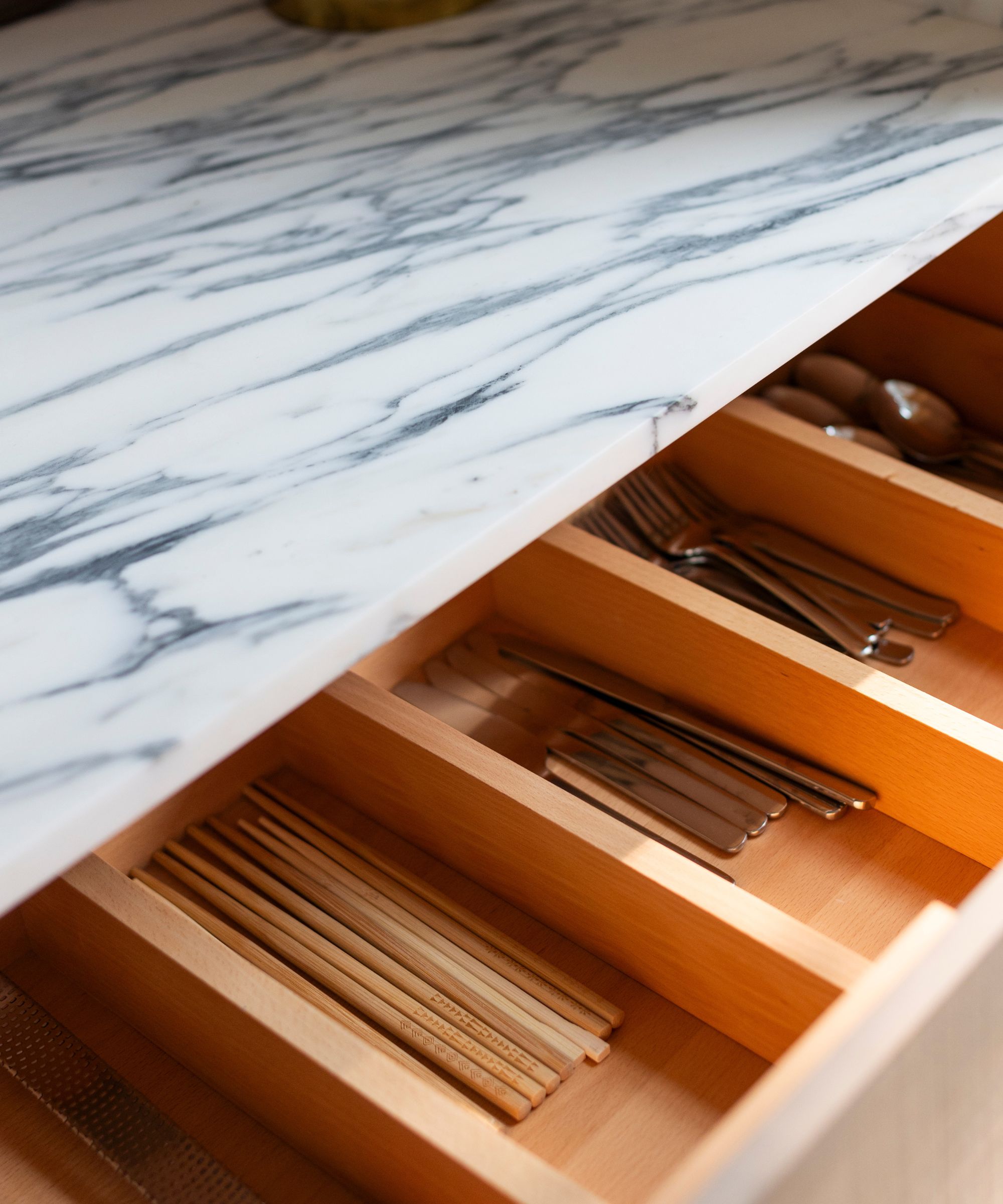
Storage drawers specially fit for kitchen utensils and cutlery also serve the family well, says Jordan: 'They have these really beautiful organized drawers that have a proper place for your forks and your knives. The more organized the system is, the better your life is, and it's really helped them stay organized and clean.'
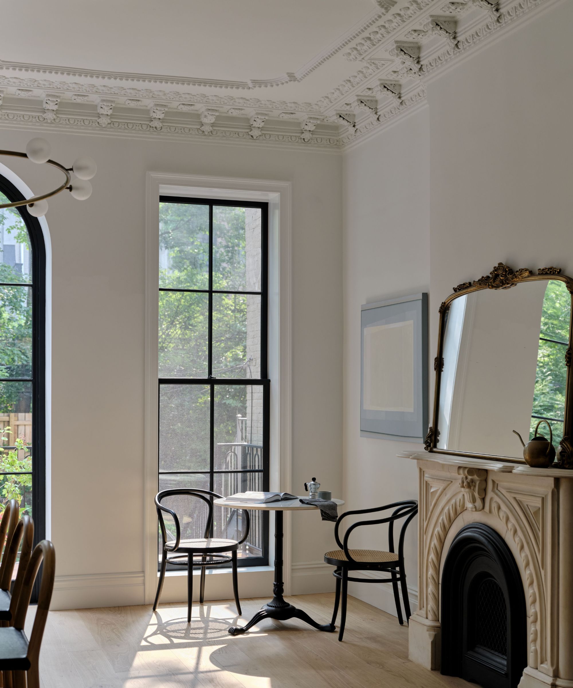
To make the space work perfectly for the young couple and their child, Barry and Jordan decided to place a flexible banquette seating area in a well-lit corner of the kitchen space.
'Now we have different zones within the kitchen that I think are really smart. The little banquette area allows them to have another seating area where they can enjoy morning coffee, that beautiful natural light from those new windows, and that arched store. But it's also a space that can evolve over time,' says Jordan.
Whether the family decides they need extra storage space or wants to expand the corner into a built-in dining nook, the possibilities are endless. They're able to enjoy the space as it is now, and expand as they see fit as their family grows.
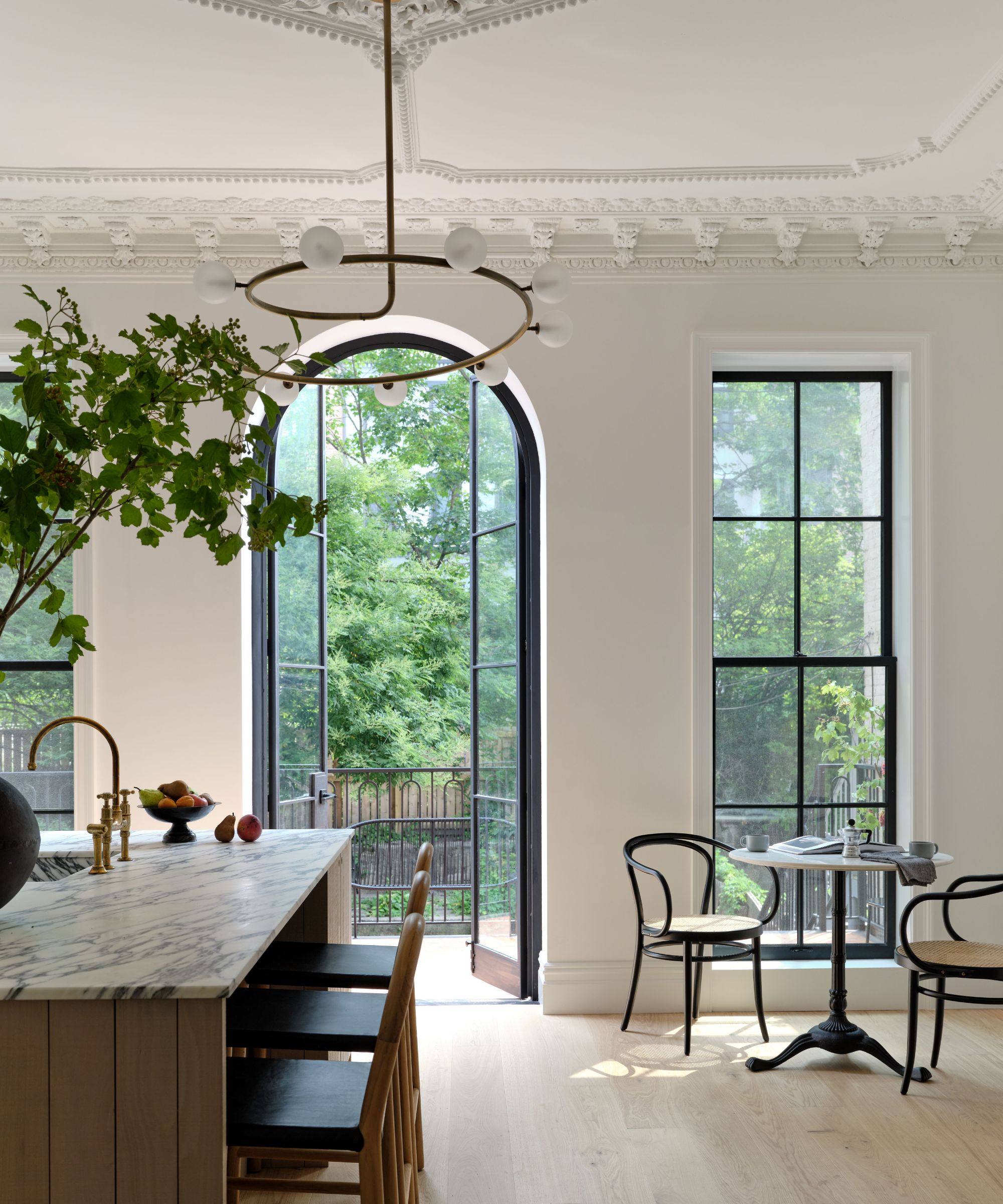
The finished kitchen does a lovely job of bringing the outdoors in, and the through line from the front door to the back patio offers a stunning view of nature – even in the big city. Barry says that this blend of indoor and outdoor living has become a 'standard ask' in Brooklyn. To fit the bill, the Brownstone Boys left a lot of room around the kitchen island for hosting and congregating, and allowed easy access to a lovely terracotta deck and stairs down to the backyard.
'It's a very easy entertainment flow – most people hang out in the kitchen. If you invite people over, they're gonna be hanging out on the island. So we left a lot of room around that island – that's where people are going to hang out, so might as well give them the space to do that,' says Barry.
With this Brooklyn space, the Brownstone Boys created a truly transitional kitchen, allowing historic features to shine while bringing in unabashedly modern features. The final space is fresh, airy and lively – the perfect environment for a young family to thrive.
'I think that this kitchen is just a perfect blend of the old and the new,' says Jordan.
