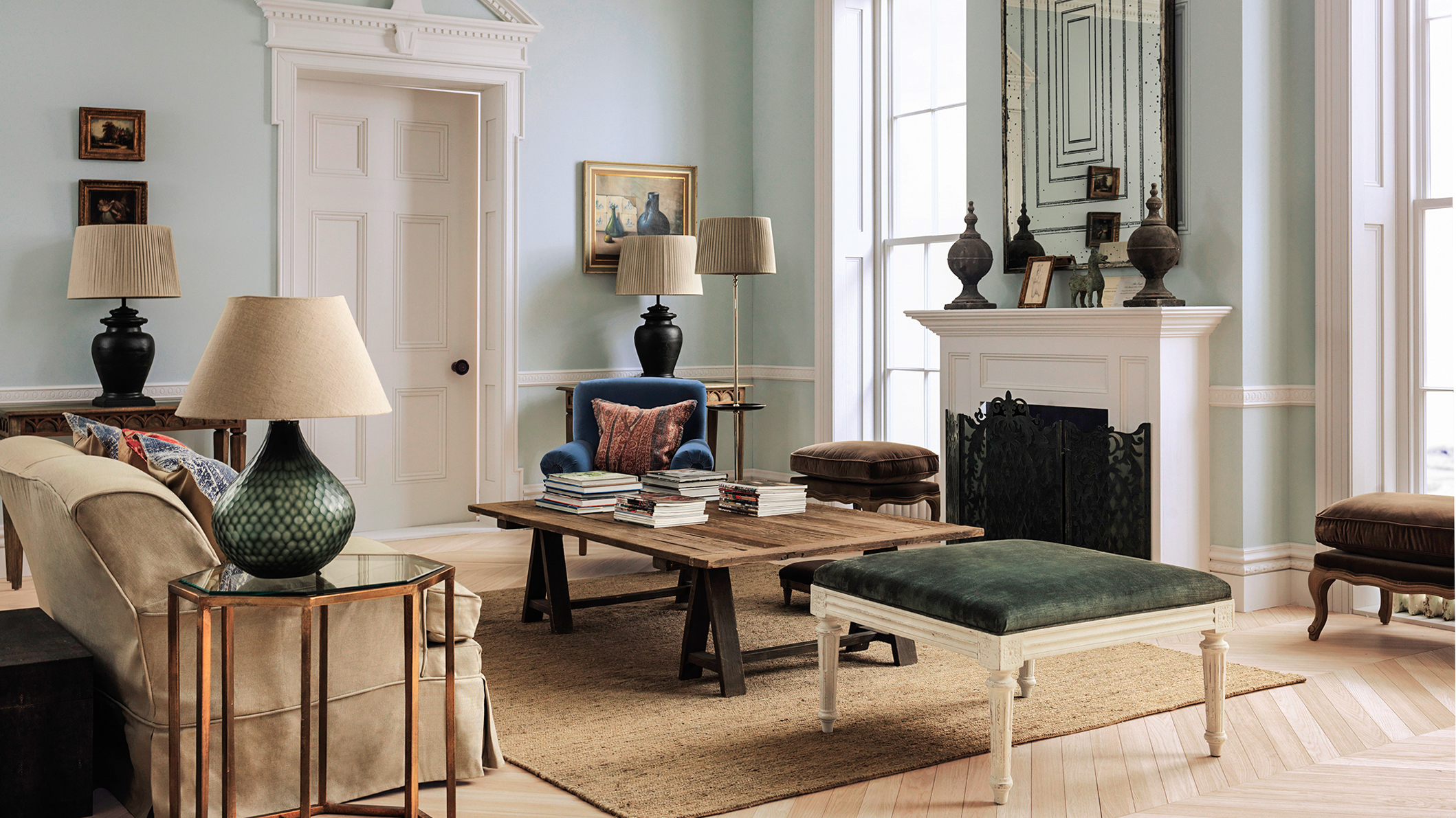
Vintage paint colors are making a contemporary comeback and are the perfect choice for anyone looking to give their home an elevated refresh. Whether you love the look of a traditional home, or you want to incorporate an antique touch into your space, vintage paint colors are the trend that will never go out of style. So how do you find a vintage paint that works for you?
You may think these paint colors will cater to something more classically neutral, but the truth is that color is at the heart of old-school decor. Out of all the color trends popping up this year, the vintage-inspired look is one of the most timeless and charming styles for interiors. We asked designers and color experts to help decipher what the biggest vintage color trends of the season are and how to implement them into your home — here's what they had to say.
Amy Krane, Architectural Color Consultant, says that one thing is especially true while shopping for vintage-inspired colors, "context is so important when talking about the perception of a color in design. You need to look at today’s trends and see what colors have come around again." We have seen everything from rich browns, deep purples, and muted greens making their way back onto the color scene. This time around, these hues are taking on a more nuanced, understated persona.
"Vintage style paint colors can refer to many decades in the mid-1900s but are often most commonly represented by muted and less saturated tones," says Color Marketing Manager at Sherwin-Williams, Emily Kantz. "Picture yourself strolling through an old vintage shop, you aren’t seeing bright pops of red and blue, but more understated secondary shades like oranges, purples, and greens." And with that, here are the shades to try for your new vintage-inspired paint ideas.
1. Rich Browns
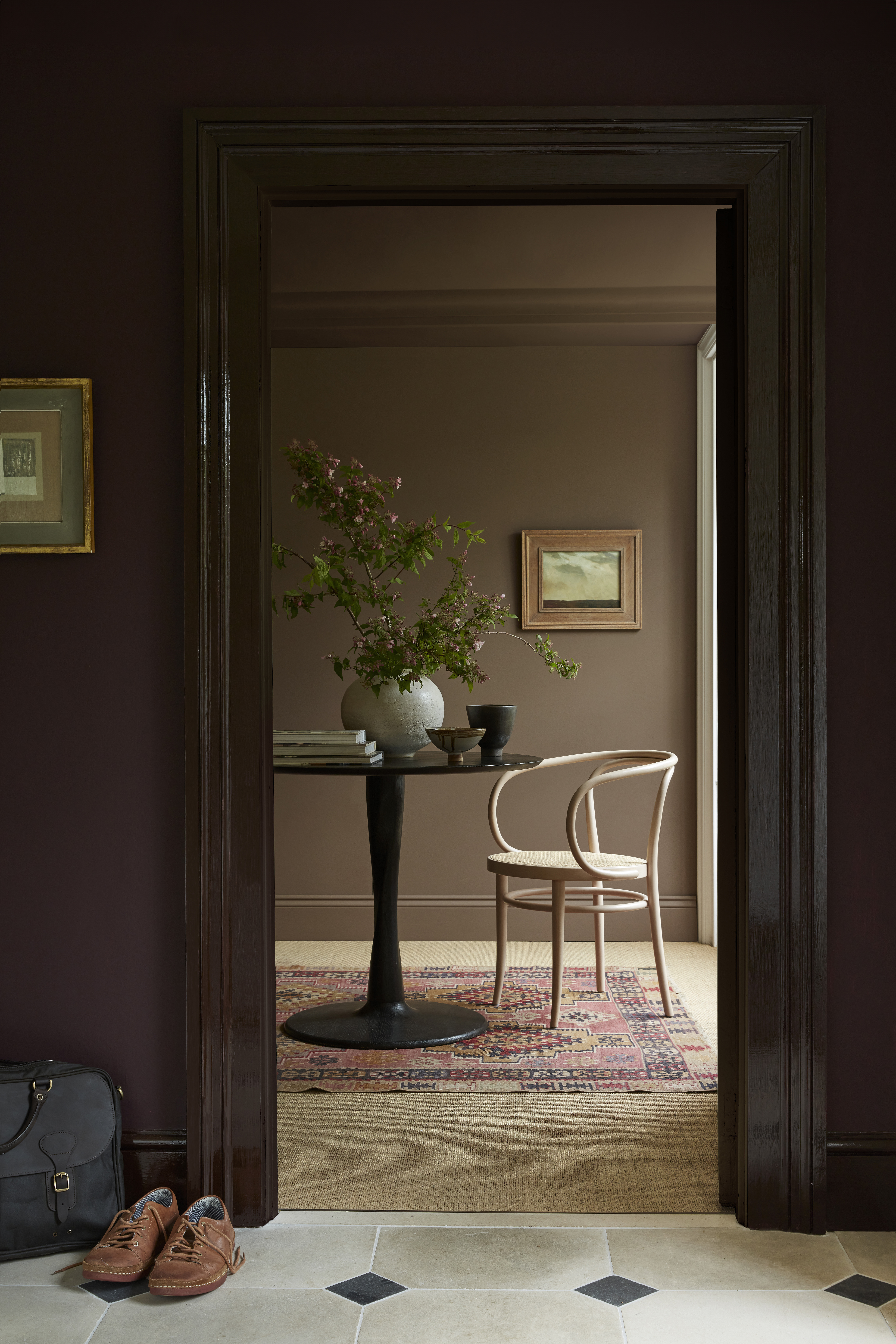
Browns are all over the color palettes for the upcoming year. They are an elevated way to introduce a cozy vibe into any room. Amy says she's seeing shades of brown everywhere and that its re-emergence is no surprise. "Brown was big in the 70s and is huge right now," she says. From lighter cinnamon shades to rich chocolatey tones, brown is back with a more moody feel than ever.
Opting for a lighter, more beige shade for the walls with a darker brown on the trim is a lovely way to incorporate the double-drenching paint technique. The color's cozy nature brings a warming sensation to a room that is coated in it, while the earth tones ground us back into nature. A brown color palette is perfect for a decor scheme that feels inviting yet luxe.
2. Antique Whites
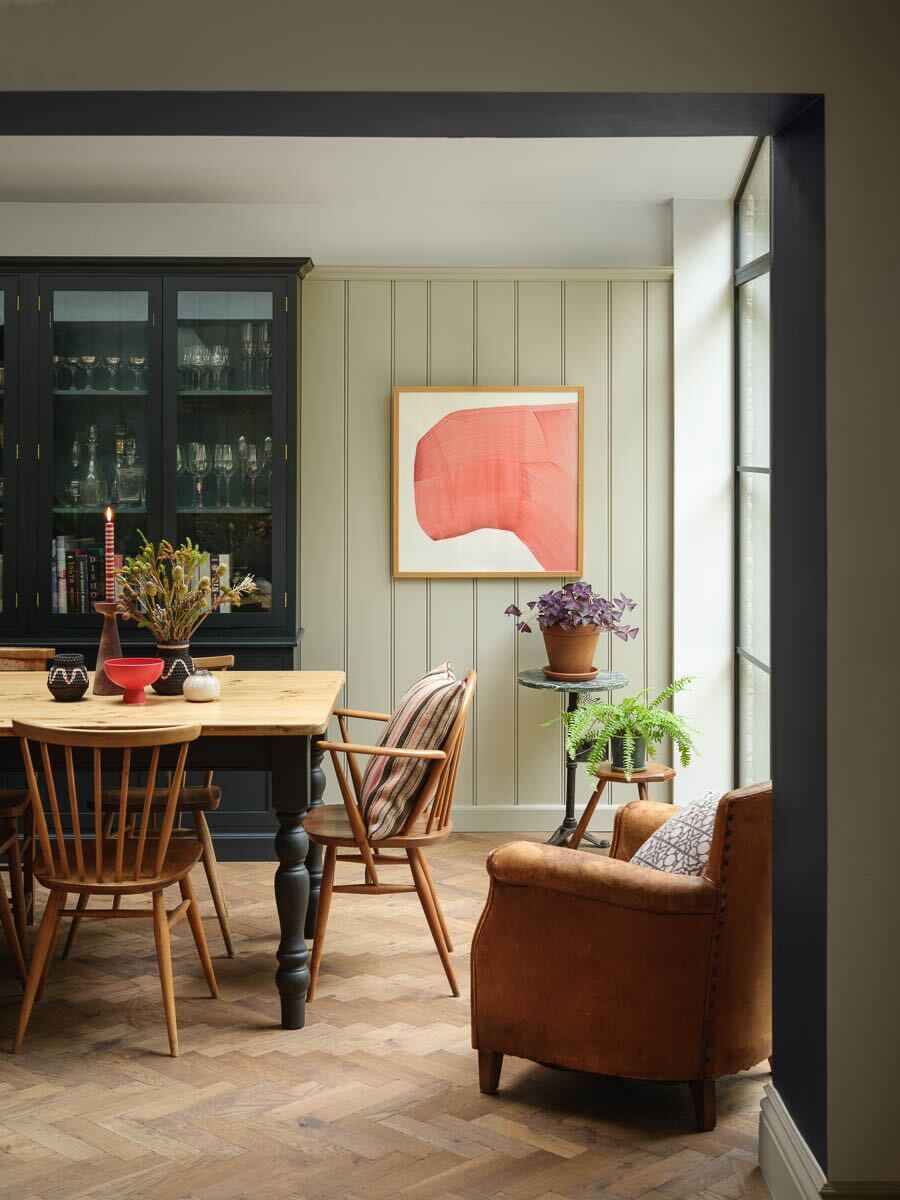
You really cannot go wrong with a white or an off-white hue for wall color. It's a safe bet for decorating and a classic color that will not age. The antique-inspired whites add a little bit more of a visual touch to a space with their colored undertones.
Sometimes the easiest way to create a stylish backdrop for a room is to go crisp and neutral. The cream and off-white shades are the best white paints for a vintage palette that will guarantee the quintessential refined look of traditional homes, and give you room to experiment with material and decor. Arianna Barone, Color Marketing Manager at Benjamin Moore says, "The charm and romance of the vintage aesthetic is about infusing a space with history and character, without being too precious or serious."
Off-whites and neutrals like Edgecomb Gray, Glacier White, and White Opulence from Benjamin Moore can be used as a backdrop for artwork you want to make the focal point in the space. Arianna says "vintage style welcomes offbeat, unique design choices so the paint colors used should highlight the well-loved, curated decor found in these homes."
3. Golden Ochre Yellows
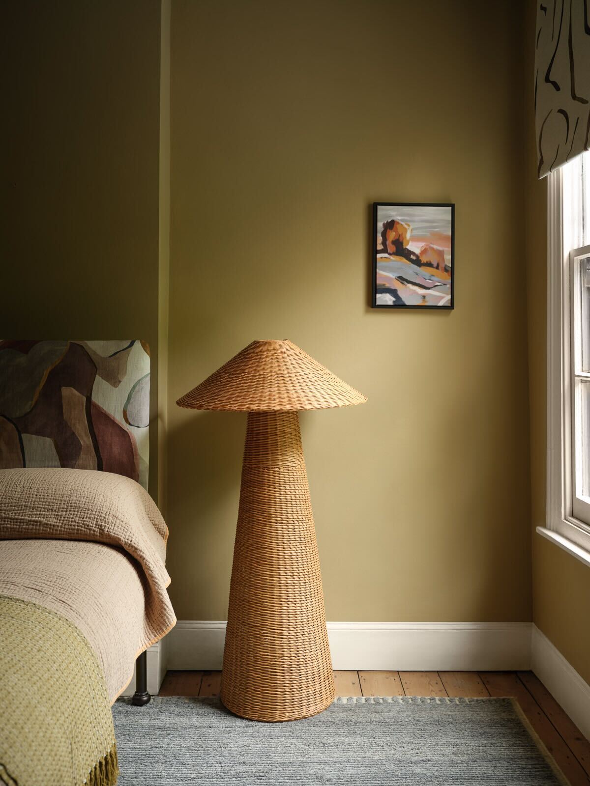
Yellow has always been a favorite color of mine, but it can be a bit of a daunting color to try and incorporate into the home. The vintage color trend offers a yellow that is more palatable to a chic space — golden, ochre yellow. This shade of the sunny hue leans into the green territory, to create that vintage and homey feel.
The more golden take on the yellow feels elevated while still feeling fun. To style, Amy says to remember that "color creates the emotional response to a space and color can tie together disparate shapes and forms." A color as happy and bold as yellow will work great in a social space, or anywhere you want to invoke a feeling of playful positivity. Just keep in mind colors that go well with yellow, so as not to accidentally clash with this prominent color choice.
Ashely Banbury, Color Marketing Manager at HGTV Home by Sherwin-Williams, says she loves to see warm yellows mixed with other colorful, vintage accents to create an effortless, and balanced retro style. "Warm tans, oranges and yellows can be a great foundation to a space layered with pops of watery blues and greens," says Ashley.
4. Muted Blues

I would argue, that blue is quickly becoming this year's new neutral. From light blues to pops of deep navies, it is a timeless living room color or a shade for any space you want to create a chic yet serene environment.
Vintage blues often feel more muted, usually with a darker tone. You want to look for a shade of blue that feels lived in, and the darker tones of a muted blue add a feeling of depth and mood, playing nicely with that antique charm.
I love the idea of a lighter, vintage blue on the walls, as the colors that go with light blue are nearly endless. Using a muted blue as a neutral will allow for bold decorative touches, like gold, vintage picture frames, and rich wooden furniture, to stand out.
5. Earthy Greens

Green is a color that ultimately never goes out of style, but it does find itself changing tone throughout the seasons. This summer, bright and vibrant greens took the spotlight, but an earth-toned green will be better suited for a more traditional aesthetic. Amy says that olive green is a particular shade she is seeing making a comeback in the world of color, given that it caters to a 70s, retro look.
Olive green leans into a more recent, retro aesthetic meaning that it's one of the best ways to get the mid-century modern look. I envision this lively color choice in plush, velvet chairs, or as a striking way to paint your kitchen cabinetry. Whatever way you choose to incorporate these earthy greens into your home, you are sure to score on the chic scale.
6. Deep Purples
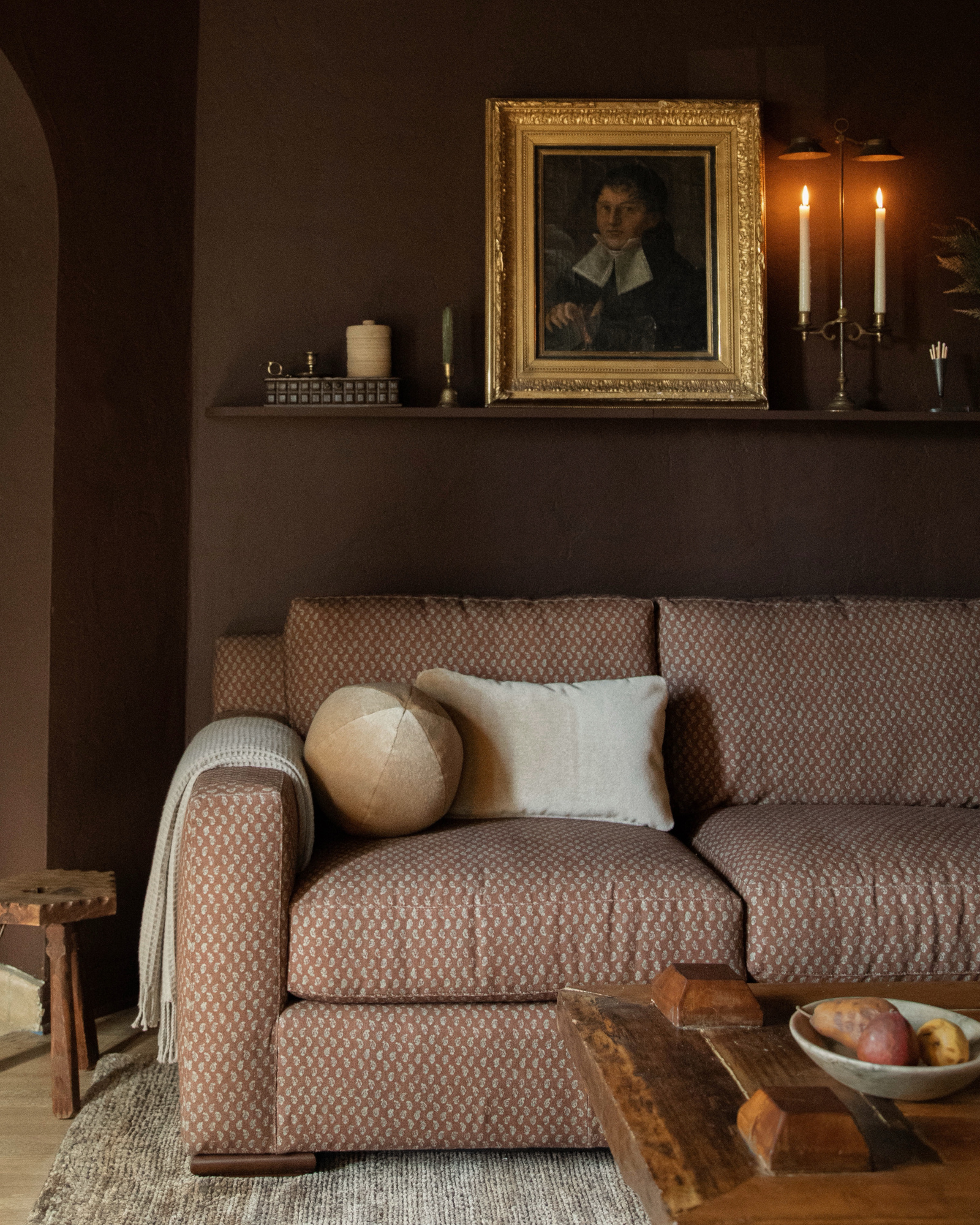
If you want to really get ahead of the latest trends in color, then introducing plum shades of purple is where you need to start. These purples almost feel like a dramatic, dark brown which gives them a more neutral characteristic, without compromising on stunning visual appeal.
As for styling with this color, Emily says to "introduce touches of a daring violet or plum shade with an accent wall detail." She recommends shades like Sherwin Williams' Dark Auburn, Brandywine or Quixotic Plum for a dramatic pop of color. You can then break up these more intense shades by combining them with some of the lighter, antique white ideas.
Styling with a vintage design gives ample opportunity to play with color while still sticking to classic charm. To give this palette a more contemporary feel, finding unique accent pieces that show off your personal style is the best way to go. "Look for items like velvet furniture, funky vintage fabrics and woven tapestries," says Emily. "You should also avoid bright white lights and opt for warmer yellow light that will make the space feel very comfortable, cozy and inviting."
The vintage aesthetic is one that you can feel comfortable boldly introducing into your home, as it ages as gracefully as it looks in your space. The past always has a fun way of circling back into current trends and design styles, so vintage shopping may be your answer to a fresh, new look.


