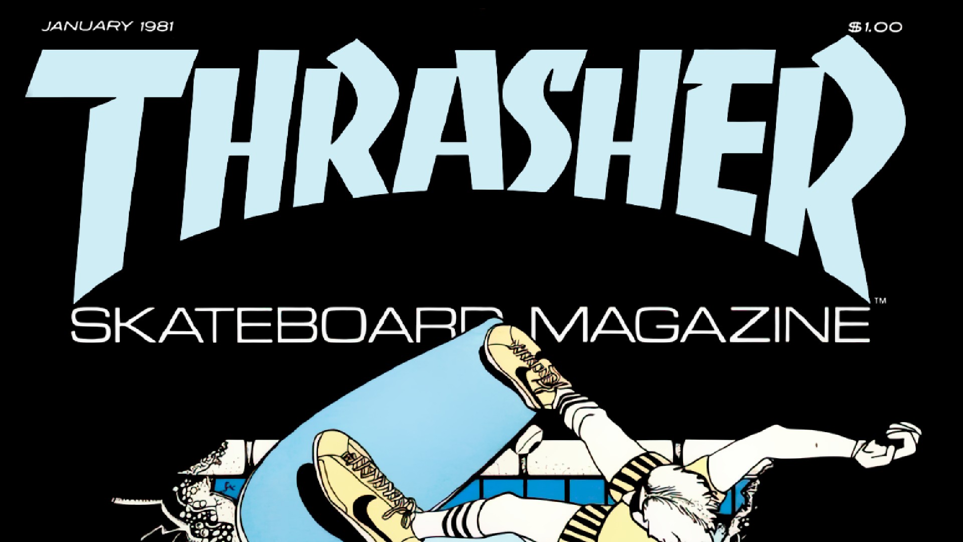
The 1980s might nowadays be associated with cheesy pop and gaudy materialism. But it was also a transformative period in design, characterised by a bold exploration of new technology and artistic expression. And as part of that, we experienced nothing less than a revolution in typography. If you're looking for more typographical inspiration, take a look at the best free fonts.
As designers began to experiment with form and function, they leveraged digital advancements to create typefaces that were both visually striking and highly legible. As a result, typography during this era was more than just a means of communication. It became a cultural touchstone, influencing everything from advertising to the birth of personal computing.