Get all your news in one place.
100's of premium titles.
One app.
Start reading
Creative Bloq
Creative Bloq
Technology
Tom May

The best typography of the 1970s, as chosen by experts

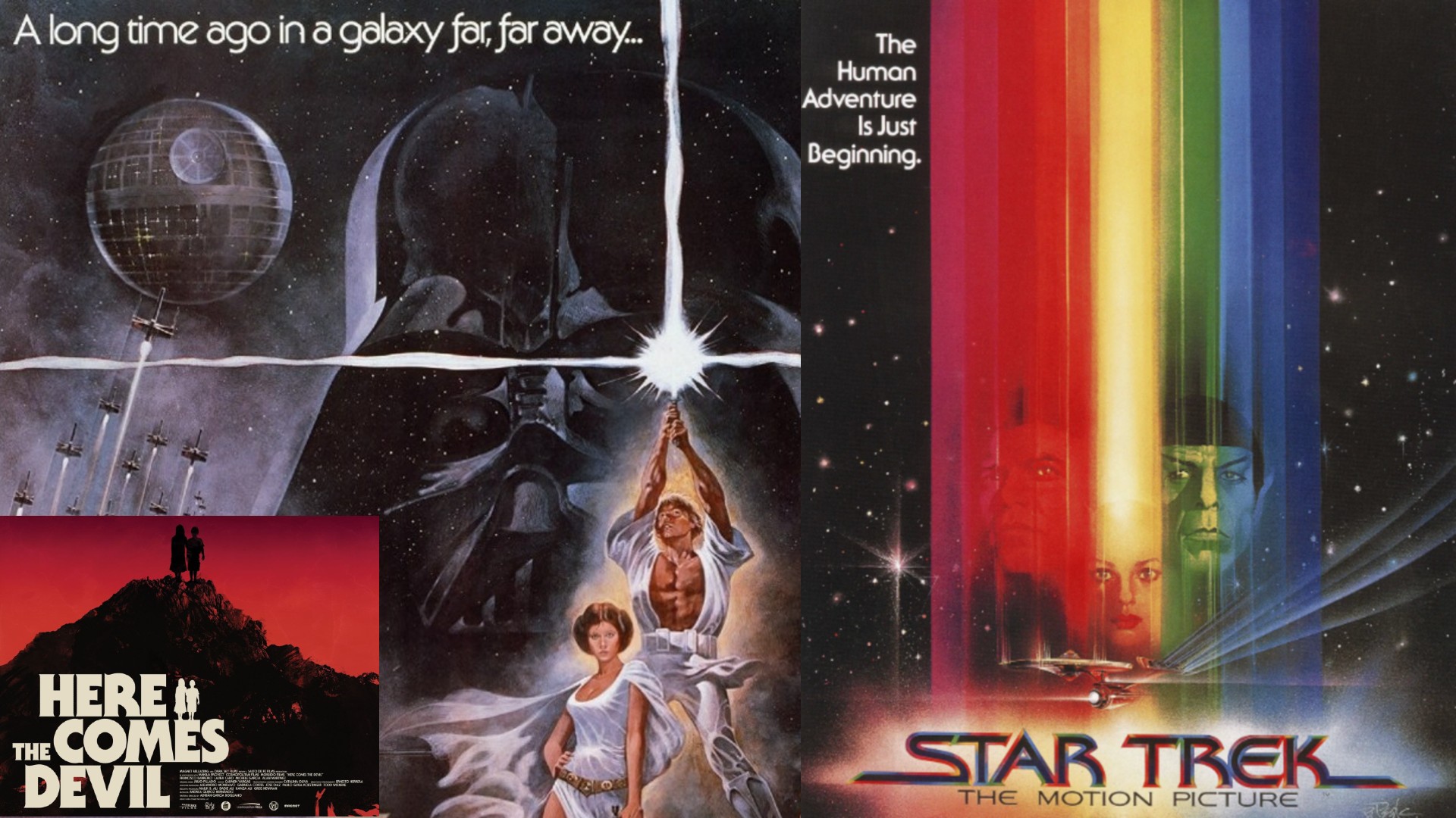
Posters for Star Wars, Star Trek and Here Comes the Devil.

The 1970s were a bold, transformative decade for design, and typography was no exception. As phototypesetting matured, designers found themselves freed from the physical constraints of metal type, enabling letters to touch, overlap, and interact in entirely new ways.

More generally, designers embraced the curves, flair, and experimental spirit of the time, giving rise to typography trends such as playful display fonts, chunky serif types, and futuristic styles.

Sign up to read this article
Read news from 100's of titles, curated specifically for you.
Already a member? Sign in here
Related Stories
Top stories on inkl right now
One subscription that gives you access to news from hundreds of sites
Already a member? Sign in here
Our Picks
Fourteen days free
Download the app
One app. One membership.
100+ trusted global sources.