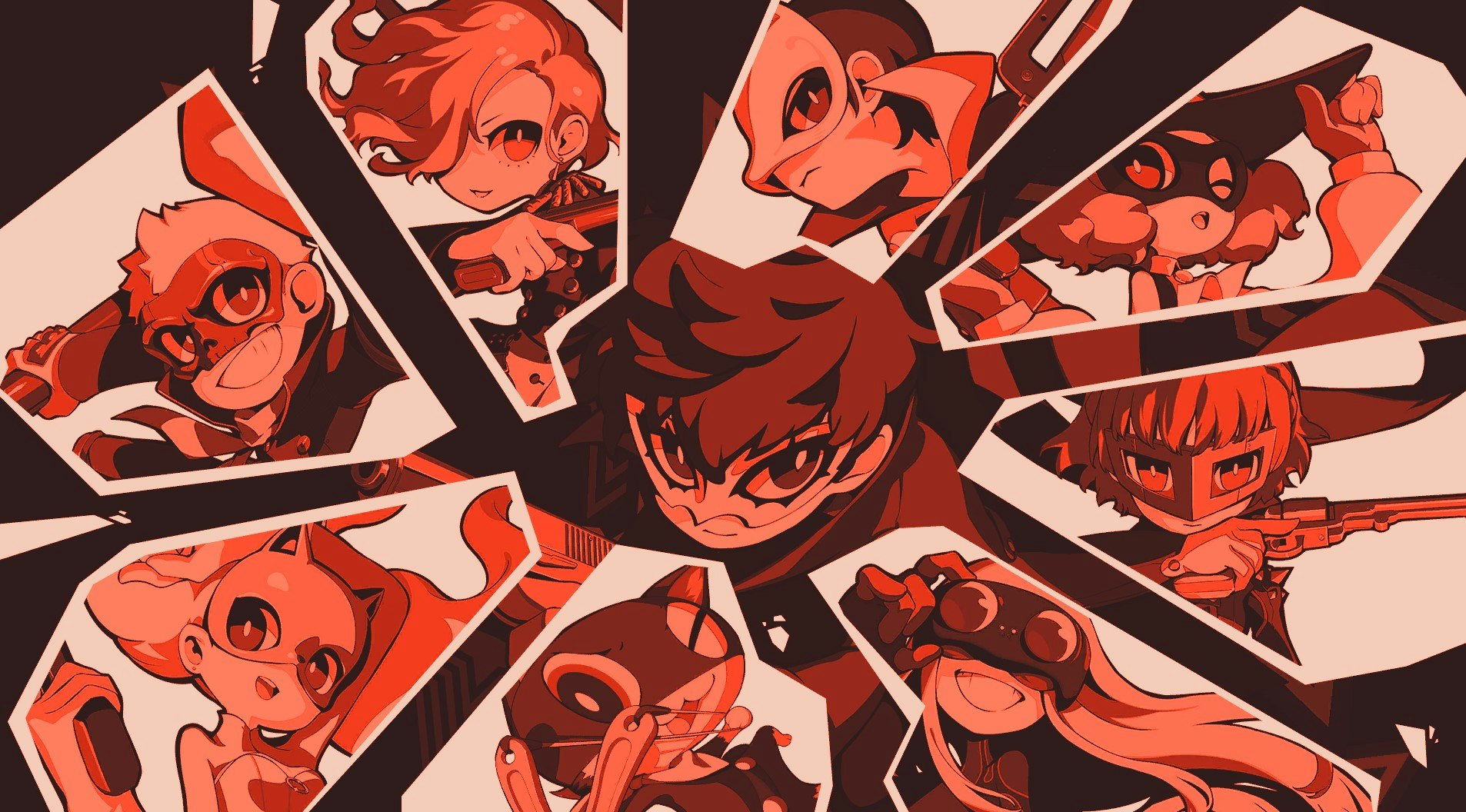
Persona 5 Tactica is Atlus’ latest attempt to milk the success of Persona 5 by giving us yet another adventure with the Phantom Thieves. I, for one, couldn’t be happier. Not just because I love these scamps but because, for a recovering typographer like myself, a new Persona 5 brings with it a new user interface.
Persona 5’s art direction was one of its biggest talking points upon its release in 2016: a blitz of red, black, and white combined with a do-it-yourself aesthetic that called to mind the brief heyday of punk. In a gaming landscape accustomed to the kind of straightforward, boring menus found in franchises like Final Fantasy, Persona 5’s use of UI for artistic and thematic expression was a marvel that is yet to be equaled — even in its own spinoff games.
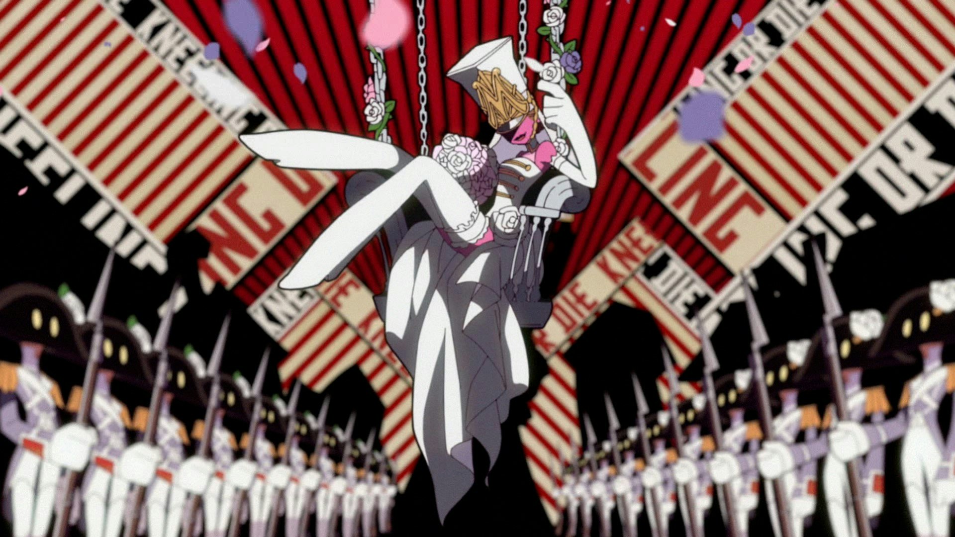
That new direction came at a cost, however. Those boring menus may be visually uninspiring but they are, for the most part, readable. The same can’t be said for Persona 5’s UI. Unfortunately, many of those issues remain in Tactica, but thanks to a shift from punk to a reliance on the early 20th-century art movement, Russian Constructivism, Tactica’s UI remains beautiful but becomes significantly more readable. Whether this is a deliberate decision or simply a side-effect of exploring a new art style, I don’t know. I reached out to Atlus on the subject but received no response. But with this newly-found accessibility, it’s a great time to talk about how things have changed and why it matters.
It’s easy to call Persona 5’s art direction “punk” thanks to its cut-out, DIY aesthetic but its real roots come from Noise. Sometimes called “Japanoise,” it’s music that sprung from punk’s roots and flourished long after punk shambled into Western irrelevance. The movement began as a wall of sound built from disparate soundscapes and genres; a rush of individual expression at odds with the collectivistic and tech-driven world of post-Todai Japan. It’s a counterculture movement that merges seamlessly with the Phantom Thieves’ rebellion against both the collectivist politics and collective consciousness of Tokyo in Persona 5.
This spirit is carried into Tactica, but transplanted into the Chibi design of Persona Q2: New Cinema Labyrinth and filtered into an unsubtle rendition of the most recognizable tropes of Constructivism. It’s an appropriate analog, not just reflecting Noise’s amalgam of styles but layering the revolutionary ideals of Constructivism over Tactica’s shifting focus from individual rebellion to all-out revolution. From an art-direction perspective, however, Tactica doesn’t quite stick the landing.
While the bold sans-serif typography, angular grids, and geometric layouts of Constructivism will be familiar to many, what may not be is what Constructivism stood for. Where Persona 5 captured the visual language of Noise within its counterculture narrative with aplomb, Constructivism was conceived as a service to a greater good which acts against, rather than integrates with, the narrative of Persona 5 Tactica. It emerged from artists’ desire to build art, as opposed to drawing from artistic impulse or academic tradition. It reflected the urban and industrial complex growing from the ashes of the First World War, to be deployed in service of a Russia pulling away from a bourgeois elite and towards a Communist utopia.
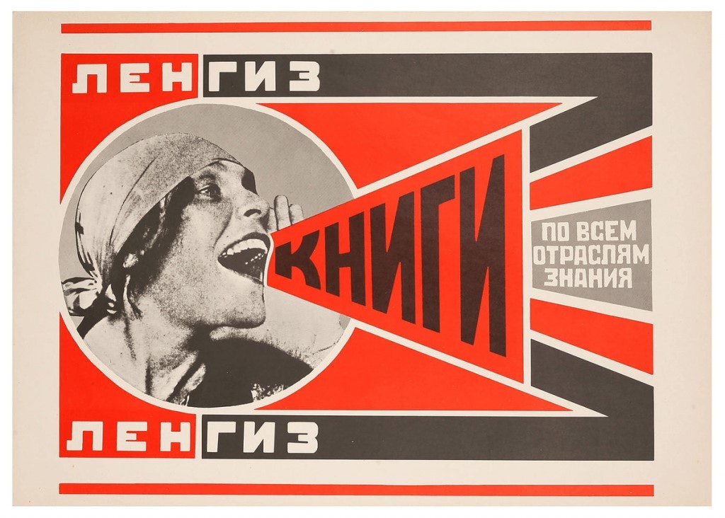
History tells us this revolution wasn’t successful and, as such, Constructivism was a short-lived movement. Yet, it remains part of our visual identity today owing to its dramatic influence on Modernism. In particular, Constructivism’s intervention at the Bauhaus, a school that consolidated the burgeoning roots of Modernism and, thanks to its international reach, pushed the idea of art as a cultural service to a global society prior to the Second World War.
Shades of this can be found in Tactica’s revolutionary themes. The game pits you against Lady Marie in a Chibi facsimile of the French Revolution and Erina even calls you “comrade.” This game is anything but subtle. But while Tactica applies Constructivism visually, its integration doesn’t reach Persona 5’s depth, failing to do much but evoke Gustav Klutsis while Lyn Inaizumi sings, “The revolution in your heart will guide the way.
In Persona 5, the Noise-inspired art direction formed part of the game’s foundation. In Tactica, Constructivism feels like little more than a reference; a decoration laid over a mismatch of revolutionary ideas that fail to congeal into a holistic whole. Compared to Persona 5’s all-encompassing visual identity and its thematic relationship to its story, Tactica’s rendition of revolution feels undefined and unsure. Constructivism becomes less a visual signpost of the game’s identity and more a shallow coat of paint to assure us that this game is, in case you didn’t notice, about revolution.

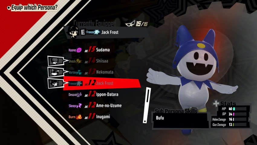
There is, however, one upshot to this stylistic change. In sticking with the most recognizable aspects of Constructivist visual identity, the UI of Persona 5 Tactica becomes more accessible than its predecessors. Lost in the cascade of breathless praise for Persona 5’s artistically remarkable UI was just how difficult to parse it was. Multiple moving axes for type and dynamic baselines that prioritized style over information, coupled with an extra bold typeface that reads poorly in the allotted space in the localization, make Persona 5’s typographic treatment a readability nightmare.
This isn’t solved in Tactica. Many menu elements remain the same. So too does Atlus appear unable to understand the importance of our optical relationship with typography and how vital tracking and kerning are for that. As a result, text is squished together and ligatures at odds with the prevailing tracking. Many menus, subtitles, and UI elements, however, have been shifted into a strong, rational sans-serif typeface that is both more readable and, thanks to the boundaries defined by Constructivist geometry, more stable.
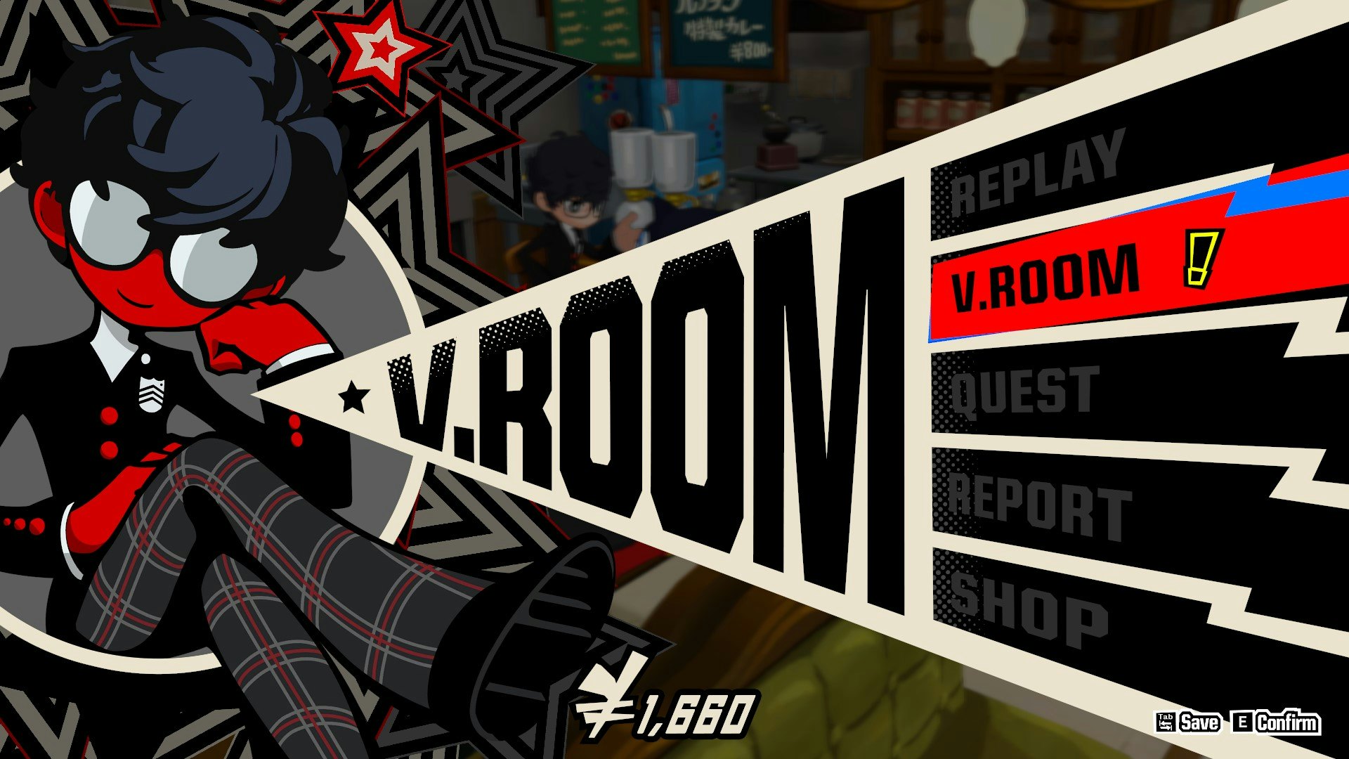
Compared to its predecessors, Persona 5 Tactica’s use of Constructivist conventions makes for a significantly more accessible UI without compromising on creative art direction. It’s a shame these elements aren’t integrated in a holistic visual and narrative identity, as with Persona 5.
But if we’re trading a bit of narrative focus in art direction for something more accessible, I’d call that a fair compromise. Despite that, however, Persona 5 Tactica does just enough to make its UI a reminder that the revolutionary ideas of punk and Noise have been around long before the Sex Pistols and Shonen Knife, and that, more importantly, rebellion doesn’t need to be inaccessible.


