If there’s one job a sports font has, it’s to make a strong impression. Some of the most famous sports logos are defined by singular words and simple symbols, meaning that the text and its font can be defining of an entire brand. We’ve put together a selection of the best and snappiest sports fonts perfect for logos, jerseys, posters and more. Some of these fonts have even made up the best sports logos of all time.Sports fonts must come equipped with the ability to deliver the correct tone and catch eyes while matching the rest of the branding, and our full selection embodies these bold and essential qualities. We’ve also selected our fonts based on versatility, to ensure that they can be used in the widest variety of assets for your sports design. Many of the fonts we’ve chosen are free to download while some are paid or available through the Adobe suite (we have marked them as free, but that's only if you already have an Adobe subscription). For more free typefaces, we’ve also compiled a list of the best free fonts as well as the best fonts for posters.
The best sports fonts
01. Tourney
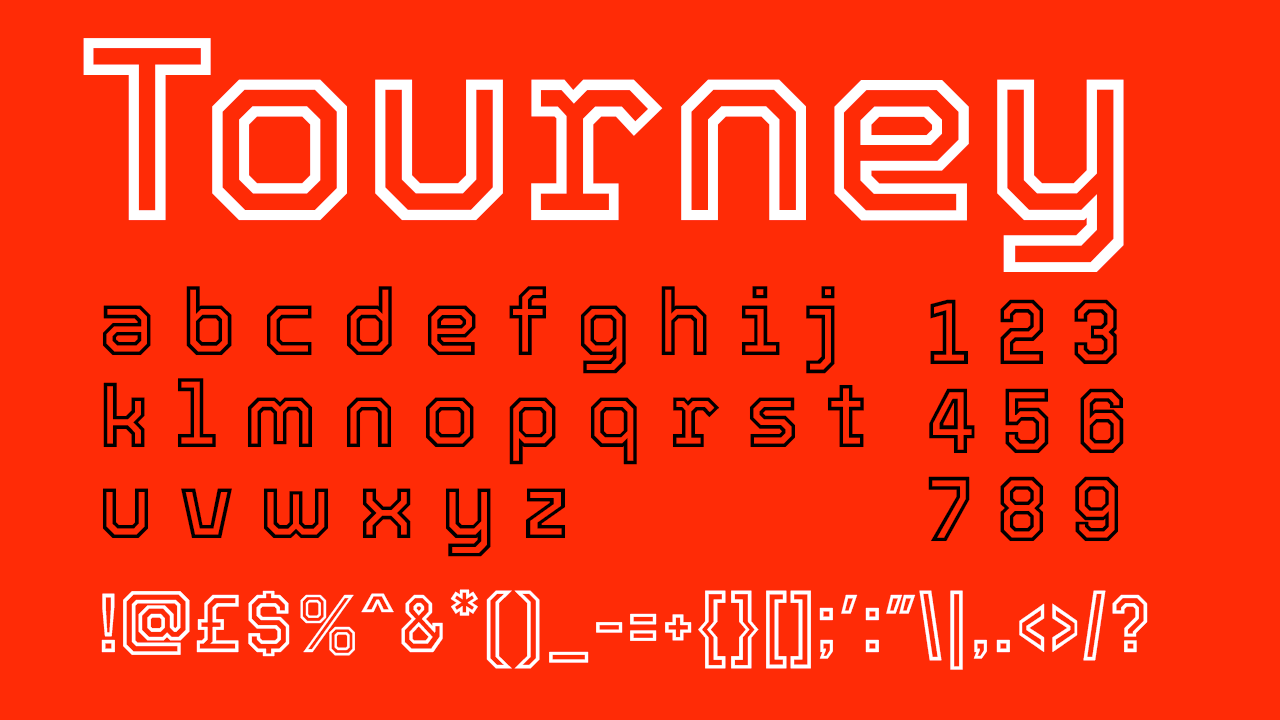
Available in several different weights, Tourney would work in a science fiction context as well as a varsity font for team clothing. Tourney is free to download, and its malleability makes it an ideal typeface to add to a designer’s collection, to use on a whole range of projects.
02. ITC Avant Garde Gothic
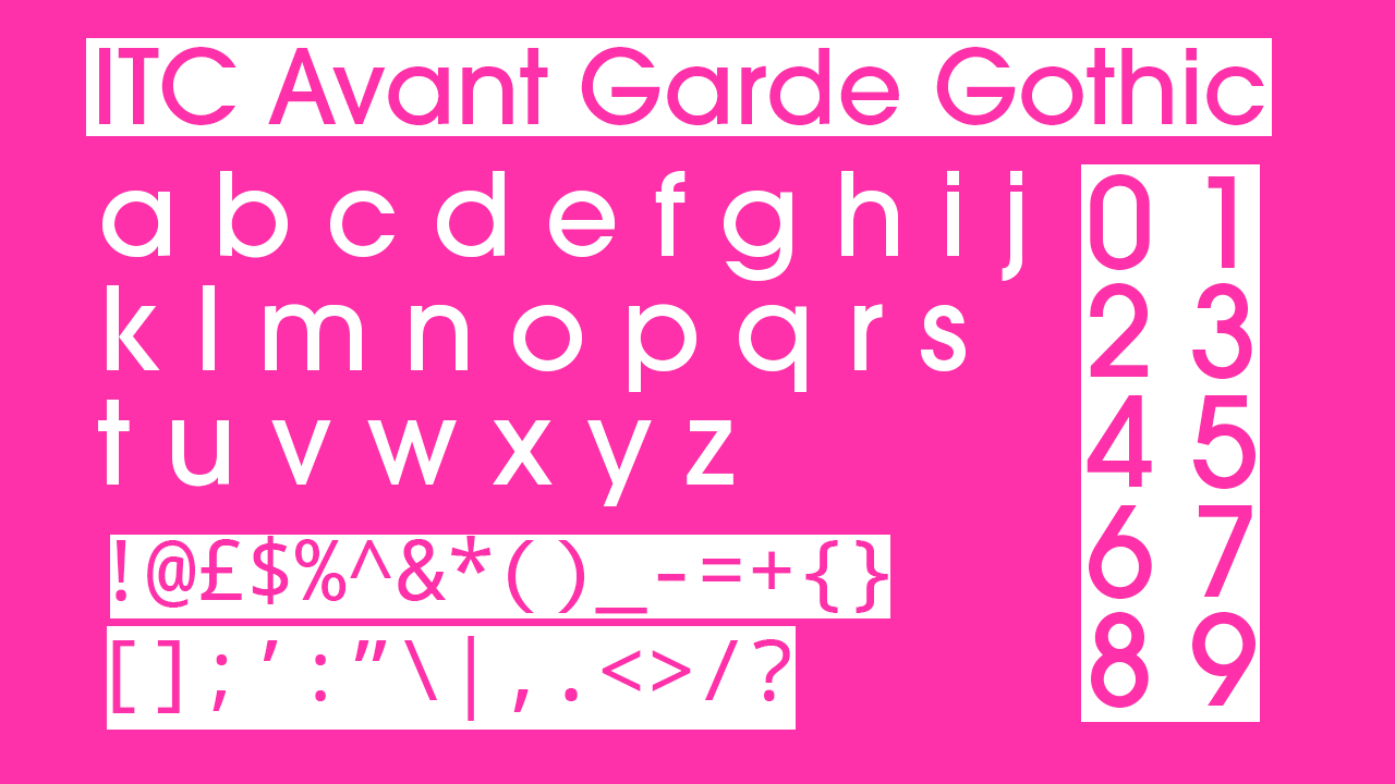
The Swiss origins of ITC Avant Garde Gothic has made it a popularly used font in many iconic logos over the years – and its clean, geometric shapes has made it the baseline of Adidas’s logo – one of the most iconic pieces of logo design in the sports industry. This typeface is a classic for logo design professionals, given its ability to be stretched, skewed and adjusted endlessly to create something that allows the text to shine and become uniquely recognisable.
03. Futura
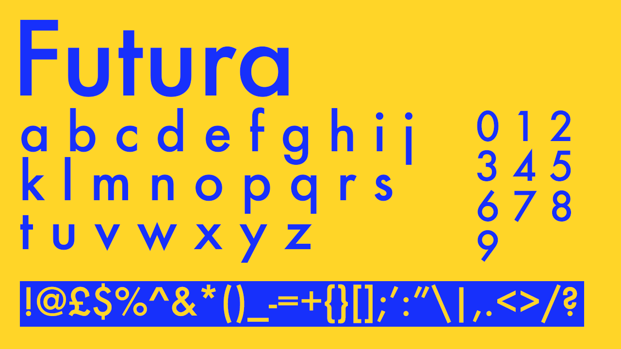
Futura’s wide use extends across all industries – even space travel – and in the sports world it's known for Nike’s famous ‘swoosh’ logo. Futura’s lettering are often adjusted to match wide range of desires successfully, but bear in mind that it is a bolder and more condensed font, making it especially ideal for a striking design.
04. VT Redzone Classic
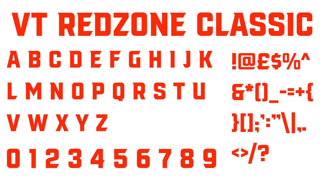
VT Redzone Classic is a decorative font flourished with a few extra serifs that help set the tone of action and dynamism that a classic sports font needs. This typeface is especially effective in italic, which adds an additional tone of urgency for signs during games and promotion of sports events.
05. University
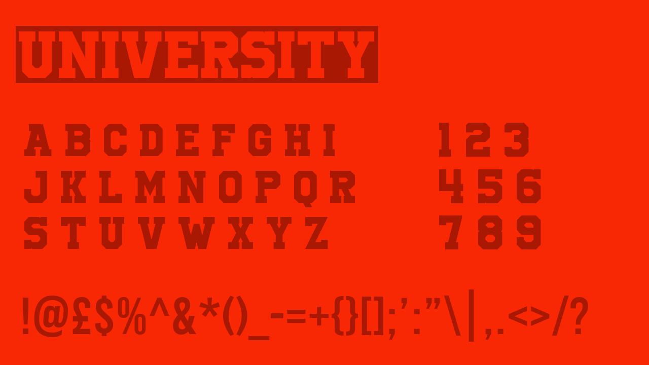
University’s bold and direct lettering makes it a typeface ideal for the task of sports clothing design. University might not work so well outside of a sports context, so its specificity should be embraced. It would also be excellent for use on posters for sports events.
06. Sporty Pro
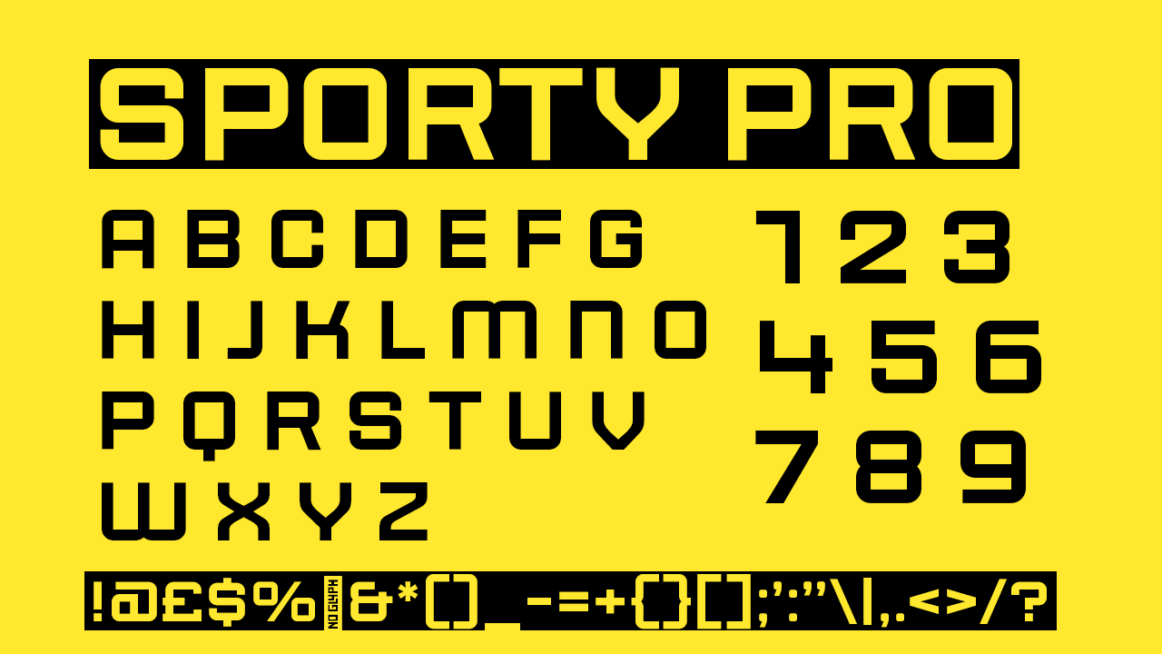
The font studio, Sudtipos, that published Sporty Pro says that the font was designed with sports in mind, with the intention for flexible usability across all sorts of projects. Sudtipos describe Sporty Pro as having a "geometric and modular structure", which is why this typeface would be most ideal for sports-related marketing and events, given its definitive structure and bold weight designed mostly for large lettering.
07. Campus MN
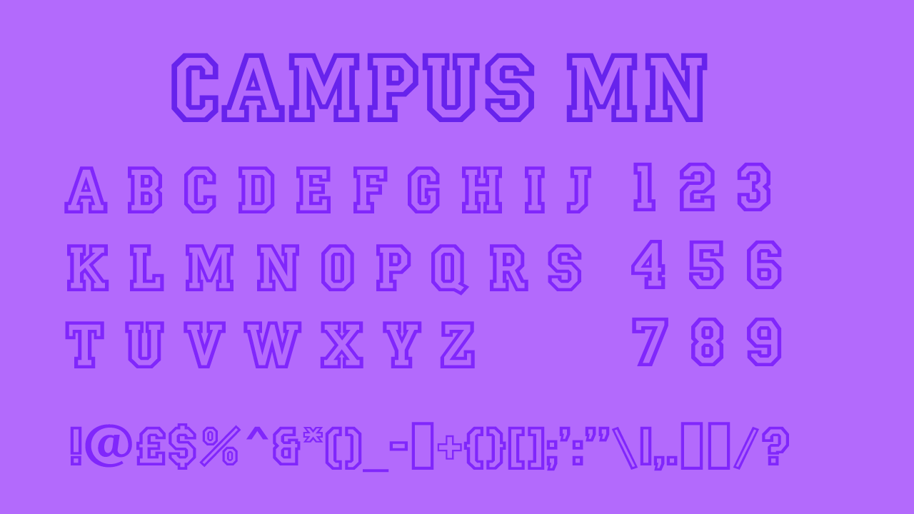
Campus MN is more reminiscent of American school sports than professional sports, so could be a fun touch in events branding for athletes whose origins are from school teams and competitions. Its classic outlines mean that the transparent centre of its letters keep the focal point in the background design.
08. Prohibition
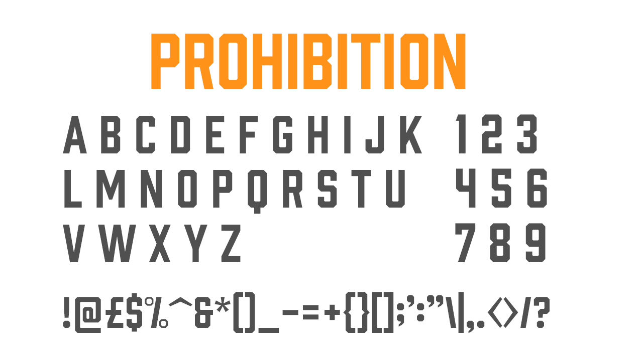
Prohibition’s solid and block-like letters make it ideal for impactful design where clarity and boldness are a necessity, such as for sports promotional assets. Its lines are strictly rectangular rather than rounded, and its utilitarian design emphasises determination and strength – ideal for the branding and marketing of sports games.
09. Espiritu
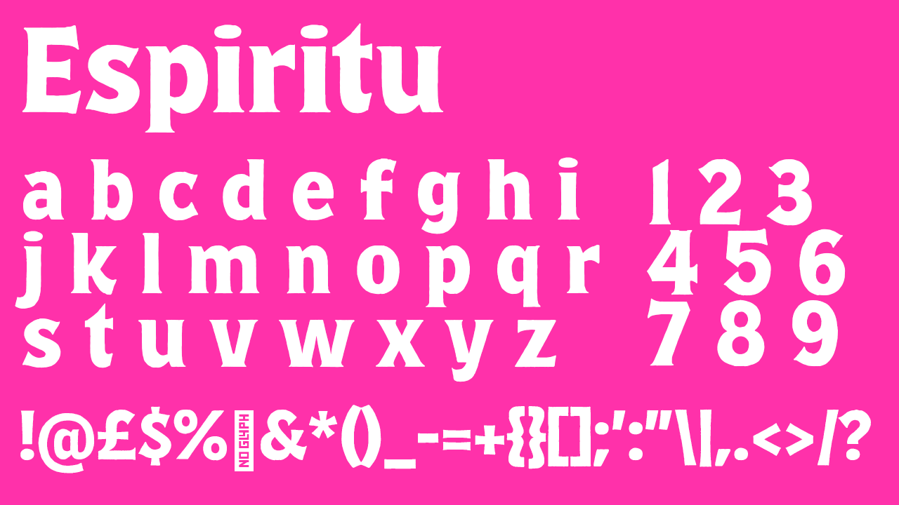
Sudtipos, the font studio behind Espiritu’s making, are responsible for a few fonts on this list. Espiritu is made up of clear and bold lettering with some exciting serifs involved that would work perfectly in highlighting the fun of a sports game. It’s also a step outside of the norm of traditional sports fonts.
10. Monte Stella
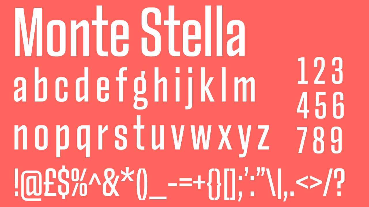
The thick and sturdy strokes of Monte Stella make it recognisable and legible from a distance, ideal for branding on sports clothing such as jerseys and T-shirts – where these aspects of design are essential. Monte Stella would also create striking signs for a sports game, and can be used across a wide variety of mediums; its condensed and modern design create a sophisticated final product.
11. Heisman
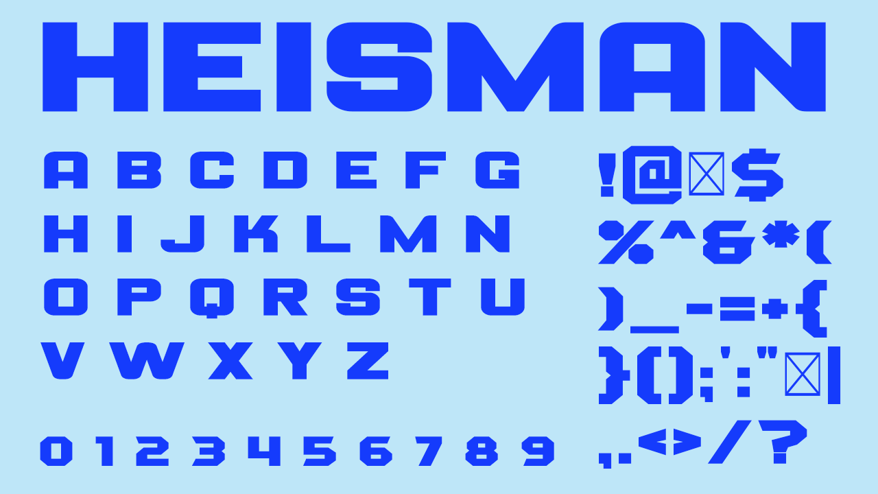
This font has gained intense popularity with school and university sports, possibly due to its naming after the Heisman Trophy. Its sans serif nature makes it easily legible and therefore practical for clothing, while its slight decorative and bold nature makes it fitting for large signage.
12. Condor

Traditionally an art deco font, Condor actually transforms into a dynamic typeface ideal for sports branding and promotional material, available to download from Adobe Fonts. It comes equipped in a large variety of weights and each one creates a uniquely new look; its bold italic option is what’s displayed on the above graphic and we think would work best for sports.
13. Empera
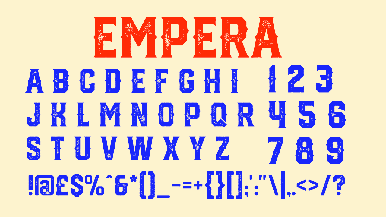
Empera’s robust quality doesn’t leave much room for editing, so it’s perfect for a design on a deadline where a ‘readymade’ typeface is needed. The whole font family conveys strength, but it does come with some more refined options too if you’re looking for something more modern and clean-cut.
For more great fonts, see our best accessible fonts, best fantasy fonts and best typewriter fonts.


