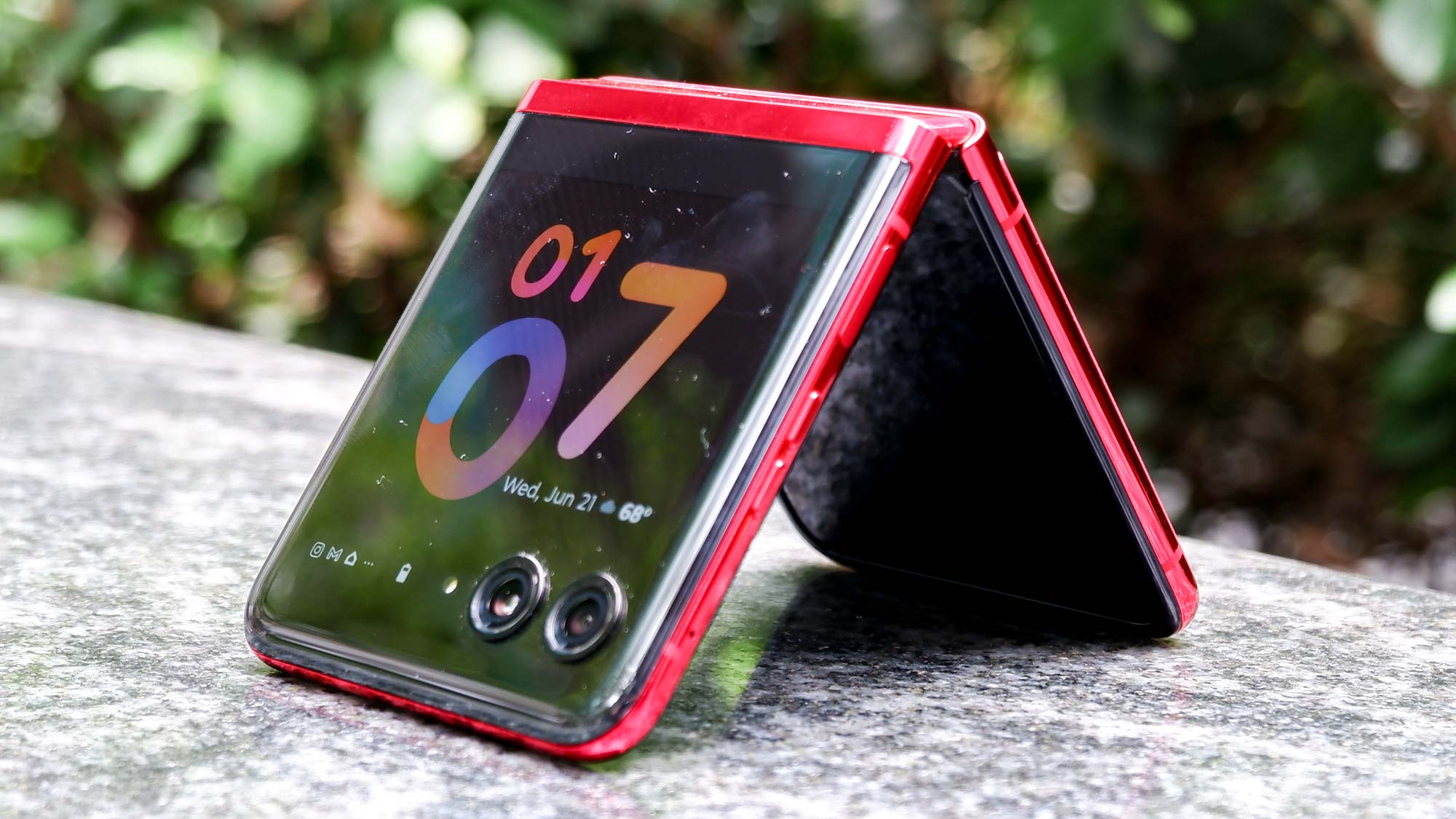
A lot of phones came out in 2023, starting with the Samsung Galaxy S23 all the way through to the iPhone 15 and Google Pixel 8. While those phones all have plenty to offer, the best one I tried wasn’t one of the usual annual releases. It was the foldable Motorola Razr+.
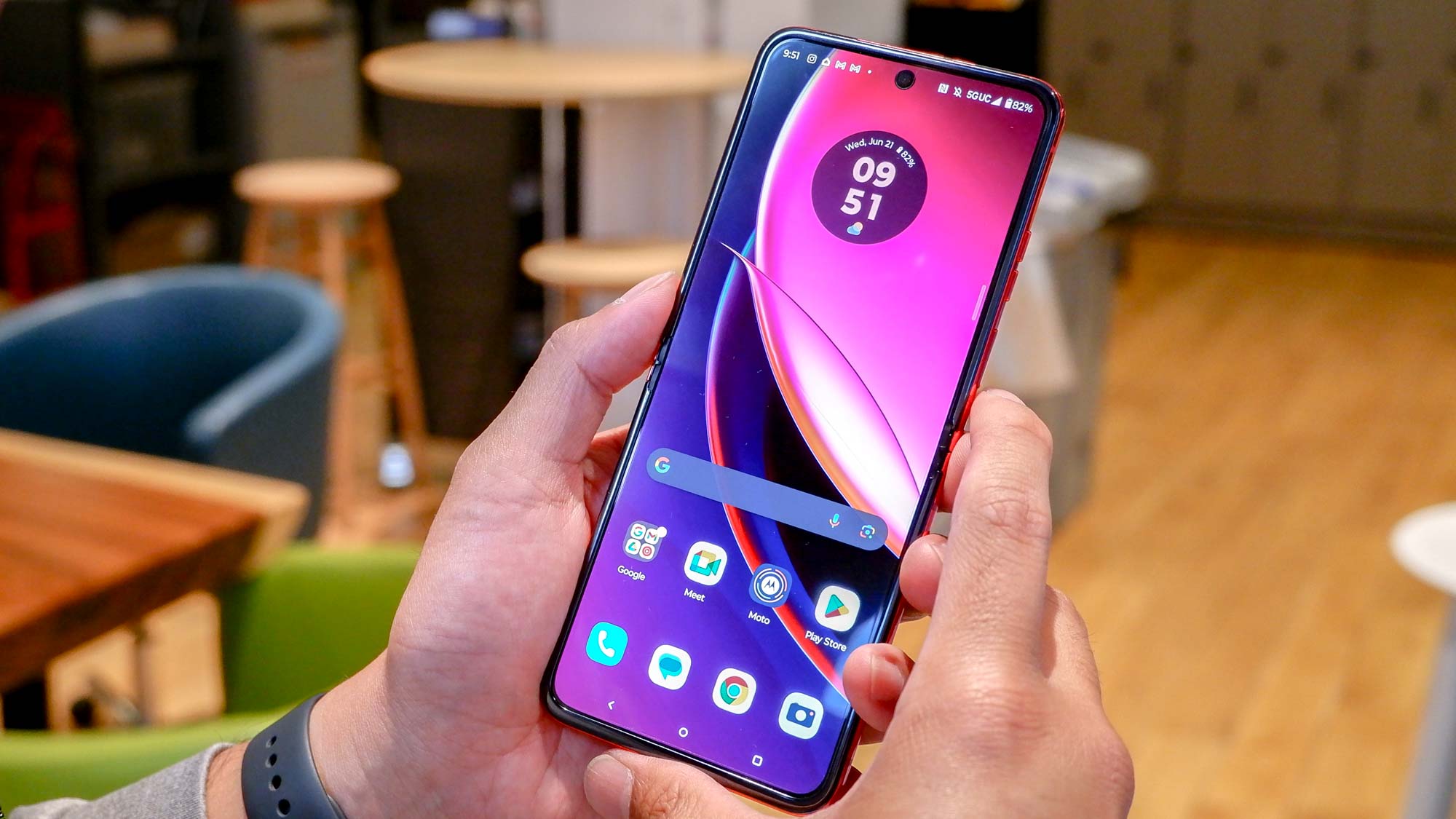
But it’s not just that the Razr+’s 3.6-inch cover display is the largest of any foldable flip phone. Samsung Galaxy Z Flip 5’s is only 0.2 inches smaller, and due to its design has very similar amounts of usable screen space. No, it’s actually down to what Motorola actually lets you do with the outer display that makes it so appealing to me — and made it my favorite phone of the year.
Android apps on the outside, without restriction
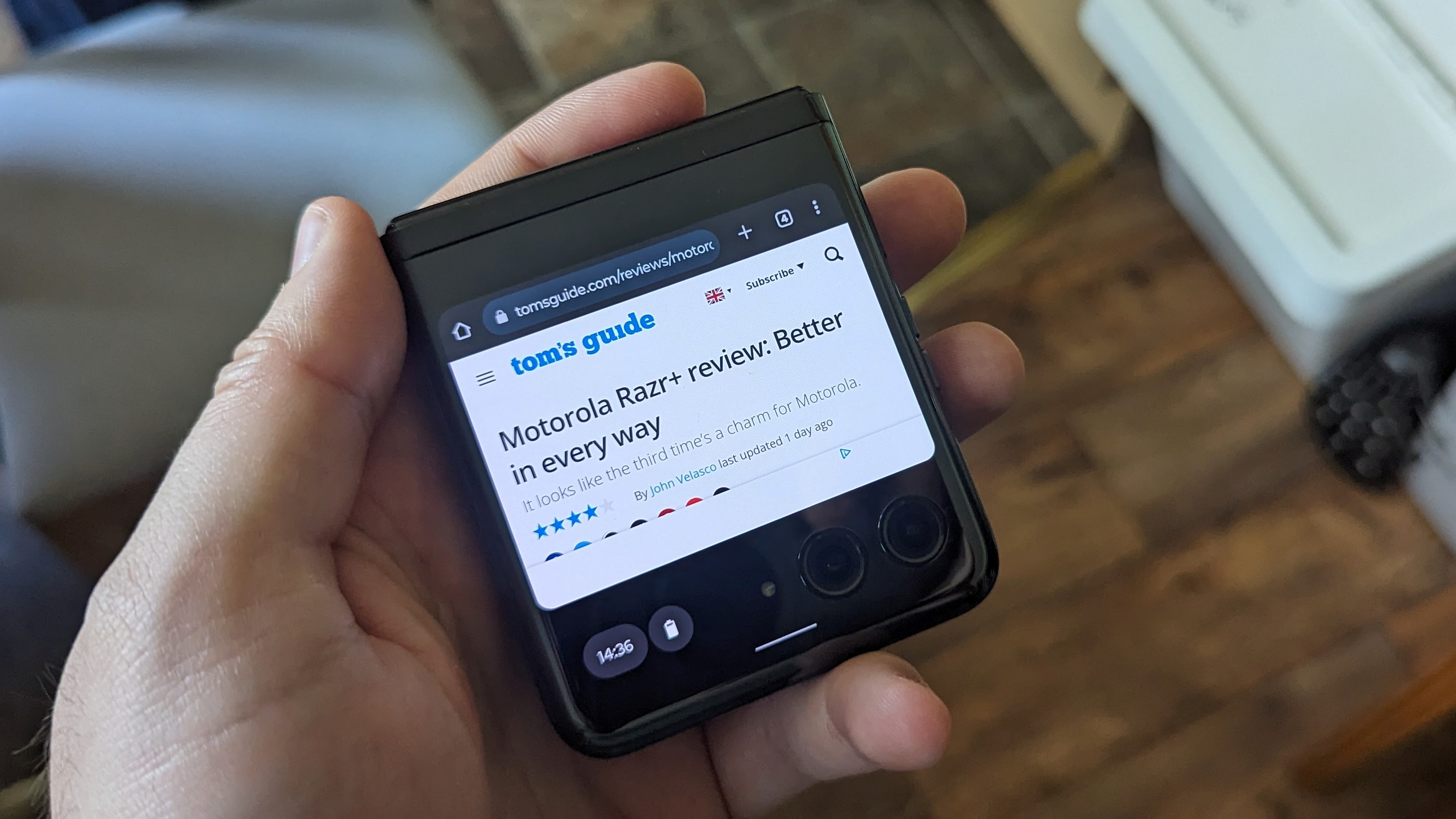
The main selling point of the Motorola Razr+, compared to other foldable flip phones, is how versatile the exterior display actually is. The only real competition it has is Samsung’s Galaxy Z Flip 5, but that phone’s exterior display is limited to a handful of officially sanctioned widgets.
There are ways to get around this restriction, thanks to apps like Good Lock. But that’s a workaround that really shouldn’t have been needed in the first place. The Razr+ is far less restrictive, and while a lot of apps need cover display privileges turned on in the settings, it’s still a feature hard-wired into the phone itself.
I found in my time with the Razr+ that every Android app I wanted to use on the cover display could be used on the cover display in some shape or form. And thanks to the fact Android is a pretty versatile piece of software designed for countless phones of varying sizes, A lot of apps were able to scale to the smaller display incredibly well.
Reddit, for instance, felt almost the same as using it on a larger 6-inch display - just with a smaller picture. As did a lot of my smart home apps, though a bunch of them did see parts of the screen cropped off the edge of the screen.
But naturally there were some apps that didn’t adapt quite so well. Google Maps looked like what can best be described as a hot mess — despite the fact Motorola had highlighted it as one of the apps that could benefit from a larger cover display.
It can’t replace the interior display for everything — but that’s ok
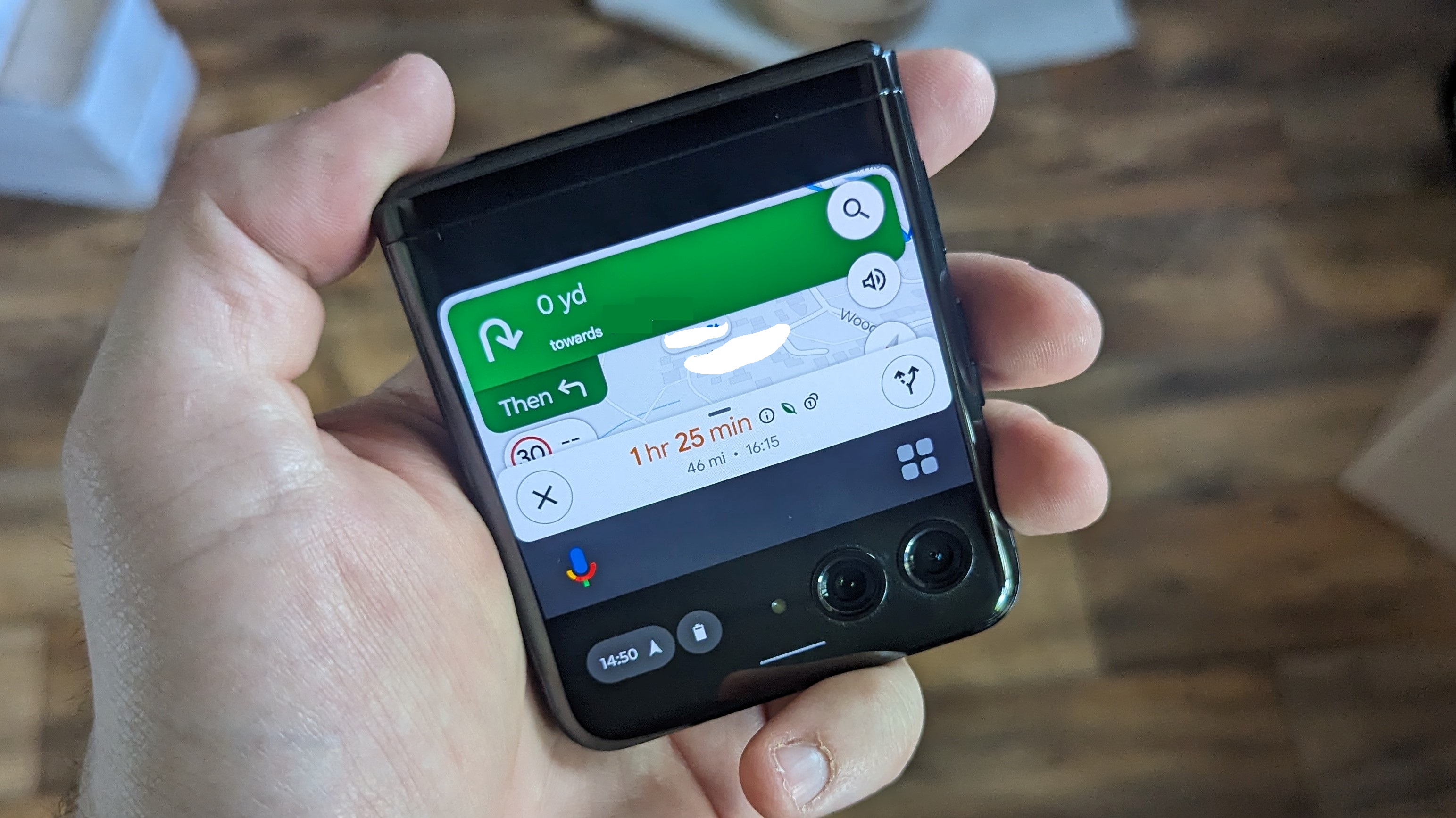
The Razr+’s exterior display can do a lot, but there are things that just don’t work compared to the larger, flexible display on the interior. But that’s ok, because it’s not built to be a full-time alternative to the 6.7-inch main screen.
Instead, a flip phone’s cover display is more of a supplemental feature that gives you a way to do stuff without unfolding the phone. For all those times where you want to do something quickly, or without the hassle of unfolding the main screen - rather than any practical concerns.
The folded version of the phone feels a lot more comfortable as well, since it sits nice and snuggly in the palm of my hand. Typing isn’t always easy, especially since the cover display doesn’t support any third party keyboards, but it’s perfect for quickly checking messages, making phone calls, or any number of other small actions that don’t need that main display.
Admittedly, it would be nice to be able to do a little bit more on the Razr+’s outer display. The fact that you can’t access the settings without unflipping the phone feels a little odd. Those are the kind of things that you’d normally only want to access for a few minutes at a time, and even then it is almost always text-based — so size doesn’t matter all that much.
A unbelievably good secondary display
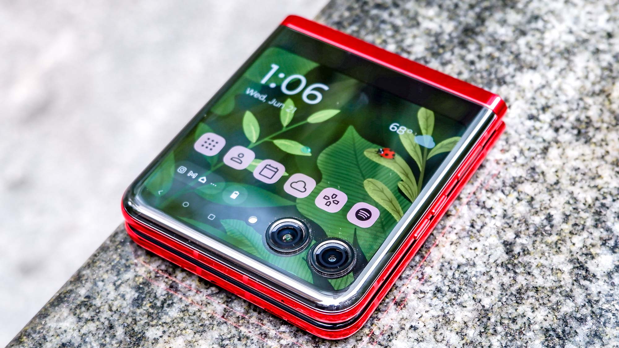
The Razr+ doesn’t just have a productive cover display, it’s also got one that’s significantly more impressive than it has any right to be. Because it would be easy for a phone maker to ignore the outer display to spend those resources elsewhere — and users probably wouldn’t mind too much.
The Moto Razr+’s cover display isn’t as good as its interior, in terms of raw hardware, but that’s only because the main display is so ridiculously over-specced.165Hz and FHD+ resolution almost feels like overkill for a non-gaming phone, and had Motorola opted for QHD+ instead it probably would have been.
While the cover display’s 144Hz and near FHD isn’t quite as good, it’s still significantly better than what a lot of other phones have to offer. This is the secondary display that has a refresh rate that’s nearly two and a half times faster than the iPhone 15 — which only offers 60Hz.
So on top of everything else, the experience of using the Moto Razr+’s cover display is really quite remarkable.
Bottom line
There have been a lot of great phones this year. Some of them came with some rather bizarre features (looking at you Pixel 8 Pro), but some of them really knocked it out of the park in a bunch of key ways. The Motorola Razr+ is definitely one of the latter, and it’s deserving of its place on our list of the best foldable phones for a lot of reasons.
It’s got a solid battery life, speedy charging, a beautiful design, and pretty competent photography capabilities — so long as you don’t go shooting in low light. But the displays are absolutely the standout feature, and the cover display most of all. It’s not perfect, and I’d like to see it improve with the next generation of Razr foldables, but I can’t help but enjoy using it every single time I hold the Razr+ in my hands.


