A font choice can help define a movie's identity, playing an important part in an audience’s first impression of it. Fonts appear in a movies' titles, posters, marketing materials and all throughout a film. All of this typography establishes a film’s aesthetic, and coherence between the font chosen and the film’s message is essential.
When this is executed well, it can create timeless cinema, and that’s why we’ve compiled a list of nine of the best movie fonts that have formed the basis of the most famous and well-crafted films ever made. Some of the fonts are free to download, but for more don’t forget to check out our list of free fonts. And if you’re designing for the web, here are some great free web fonts, picked out by our font experts at Creative Bloq.
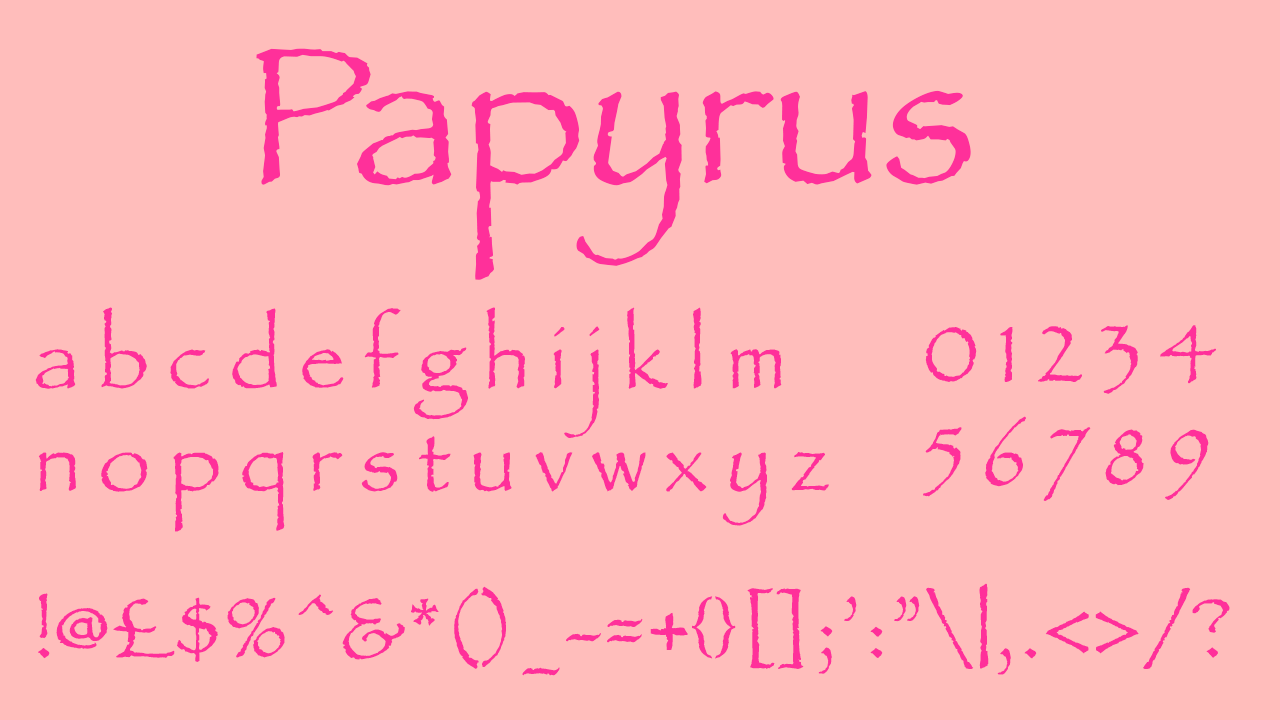
01. Papyrus
• By Chris Costello
• Download from My Fonts
• Cost: From $40.99
Although Papyrus is a divisive font, its jolty letters became iconic with its use in the Avatar title graphic. Papyrus has never gained much positive popularity, but when styled and designed individually it can provide everything you need and become unrecognisable. People will be shocked when you tell them your expert typography is actually Papyrus! This font should be used sparingly and only in the right setting, and you should be prepared to adjust it to make it work – but if its groundworks have headlined a world-famous film, it clearly has potential.
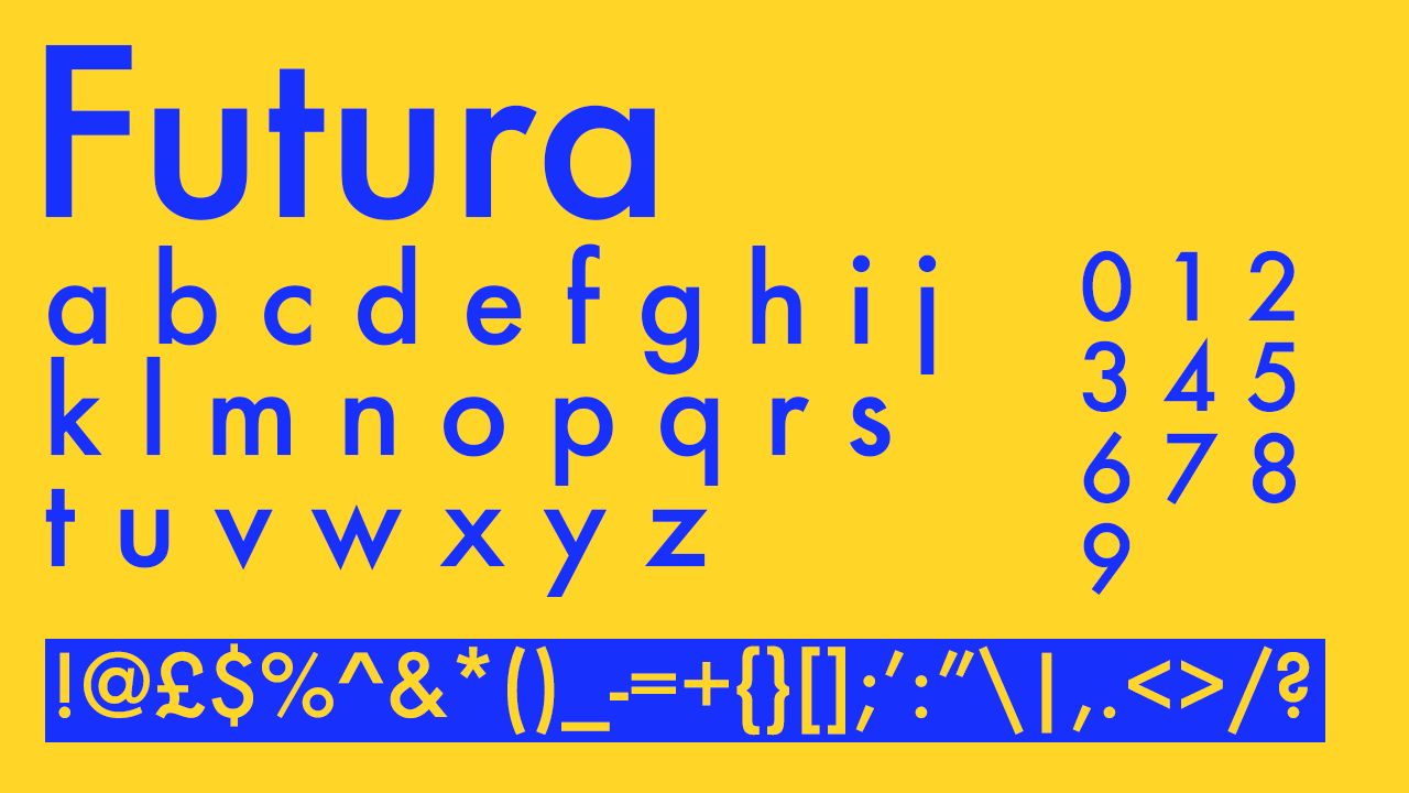
02. Futura
• By Paul Renner (Paratype)
• Download from Adobe Fonts
• Cost: Free with Adobe subscription
It was inevitable that such a vastly used font would make it to this list, with Paul Renner’s typeface dominating typography all over the world today but especially in the ‘60s. You can’t move for it in genre-defining sci-fi films and space films, with its use on the posters of 2001: A Space Odyssey, inside the space ships in Interstellar, and all over the newspaper props Bladerunner: The Final Cut. In contrasting genres, it’s also been used all over Wes Anderson’s vibrant films, all of which are full of typography-based production design. Type is actually widely relied on to make Anderson’s dream-like worlds convincing, and Futura is used as his house font in all of his films other than Moonrise Kingdom and The Grand Budapest Hotel.
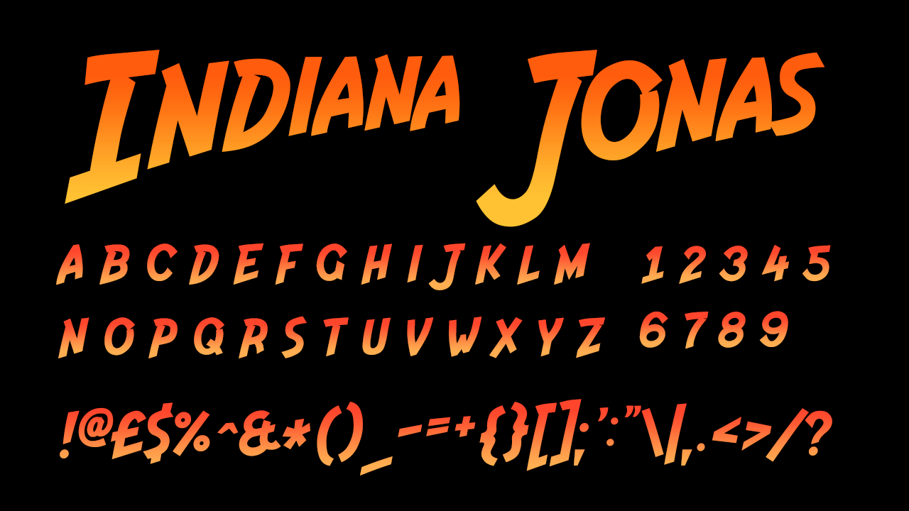
03. Indiana Jonas
• By Vit Condak
• Download from DaFont
• Cost: Free
The typography of the title graphic from the Indiana Jones film is undoubtedly iconic. Its design was inspired by the styles of old-fashioned adventure posters and also holds connotations of comic strips, fitting for the film’s tone. Although its inspirations stemmed from print, the typography was created for the film’s on-screen title graphic, creating a noticeable homage to its inspirations at the time. These inspirations combined with the wacky orange-yellow gradient make it an iconic moment in on-screen film typography. Indiana Jonas is the most accurate available reworking of the font, available to download from DaFont.
04. News Gothic Bold
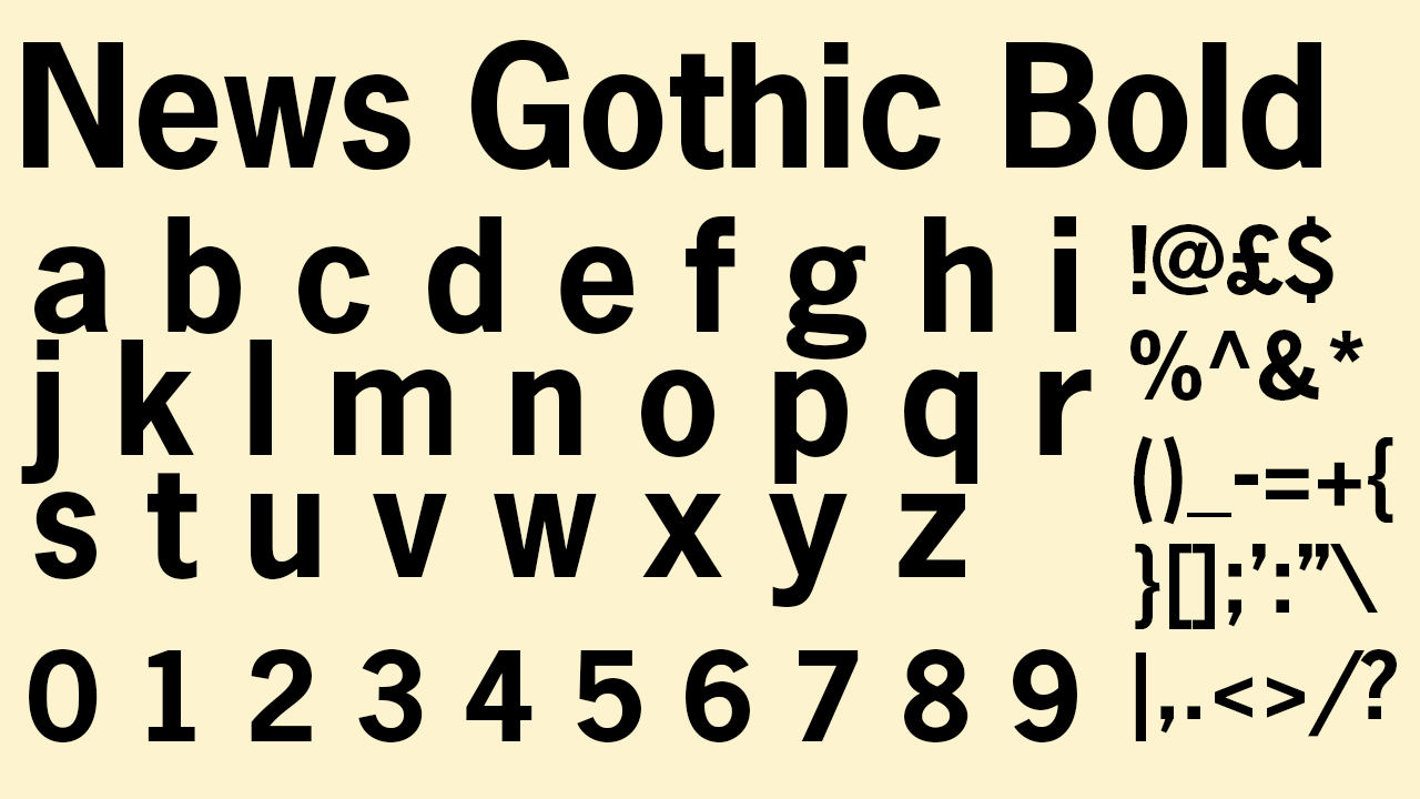
• By Morris Fuller Benton
• Download from Adobe Fonts
• Cost: Free with Adobe subscription
News Gothic Bold is the font behind the title of Psycho’s famous opening graphic, a sans serif choice edited to appear glitchy despite its modern typeface. The graphic was jarring for audiences at the time, when serif fonts were used more commonly in film titles, and the jolty editing created a great sense of tension, ready for the film’s oncoming plot.
05. Gill Sans Nova
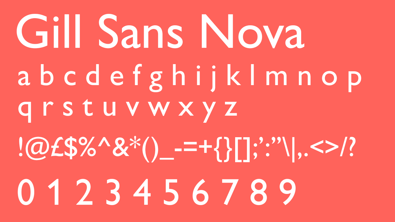
• By Monotype
• Download from Adobe Fonts
• Cost: Free with Adobe subscription
Although Futura was Kubrick’s favourite font to employ in all his films, it was only used on the posters of 2001: A Space Odyssey, where Gill Sans was used for the film’s title graphic. A popular grotesque font which has collected a large portfolio of practical, professional usage over the years such as in the BBC logo, Penguin’s iconic ‘30s book design, and several British train companies, Gill Sans is the best of the best, and could not have a more impressive track record. It’s not just sci-fi films and big companies that have snapped up this font though; its flexibility has even made it suitable for the Toy Story logo too. Gill Sans Nova is Monotype’s most modern version of the font, and is available on Adobe Fonts.
06. ITC Serif Gothic
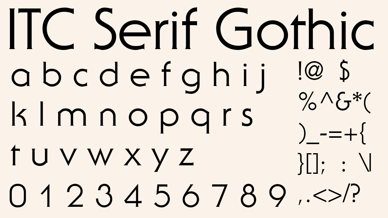
• By Antonio DiSpigna, Herb Lubalin, ITC
• Download from MyFonts
Cost: From $29.99
For those in search of the font used in the world-famous Star Wars typography, ITC Serif Gothic is responsible for the logo of Star Wars. The extra serifs that make the logo so recognisable were hand-modified, but the bones of the typography come from ITC Serif Gothic. Its flexible nature also placed it in the credits of Star Wars and even in Star Trek as well, making it the ideal fit for all areas of sci-fi films.
07. Neue Aachen Pro Bold
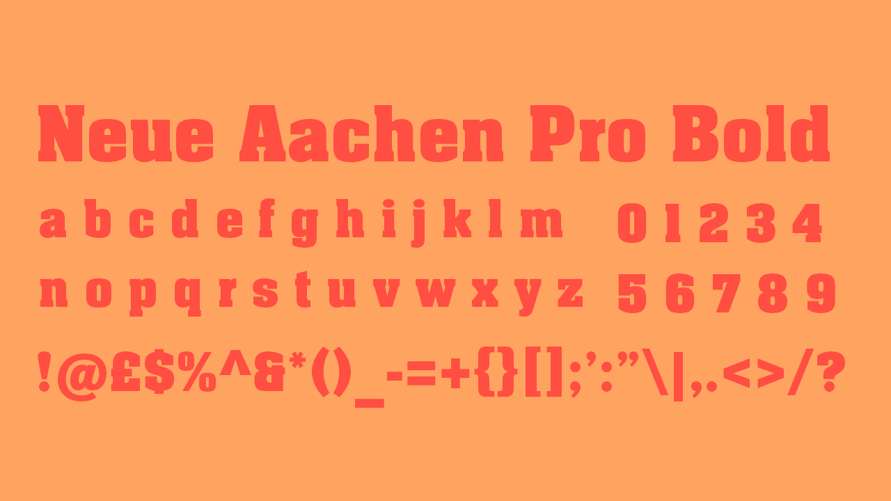
• By Colin Brignall, Monotype
• Download from Adobe Fonts
• Cost: Free with Adobe subscription
Aachen Bold was the font created by Colin Brignall for the title graphic of Pulp Fiction. Its retro serifs and blocky structure complemented the matching retro colours of muted orange and red that helped signify the production style and inspirations of the film. Neue Aachen Pro Bold is a reworking of the same font created by Monotype and available on Adobe Fonts, making it an excellently crafted professional equivalent, and available for all your creative projects.
08. Helvetica
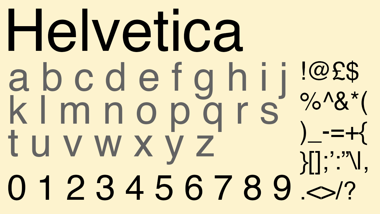
• By Max Meidinger, Eduard Houffmann, Linotype (now Monotype)
• Download from MyFonts
• Cost: $39
One of the most iconic romance films and Christmas films, Love Actually is a film where the use of Helvetica is significant. Its title graphic and posters all used Helvetica Black, and other variations of the Helvetica family are seen in graphics throughout the whole film. Love Actually is one of the most iconic romance films of the 2000s, and it heavily lead the widespread Helvetica-based designs that all romantic comedies used at the time - when the genre was especially rampant and we couldn’t move for Hugh Grant and Julia Roberts. This typography style that relied on the use of Helvetica defined the style of so many iconic romantic comedies of the early 2000s that we still watch regularly today, and that earns it a satisfying, well-earned place on this list.
09. Archer
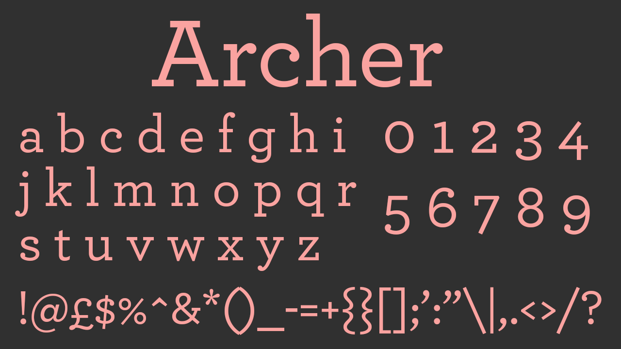
• By Tobias Frere-Jones, Jonathon Hoefler, Hoefler and Co
• Dowload from MyFonts
• Cost: From $23.81
The Grand Budapest Hotel was one of Wes Anderson’s first films that didn’t use Futura as its primary font, and although Futura did still crop up a few times in the film, Archer is the font that dominated. Used in the title, poster, the hotel’s signage and the credits, the delicate serifs and tall letters of Archer blended into Anderson’s mid-European, aged-looking world perfectly. Anderson’s unique and cult-favourite production design makes Archer’s use in The Grand Budapest Hotel impossible not to mention, especially as this is possibly one of his most well-designed films.
