We're halfway through the 2020s, and so far it's been a fantastic decade for logos. In contrast with the bland minimalism of the 2010s, the latest logo trends have driven a surge in bold, innovative designs.
In this article, we've gathered together the 10 best to date, and gathered expert opinion to explain just why they work so well. These logos are more than just visual identities – they encapsulate cultural shifts, technological progress and the ethos of their respective brands.
Listed in chronological order, these designs all demonstrate how great logos can reinvent a brand’s narrative and stand out in a crowded digital landscape. If they inspire you to craft your own, check out our guide to how to design a logo and for more in this series, see our logos of the decade pieces.
01. One Football by DesignStudio (2020)
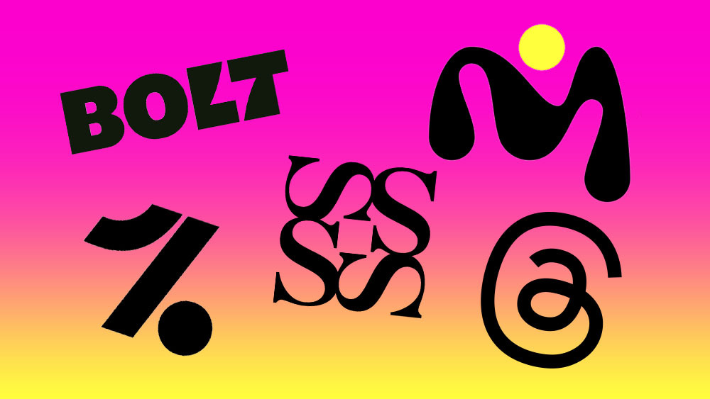
Based in Berlin, OneFootball is a digital platform dedicated to football fans around the globe. And this striking logo by DesignStudio does a brilliant job of distilling the energy and passion of the sport into a single mark. Its geometric simplicity is paired with a vibrant yellow palette, ensuring it feels both modern and energetic, and reflecting the platform’s mission to 'hype the game'.
For David Gibson, design director at DEPT, it's the best logo of the decade so far. "It’s a logo that speaks for itself: both a '1' and a pair of legs kicking a ball," he points out. "One of those ‘I wish I’d thought of that’ ideas. Crafted from just three simple shapes, it’s elegant, dynamic, and full of motion, perfectly capturing the joy of football, from playing in the street to the Premier League.
"I also love it because it evokes classic graphic design, like Otl Aicher's Olympic work," he adds. "As a football fan, it’s been exciting to see more football brands embrace design."
02. M.Ad School of Ideas by COLLINS (2020)
Formerly known as Miami Ad School, M.AD School of Ideas is a global network of schools that teaches students how to succeed in the creative industry. COLLINS’ rebrand – which won a Brand Impact Award in 2021 – embraces the school’s legacy while preparing it for the future of creative education. Crucially, this logo embodies creativity in flux; the ever-changing 'M-dot' symbolising the evolving nature of ideas, while the steadfast dot anchors it in purpose.
"I think what is so successful about this is its responsiveness," says Cat How, founder of How&How. "The logo flexes, arches, moves and embodies the spirit of what it represents: creativity and music. But this also helps it to live in our digital age, flexing to fit screen sizes now is something all brands must do. And we love the lairy – but gorgeous and expressive – pink palette too."
03. San Francisco Symphony (2021)
Another 2021 Brand Impact Award winner for COLLINS, and win of the coveted Best of Show 2021, this responsive identity for the San Francisco Symphony breathes life into an age-old art form. Cleverly, the minimalist black-and-white core palette contrasts with Bay Area-inspired accents, uniting heritage and innovation in an evocative, transformative design.
"Designing this dynamic logo built around a custom variable font allows each letter to shift and transform in response to sound and music," says Alex Andlaw, founder and creative director at FORM Brands Studio. "It’s a simple yet clever idea, with a fluidity that mirrors the symphony’s vibrancy. And the accompanying motion work is truly inspiring stuff."
04. Burger King by Jones Knowles Ritchie (2021)
By 2021, Burger King's branding was looking dated, so this rebrand by Jones Knowles Ritchie couldn't have come sooner. This new look, which we picked as Rebrand of the Decade for our Creative Bloq at 10 Awards, brought refreshingly retro-yet-modern vibes to the fast-food giant. And central to that was a spanking new logo.
"Jones Knowles Ritchie revived its iconic 1969 logo with a few modern updates," explains Alex. "This one wins for its warmth and nostalgia. By looking to the past, Burger King cleverly set the stage for a future filled with character.
Cat agrees. "What we love about this rebrand, and I think what was symptomatic of a re-awakening in design in the last decade, is that brands realised they didn’t have to come up with anything new," she explains. "Sometimes the best material for their future would come from looking back through their past.
"Lisa Smith, global ECD at JKR, was instrumental in leading this bold approach," Cat adds, "trawling through the archives, testing, and finding something that felt more Burger King than Burger King themselves were aware of. Refining the old logo, but then smashing it with a contemporary palette, vibey new illustrations, strong verbal identity, robust design system and some motion twists meant it was everything at once. Reassuringly old, but excitingly new at the same time. Genius."
05. Jodrell Bank by Johnson Banks (2022)
A world-renowned astronomical observatory in Cheshire, UK, Jodrell Bank is home to several radio telescopes, including the iconic Lovell Telescope, one of the largest steerable telescopes in the world. In 2022, this revered institution got a new logo, as part of a rebrand that was among our Brand Impact Awards winners for that year.
It's another firm favourite of Alex from the decade so far. "Designed by Johnson Banks, the logo was inspired by the Lovell Telescope," he says. "The design tilts and turns as if scanning the cosmos, perfectly encapsulating the essence of their mission. A clean, elegant concept executed with charm.
"Paying homage to the site's monumental scientific achievements, this work blends geometric design with bold sixties typography, nodding to its space-race era roots. The result is a flexible, visually arresting identity that inspires curiosity and wonder."
06. Threads by Meta (2023)
One of the biggest tech stories of the decade has been the splintering of social media, with changes at Twitter and Instagram prompting the rise of several new platforms. Foremost of these, in terms of raw numbers at least, has been Meta's Threads. And for its launch logo, it took a minimalist approach, with a monochromatic design based on the @ symbol that emphasises connectivity.
This design wasn't immediately popular with everyone. But today Megan Allcock, junior designer at ilk Agency, reckons it's one of the best logos of the 2020s so far. “It might not initially seem it, but the Threads logo is anything but ordinary," she says.
“The use of the @ symbol is a nice continuation from Instagram, a cheeky dig at rival X, and an obvious tie-in with the app itself," she explains. "But dig a little deeper and it's clear that Meta is reinventing the famous symbol, embedding cleverly hidden double meanings. Take the ‘e’ in there, for example, and, through its single, unbroken line, the concept of a continuous thread.
“Overall, it’s a brave logo," she concludes. "It's reliant on an already established Instagram audience, yet separate enough from that parent brand. As a design, it allows for experimentation around the ‘threads’ concept in other brand elements, yet works just as strongly in static black and white and at all sizes; an essential for a social media platform.”
07. Bolt by Koto (2023)
We love to see clever use of negative space in design. And here's a fabulous example from 2023. Koto's rebrand of Bolt aimed to embody the ecommerce company's fast and efficient service. And Koto found a clever way to convey this graphically, both subtly and effectively.
"The lightning bolt subtly embedded in the negative space between the ‘L’ and ‘T’ is effective and bold," Alex enthuses. "Meanwhile the vibrant 'lightning yellow' breaks away from industry norms, infusing the brand with energy and modernity, while dynamic motion graphics reflect its core value of rapid checkout."
08. Nationwide by New Commercial Arts (2023)
Branding a bank is always a balancing act: you want to seem fresh and modern, while still conveying the core values of trustworthiness and heritage that make people trust you with your cash. But for Kevin Points, founder of Points Studio, Nationwide had been failing at this for some time.
"Having been an account holder for longer than I care to remember, their logo's been an ever-present backdrop to my financial life," he reveals. "But for a long time it's felt like something dragged out backwards out of the 1980s. Many a time I’ve cast a jealous eye over the far prettier competition. I even flirted with a few, knowing full well I was being seduced by looks alone."
In this light, Nationwide's 2023 rebrand was a revelation. "This new logo is both respectful of heritage and boldly modern," he explains. "The icon is tastefully simplified, colours thoughtfully tweaked to communicate trust, and the lowercase wordmark in Founders Grotesque – one of my most favourite fonts of the modern era – exudes an authentic friendliness.
"To design purists seeking revolutionary statements, this might seem unremarkable," he concedes. "It doesn't scream, disrupt, or talk of revolution. Plus there’s no neon. But that's precisely why I like it.
"NCA understood that for a building society, true innovation lies in subtle refinement," he explains. "By positioning Nationwide as the 'dependable disruptor', they've created a logo that feels both familiar and fresh. This isn't just a visual update; it's a nuanced narrative of institutional evolution. And as a lifelong customer who's weathered decades of visual mediocrity, I'll be celebrating this redesign long after the decade fades from the rearview mirror."
09. Nokia (2023)
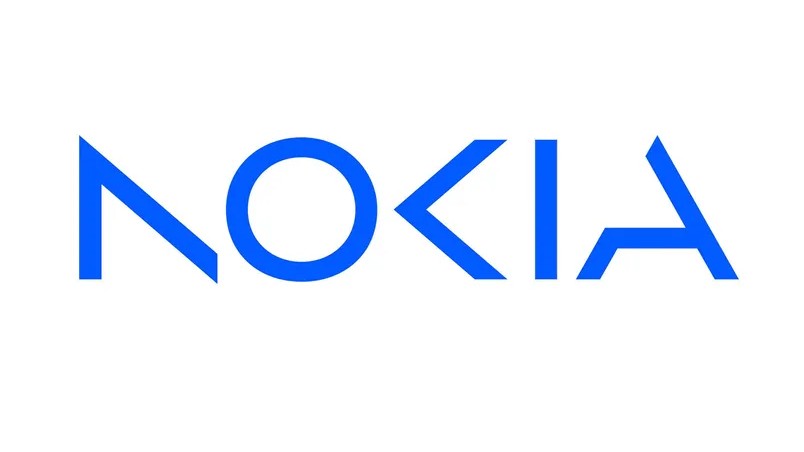
Many people don't realise this, but Finnish company Nokia no longer makes mobile phones. They sold that division many years ago, and Nokia-branded phones are now made by HMD Global. But Nokia the company is now a major player in telecoms equipment, providing infrastructure to mobile operators and other service providers around the world.
Consequently in 2023, Nokia embarked on its first redesign in nearly 60 years. Shedding its mobile phone legacy with a sleek, fragmented logo, the angular, disjointed design positions the brand as a leader in industrial digitalisation and 5G tech.
"Unlike brands such as Pepsi, Burger King and Kodak, which are reverting to heritage logos, Nokia’s logo embraces a forward-looking approach," says Natasha Blevins, creative director at We Are Collider. "This shift is partly driven by the need to shift perceptions beyond a mobile company to an innovation-focused brand. But that said, the minimalist new design is undeniably elegant.
"I especially like the 'invisible strokes' concept, where the brain completes the missing elements of the typography," she adds. "This simplicity works well when paired with a vibrant, gradient-heavy palette and punchy imagery to work around."
10. Sinfona Smith Square by Studio Sutherl& (2024)
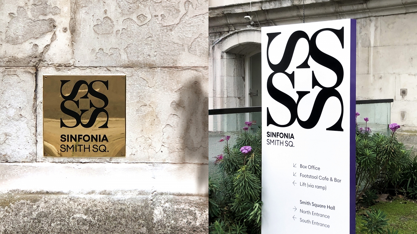
Until recently, St John's Smith Square was an arts venue, while Southbank Sinfonia was an orchestra of young musicians. In 2021, the two London institutions merged to form 'Southbank Sinfonia at St John’s Smith Square.'
A bit of a mouthful, right? So last year they relaunched Sinfonia Smith Square, along with a logo that fuses classical traditions and youthful energy.
"This could have been designed 60 years ago and yet it'd still look just as fresh today," enthuses Kevin. "The simplicity and clever execution of Studio Sutherl&'s design elevates it beyond the decade and into the realms of timelessness. It may appear obvious once you've seen it. But once you've seen it, you simply couldn't imagine it being anything else.
"The flowing curves and sharp angles conjure up the sounds of a sinfonia beautifully," he continues. "The way the four letters create not only the overall square outline of the logo, but also the negative square space at its centre is nothing short of brilliant. It not only symbolises the of sounds emanating out from the venue but also reflects the four corner towers of what is regarded as one of the finest works of English Baroque architecture."
And not only is it conceptually sophisticated, but it's also brimming with design efficiencies. "It makes for a wonderful decorative device to frame images and copy and can be utilised to create many distinctive graphical patterns," notes Kevin. "Nostalgia plays a big part when reflecting on logos, but for me, the very best examples are those that can transcend the zeitgeist. The ones that are hard to carbon date. The Sinfona Smith Square logo has the potential to do just that: a design that feels both of this moment and eternal."
For more nostalgia about graphic design, see our typography of the decade and rebrands of the decade series.


