It's been an interesting week in branding, as Elon Musk has thrown out the rulebook and decided to rebrand the cohesive brand Twitter with an '𝕏'. He then decided he didn't like the 'X', which is a Unicode character, and switched to another 'X' with slightly thicker lines, before switching back to the original.
All this talk of 'X's got me thinking about times when using the 'X' letter really does work. And there are plenty of them, as you'll see below. Here I've focused on logos that contain an 'X', rather than those that are solely made up of an 'X'. But still. Elon, take note...
01. The X-Files
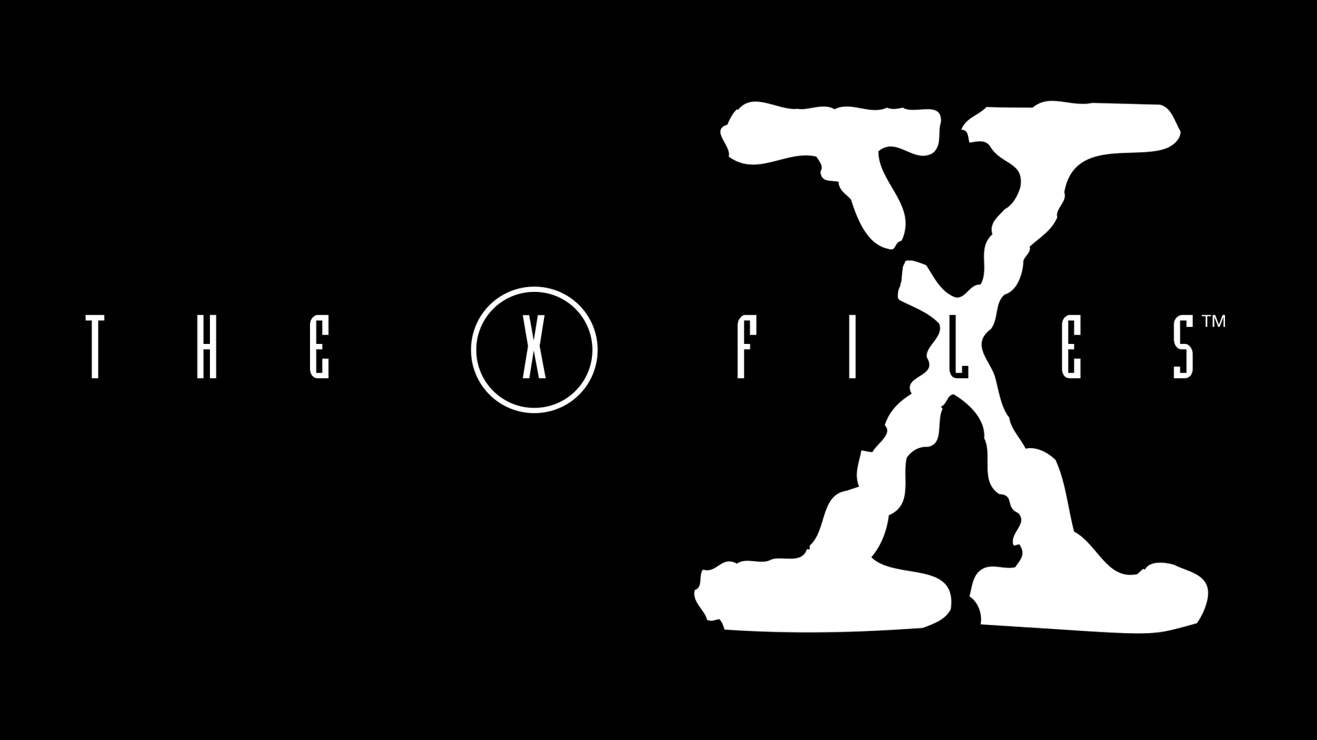
The X-Files logo has two 'X's in it, the thin one in a circle in the style of the main text, and the giant 'X' with a distressed look. I prefer the latter for the sheer boldness of it – it works well with 'files' on its own as well – and it gives off a creepy vibe that is a nod to the series.
02. Matrix

For another 'X' with edgy vibes, look no further than The Matrix. The distressed uneven font reminds us of glitches in, well, the Matrix. Unlike with the X-Files, the 'X' isn't the focal point here, but it does give the word as a whole an extra edge.
03. Durex
The Durex logo has been through a few iterations, but the 'X' with its extra descender has remained. Without the long descender on that 'X', the logo would arguably not be that special, so I think it's the 'X' that makes this logo really work.
04. Xbox
The Xbox logo has three 'X's in it. There are the two in the name, which are straight up all-caps 'X's, and then there's the 'X' within the globe that also forms part of the logo. It's this 'X' that makes the logo memorable for me.
05. XXX
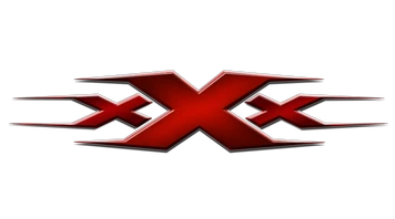
If you want to represent an action film, then only certain fonts will do. The XXX film series uses three powerful red 'X's to show what it's all about. The flick on the end of the 'X's adds extra interest.
06. X-Ray Spex
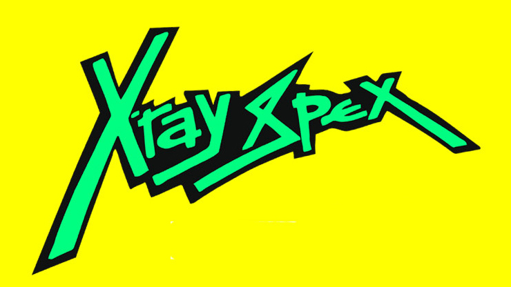
There are quite a few band logos with 'X' in the them, The XX and just X come to mind, but I think the prize for the best 'X' goes to 70s punk band X-Ray Spex. Just look at the way it snakes below the other letters at that jaunty angle. There's also something quite special about words that begin and end with 'X' and this font makes the most of it.
07. X Games
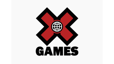
The X Games are a series of action sports events and their logo involves a chunky 'X' with a little globe in the centre. The logo is kind of old-school in its look and feel, but that's not bad thing.
08. Xanadu
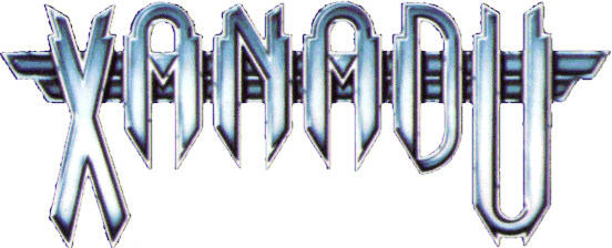
Talking of throwback, the Xanadu absolutely owns the retro font look. That 'X' is big, bold and unafraid to take up space. And let's also pause to look at that 'U' for a second, which is also a thing of beauty.
For more logo inspiration, see our pieces on the best logos of all time, the best simple logos and the best 90s logos.


