Kinetic typography is a powerful way to engage viewers and ensure they pay more attention to words in a design. Also known as motion text, type animation is widely used to add dynamism and visual engagement to branding and creative campaigns as well as movie credits, music videos and more, weaving a story through clever motion design.
In the round up below we'll look at examples old and new from a wide range of applications. If you're looking to boost your motion design skills, take a look at our collection of the best After Effects tutorials and check out our handy guide to font design to learn how to create your own custom typography. If you need new equipment, you might want one of the best laptops for animation.
What is kinetic typography?
Kinetic typography is essentially a technical term for moving text, using animation to bring typography to life. The style began gaining popularity in the 1960s when it was used in movie title sequences and has since developed to become a diverse genre of animation. Often used in campaigns and bold branding, it's an invaluable graphic technique for grabbing an audience's attention.
There are no strict rules to creating kinetic typography, as the examples below will demonstrate, although they can often be refined into the following categories: fluid typography and motion typography (split into the subcategories of scrolling typography and dynamic layout). From shifting colours to warped words, kinetic typography is a fluid technique that presents a world of creative opportunities.
01. North by Northwest kinetic typography
Let's start where it all began. Kinetic typography isn't something new; it's been around for decades. Alfred Hitchcock’s North by Northwest (1959) is often credited as being the first feature film to make extensive use of kinetic typography in its opening titles, and Saul Bass's work had a major influence on making kinetic typography part of movies – it became a way of keeping viewers' attentions.
02. The Office
Moving on to how kinetic typography is being developed by contemporary creatives, this piece by motion graphics artist, Stepdraw riffs on a classic moment from The Office (the US version). Including bears, beets and Battlestar Galactica, the timing is spot on as is the personality the sketchy typography lends to the audio.
03. Numbers Protocol
The kinetic typography in this video was created by animator/director Gary Motion. for Numbers Protocol, a decentralised system designed to verify the authenticity and track the origin of digital content through blockchain technology. It uses a wide range of text effects to grab the viewer and reinforce the words of the narration, which is the whole aim with these kinds of pieces.
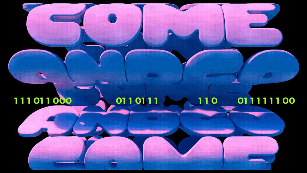
04. The Light in the Dark
Animated and directed by Eli Guillou, this animated typographic piece takes a very different approach and shows that animated typography doesn't need lots of intervention on the text itself. Simple shapes carry most of the narrative, and the typography is minimal and small in size, giving those words that appear more power. The piece aims to encourage anyone who feels that they're lost in the darkness, and to help them find the light in the dark and to move forward.
05. Tina Touli‘s Shifting Symphonies
No roundup of the best kinetic typography would be complete without mention of Tina Touli, and we could have included any number of her striking dynamic pieces. Shifting Symphonies is series of kinetic typography artworks on the theme of transition created for the main stage projections at the Videocittà festival in Rome. We love how she creates harmony through combinations of hard and soft forms. The piece above was inspired by DNA, but it also conjures up ideas of fluffy marshmallows, giving it a dreamy surreal feel.
06. From Paper to Screen
This masterpiece was, unbelievably, a graduation project by graphic designer Thibault de Fournas. The animation shows the evolution of typography from paper to screen in serious style. The first half of the video deals with the basic rules of typesetting, before moving on to the use of typography in cinema, with impressive effects running throughout – the tribute to Saul Bass (whose work we mentioned at the start) being our favourite.
07. Language
Designer Matthew Rogers is the man behind this kinetic typography animation of the words of British writer and actor Stephen Fry. A fan of this particular essay on language, Rogers decided to make it his first kinetic typography project using a combination of After Effects, Flash and Illustrator.
08. The 10 Commandments
In just under two minutes, this kinetic typography animation reveals the 10 Commandments. The man behind the piece is designer Vit Ryznar, who completed the project using After Effects.
09. Childline: First Step
Ad agency YCN Studio collaborated with LA-based production company Buck on this powerful animation, which encourages children to talk about and report sexual abuse.
The video promotes the services of UK-based, confidential, free, 24-hour counselling service for children, Childline. Following a conversation between child and advisor, the four-minute animation uses kinetic typography and abstract art to get its message across. It's by no means an easy issue, and we think YCN Studio and Buck have done a sterling job at covering it in a powerful yet sensitive way.
10. Procrastination
This trailer for David McRaney's international bestselling book You are Not So Smart uses cleverly animated typography to sum up its contents. Animated, designed and produced by Plus3 productions, the perfectly timed animation is all about procrastination, and it'll have you nodding in agreement and smiling all the way through.
11. The Edge
Hunter S Thompson has influenced a generation of film-makers, writers and designers. This homage to the author by Piotr Kabat combines an array of design disciplines to showcase some of his finest words.
12. Coded Objects Research Group
With motion becoming increasingly important in branding, kinetic typography in logo design is an interesting way add dynamic and create an identity that engages the viewer. Lena Weber created this logo for the Max Planck Institut and Kunsthistorisches Institut's Coded Objects Research Group. The shifting forms reflect the group's focus on systems and algorithmic thinking.
From kinetic typography to a kinetic typeface, Lena is also the creator of Gradial, a variable gradient typeface animated by developing a shifting variable axis. It was inspired by the idea of creating a typeface that could encrypt itself. It comes in Thin to Extended, Regular to Italic, and Regular to Encrypted. In the latter, readability dissolves into an abstract gradient.
13. Rolling Stones - Doom and Gloom
Celebrating their 50th anniversary with a series of gigs back in 2012, the old-time rock 'n' rollers released an accompanying new track that was pretty darned good. For the music video, Trunk Animation designed this great splatter style animation, which is reminiscent of Ralph Steadman's typographic artistry.
14. ALQUIMIA Animated Type
Pavel Paratov has constructed a mesmerising piece of golden kinetic typography here. The letterforms reshuffle to the electro beat by Satoshi Yoshitake, integrating abstract shapes into the mix.
15. The Breast Cancer Alphabet
The Breast Cancer Alphabet was conceived by Amsterdam-based agency TBWA\Neboko for the Breast Care Foundation and Alexander Monro Hospital to coincide with Breast Cancer Awareness month in the Netherlands. As could be expected, the forms are visually arresting, especially in the animated typography, but they're also educational, since they each represent potential symptoms of breast cancer, showing that there's much more to checking than looking for lumps alone.
Frequently asked questions
What are the types of kinetic typography?
Barbara Brownie's kinetic typography categorisations are often the most cited when it comes to distinguishing the different styles of moving text. The main categories are fluid typography and motion typography (which can be subcategorised into two seperate concepts – scrolling and dynamic layout).
Fluid Typography – Fluid typography has a looser feel, with letters morphing and changing before our eyes without physically moving across the screen.
Scrolling Typography – A fairly simple motion typography concept, scrolling refers to any text that moves across a plane. This can be forward or backward, up or down, or even away and towards the screen.
Dynamic Layout – This concept refers to when the text elements' movements are informed by each other. This can be in a flat or 3D space, creating a deeper sense of visual immersion.
How is kinetic typography made?
Designers and animators usually make kinetic typography in motion design software such as Adobe After Effects. Designers will often draw elements in vector software like Illustrator and then take them into After Effects to do animate them. There are also many kinetic typography templates available on stores like Adobe Stock and Envato.
Both Illustrator and After Effects are part of the Adobe Creative software package. See prices below.