We all know the old saying ‘never judge a book by its cover’, but what about the text on its pages? Typography on cover design might get you to pick up the latest hardback or paperback, but if the text inside is illegible or inappropriate, you can’t enjoy it.
That’s why we’ve gathered the best fonts for book publishing, including several free fonts, to give you plenty of options (and, for aspiring ebook designers looking beyond the printed page, see our guide to free web fonts).
What to consider before choosing your book font
Imagine ‘War and Peace’ written in Comic Sans, a travel guidebook ruining the moment with Chiller, or a textbook typeset in 8pt Raleway Thin 100: all poor choices for their intended audiences. You need to consider what looks right for your reader, how much white space they need, and how modern the font should be.
“Our designers look to fit the chosen design intention, legibility at smaller point sizes if required for captions or smaller text, character support for global languages, character and uniqueness, modernness, and clarity (particularly looking at visually similar glyphs),” says William Collins, the Head of Creative Technical Operations at DK, which covers many different genres such as travel and food and drink. “In general, we have seen a shift toward more humanist sans-serifs for our interiors.”
Hadley Hendrix, an editorial designer who specialises in publication design and typesetting, has noticed accessibility is increasingly being considered by publishers: “In some books, I’ve noticed a subtle but growing trend toward fonts with higher x-heights, more open letterforms, wider letter spacing, and more geometric shapes, all contributing to better legibility and readability. I think this shift reflects a broader movement toward making books more accessible and easier to read in print and on screen.”
Booksellers, as the all-important step between publishers and readers, know that text counts beyond the cover. Print shouldn’t be visually overwhelming and cluttered on the page, but it also won’t be legible with too light or fine a stroke. It’s a balancing act, especially as printing costs for publishers have been on the rise in recent years, with increasing prices for paper, freight and energy bills, which understandably could lead many towards smaller font sizes (thereby making them harder to read).
Fortunately, we haven’t seen smaller text across the board, with legibility and a de-cluttered page still big considerations – a big sigh of relief for booksellers and readers.
“We've noticed that certain independent publishers, like Fitzcarraldo, Honford Star and Lolli Editions, are actually giving the text more white space for aesthetic reasons, at the risk of increasing the price to the consumer. Honford Star also has a nifty way of numbering pages,” says Dan Ross, Co-Founder of Storysmith bookshop in Bristol.
“In the 'Big 5' of the publishing world, Hamish Hamilton [a Penguin imprint] always gives the reader loads of space and set everything in a very considered manner. For example, Deborah Levy becomes associated in my head with the look of the words on the page.”
As for where to find your inspiration, Collins keeps an eye on internet trends: “I’ve started to see a lot of social media trends driving typographic choice; it’s now an important source of inspiration and creativity,” he says.
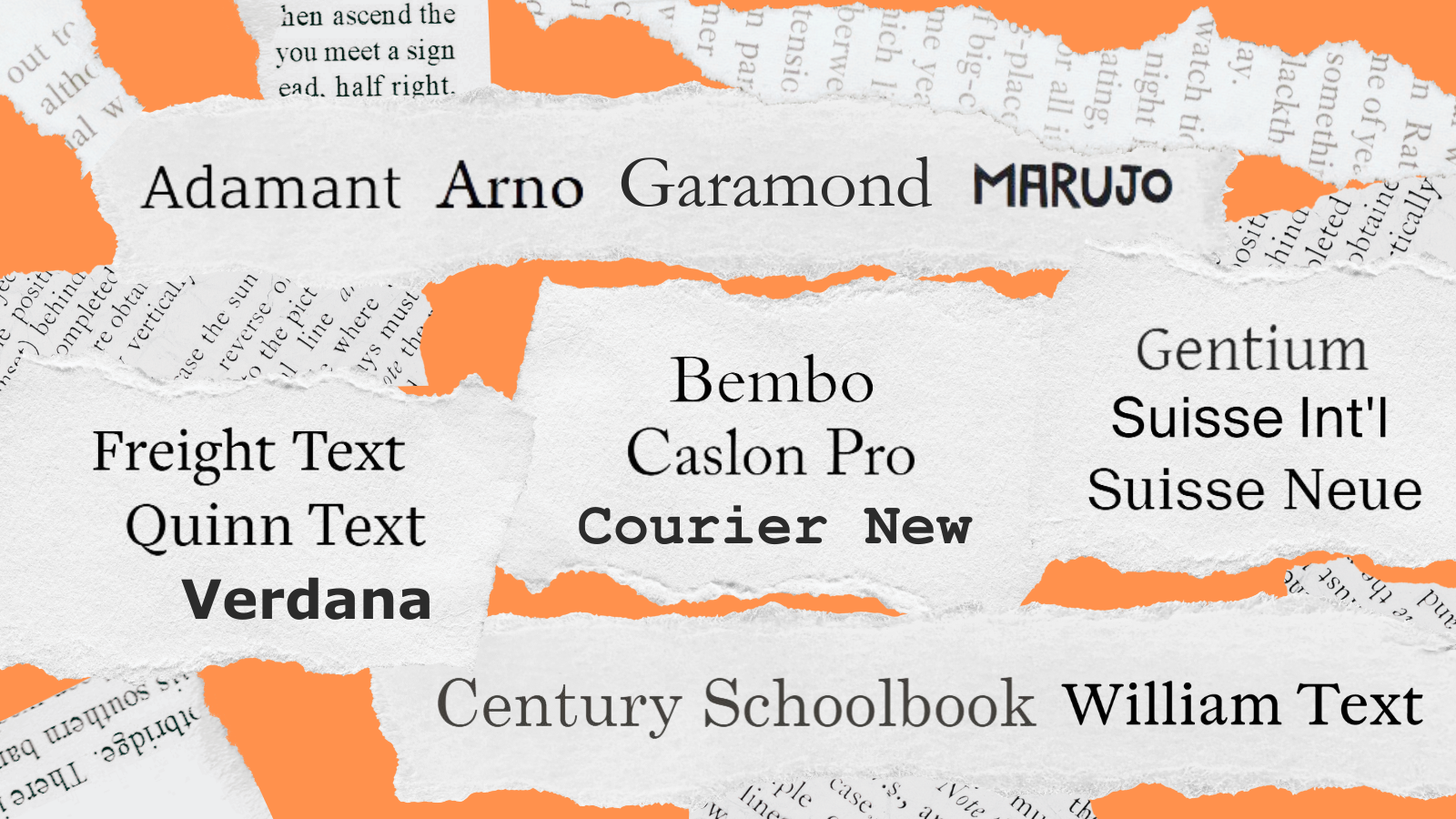
Now let’s get down to our picks of the book publishing fonts.
01. Adamant

Find Adamant from £40 at Parachute or from £27 on My Fonts
Parachute Type Foundry’s Adamant is easy to read in small sizes, and is readily adaptable with six weights. It uses wide apertures to make letters more legible and open, and a high x-height (if this all sounds confusing, just use our typography glossary).
Designer Vedran Eraković, who’s also a typography professor, won a Granshan Excellence Award for this. Adamant works well at poster sizes, too, so it can adapt to book promotions.
02. Arno
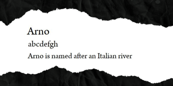
“We use Arno in nearly all our books, and in the forthcoming ‘Ten Thousand Miles of Clouds and Moons’ anthology, although the typesetting was more magazine-style for that one,” says Anthony Bird, Co-Founder of Honford Star. “It’s a very classic looking font, and we didn't want something distractingly modern for interior text. We needed to choose a font that covered a wide range of languages.”
Arno was also chosen for ‘East London Food’, designed by Studio Thomas for Hoxton Mini Press, a photo-laden book of interviews and recipes; sans-serif font Sofia is used for headers and image credits, as a contrast. Arno, created by Robert Slimbach for Adobe, is inspired by 15th and 16th century humanist typefaces.
03. Bembo
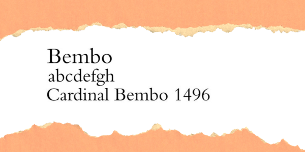
Find Bembo from £44 on My Fonts
Bembo is a publishing classic, created by Monotype in the 1920s, with many variants. Bracketed serifs and taller lowercase ascenders than upper case ascenders make this satisfying on the page.
It’s based on Italian publisher Aldus Manutius’ new type design for an essay by Cardinal Bembo in 1496, hence the name. Manutius commissioned Francesco Griffo to design it for him. Legendary type designers like Claude Garamond were inspired by Bembo. You’ll find Bembo Book another strong option for traditional printed work.
04. Caslon Pro
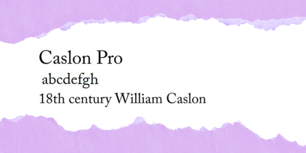
Find Caslon Pro on Adobe Fonts or My Fonts from £21
Caslon Pro, by Carol Twombly, harks back to an 18th century typeface by William Caslon. It comes with fairly high contrast, bracketed serifs, and high ascenders and descenders. It’s not the most cutting-edge font, nor does it work as well on a screen as on a printed page, but it’s still a traditional favourite.
Long-gone but influential publishing house The Golden Cockerel Press often used Caslon for its book text, including ‘Sir Gawain and the Green Knight’ in 1952; Eric Gill (a super-talented typographer with terrible values) was one of the company’s main designers.
05. Century Schoolbook
Find Century Schoolbook on My Fonts from £29
Dating back to 1924, this has often been the gold standard for many American textbooks. If you find any second-hand, chances are, they’ll contain Morris Fuller Benton’s Century Schoolbook.
The thing is, it still works well today; it’s rounded, friendly, and well-suited to newer readers, with each glyph containing enough differences to stand out.
06. Courier New
Find Courier New on My Fonts and Microsoft Office
This slab-serif choice is often used to represent letter writing in novels, according to Joel Friedlander of The Book Designer. Of course, we now also have novels that contain emails, text messages and social media messages inside the copy, which might call for sans-serif options, but letter writing still crops up in plenty of books; beyond fiction, you could find it in a language textbook or a biography.
You need a font that’s different enough from your regular body copy, but still easy to read. Courier New was originally designed for IBM, and was redrawn for them by typography legend Adrian Frutiger. It has fixed pitch and is designed to mimic typewritten documents.
07. Freight Text
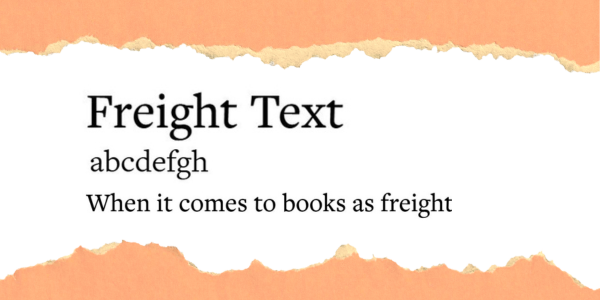
Find Freight Text on Adobe Fonts
Hadley Hendrix has picked Freight as one of her go-tos, because “it appears darker and more substantial on the page; it’s a bit more contemporary and less formal. A higher x-height contributes to its readability even at smaller sizes.”
Freight Text was created by Joshua Darden for GarageFonts, with a nod to 18th century Dutch type. It made Darden one to watch in the type world. There’s now the Freight Collection, with different typeface families that work well together, made up of 156 variants.
08. Garamond
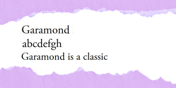
A well-known typeface that combines Claude Garamond’s Roman type with Robert Granjon’s italics, this has been going strong since 1989, with its tall ascenders and wide apertures. Adobe reissued Garamond with OpenType capabilities, giving designers more control.
“Garamond has flowing curves that create readability and a refined, classic aesthetic – I often choose it for more traditional and literary works,” says Hadley Hendrix. Garamond is also used by Gallic Books and its imprint, Aardvark Bureau, which chose this font to print international literary fiction by David Foenkinos and Natsume Sōseki.
09. Gentium Plus
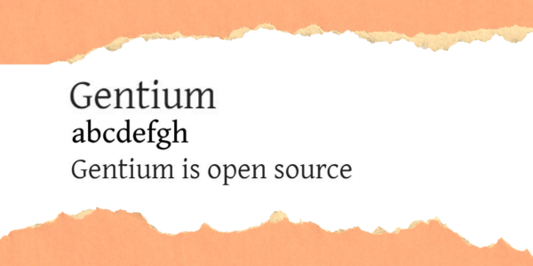
Find Gentium Plus on Google Fonts
The whole Gentium font family is open source, and specifically designed by SIL International for publishing in various languages that have roots in Latin. Gentium generally works well at 10-11pt. It won a Certificate of Excellence in Type Design from the Association Typographique Internationale in 2003.
Variations include Gentium Basic, but you might like the slightly heavier Book Basic; both contain bold and Italic options.
10. Marujo
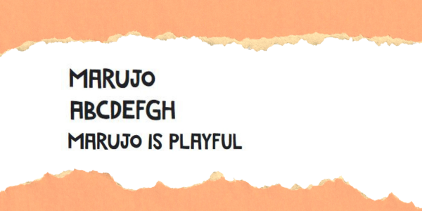
This quirky all-caps font, from PintassilgoPrints, is used for chapter headings and page numbers (to match cover art) in Roopa Farooki’s ‘Double Detectives’ series, published by Oxford University Press. Marujo plays around with baselines and toplines but remains legible.
With distinctive differences between often-confused characters like capital L, capital I and number 1, this is a practical but fun choice. The Marujo type family was inspired by outsider artist Arthur Bispo do Rosário.


