We spend a lot of quality time in our living rooms, so it pays to find a colour scheme that makes us feel cosy and comforted. Choosing between the best living room paint colours is no easy task, mainly because it's a multi-functional space, but also because not everyone in the household has quite the same vision.
Recent research by Dulux found that living room colours are the most argued about among those decorating homes together. 28% of all colour-fuelled spats centred around the living room.
To put an end to heated discussions over paint charts, we have gathered the best colour combinations to help you create a living room you never want to leave.
A fresh lick of paint is the easiest way to transform your living room on a budget, and colour-drenching everything in the same tone can go a long way in making a small living room look bigger.
The best living room colour combinations
Before we dive in, it's worth saying that colour choice is hugely personal. Think about how you want it to feel and ask yourself questions like, "What is your favourite thing to do?" and "What's your favourite holiday destination?" Are there any colours that will help emulate that feeling?
Here is what the colour experts suggest.
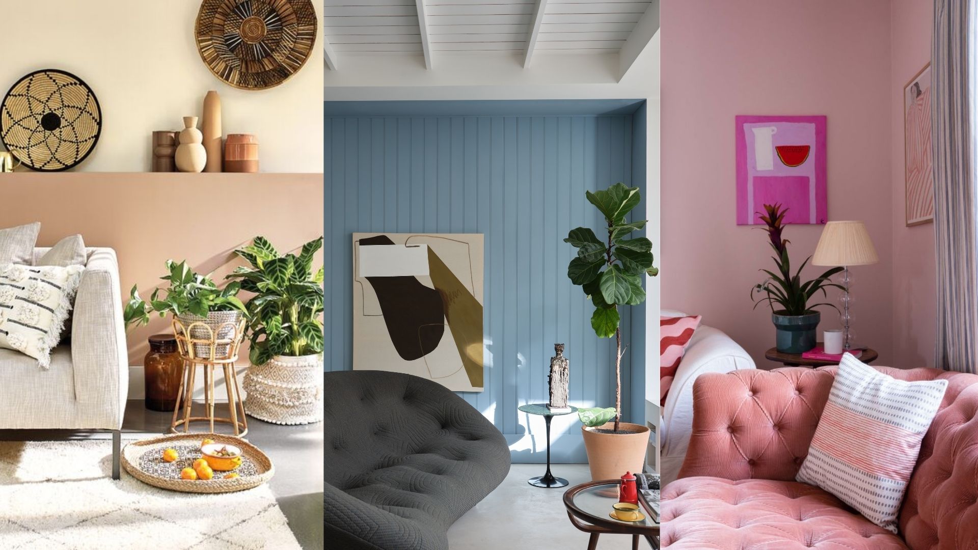
1. Beige, brown, and blue
Simultaneously grounding and soothing, beige, brown, and blue is a great living room combination – no doubt why the popularity of decorating with brown is on the rise.
"We use our living rooms as spaces to entertain guests, come together for family time, and also retreat to after a long day to get cosy and relax," begins Tash Bradley, director of interior design and colour psychology at Lick. "For this reason, I’d recommend bringing in colours that are welcoming, warm and comforting.
"Earthy neutrals with warm pink, red, or yellow undertones will feel physically soothing, deeper browns and reds will cocoon you, while refreshing blues will help you mentally unwind." Try using it in the 60:30:10 ratio, with beige as your primary colour, brown as your secondary colour, and blue as your accent.
We think this subtle and sophisticated blend can make a small living room look expensive on a budget and works well with a coastal or boho style.
£45 for 2.5L | Lick Taupe 03 matt emulsion paint is subtle and warm, with grey and red undertones, providing a great base for a calm and grounding scheme.
£45 for 2.5L | Brown 02 is an earthy dark brown with red undertones, with a warmth that makes it perfect for creating comforting spaces.
£45 for 2.5L | Blue 15 is a mid blue with yellow and grey undertones, blending optimistic sunshine yellow with soft cloud grey.
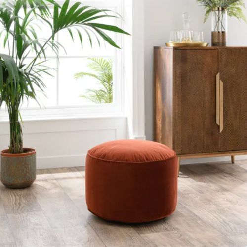
2. Neutrals, terracotta, and green
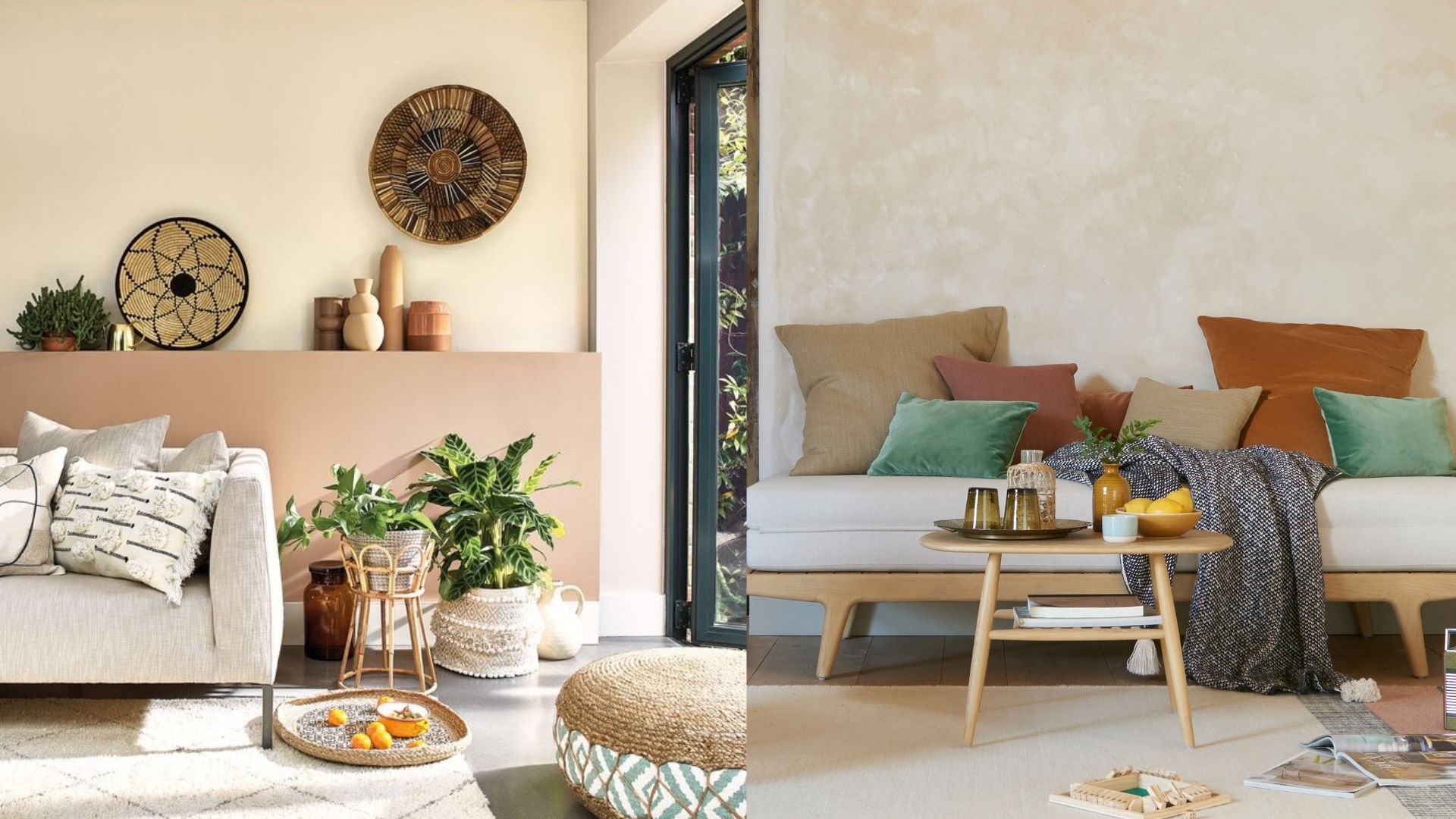
Green has been one of the biggest interior paint colour trends over the last year, and we don't see it going anywhere. Blend it with neutral tones and warm terracotta, and you get a dreamy combination that transports us to carefree holidays in Italy. You could combine these colours with a touch of terrazzo, either with a side table or a cute little like this John Lewis ANYDAY Terrazzo Bulbholder Table Lamp, or embrace a traditional Italian aesthetic with a couple of Sicilian ceramic plates on the wall.
Sophie Clemson from online interior design company The Living House says that an earthy colour palette is becoming increasingly popular among her clients because it creates such a warm and cosy feel. "It could be that you go for a neutral base with your sofa and add earthy accents of greens and terracottas."
RRP: £39 | This pouffe from Dunelm is a good size and light enough to move around the room if needed. It's a comfortable spot for resting feet and robust enough for smaller members of the family to sit on.
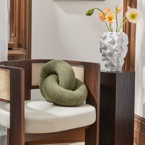
RRP: £24.99 | This soft, knitted cushion is made from bouclé yarn in the shape of two interlinked doughnuts. It's 40 cm and a real eye-catcher. A great way to add some khaki green to a living room and give a stylish, elevated look to any sofa or armchair.
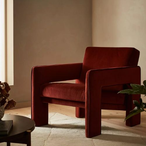
RRP: £349| This blocky armchair is a head turner, and it's currently reduced at John Lewis. Its sculptural silhouette and cut-out sides give it a contemporary feel, with piping along the arm perimeter adding a nice detail. Available in this rusty terracotta tone and navy.
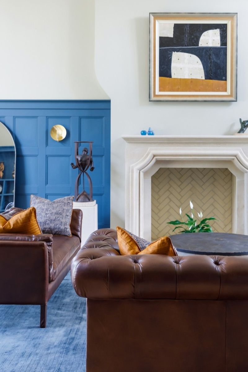
3. Blue and coral
"One of my favourite contrasting colour combinations at the moment is blue and coral," says Sophie Clemson. "The coral has a punchy feel against the blue, which I love. I'm using this colour palette for my downstairs toilet project currently."
"Using contrasting colours can look amazing and, when done correctly, can create a beautiful, well-designed look," Sophie adds. Follow Sophie's lead and choose a patterned, blue wallpaper with some coral tones in it as your starting point for your scheme. You can look at blue and coral swatches on The Living House's Instagram.
Alternatively, you could go for something more pared back – Patrick O’Donnell, brand ambassador at Farrow & Ball suggests keeping your scheme controlled by blending a bright blue with natural tones of biscuit and earthy whites.
"Something like Kittiwake or the bolder archive shade of Chinese Blue would create an uplifting, positive atmosphere for a living room," he shares. It depends on how you want your space to feel, as bolder combinations are more high-energy, and less saturated tones will be more chic and subdued.
4. Purple, white, and green
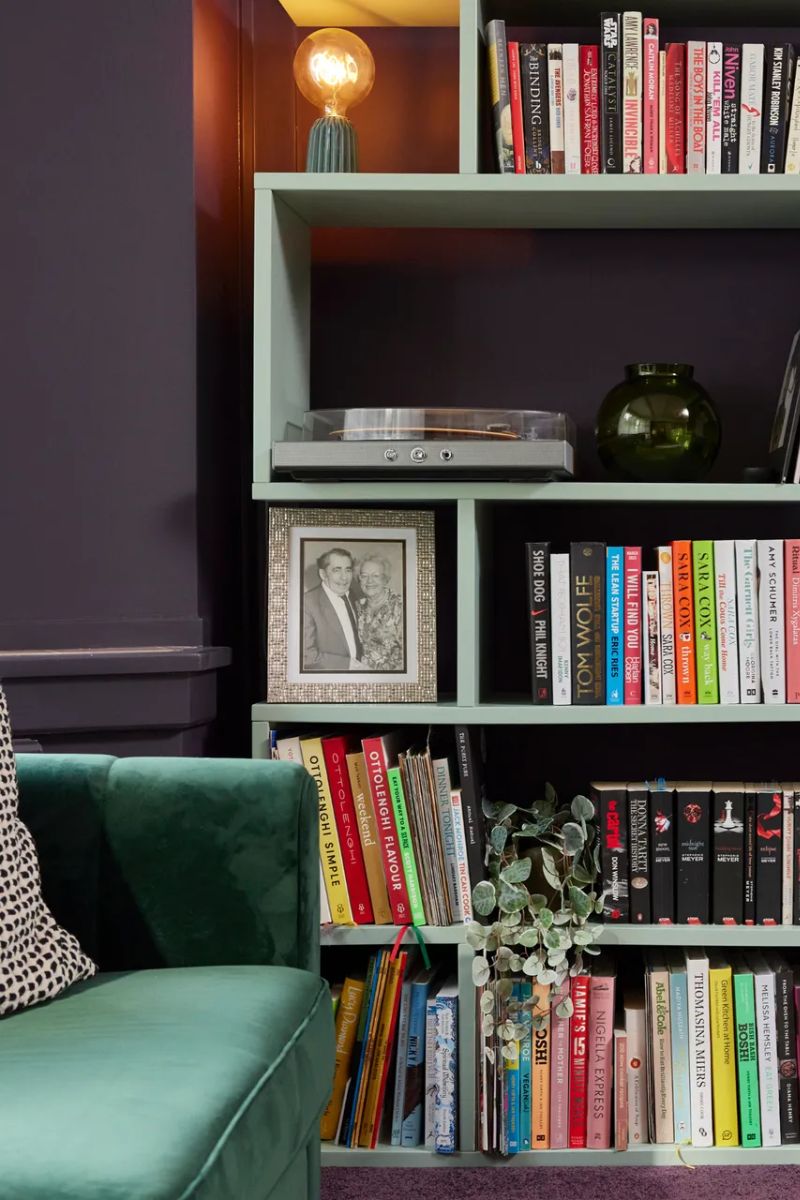
Dulux's creative director Marianne Shillingford recommends combining tenniscore-inspired tones of purple, white and green in your living room. This palette of sumptuous colours will wrap you up in their warmth, promoting a cosy atmosphere, she says.
Dulux Heritage recently collaborated with Sara Cox to transform her living space into a comforting book nook, pictured above, and they used Wild Blackberry, Linnet White and Sage Green.
Wild Blackberry is a rich purple that blankets a room in calm, while Linnet White provides a contrast and helps balance and brighten a space, while Sage Green, used on the bookshelf above, is a shade rooted in nature, bringing earthly delights to the room.
"The mixture of these soft, supple tones together with the more daring Wild Blackberry combines elegance and regalness to create a tranquil space at the height of luxury," says Marianne.
5. Pink, red, and pinky white
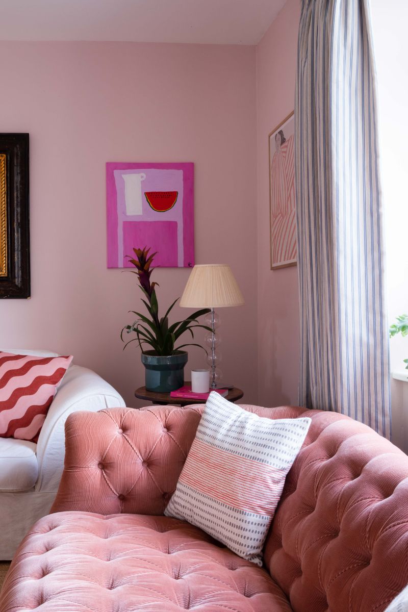
We love pink and red together, in our wardrobes and our home decor. A tonal scheme of pink, red, and pinky-white, as pictured above, will feel cosy, nurturing and calming.
So if your ideal living room feels enveloping and ultra-comfortable, you might like to consider a soft, plaster pink for your walls, with some warm whites, and a red accent or two.
Create a clear focal point (and essential in small living room layouts) by matching your paint colour to your sofa. By painting the wall behind your sofa the same shade, you can create a striking, colour-drenched look.
Hang a gallery wall of meaningful artwork and photographs above to create an inviting, sumptuous spot to kick off your shoes and relax in. For expert tips on where to hang artwork, you can read our guide.
RRP: £22 | This throw cushion has a slightly retro checkerboard design, with soft loop tufts, and is a great way to layer in some eye-catching colour, pattern and cosy texture.
RRP: £8 | We love this plant pot's pretty tulip pattern, and think it looks more expensive than it is – at £8, it's a steal.
RRP: £25 | This 3-tier lampshade has a mid-century style, bold colours, the geometric shapes. Made from linen-like fabric, it has a brass-plated metal frame.
FAQs
Are there any colour combinations to avoid?
There are various living room design mistakes to avoid, such as making an error when choosing a rug, but the colour is much more personal. It's your living room, your rules. The only advice we would give is to avoid combining too many bright colours in one space, as this can feel too busy.
"Try to avoid using too many saturated colours together," colour specialist Tash Bradley says, no matter how much you adore the dopamine decor trend. "Saturated orange and saturated yellow, for example, can feel over stimulating when used together in large proportions."