A good coat of blue paint can be the ultimate dose of calm for a home, but from dark and moody to light and playful, there's a huge range to choose from.
My favorite way to find a good paint color? Take paint color ideas from real spaces. With that in mind, I've sought out some of my favorite designer projects where blue is the star.
This roundup isn't only full of blue inspiration, but designers' favorite shades and advice on what to pair it with.
1. Nimbus Grey by Benjamin Moore
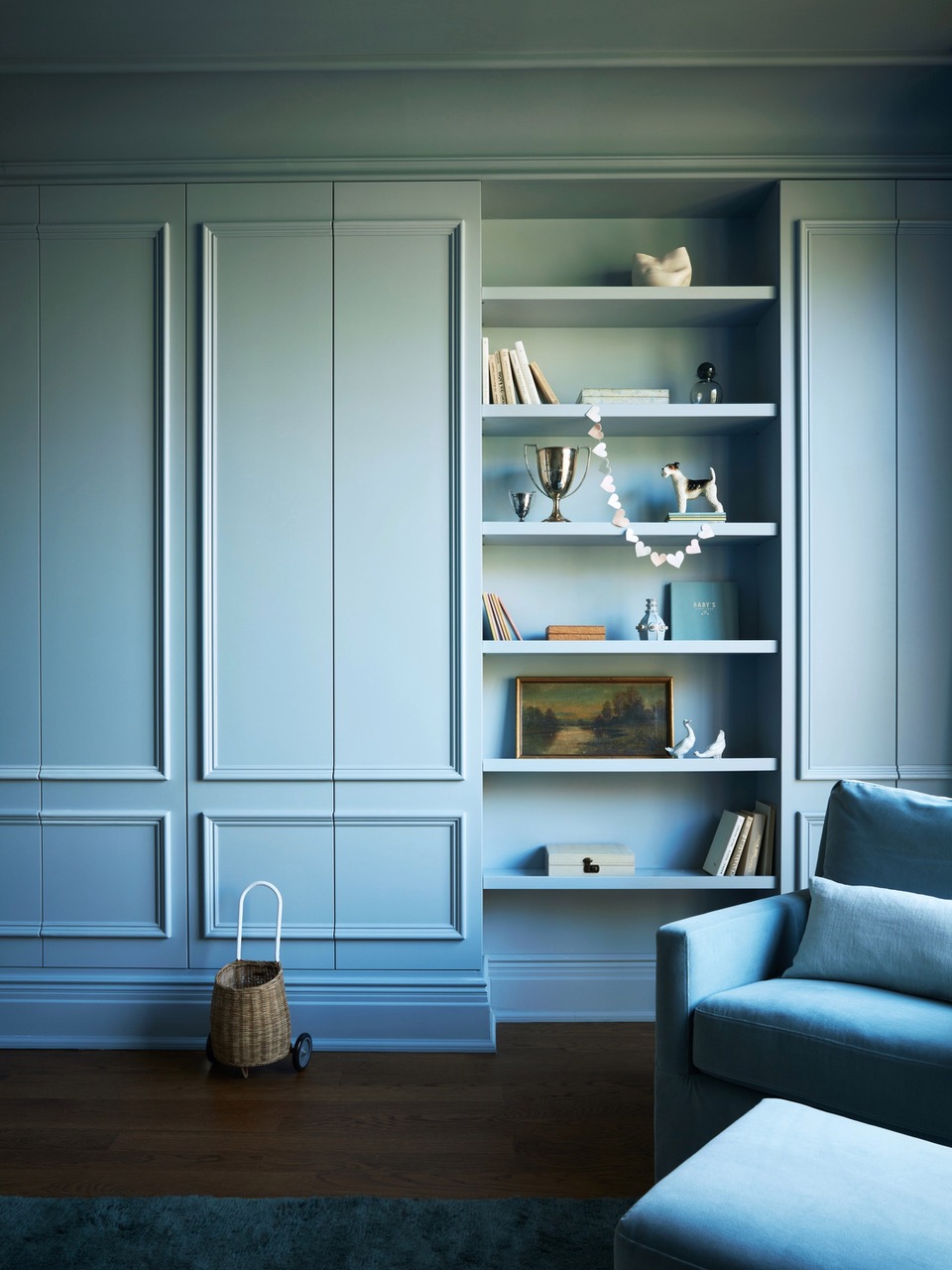
"Blue is a neutral in its own way," Crystal Sinclair, founder of Crystal Sinclair Design says. "It adds depth to any space and reflects light while softening it."
The light blue paint color used in this design is one that mirrors some of the big trends in color this year — pale, playful, but still grown-up.
Nimbus Gray by Benjamin Moore is "a warm blue, very calming tone, working perfectly for a space such as this nursery where the client wanted a comforting shade of blue," Crystal explains. "It pairs beautifully with the dark wooden floor, and the simplicity of the room being one color brings focus to the architectural details in the space."
2. Galapagos Turquoise by Benjamin Moore
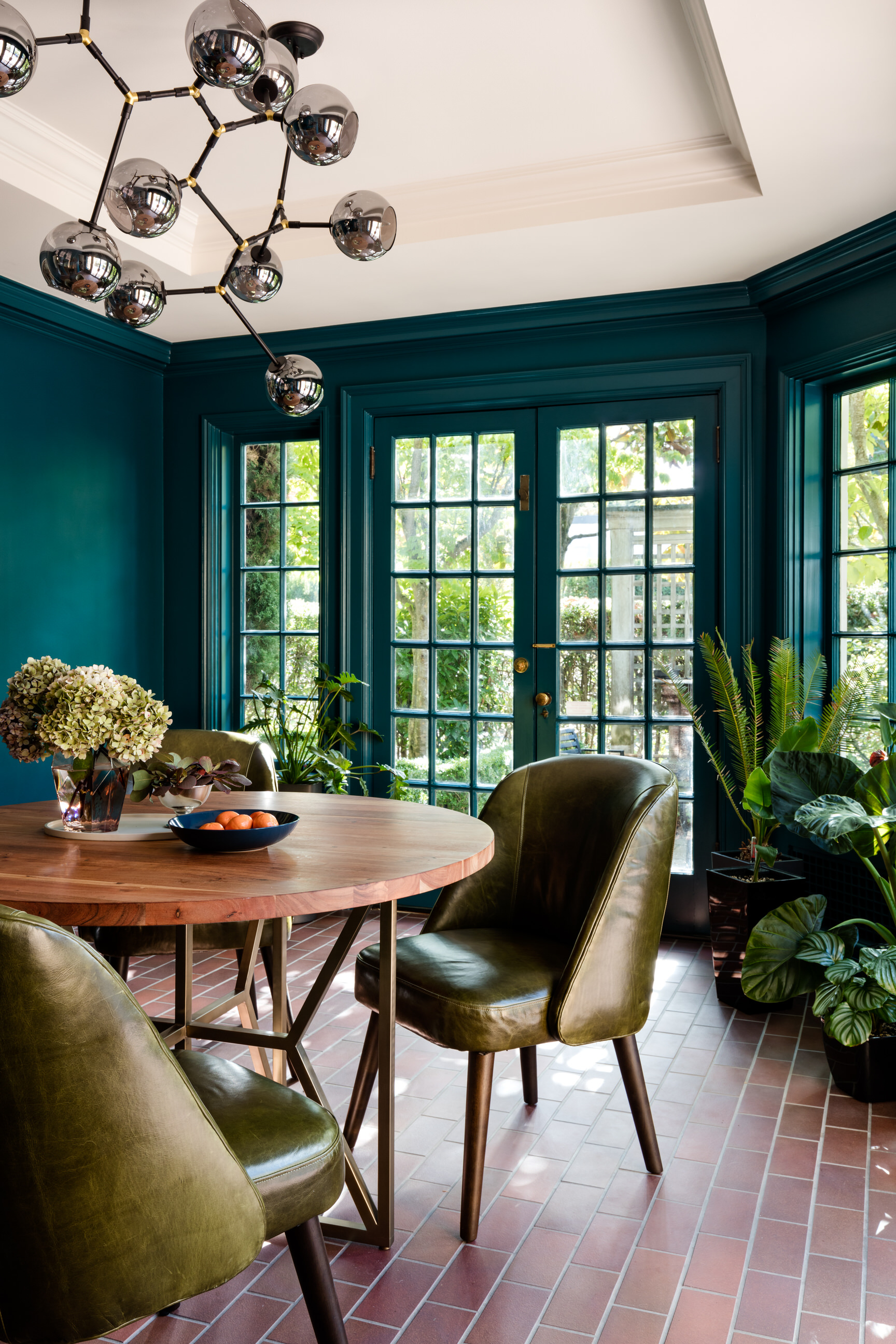
Benjamin Moore's Galapagos Turquoise is a firm favorite of Shannon Adamson, founder of Shannon Adamson Interior Design. This teal-leaning shade is ideal for a space with a little more drama and glamor.
"This sunny dining room was a mid-century addition to our clients' 1919 Tudor home in Seattle," she explains. "The room captures natural light so beautifully, all it required was the perfect paint color and a new chandelier to make the space sing."
It's a perfect shade for entertaining spaces or even something like a snug where you want to feel cozy.
3. Oval Room Blue by Farrow & Ball
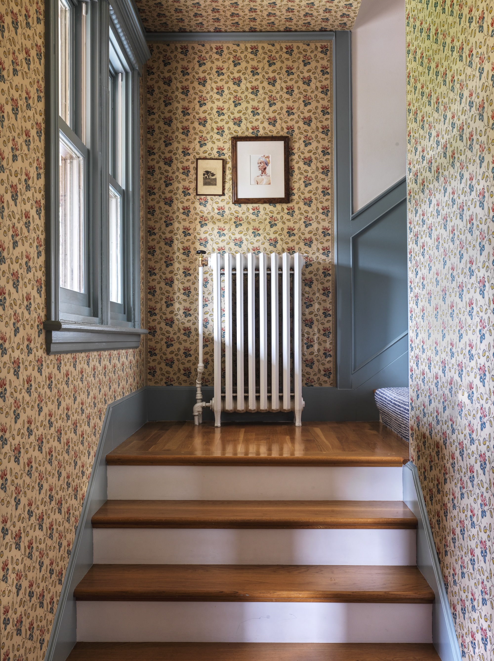
This stairwell by Prospect Refuge Studio features Farrow & Ball’s Oval Room Blue for the trim and wainscoting. "We love to play with blue: it’s very calming to most people, but it also holds a mixture of connotations from rich and royal, to sensible and grounding, to dreamy and fresh," says Victoria Sass, Founder of Prospect Refuge Studio, and she has a favorite Farrow & Ball blue paint color she always recommends. "I never get tired of Farrow and Ball’s Oval Room Blue. It has this warmth to it that seems to do something different in every room we use it in."
Victoria says that blues are great because they're so malleable, too. "They change a lot with the quality of light in a room and also what it’s paired with in the space. Blues will also change throughout the day and even through seasons, which I find enchanting. I like getting lots of personalities out of a single paint color."
4. Gentleman’s Gray by Benjamin Moore
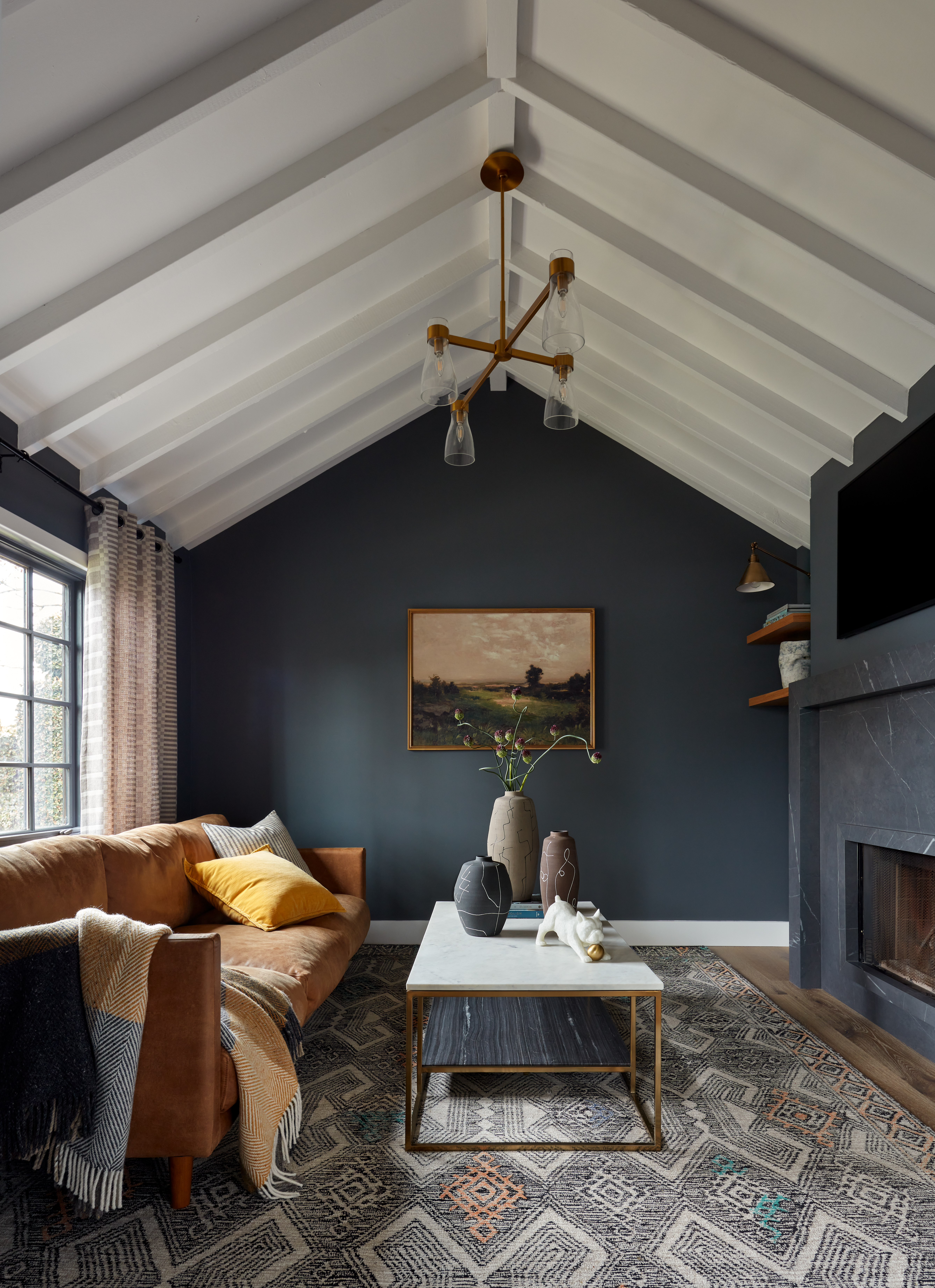
This relaxed living room by Bynn Esmond Designs offers a grounding feel as well as an air of sophistication. "We selected Benjamin Moore’s Gentleman’s Gray for this room — a deep blue-gray with a hint of teal that adds the perfect moody vibe," explains Bynn.
But Bynn has some other blues she may turn to, especially if she's looking for paint colors for rooms without much light. "When clients are looking for a rich blue, we often begin with Benjamin Moore’s Van Deusen Blue or Newburyport Blue and adjust the shade based on how it interacts with the home’s natural and artificial lighting, as well as the window placement and orientation. What works beautifully in one space might look entirely different in another due to these factors."
5. Hague Blue by Farrow & Ball
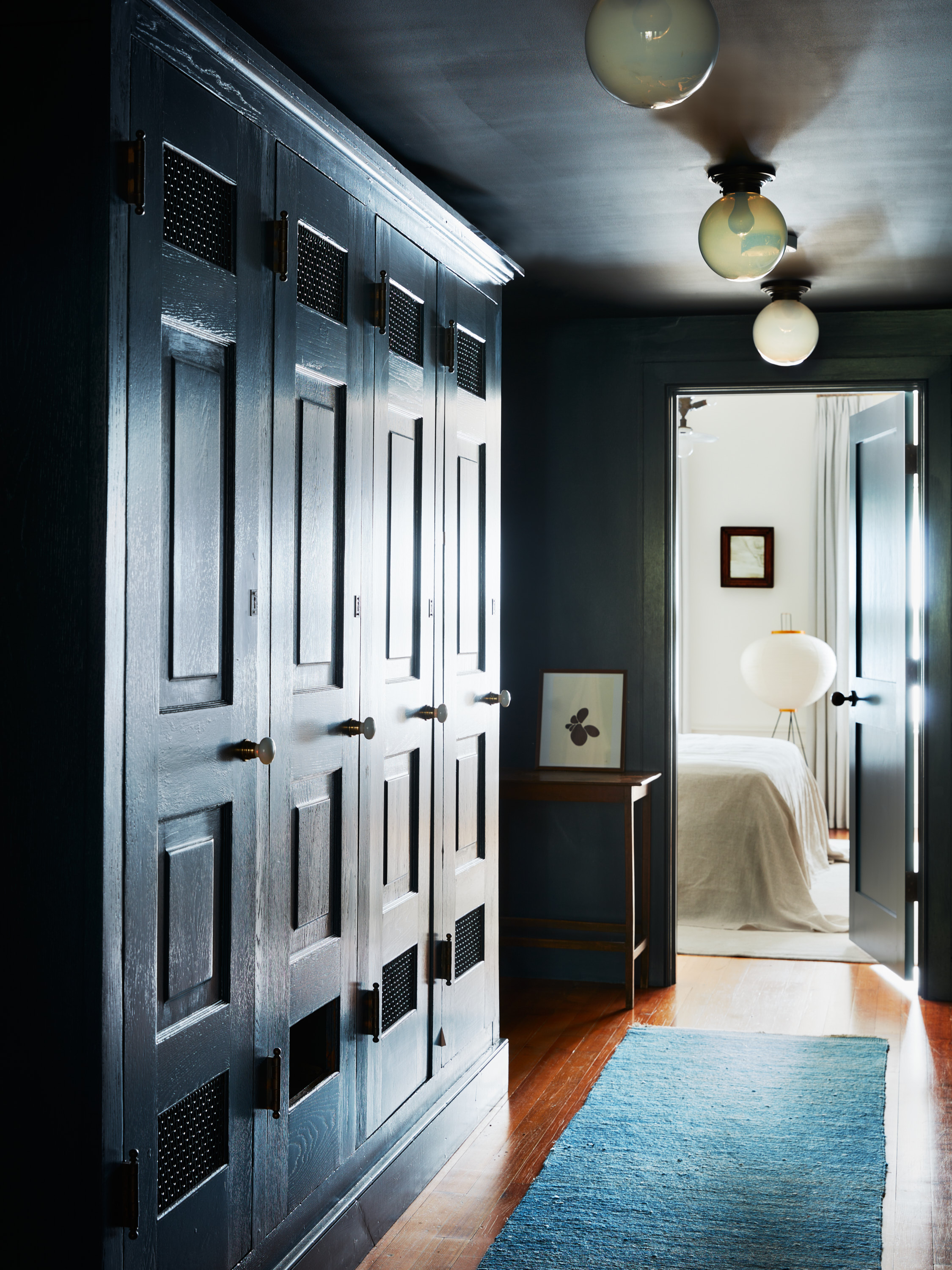
Farrow & Ball’s Hague Blue in Modern Emulsion has been used for this moody walkway designed by Atelier RO. "The finish has a slight sheen and reflection that bounces the light around when the rooms open up the doors bringing snippets of natural light. It's also a more hardy finish for heavy traffic areas," recommends Juliette Spencer, founder of Atelier RO. "Farrow & Ball paints have such a depth and richness to them, that Hague Blue feels distinctly warm and luminescent."
Nina Lichtenstein, founder of Custom Home Design by Nina Lichtenstein agrees it's one of the best Farrow & Ball paint colors: "The color's depth allows it to shift beautifully with the lighting, appearing almost black in dimly lit rooms while revealing its green notes under brighter light. This versatility makes it perfect for studies, dining rooms, or as a statement wall." She suggests, "In spaces with good natural light, Hague Blue takes on a more vibrant appearance, while in darker rooms, it adds a cozy, enveloping feel. Pairing it with a matte finish can enhance its richness and depth, while a satin finish gives it a subtle sheen that reflects light beautifully."
6. Jet Blue by Benjamin Moore
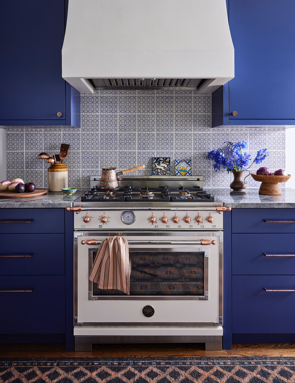
This zingy blue kitchen by Studio Ganz is finished in Benjamin Moore’s Jet Blue CC-870. "Our client wanted a jewel box live-in kitchen with Middle Eastern and Moroccan touches to complement the Spanish architecture of her home. As she requested we implement “blue” into the millwork, we wanted to choose a blue that was timeless, bold, and unique to stand out from some of the other blue cabinet trends we’ve been seeing lately," explains Sondra Ganz of Studio Ganz. "Throughout the kitchen, we implemented Mediterranean color combinations which were inspired by her worldly travels— deep blues, rich earthly terracotta and browns, and metallics in copper and bronze."
"This blue is one of our favorites, we love how it can totally change personality during the day and with different lighting," Sondra adds. "Implementing blue-violet colors can elevate an interior by bringing a special twist of elegance."
Is there a warm blue paint color?
In short – yes, there is! In every example above, whether it's a lighter shade or darker tone of blue, each designer mentions the warmth and comfort each blue they’ve chosen brings to the space, an essential feeling in a home. Nina explains, "While blue is generally considered a cool color, warm blue shades do exist and are prized for their ability to bring a cozy, inviting feel to a space. Warm blues typically have undertones of green or gray, which soften the coolness and add a layer of warmth."
There are most definitely warm blues and they can be enhanced by artificial lighting as well as other finishes. creating a grounded and calming atmosphere, as well as an air of class and elegance is the ultimate goal.


