The Eurovision Song Contest 2024 is upon us, so let's take a moment to recall that it isn't only about the music. Over its 67 years of history, the contest has delivered a vibrant legacy in visual design in the form of the annual Eurovision logo.
Ever since 1956, each host broadcaster has had to come up with a new logo design. Sometimes the Eurovision logo has featured national symbols and landmarks, sometimes it's had a more metaphorical meaning. And sometimes they just didn't make much of an effort. Below we look back at some of the highlights in an entirely subjective round up the best and worst Eurovision logos yet (we asked Graham Norton to do it, but he was busy. For more inspiration, see our pick of the best band logos).
The best Eurovision logos of all time
We'll start with the best Eurovision Song Contest logos before moving on to those that deserve nul points. High ranking designs range from the iconic to the courageously unique.
01. The 1974 Eurovision logo
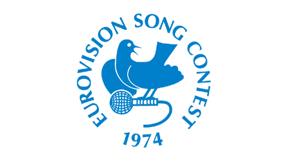
Top of the list is this logo design for the Brighton 1974 event, which symbolises everything that Eurovision stands for (spreading world peace through the beauty of song, if you're wondering) in a simple, universal symbol. This was during the Cold War, when the dove was associated with movements against nuclear armament as well as being a general symbol for peace. The winning song this year was a catchy number that revolved around a metaphorical reference to a major European battle in which thousands of men died. Nice one, Abba.
02. The 1985 Eurovision logo
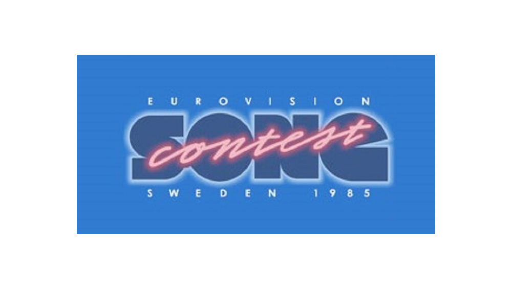
The 1980s was a rich period for Eurovision logos. Just check out this beauty that looks like it could have been lifted straight from the box of a video game from the period. Sure the 'G' in 'Song' isn't quite clear, but the neon light typography for 'Contest' is really something. This was peak Eurovision graphic design. Twelve points, Sweden.
03. The 2023 Eurovision logo
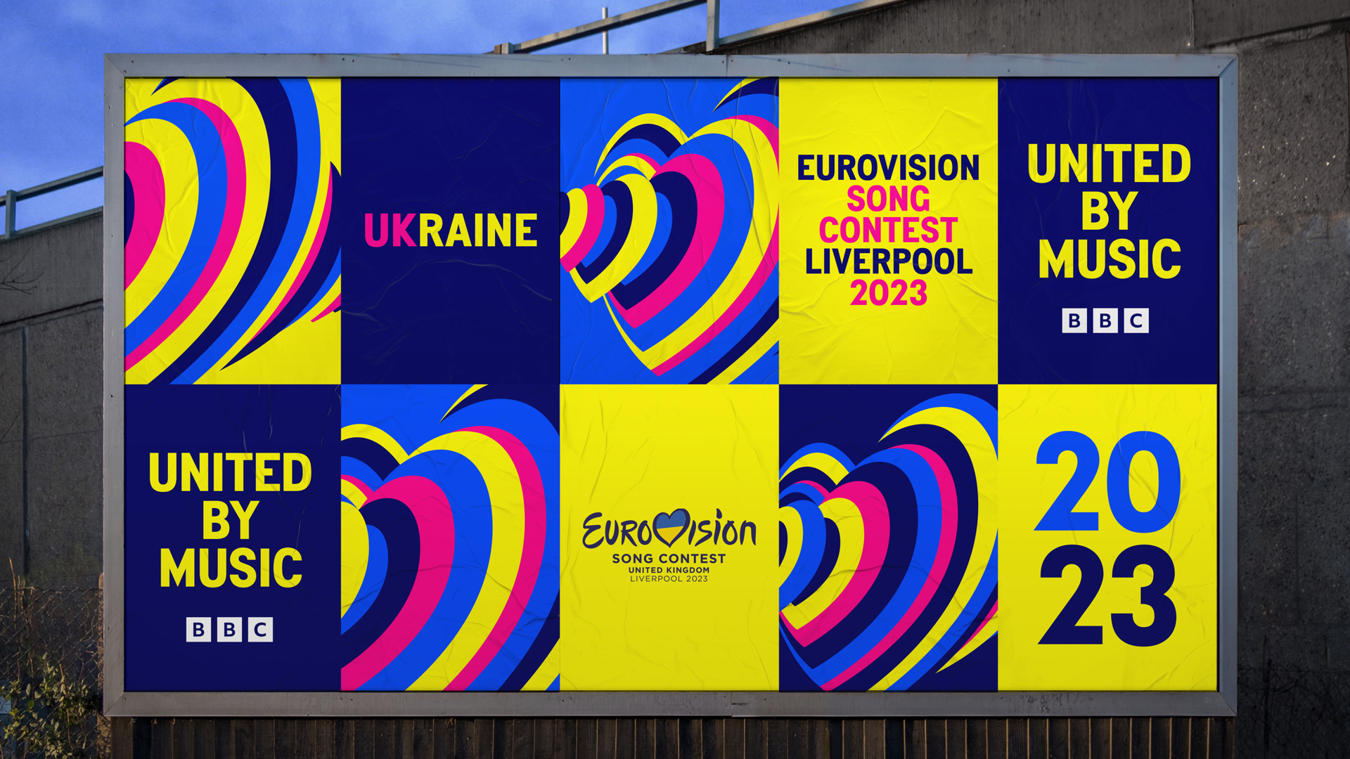
The best of the more recent Eurovision logos has to be the 2023 design from Design Bridge and Partners and Starlight Creative for Liverpool's hosting of the event on behalf of Ukraine. Many recent Eurovision logos have aimed to communicate themes of togetherness and diversity, but few have succeeded with such a classy concept and execution.
The logo design was inspired by the idea of "160 million hearts beat as one", reflecting the 'United by Music' them and Eurovision’s massive global viewing figures. Read our interview with the team behind the branding to learn more.
04. The 2020 Eurovision logo
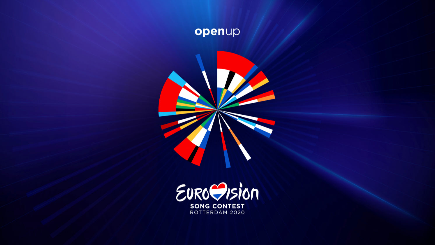
Another successful recent design was Rotterdam's infographic-inspired Eurovision 2020 logo. The work of data visualisation agency CLEVER°FRANKE, it features the flag colours of each competing country in the order in which they first participated. Going for a data-driven approach could feel a bit cold for the camp and slightly bonkers joy that is Eurovision, but the result was a bold logo design that escaped the cliched cheesiness of previous two years.
The design was also reported to have a cheeky hidden reference: the five beams of light shooting off to the right are said to represent the five times the Netherlands had won the contest up until then. I'm not sure such bragging is in the sporting spirit of the competition, but it's not often we get an Easter egg in a Eurovision logo. The design was such a success that Rotterdam stuck with same data-driven approach when it hosted Eurovision 2021 the next year.
05. The 2000 Eurovision logo
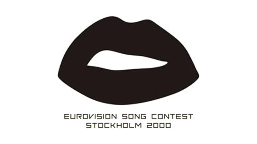
Sweden did it again in 2000. The minimalist approach and lack of colour might not exactly capture the camp fun of the contest, but the motif does recall the Rocky Horror Show, which is nothing if not camp fun. It's also a clear reference to song and speech. All credit to Stockholm for bucking the trend.
06 / 07. The 1994 and 1995 Eurovision logos
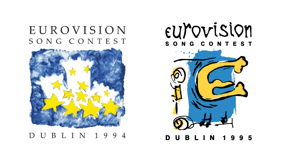
Credit must also be given to Dublin for what have to be the two wildest logo designs Eurovision has seen. The 1994 logo has castles from Dublin's coat of arms and the 12 stars from the European flag. Entry to the contest isn't limited to members of the European Union, but let's not mind that. I've no idea what's going on with the 1995 design – there's an E for Europe, or Eire, maybe – but it has personality. No, it's not going to work at a small size, but, hey, this was before the internet (almost).
08. The 1968 Eurovision logo
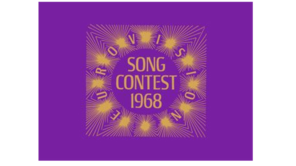
Simple and to the point, this 1968 design was the first Eurovision logo that really looked like a logo. The form is based on a design that's believed to have been created by BBC stage designer Timothy O’Brien for Eurovision stage sets some years previous. The shape was used in the Naples 1965 logo, but for London 1968, the Eurovision name was added. Madrid opted for a similar design for the following year's event.
09. The 2017 Eurovision logo
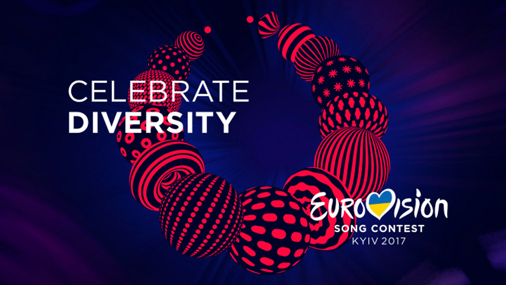
Kyiv's Eurovision 2017 logo was an interesting design that we could actually learn something from. The logo took its inspiration from a traditional Ukrainian necklace, or namysto, which is considered to be a protective amulet and a symbol of beauty and health. It was chosen since it's made up of different balls each with their own design, thus celebrating both diversity and individuality.
The worst Eurovision logos of all time
Alas, some Eurovision Song Contest logos didn't generate quite so much design 'euphoria'. Here's our pick of those that should have left 'before the party's over'.
01. The 2014 Eurovision logo
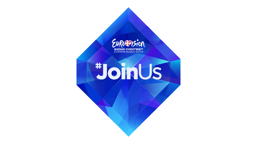
There is a place for hashtags, and that place is at the end of a post on X or Instagram, not in the middle of a logo design. The diamond, which looks like something you might have to collect in a video game, just adds to the naff vibe. Sorry, Copenhagen.
02. The 2004 Eurovision logo
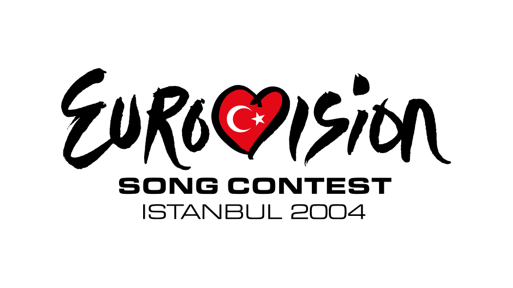
In 2004, the European Broadcasting Union (EBU) introduced a new generic logo that's still being used today (the script was cleaned up a little in 2015). As we've seen from the reaction to recent Super Bowl logos in the US, foisting generic branding on a big event creates a more consistent brand identity but is often met with disappointment from fans. At least the EBU still allows each host to design its own complementary icon, but for this first appearance, Istanbul just went with the generic logotype, which, in retrospect, looks like a lack of effort.
03. The 2024 Eurovision logo
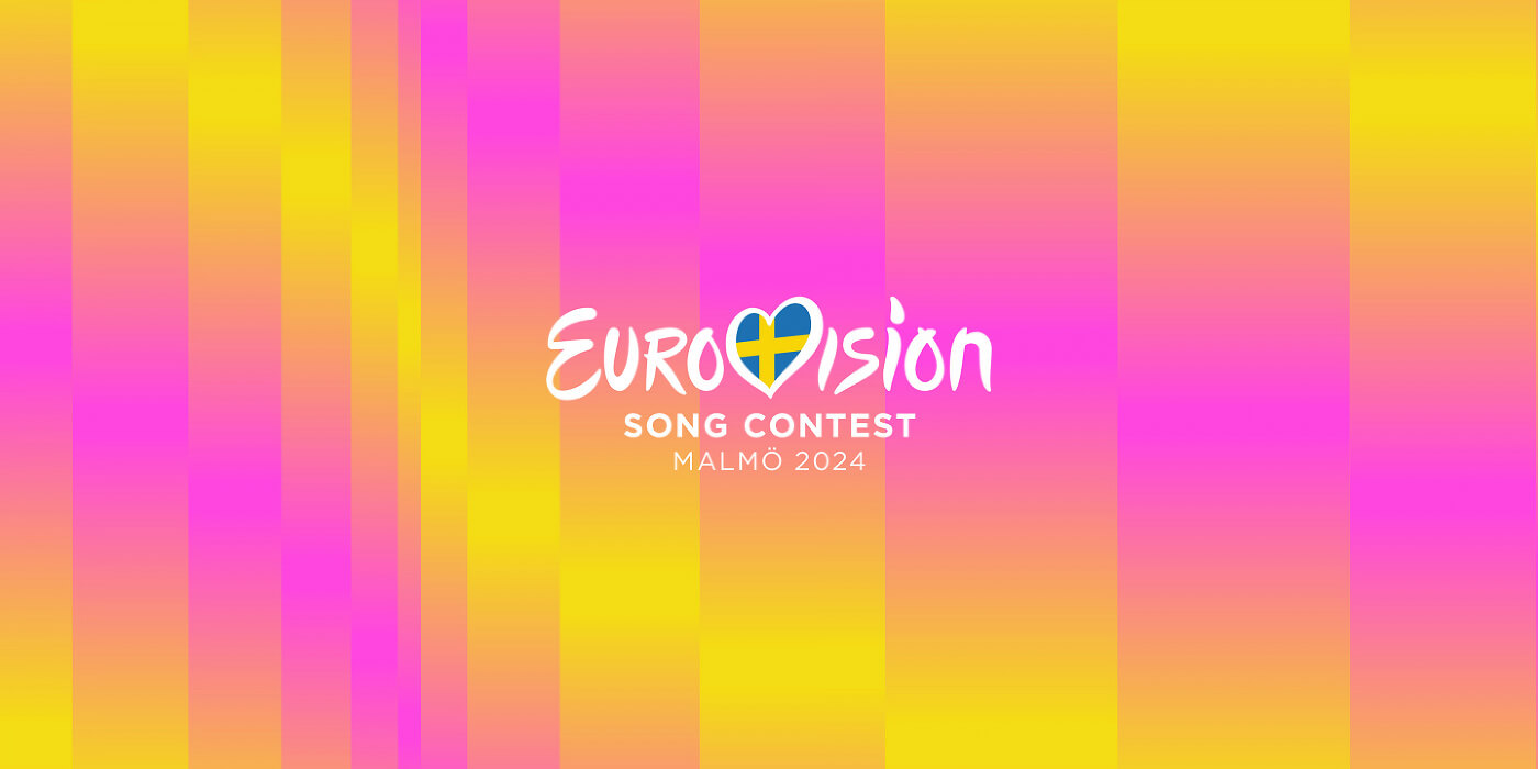
No, Malmö; that's not a logo design. That's just the generic Eurovision logotype slapped on a gradient background.
04. The 1957 Eurovision Logo
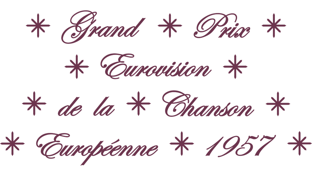
It's a little unfair to criticise early Eurovision designs. Branding wasn't what it is today, and the first few events didn't really have proper logos: they just wrote out the contest's name in French. But this design from the Frankfurt-hosted second year of the contest looks like a poor homemade wedding invitation. I'd love to be able to say that the number of stars represented the number of countries competing or the stars on the European flag. But it doesn't.
05. The 1973 Eurovision logo
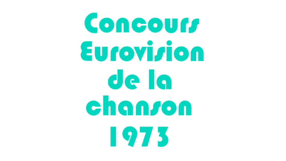
Through the 1960s, Eurovision started to adopt a more stylized visual identity with fully fledged logo designs for each event. This offering from Luxembourg in 1973 was a step backwards.
06. The 1998 Eurovision logo
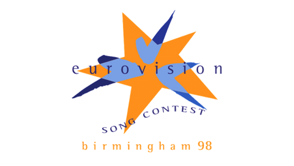
Some designs just don't age well, but the logo for the Birmingham-hosted Eurovision Song Contest feels like it could have been from several years earlier than 1998. The blue shapes are taken from the logo of the European Broadcasting Union, something that most Eurovision viewers were unlikely to either know or care about.
07. The 1986 Eurovision logo
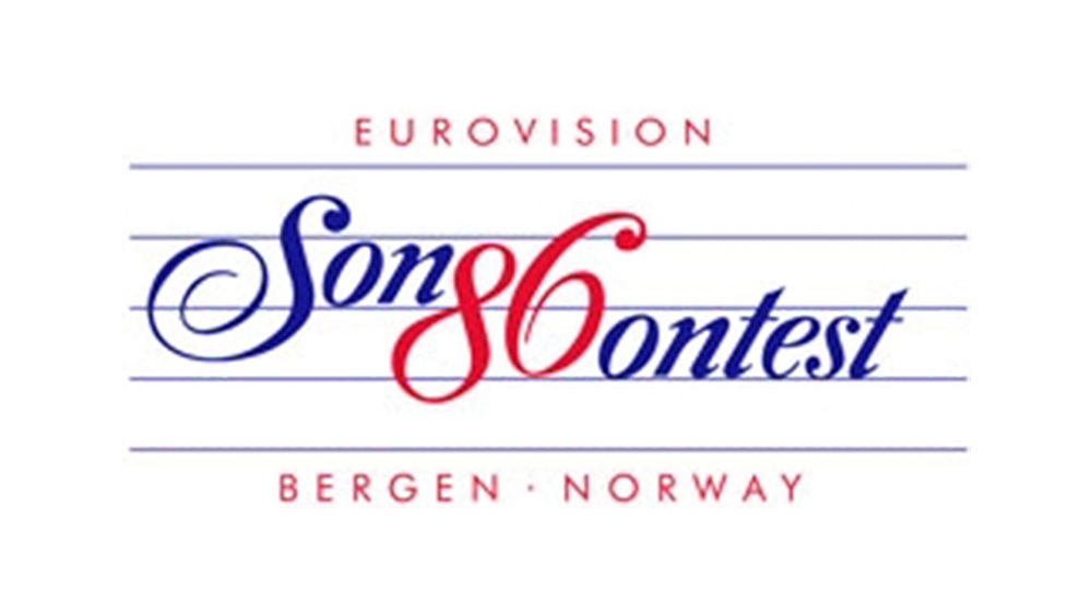
Did you see what they did there? Too much is what they did, making the 'G' and 'C' look like an '86' while also making the whole thing look like musical notation. The 'Sonontest' was held in Bergen that year.
08. The 1991 Eurovision logo
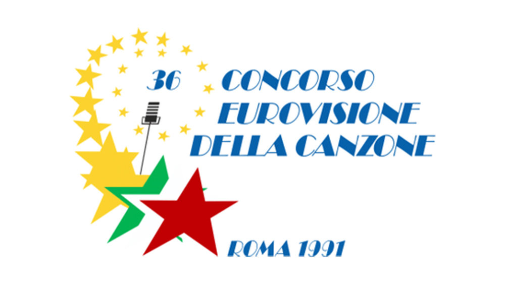
From the clip art microphone to the random placement of the 36 and the font choice, this design didn't rise like a phoenix.
09. The 2003 Eurovision logo
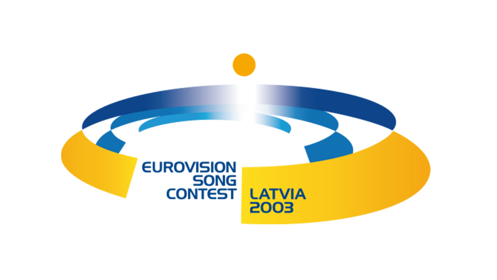
Latvia thought it was hosting a MICE tourism congress in 2003.
10. The 2016 Eurovision logo
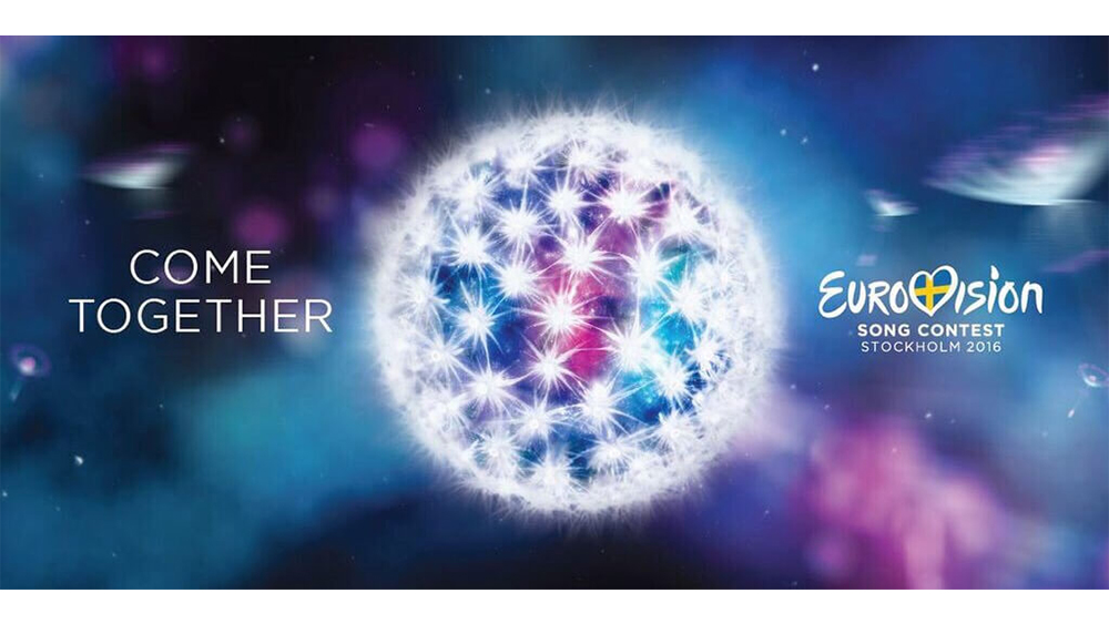
And in 2016, Stockholm thought it was hosting an intergalactic biotech conference. Either that or someone spiked its drink.
11. The 2001 Eurovision logo
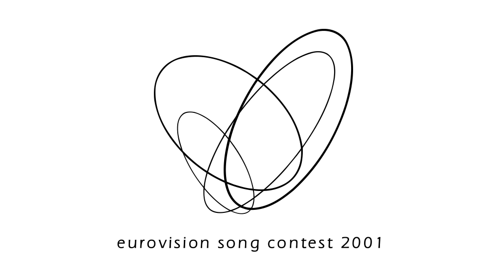
Listen, Copenhagen. The Eurovision Song Contest is an event that's given us Dana International and t.A.T.u., not Autechre. Sure, the design draws on Danish minimalism and it reflected the stage design for the event, but it was way too abstract and pretentious for Eurovision, only very vaguely resembling a heart. And the all lowercase title is just infuriating.
Looking for more logo design inspiration? See our pick of the best World Cup logos and the Euro 2024 logo.