The Olympic Games men's road race started in the shadow of the Eiffel Tower on Saturday, with a rainbow of colours in the peloton.
Like the World Championships, the Olympics put riders into new kits that makes it tricky to identify riders even for the most seasoned cycling fanatics. Each nation designs their kits to reflect either their country's flag or, in the case of Australia, Italy, Belgium and the Netherlands, colours that are part of the nation's identity.
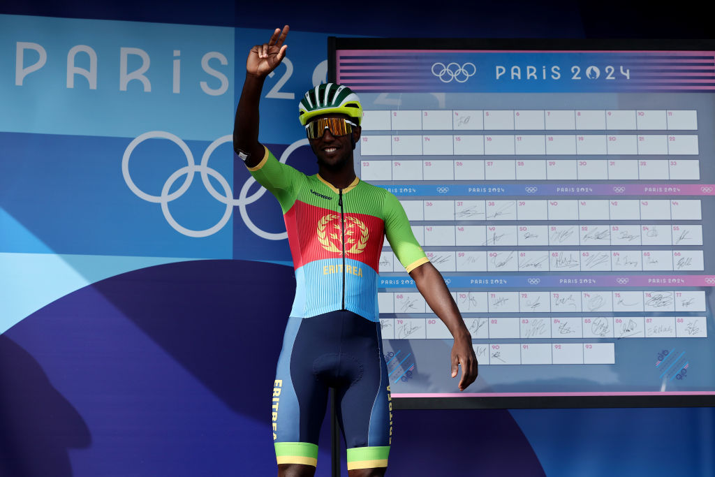
Biniam Girmay, the sole entrant from Eritrea, sported a kit that accurately reflects the blue of the sea, green of the agriculture and red of the flag representing the country's struggle for independence. Gold bands on the neck, legs and arms could represent the Tour de France green jersey winner's ambitions for the medals in the men's road race.
Cyclingnews picked a selection of the best and worst of the rest of the team kits.
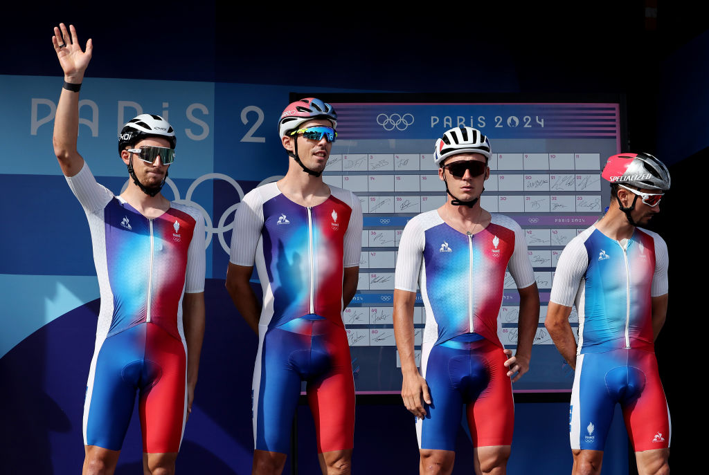
The host country went with a very attractive red white and blue fade - like the rest of the French Olympic teams, the cycling kit is cool without looking too flag-like. Trés beau!
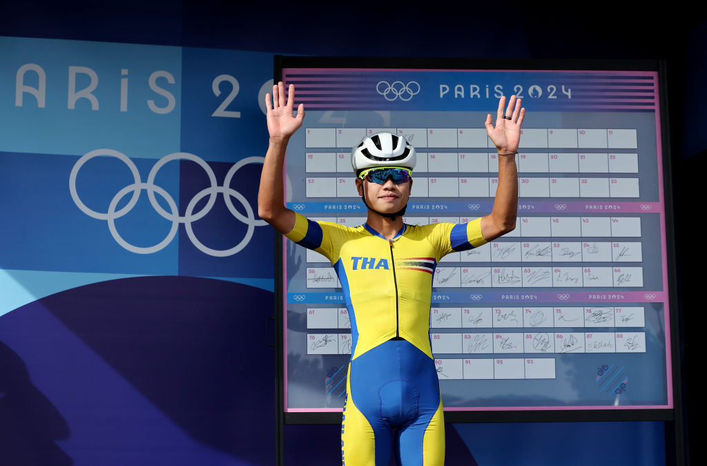
Thailand's flag is also red, white and blue but the kit is a big splash of a cheerful bright yellow with blue accent panels.
Yellow is the colour of the country's King Vajiralongkorn. Thanakhan Chaiyasombat above is easy to pick out in the peloton in Paris.
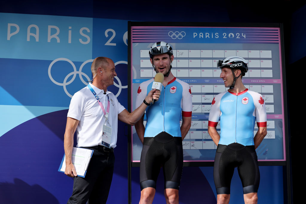
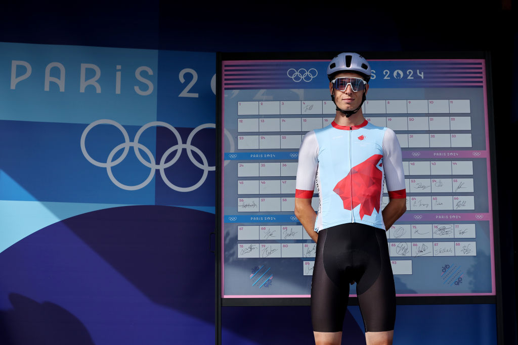
Canada, like Belgium, uses a light blue background rather than stick with the red and white of the country's flag. According to Canadian Cycling Magazine, the colour represents the three oceans that Canada touches.
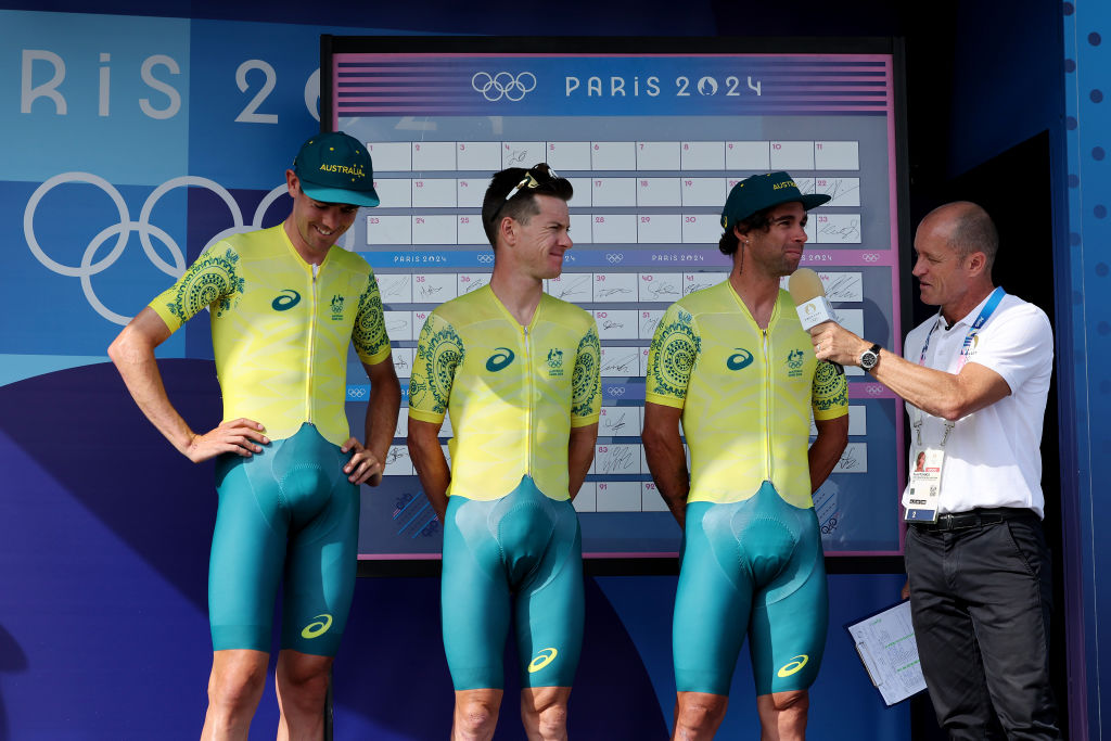
Australia's kit is part of a long tradition of yellow and green sports kits.
Whether it's because of the native golden wattle flower or a reference to the beaches and forests of the nation Down Under, the 2024 Paris kits from Australia are one of the most distinctive.
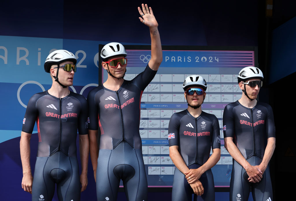
Great Britain seemed to play it safe with their kit design - maybe wanting to hide in the shadows of the major favourites like Belgium and the Netherlands rather than ride around with a Union Jack as a target on their backs.
There's definitely not much to make them stand out in the peloton.
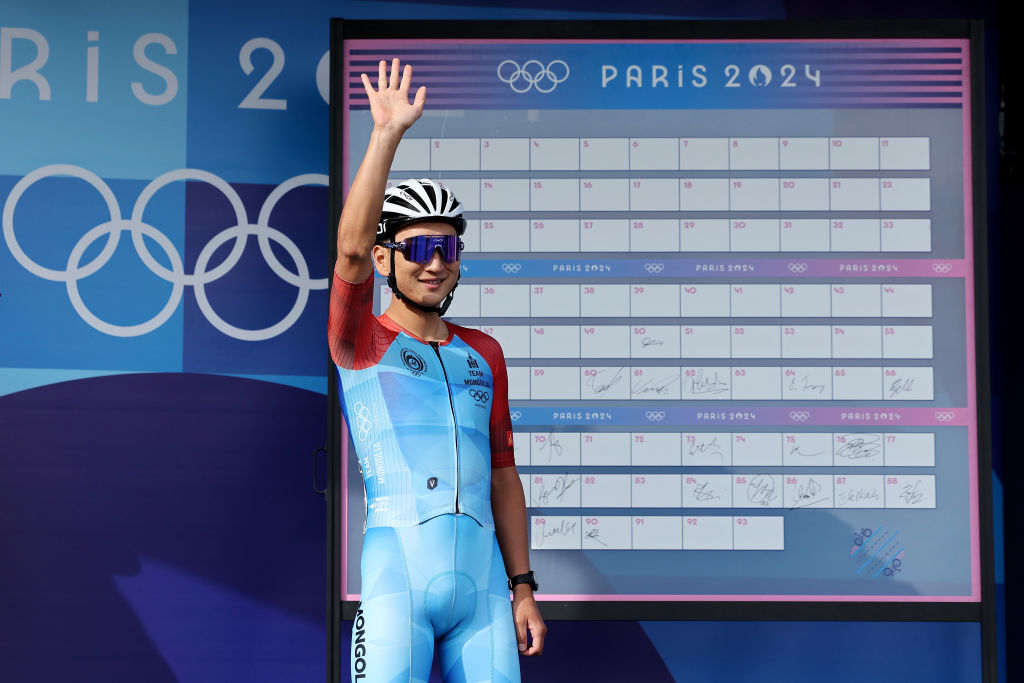
Mongolia's Jambaljamts Sainbayar, the first Olympian in cycling from that country, looked cool in his flag-themed kit. The sky blue and red create a vibrant combination - more so in person than from the photo. It's a classic look.
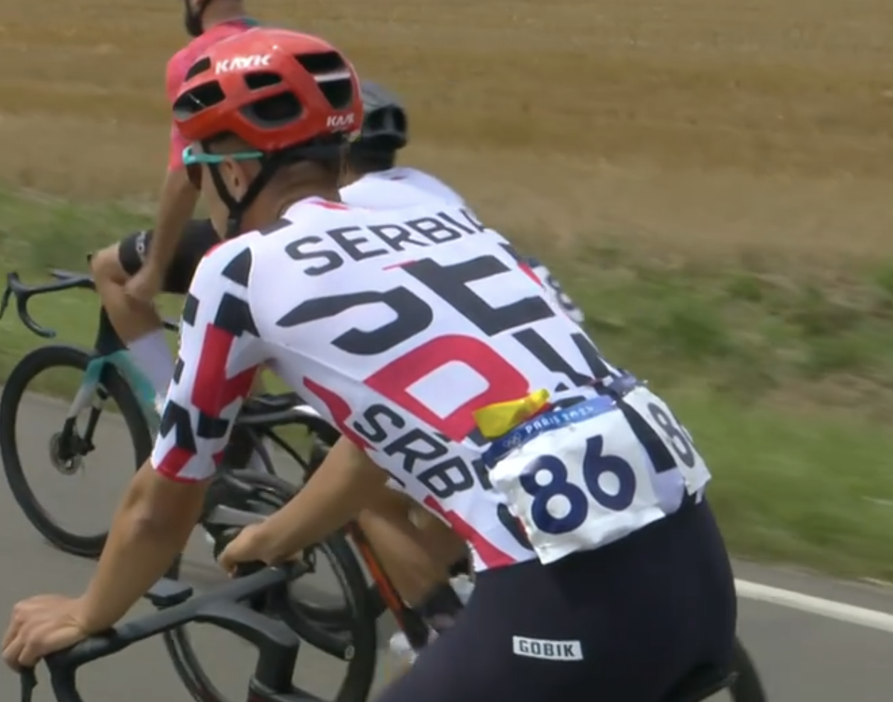
Serbia went bold with the kit for Ognjen Ilic, the only rider from that country in the men's road race. The jersey is reminiscent of the old AG2R La Mondiale kit, which was always a favourite.
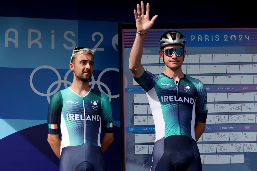
Ireland went with a ocean-themed blue and teal kit with only a fade into the more traditional green of the country's flag. It's a lovely mix of what makes Ireland beautiful and brings to mind the crashing waves beneath the Cliffs of Moher.
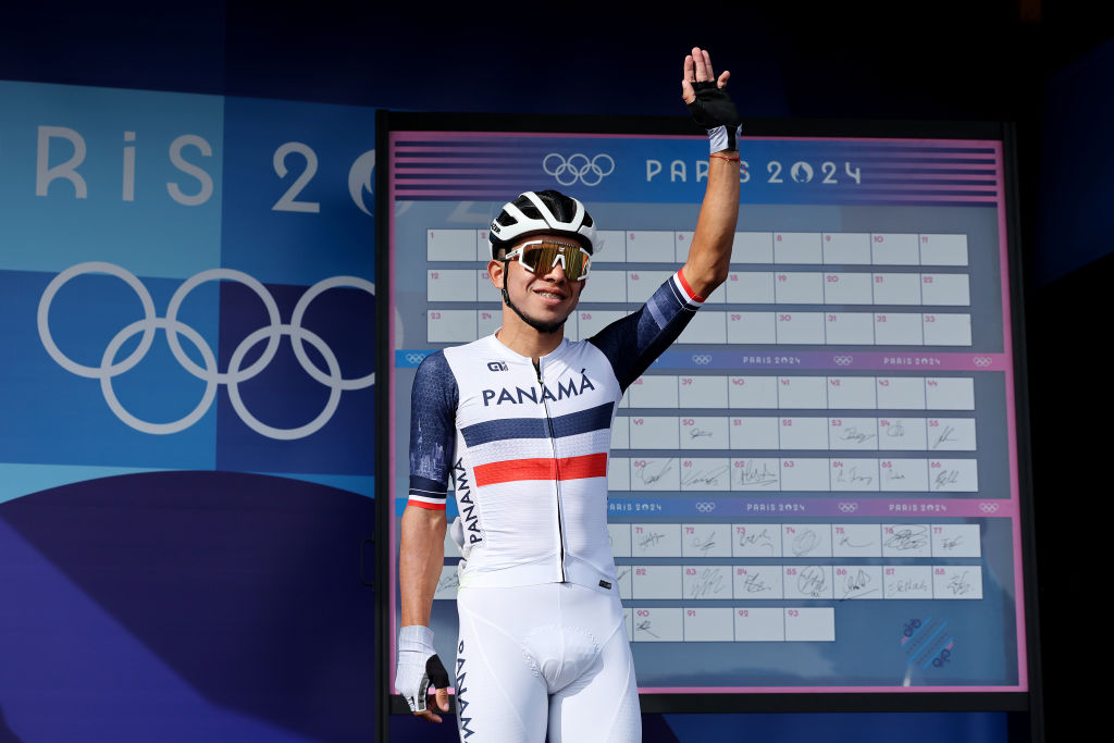
Panama wasn't afraid to go with red, white and blue, although the kit on Franklin Archibold above lacks the stars and quartered pattern of the nation's flag.
It's a clean, sharp look especially with the dark blue sleeves, and the white stripe between the red and blue brings to mind the Panama Canal.
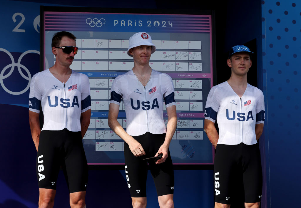
The Team USA cycling kit falls a bit flat in comparison with their competitors. The white is useful for the summer heat but there's a notable lack of symbolism. Just U-S-A. The dark blue arm band makes us wonder what they're mourning.
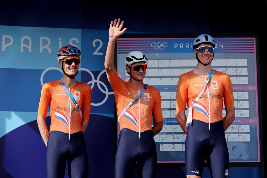
The Netherlands stayed with the usual orange, the colour of the House of Orange-Nassau, as is tradition.
The red, white and blue stripe is a new feature but is quite a bit more subtle than Belgium's bold graphic.
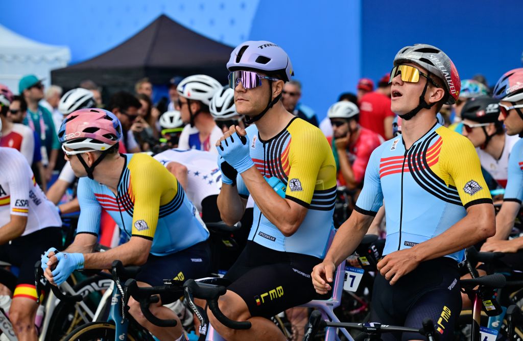
The blue colour of Belgium's cycling kits isn't as obvious as the Dutch orange but it's a long tradition that is also linked to the country's royals.
There is also speculation the blue might have originated in a 20th century sponsor of the team. This year's shoulder sling of black and red with the yellow arm brings to mind the Belgian national flag like never before. It looks fantastic in the bunch.
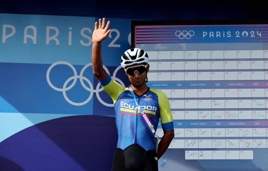
We're sad that defending champion Richard Carapaz isn't in Paris but Jhonatan Narvaez looked fabulous in the Ecuadorian kit. The colours of the flag are subtle and the bright yellow arm bands really stand out against the blue.
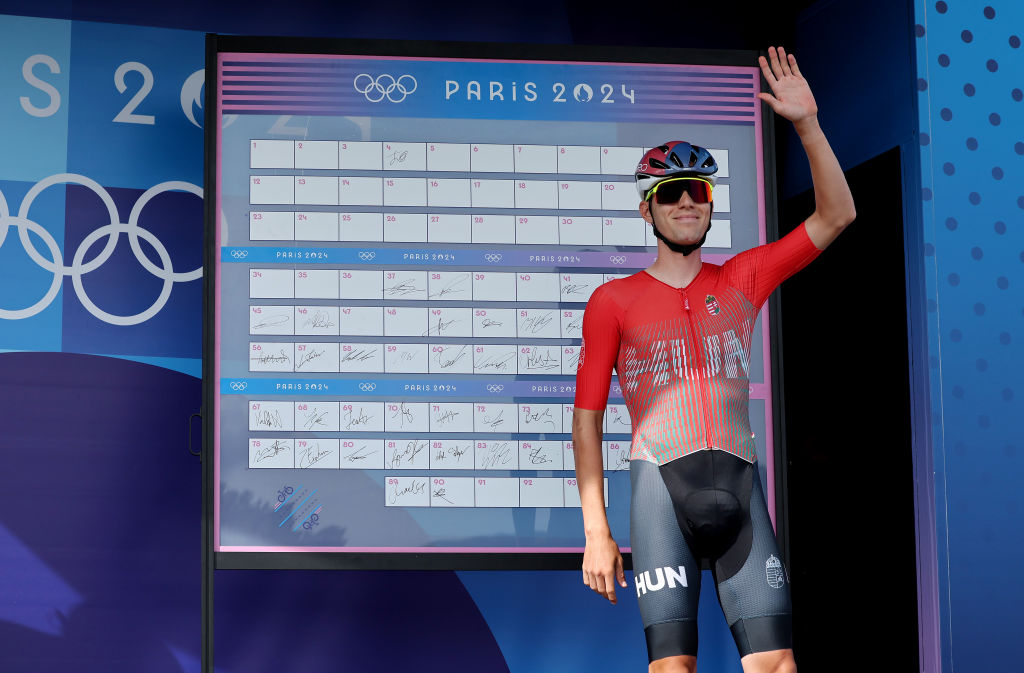
Hungary went with a modern, bold look like Serbia and Attila Valter's red fade and big HUN looks great.
We have to question the design of Luxembourg's kit for Alex Hirsch. Is the map so that he can point to his belly button and say "I'm from around here"?
Sad to say, it looks more like he's in dire need of medical assistance.
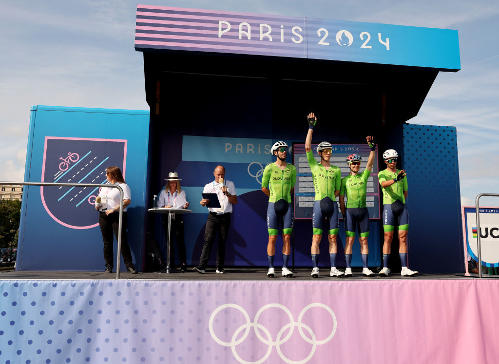
Slovenia's cycling kit for the Olympics is similar to previous national team kits and is a wonderful blend of lime green and blue.
Too bad Tadej Pogačar isn't in Paris to sport it.


