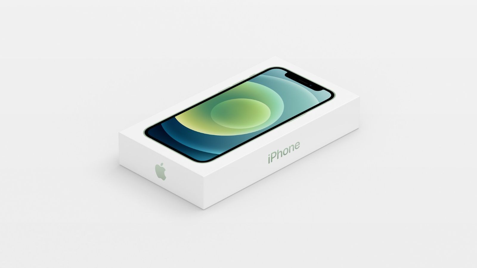
Once upon a time, brands had guts. They dared to be weird, wild, colourful. Logos had serifs. Packaging had personality. Fashion had flair. But now? Everything looks like an iPhone box. Beige, blank, polite. From furniture to fashion to branding, have we entered a timid age of tastefulness – design so terrified of being tacky that it barely exists at all? While the best logos are undeniably unique, we've entered an era of homogenised design.
Welcome to the Beigeification of Design. Please take a seat – preferably a bouclé armchair in oatmeal, under a wall painted “Swiss Coffee” (or perhaps Pantone's colour of the year, Mocha Mousse) and let's see how we got here.