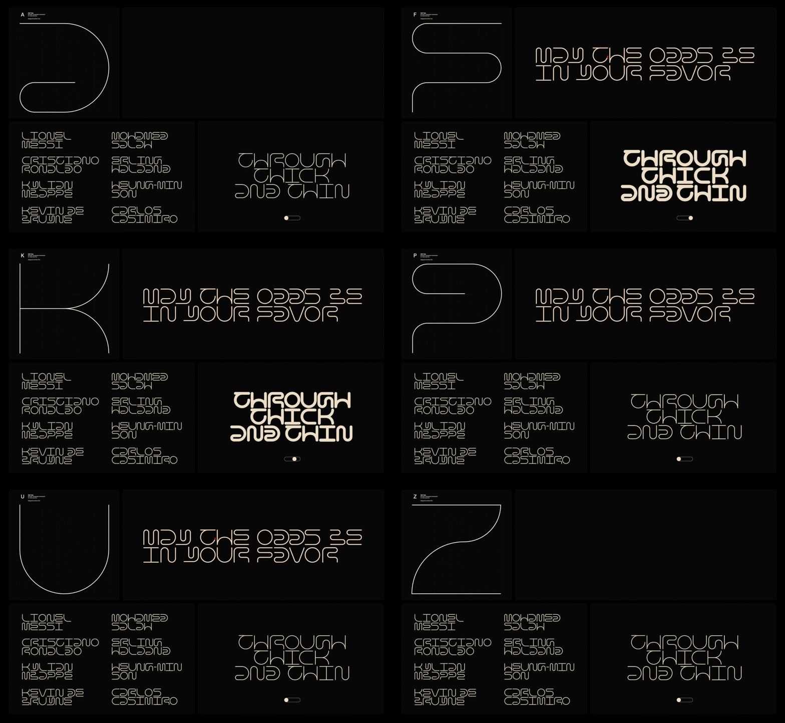
It's Typography Week here at Creative Bloq, and to mark the occasion we've been catching up with designers across the globe to learn about their approach to type, and how fonts impact their work.
Brian Cho is a graphic designer based in San Francisco, California, working in tech with a focus on art direction and brand identity. His work blends creativity with strategic thinking, focusing on crafting compelling visuals that resonate across diverse platforms. Whether developing brand identity, art direction, or refining the nuances of typography, he aims to create designs that connect with audiences and elevate brand narratives.
Can you tell us about a recent creative project that involved typography?
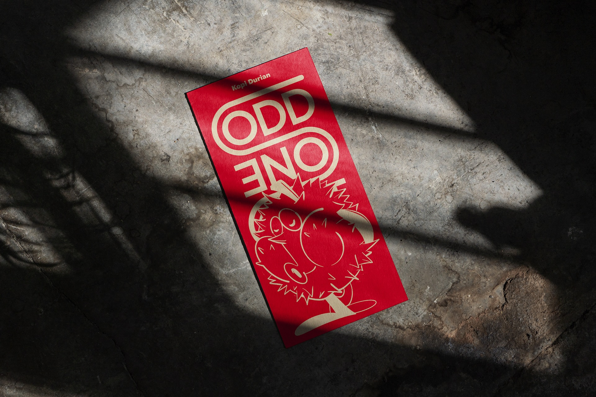
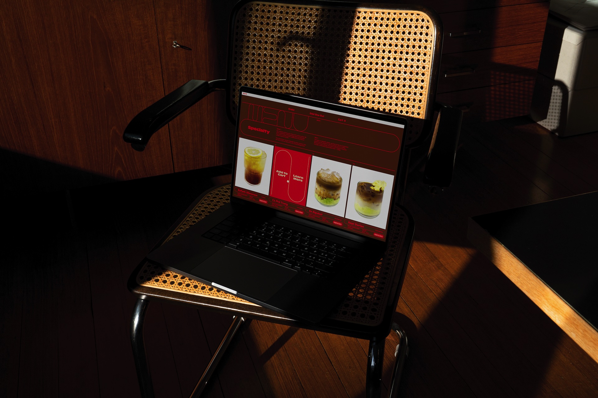
In 2023, I initiated a passion project to create a brand identity for a hypothetical café called Odd One Out, which specializes in a diverse array of unique coffee concoctions enjoyed around the world. The identity features a custom typography called Odd Type that was integrated throughout the identity system. The typeface was inspired by the landscape of the coffee farm and the patterns used by coffee farmers to dry their beans.

What were the challenges and rewards involved with this project?
This project holds a special place in my heart because it was entirely self-initiated, allowing me to express my creativity during my free time outside of my full-time job. Throughout the process, I faced numerous challenges, including daily self-doubts and experimentation with unfamiliar mediums like illustration and photography. However, these struggles were incredibly rewarding, as they pushed me to learn and grow, ultimately leading to results that exceeded my expectations.
How do you think your use of type impacted the overall result?
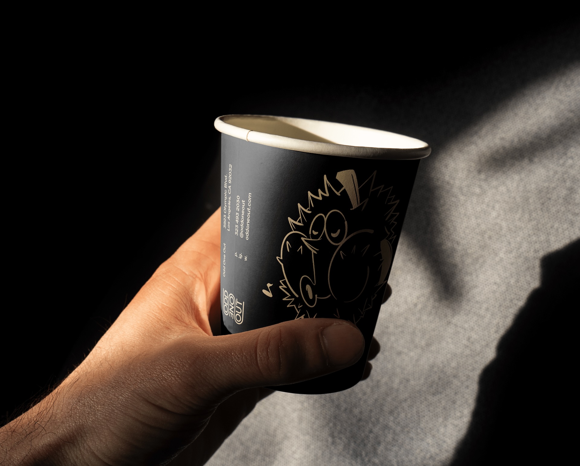
The custom typography was key in making this identity feel distinctive, giving the café a fun and unique personality. It was integrated into every aspect, including business cards, menus, and the website. My goal was for people to remember this café not only for its unique drinks but also for its quirky vibe. The typography was crucial in crafting this atmosphere, as it helped convey the café's character and set it apart from others. In my view, typography is fundamental to a memorable brand identity, shaping how it is perceived and remembered.
What are the benefits of collaborating with a type foundry like Monotype?
Collaborating with Monotype has made my life as a designer easier and more educational. It’s given me access to a vast library of exceptional fonts, ensuring my typography is unique and consistent across all platforms. Exploring their collection has broadened my design perspective, introducing me to fonts I never knew before. I’ve been particularly drawn to Japanese typography in my practice, and their selection of Japanese fonts has been incredibly useful.
Do you have any advice for designers considering embarking on a type-led design project?
When working on type-heavy projects, I always start by thoroughly understanding the message I want to convey. This makes it easier to choose fonts that align with the project’s tone and audience, as typography is a powerful tool for setting the mood. Once you’ve chosen the right font, experiment with scale and hierarchy to create an interesting composition. The beauty of typography, and design in general, is that there are no set in stone rule, so don’t be afraid to mix and match typefaces. Tools like Monotype's font pairing feature can be incredibly helpful.
This article was produced as part of Typography Week, held in association with Monotype.


