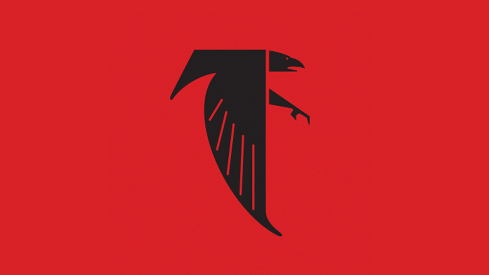
Sports logos generate strong opinions at the best of times. And perhaps that's the way it should be. Fans are passionate about their team, and often equally passionate about their rivals, so it makes sense that they should care deeply about the identity that's being used to represent them.
It's perhaps not surprising then, that people have made their feelings known about the new Atlanta Falcons logo. When I say 'new', I mean old. The NFL team has jumped on a bit of a nostalgia trip, temporarily bringing back an old logo design from the 1960s for their helmets in Week 4, which will see them play the Saints on Sunday. But people are getting some dark vibes from the retro design, and I can see why.