It was always going to be hard to pack the United States semiquincentennial celebrations into a neat, elegant logo design that people could get behind. After all, many of us can't even pronounce the word.
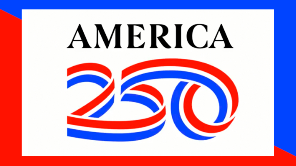
The America250 design aims to be celebratory while keeping things simple and playing it safe (although inevitably some are already seeing unintended NSFW references). There are ribbons. They spell out the numbers 250. The US colours are also in there... or are they? (see our piece on the importance of choosing the perfect logo colour).