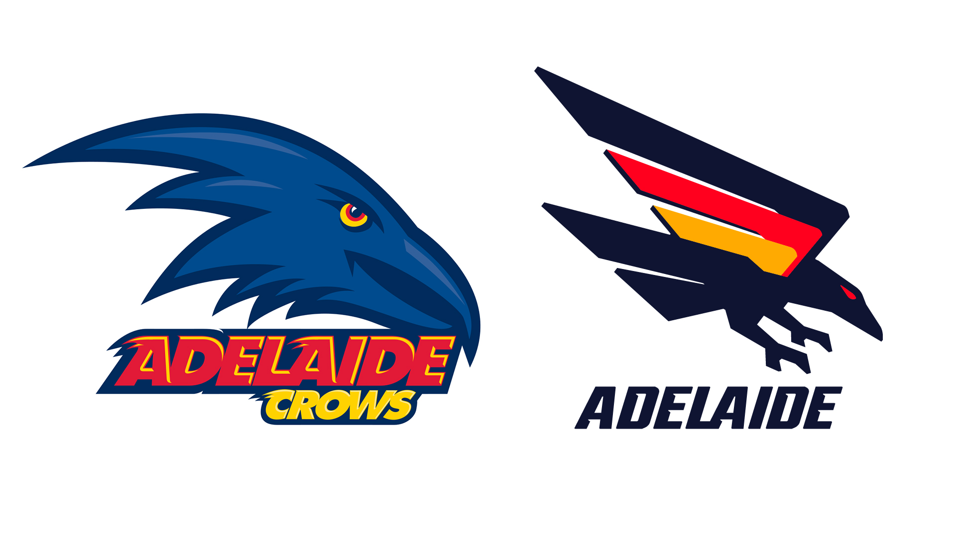
AFL team Adelaide Crows has unveiled a new logo, drawing on the team's '90s roots and throwing back to a previous design. The new look first leaked in September, where it drew a somewhat negative response from fans. And now that it's been officially unveiled, it's drawing even more ire.
The new logo drops the word 'Crows' from the branding, and does away with the cartoonish crow profile, replaced instead by a more minimal design with a swooping wring rendered in black, red and orange. And while yes, while it isn't one of the best logos of all time (and does somewhat resemble the German flag), the backlash to what's essentially a cleaner design does seem a little unwarranted.