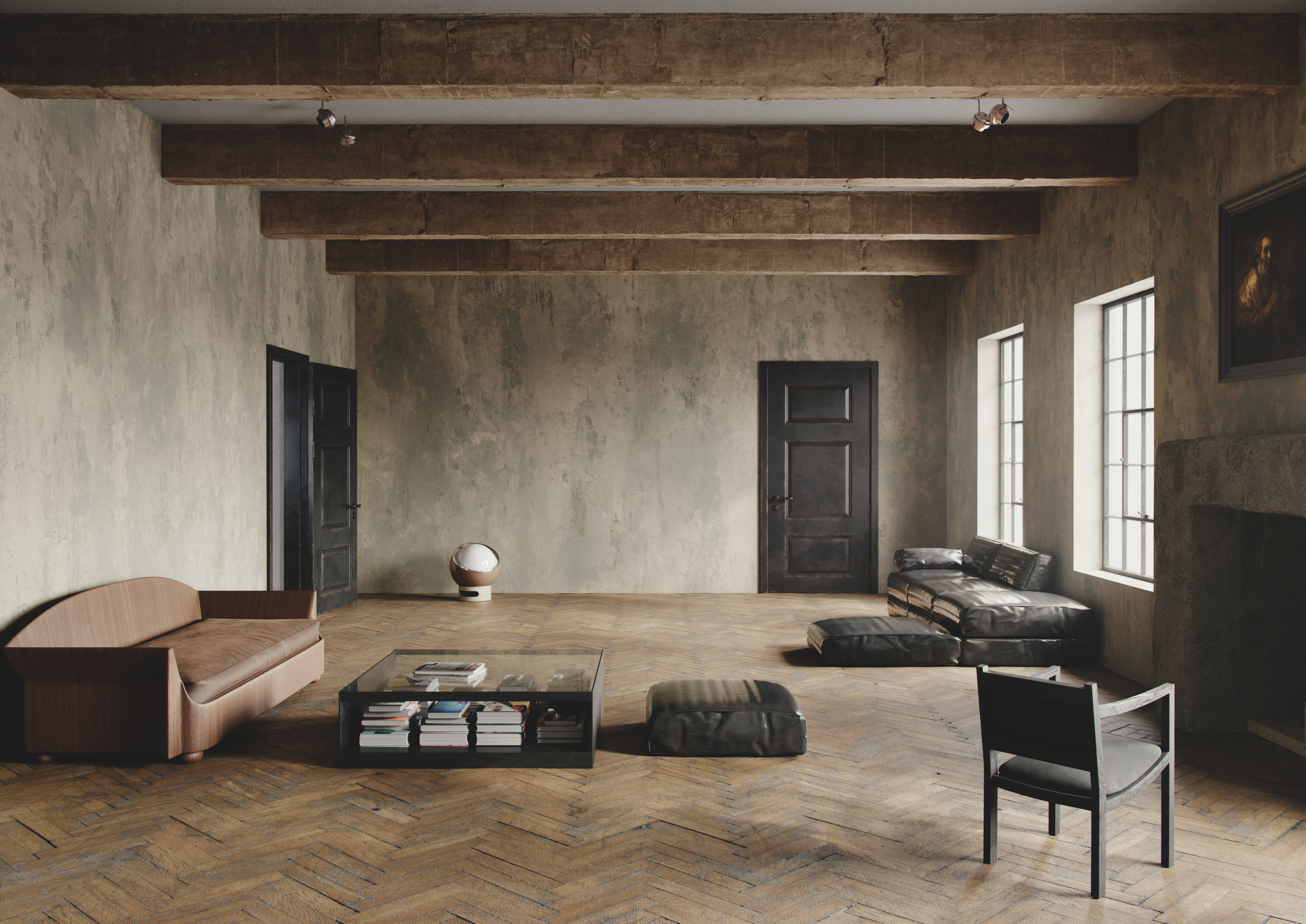
There are few events in the design world calendar that manage to draw such an audience like Milan Design Week. As I was lucky to be in the city a bit early, I took the opportunity to already start seeing some great pieces before most of the design world arrives today. I can already tell that this year’s bound to be a treat.
From impressive installations that would feel perfectly at home in an art museum, to pieces of furniture that are as outstanding to look at as they are useful and comfortable (yes, it’s possible), there’s a feeling of playfulness and joy in the air, mixed with just the right amount of sensibility and appreciation for the past.
As we launched our Italian Issue for Spring 24, Milan Design Week couldn’t have come at a better time to celebrate all that the home of design has to offer, and leave us inspired and looking forward to the game-changing trends to come. Here are my most loved things so far.
1. Colin King and Calico wallpaper collections

The result of this collaboration is a thing of beauty. It consists of two collections of wallpaper, Perception and Nuance, both inspired by the effects of time and patina reminiscent of the walls and surfaces of old historical homes, and presented at Milan Design Week in an installation structure adequately named Monument, in a magical historical setting.
The wallpaper tones are warm and welcoming, and I love the subtle variations of light within the sludgy colors, like the light just before dawn. If you were to use any in a light filled room, the way they would change throughout the day would be so enriching and fascinating, perfectly fitting into the new pretty trend.
2. Massimiliano Locatelli Editions chairs and rug

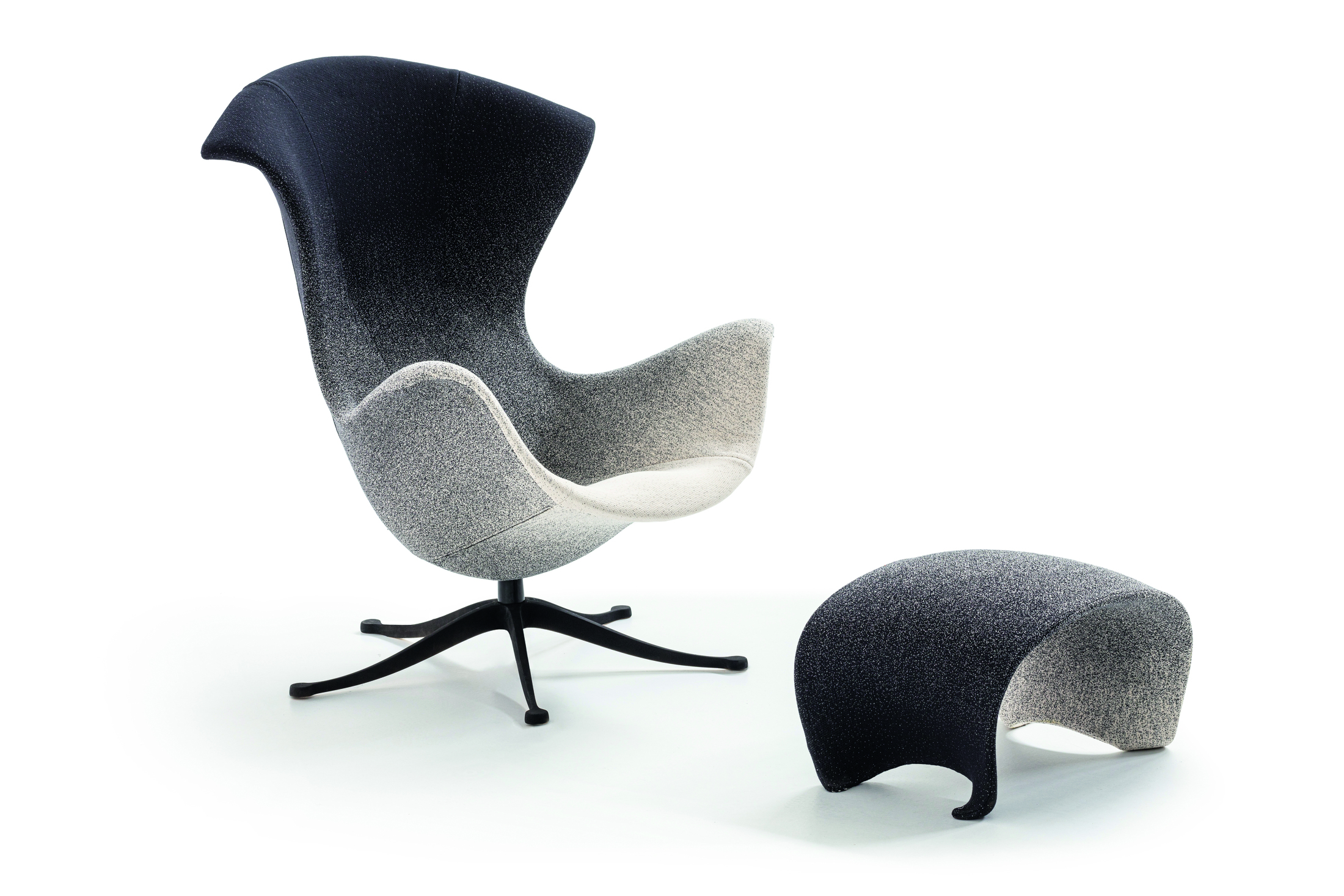
I think I found a perfect design pair that sparks pure joy. The palette on these Massimiliano Locatelli Editions ombre chairs is one I'm going to be using in decorating later this year, and the brand’s imperfectly perfect edges of the Rug 01 are so clever and unexpected and bring so much character. The chairs would sit so well (pun not intended) on top of this rug, in a modern dining room.

If you haven’t heard of this brand before, don’t worry. It’s new, luxe, launching properly in November, and definitely one to keep an eye on for some very refreshing combinations of forms, colors and materials to get you inspired, and provide a new, more playful perspective on home furniture design.
3. La Bursch collection by Alessandro Ciffo

I loved this innovative collection of pieces that seem to be made from syenite, a rock similar to granite, but they're in reality completely made from regenerated silicone. Syenite was used in the past to make the pavements of Milan, and it’s now reinterpreted and showcased at Design Week in the shape of sculptural, outstanding furniture.
It’s impressive how the look of stone makes them feel heavy, but the colors used balance the pieces with lightness. Any item of this collection would be a guaranteed conversation starter in a home. The dining tables and bench look amazing, but so does the Armadio which I'd use in a living room as a very chic drinks cabinet.
4. The new One Page chair by Ron Arad for Moroso

As comfortable as it looks, its peaks and curves providing drama and flair. I’m talking about the new One Page chair designed for Moroso by Ron Arad. And yes, I will be sitting on and trying out as much furniture this week as possible, especially when it’s designed by such an iconic figure as Ron!

His work for Moroso over the years has changed modern home design, adding curves and loops, and shapes that no one had used before. This latest piece is set to be another classic that you'll want to invest in and keep for a long time, as pieces like this tend to look better and better with age and go beyond trends.
5. The Inbetween shelves and mirror by Naessi Studio and Fenix

This double-sided piece of furniture by Naessi Studio is a showstopper. On one side, useful shelving, and on the other, a tall mirror placed on top of a very distinct looking surface crafted by Fenix. I love how it can be used in an open plan space as a divider, the shelf side facing the living area, while the mirror side can face the hallway.

The interesting combination of colors make this a stand-out piece and make a statement, in a similar way an oversized artwork would. This material iteration has the look of a shower of comets or a lava flow. There is a heat and a playful element to this surface that I can imagine being used also on a very durable dining table.


