This past week, I’ve been stomping the streets in kitten heels with an umbrella in hand, relishing the distinct pleasure of attending NYC Design Week. Like the city itself, the emerging decor is a vibrant and eclectic mix. From solo ceramicists and daring colorists to visionary architects and the ever-fabulous Kips Bay Decorator Show House, I’ve been treated to a sneak peek of what New York’s finest have in store for the next one, two, or even three years.
Despite its variety and unpredictable nature, the city certainly has a distinct flavor. After making my rounds over the past few days, I’ve managed to pinpoint a few of the biggest interior design trends to watch — and they’re very exciting.
As someone who enjoys a room with a little personality, I’ve been thrilled to see dramatic color combinations, tactile textures, and spaces devoid of monochromatic beige and predictable silhouettes. There’s so much to discuss, and I’ll likely pen a few more pieces on my favorite finds in the coming weeks. But for now, let’s kick off this recap with a bang: the top 5 trends from Design Week. This is your sign to get inspired, because if this is the first you’ve seen of these styles, it certainly will not be the last.
Biggest Trends from NYC Design Week 2024
Fringe
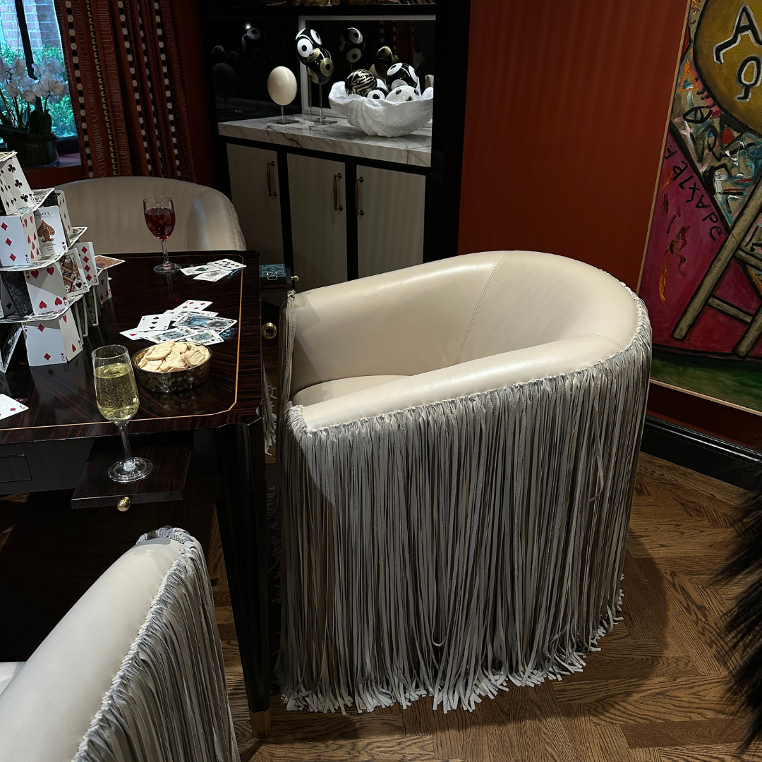
First on the list is fringe — in all lengths, materials, and textures. From short, dense fringes lining lampshades in a room designed by Jeremiah Brent, to dramatically exaggerated, floor-skimming fringes on leather chairs from Barbara Ostrom Associates — so extravagant that each chair used six cowhides to create.
And of course, I noticed quite a bit of classical fringe — by that I mean the antique-inspired variety you’ve likely seen on an armchair or circular ottoman, or what one might imagine belonging to an aristocratic grandmother. This heirloom style complemented other vintage and vintage-inspired designs, such as those in the old-meets-new curation by The Jayson Home Loft, which, by the way, will be at Bergdorf Goodman for the next few months. So, if you’re in the city this summer, I’d definitely recommend stopping by.
Fringe even appeared in unexpected places, such as the bottom of a shiny metal dresser. The takeaway? Fringe can belong almost anywhere. I’m definitely planning to add a few fringed edges to my decor.
Animal Print
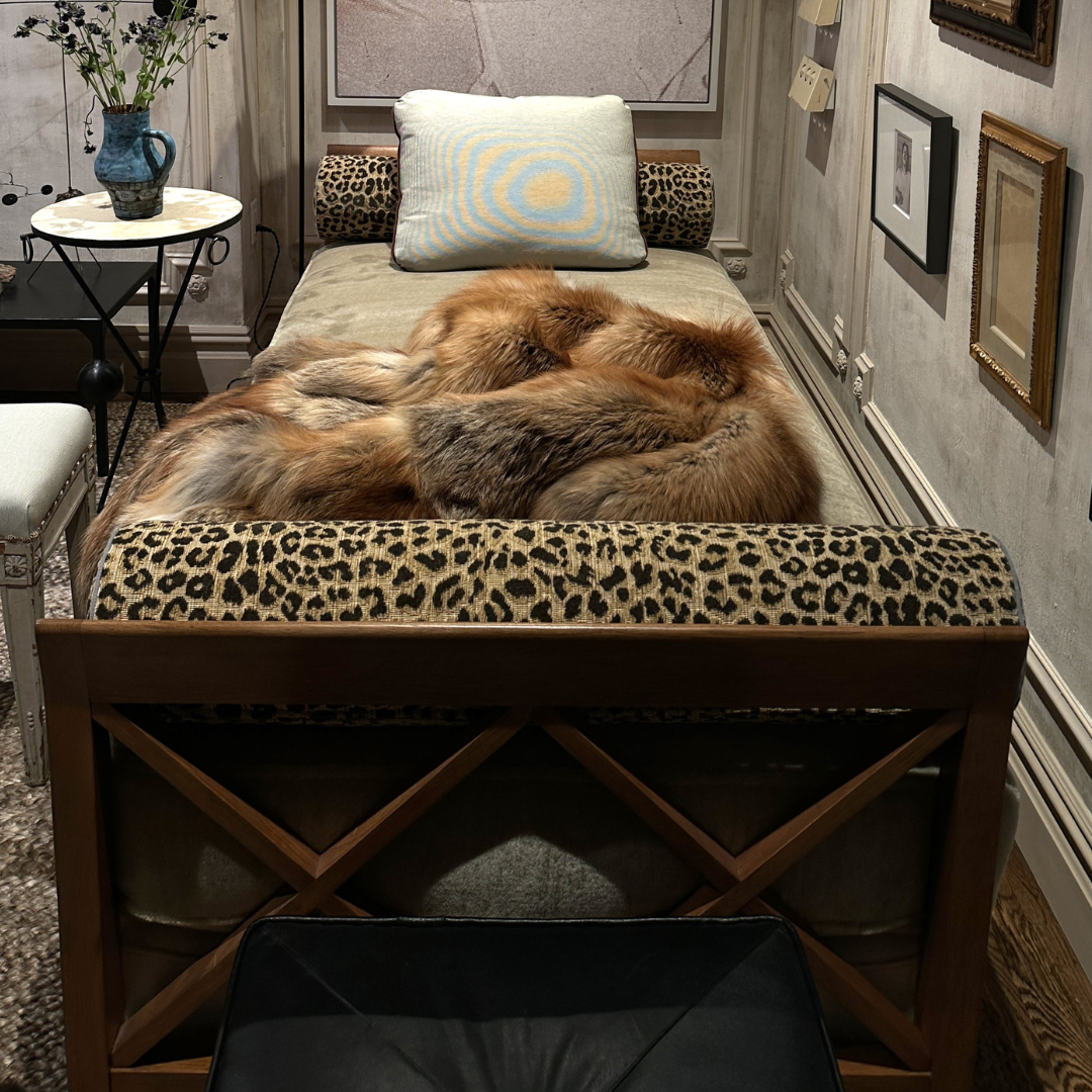
Animal print. I can’t say I was surprised. With my background in fashion and chronic TikTok use, I saw this one coming from a mile away (a moment of silence for the "Mob Wife" aesthetic — feels like lifetimes ago). In fact, I wrote about the leopard trend revival in interiors back in January. It’s a sort of sleazy ‘70s chic: animal print on walls, pillows, and carpets.
Predominantly, the trend featured jungle cat motifs, but I also noticed quite a bit of calf hair and even the far more shocking real zebra hide varieties, making earlier "wild" references seem quite tame.
The result is an exotic look — tactile, touchable, and traveled — Lenny Kravitz-esque glamour. Animal print may not be to everyone's taste, but it is very New York. If you’re not completely overwhelmed by the idea and want to dip your toe in (because I think this trend will only grow), I’d suggest starting with low-stakes accessories — a cowhide pillow cover or perhaps a leopard print rug (I have one to the left of me as I write this piece).
Metallics
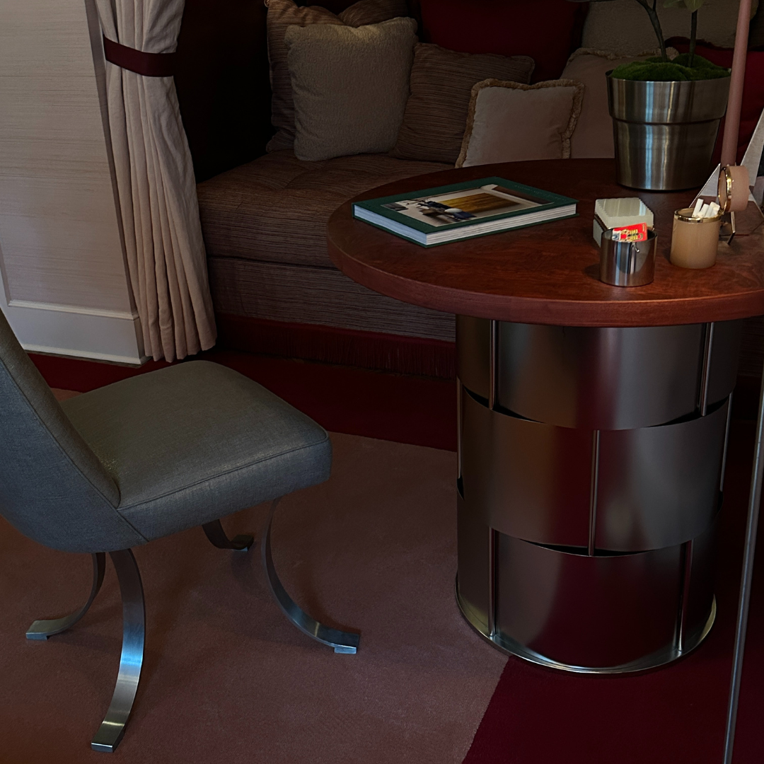
Metallics are another trend I've been seeing in the zeitgeist, so it was a pleasure to see it executed on a grander scale during Design Week. I find this trend very accessible: chrome bathroom accessories like tissue and soap holders, as well as eye-catching gilded wall art and frames above a sofa or loveseat.
However, I was most captivated by instances where metallics were taken to the next level, like a shiny gold fireplace mantle frame. My favorite, which sounds a little outrageous, was a silver chrome table base that resembled Bottega Veneta’s iconic Intrecciato weave.
Most often, golds were styled paired with jewel tones like deep purple or teal, while silvers, often accompanied by cherry reds and pinks, evoked a ‘60s space-age vibe — almost reminiscent of a retro Americana diner. And to my delight, gold and silver were occasionally paired. Some might still consider this a faux pas, but done right, mixed metals can be quite chic. Expect to see metallic accents in unexpected combinations cropping up everywhere.
Murals
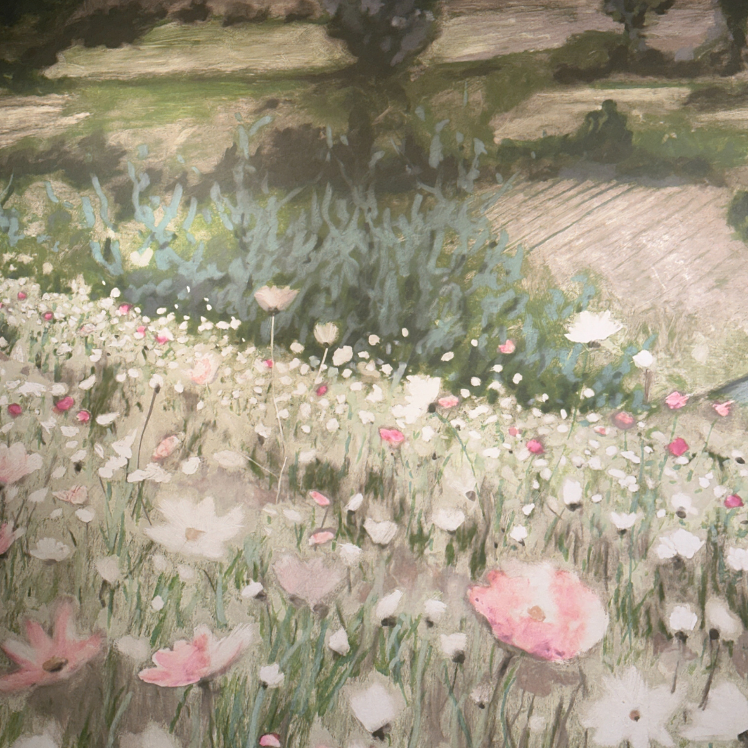
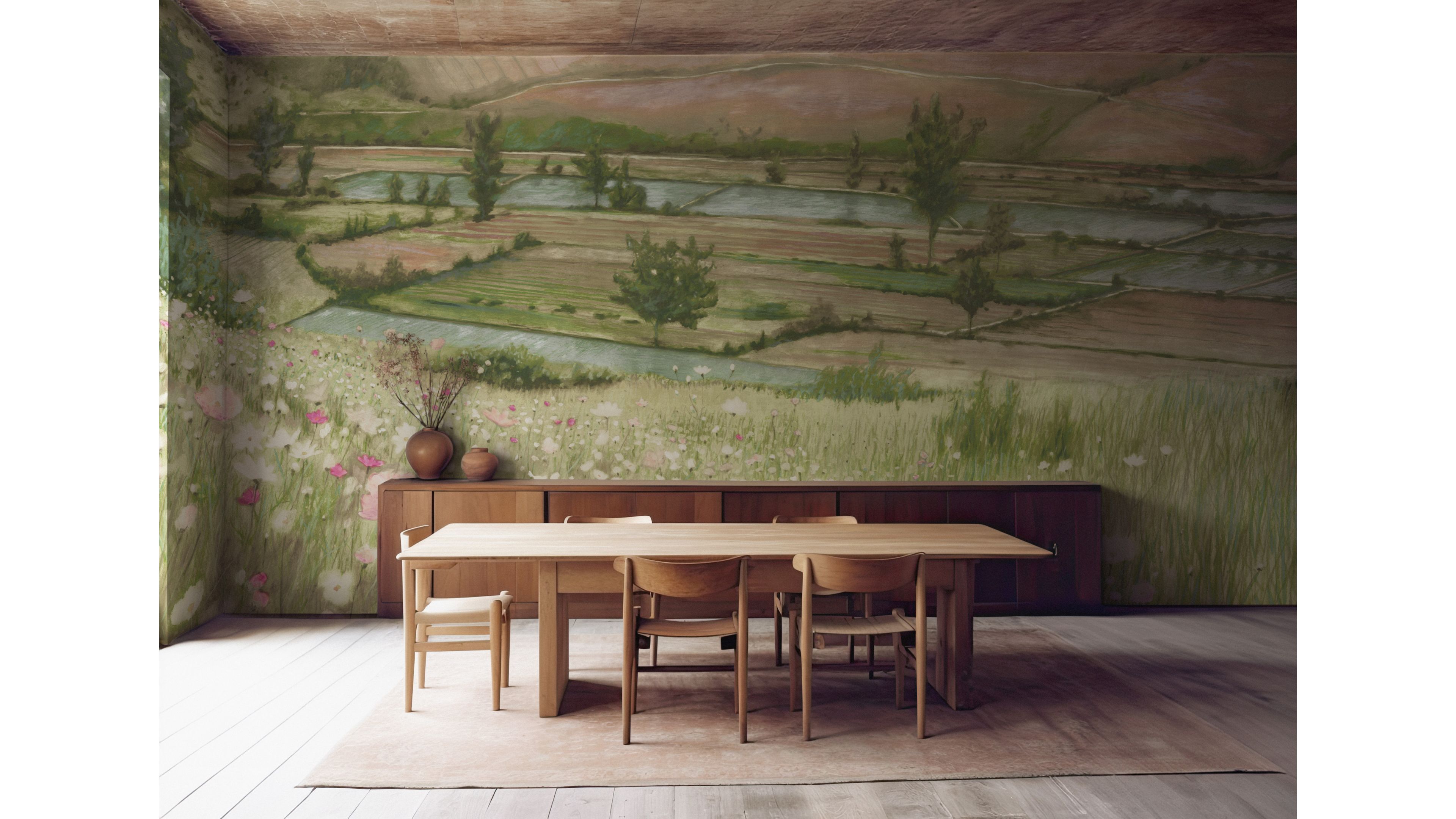
Amidst the shiny silvers and exotic animal prints emerged something more serene: murals — wallpaper’s more artistic older sister. The most spectacular ones were part of Calico Wallpaper’s Memoir collection, featuring scenic landscapes inspired by Jean Pelle’s father’s old photographs. Think flower beds and grassy rolling hills in pastel hues, executed with masterful skill. Photos don’t do them justice — these murals possess a painterly quality that belongs in a museum, yet they make for a stunning everyday backdrop.
Other murals embraced abstraction. Phillip Thomas, founder and principal designer of Phillip Thomas Inc, created a one entirely from fabric inspired by his travels in Chile. It depicts a mountainous scene with a camouflage-like effect, made even more enchanting with sparkly silver accents.
A few murals exuded heirloom quality, as if plucked from a noble’s estate. One perfect replica of The Unicorn Defends Himself tapestry from the early 17th century caught my eye. No matter the style, these murals lend a sense of expansiveness to a room, adding openness even if the colors seem imposing. They’re a fantastic option for spaces that lack natural light — after all, the mural might be a better view than what’s outside the window anyway.
Surrealism
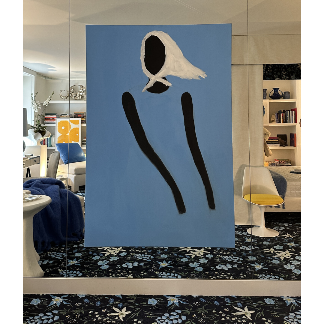
And finally, there were the surrealist styles — visually perplexing and delightfully playful. This trend was the highlight of my week. Notable sightings included a lounge chair made entirely of stuffed animals, a shadow box-style side table with a magnet for moving around hundreds of tiny metal beads (a dangerously addictive living room game), toilet paper designed to look like a roll of hundred-dollar bills, and an incredibly realistic pigeon sculpture perched on a desk, courtesy of Patrick Mele. Essentially, all the quirky ingredients needed to create the chicest adult funhouse ever.
For those less amused by shock value, there were subtler takes on the trend: sculptural table bases that seemingly defy gravity, inverted lamp shades like those on view in 31 Days by Dumais Made, and walls gently twinkling with glitter and small, sparsely placed lights, creating a magical, celestial look in a staircase. If these items seem unrelated, that's precisely the point! Surrealism was one of the most creatively diverse trends I’ve seen. Basically you can dream it, you can bring that whimsy home.
Love it or hate it, one thing's for sure: interiors are about to get a whole lot more interesting.


