It’s the first area you see when you walk into your home that instantly creates an impression and sets a tone. Your entryway is like an introduction to your home that allows the story of space to develop thereafter from one room to another in a cohesive way. If you want to create a calming, welcoming interior that is easy to style and accent with other colors, and remain a solid canvas for rotating trends, your best bet is to seek out a neutral paint that will give you flexibility, and a sophisticated look.
Neutral does not have to mean white or grey. Paint brands have now developed so many interesting, muted nuances with just the right hint of color that show subtle changes in different lights, adapting to the other colors around them. The new neutrals are intricate and full of character and have moved far ahead from the flat and dull tones of the past. Here are the experts’ top three picks of beautiful neutrals that will work in any entryway.
1. Plaster pink

We love plaster pink for its warmth, and feeling of joy it creates. It’s been one of the most popular color trends for a while now, synonymous with welcoming interiors. There are plenty of elegant, grow-up shades of pink that designers are using everywhere from entryways, to living rooms, bedrooms, and even kitchens, and it’s come to be considered a neutral in its own right.
‘Blush or plaster pink is having a moment right now – but it’s always been my go-to neutral,’ interior designer Matthew Williamson tells me. ‘Warmer than grey, more interesting than beige, and more forgiving than white, it’s a colour that I return to again and again for full wall coverage,’ adds the designer. If using plaster pink, don’t be afraid to match your ceiling in the same tone, or for a bolder palette, pair it with a natural green.
Price: $85.49 / gallon of Emerald Interior Acrylic Latex Paint
A light pink can be a perfect neutral for your hallway that will create a joyful feel.
2. Beige hues
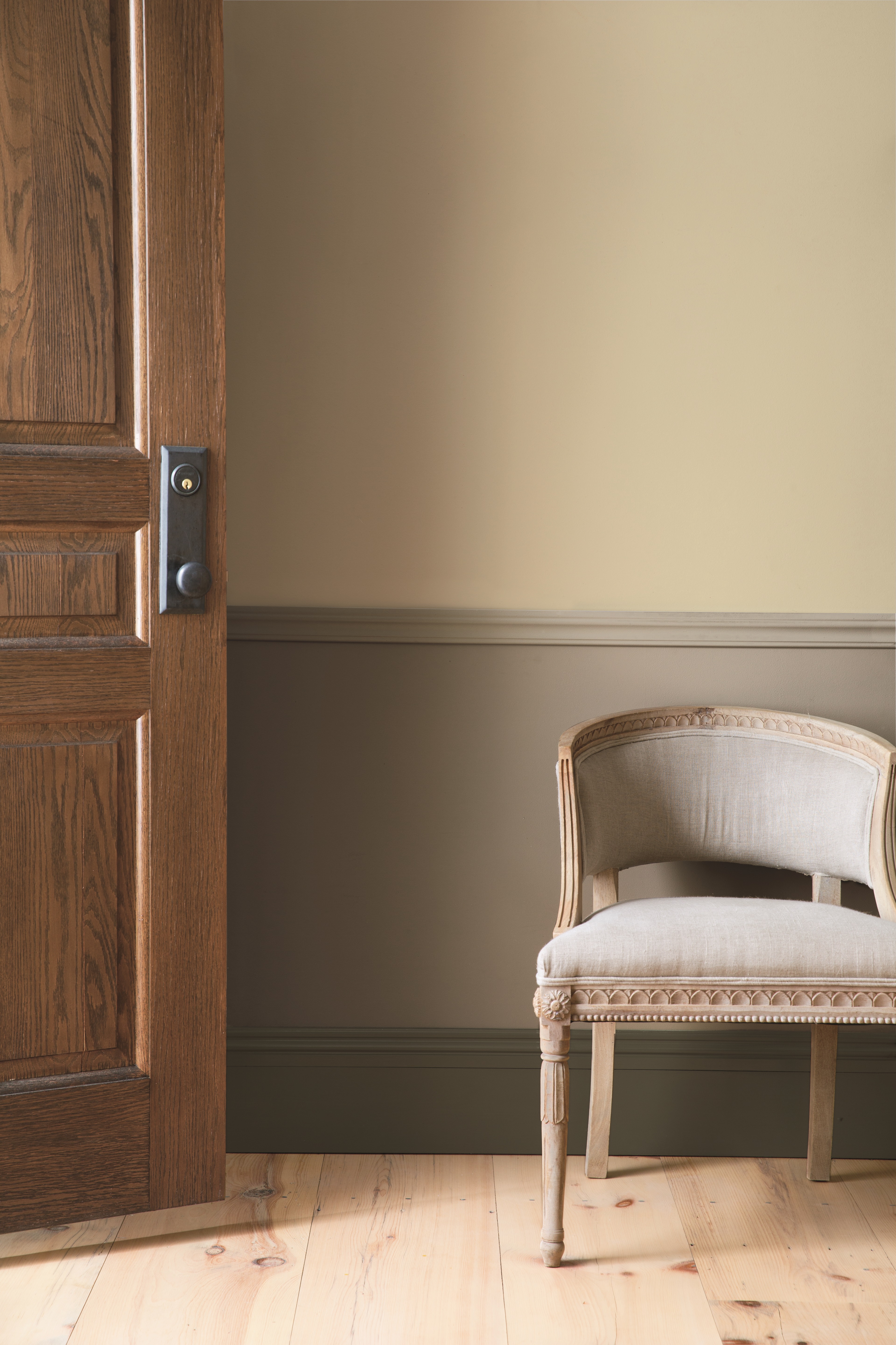
Yellow based beige tones are the most popular neutrals right now, anything from pale beige to warm brows and darker, chocolatey tones. As a color for entryways especially, a lighter tone can create a light, inviting feel, while a darker, richer color will feel cozier. ‘The entryway sets the tone for the rest of the home,’ says Benjamin Moore expert Helen Shaw. The great thing about a beige is that it’s incredibly versatile, so you can play with different color accents and swap out accessories with ease, without worrying they won’t match your wall color.
‘Beige hues work perfectly to provide a neutral backdrop to compliment the rest of the interiors and your favourite furnishings,’ explains Helen. ‘Warm tones such as Muslin OC-12 offer a homely ambience, creating a welcoming space for when guests enter. Entryways are often narrow spaces that lack natural light, so therefore opting for lighter shades such as Calm OC-22 will help open the space and make it feel bigger,’ adds the expert.
Price: $81.99/ 1 gallon of ADVANCE Interior Paint
This warm beige will create a very homely ambiance and will be easy to pair with bolder accent colors.
3. Pale blue

For those of us who prefer something cooler, and like the effect of a grey tone, light tones of blue are the way forward now. More calming and serene, a blue tone is reminiscent of nature, and will create a much softer look than an austere grey. ‘The first step when choosing a colour for a particular room is to always think about how you want to feel in that space. Do you want to feel calm and relaxed? Choose cool tones, like blue, and then work with a few additional shades of this colour base to dress the room with larger items. This creates a stylish, harmonious feel,’ says Matthew. For a bold look, pair with a contrasting color, like fuchsia.
Betsy Smith, color expert at Graphenstone thinks a pale blue is a perfect alternative to white in the entryway or hall. ‘Graphenstone’s Whisper is the perfect alternative to white,’ says the expert. ‘It has a translucent quality that changes in different lighting conditions and gives an airy, clean, and uplifting feel to any space. Crisp but not cold it is the ideal neutral and works particularly well for Spring Summer. Pair it with Duck Egg for your wall paneling. This soft blue has a timeless quality that compliments yellow and red tones in timber, enriching the natural grain and making them feel more alive,’ she adds. The expert advises to pay attention to the preparation and finish of the walls being painted in blue especially. ‘Blues are understated and have a quiet elegance, so a good quality finish is essential for setting the tone for everything within the room,’ Betsy tells us.
Price: $49 / half gallon of interior standard paint
For those who like cooler tones, a pale blue in the entryway will feel calming and serene.