No room in the house is as sacred as the bedroom. It's a personal haven where we lay our heads to rest each night for a moment of restoration and rejuvenation. But did you know that the wrong bedding (specifically, the wrong bedding color) can disturb this divine ritual, causing restlessness and alert energy rather than serenity?
"Color is largely subjective, and we all experience it differently," says sensory color expert Pippa Jameson. "That said, many of us have a consistent physiological response to certain tones." This is because color isn't just aesthetics; it supports mood and function. "When you choose color with the function of a space in mind, it works harder for you," adds Pippa. For example, you want a bedding color that promotes sleep, not socialization or stress.
Soft, muted tones create a sense of calm and reassurance, helping the mind to gently slow at the end of the day, while overly saturated colors can read as 'too alert' for the bedroom. Why is our bedding color so important? Well, it sits so close to our body (we literally wrap ourselves in it), so we need to choose shades with less visual intensity to reduce stimulation. So, importantly, which bedding colors should we avoid if we want to sleep better? Here's what the experts say.
1. Overly Sharp and Saturated Hues
"Color has an extraordinary ability to influence mood, often without us realizing it," says Jessica Hanley, bedding expert and founder of British bedding company, Piglet in Bed. While you may be enjoying certain bold color trends right now, they probably aren't the best for your sleeping space.
"I tend to be cautious with very bright or highly saturated tones when it comes to bedding colors, particularly anything overly sharp or synthetic in feel," says Jessica. Colors such as vivid reds, Ultra Azure, and electric blues, and even stark, cool whites, can feel visually activating rather than restful.
The divide in what's right and what's wrong all comes down to the science behind bedding sheet color psychology. High saturations hold an intensity that can create subtle tension, making it harder for the mind to settle. "Even if only on a subconscious level, these shades can feel energizing when what we truly need at bedtime is softness and quiet," says Jessica.
That said, rich colors absolutely have a place in bedding when used thoughtfully. The key is to soften and balance it. "I love the idea of introducing warmer, more diluted versions rather than anything too bold or primary," says Jessica. This way, you can still embrace color in your bedding while making it feel livable and calm.
2. Dark Shades Like Black and Gray
Cutting blacks and harsh grays are not often seen in bedding and for good reason — it can read as intense, unsettling, and even sad. Color psychologist Suzy Chiazzari explains that black doesn't reflect light, which makes it an inescapably intense color. "So some people feel secure and relaxed with black bedsheets, while others may find them threatening and psychologically uncomfortable," she adds.
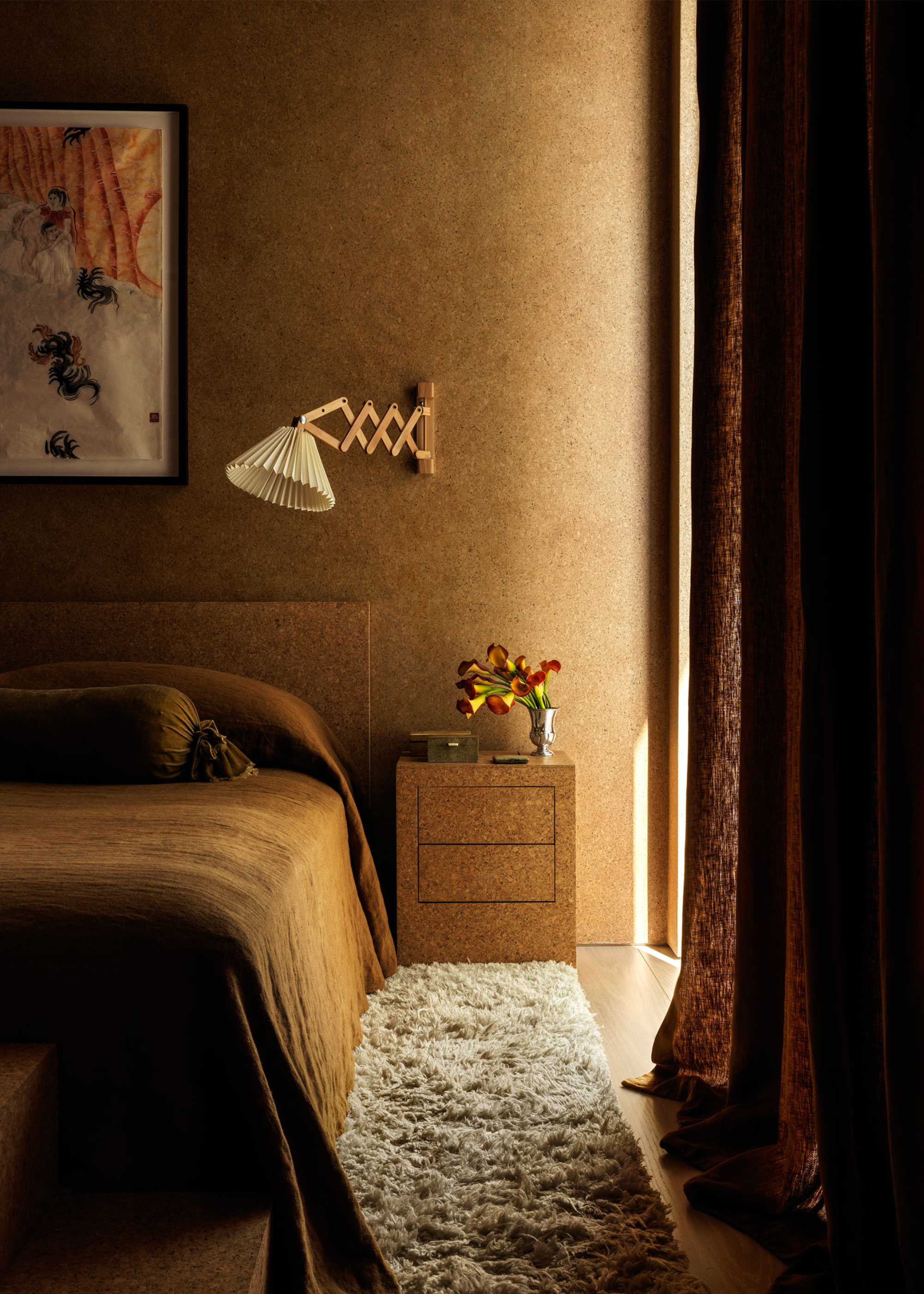
However, more naturally-led dark colors can still have a place in bedding color palettes. Think shades like deep charcoals found on black-sand beaches, rich browns reminiscent of forest floors, or cozy caramels for a touch of warmth, instead.
You might incorporate these darker colors through smaller, layered elements such as an accent cushion or throw at the foot of the bed. "This allows the color to add depth and character without overwhelming the overall sense of ease," says Jessica. A pop of chocolate brown or even our current color crush Obsidian Heart can be really stylish when integrated strategically.
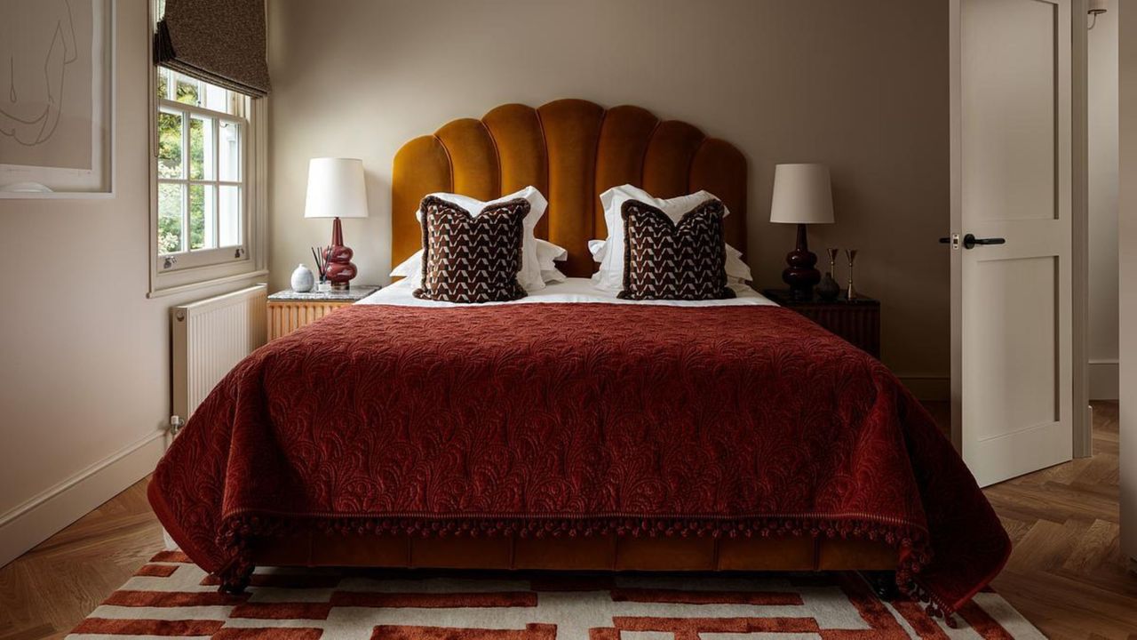
3. Bold Oranges, Reds, and Pinks
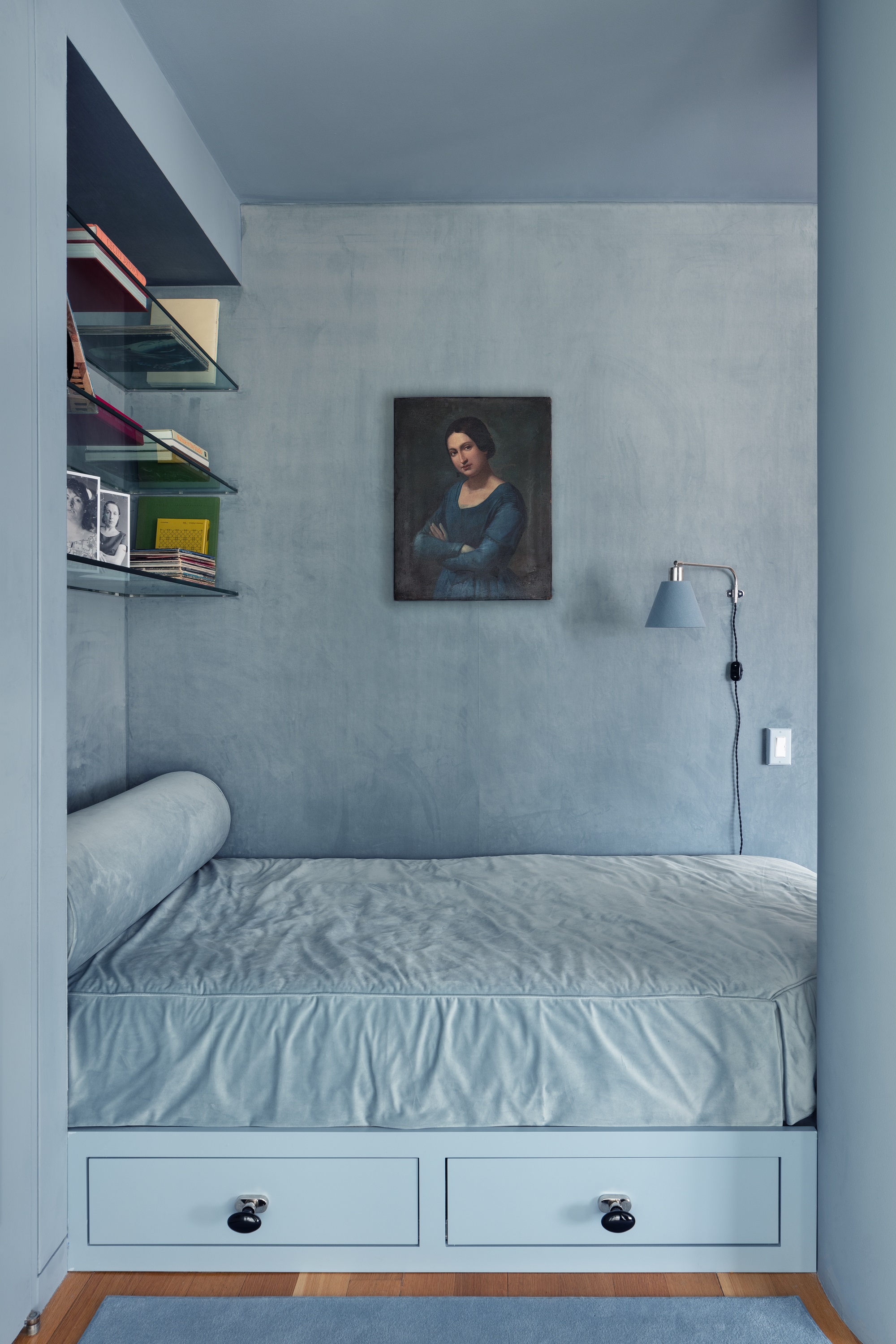
To help work out the bedding colors to avoid, it helps to think about color in terms of temperature. As a general rule, warmer tones on the color wheel, such as reds, oranges, and hot pinks, tend to feel more stimulating. Cooler, muted tones such as gray, blue/greens, and soft neutrals feel more regulating.
"I would generally avoid large amounts of bright orange, red, or saturated pink in bedding," says Pippa Jameson. "Not because they are 'bad' colors, but because they can feel activating. In a space designed for rest, that extra stimulation can work against you."
However, it all depends on the individual and their sensory profile. Some people are more sensitive to color than others. For certain nervous systems, "highly saturated warm tones can keep the body slightly alert," says Pippa. "In a bedroom, we are usually trying to support the shift from day to night, so restorative tones and sensory conscious colors help the brain quieten rather than stay switched on."
If you love a stronger color, such as oxblood red or burgundy, there is absolutely a place for it in the bedroom. The key is proportion and placement. A general rule of thumb when decorating with red in the bedroom is to use it in smaller volumes or in a moodier, diluted variation.
"Think trims, cushions, throws, or artwork rather than the main duvet cover or walls," says Pippa. "An earthy clay, deep cinnamon, or muted berry will feel very different from a bright pillar box red. It is not about removing fun and personality, it’s simply about adjusting intensity."
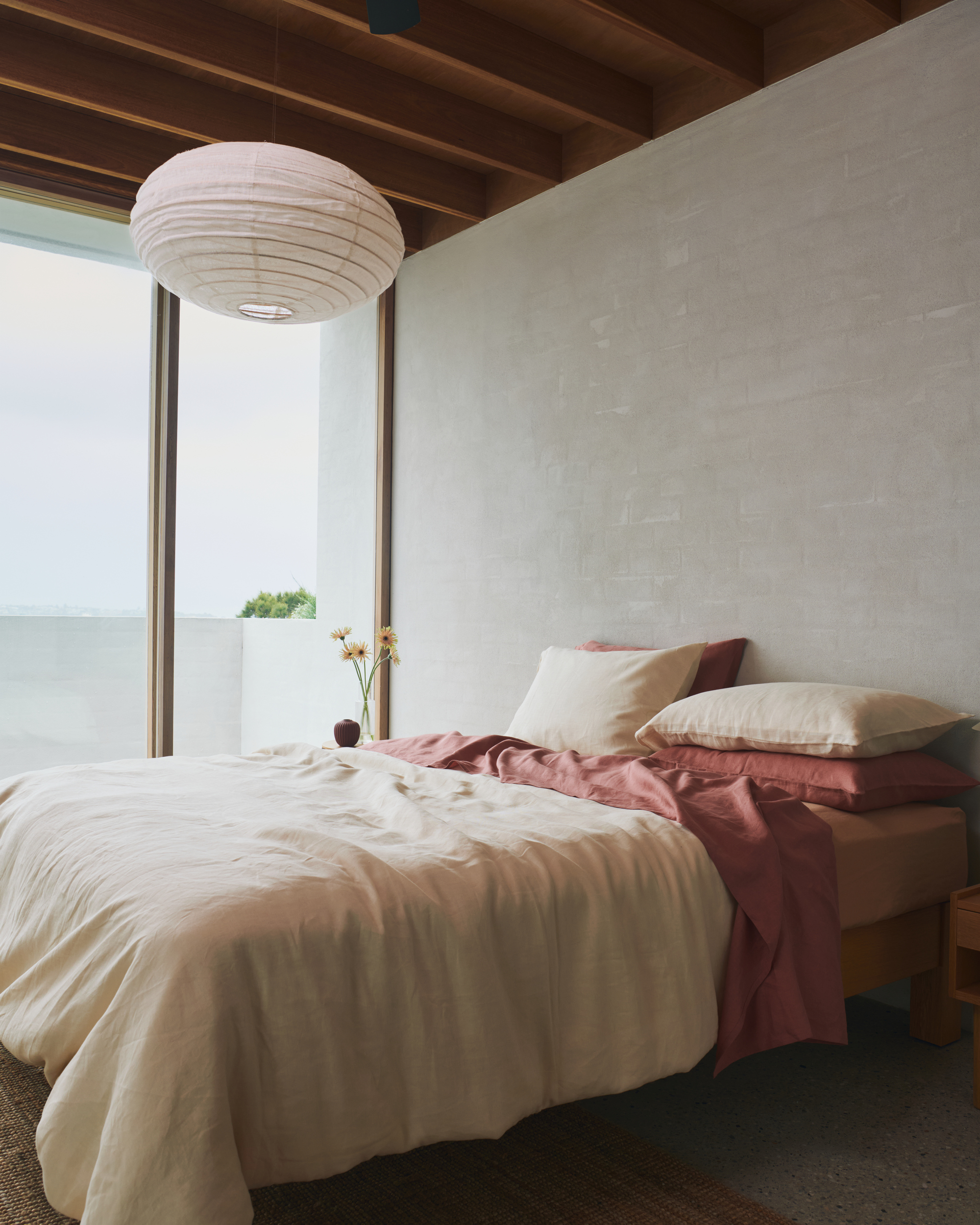
"The most restful bedrooms are often built around bedding colors that feel timeless and quietly familiar," says Jessica. Warm neutrals create a cocooning effect, while earthy shades like botanical greens, clay, and muted pinks add depth without heaviness.
Once you've ruled out the bedding colors to avoid, it's time to discover bedding color combinations that carry a natural softness that feels super comforting. "These are the shades that will be perfect for a space of restoration," says Jessica.
If you want more inspiration and advice for how to furnish your bedroom, why not sign up to the Livingetc newsletter?