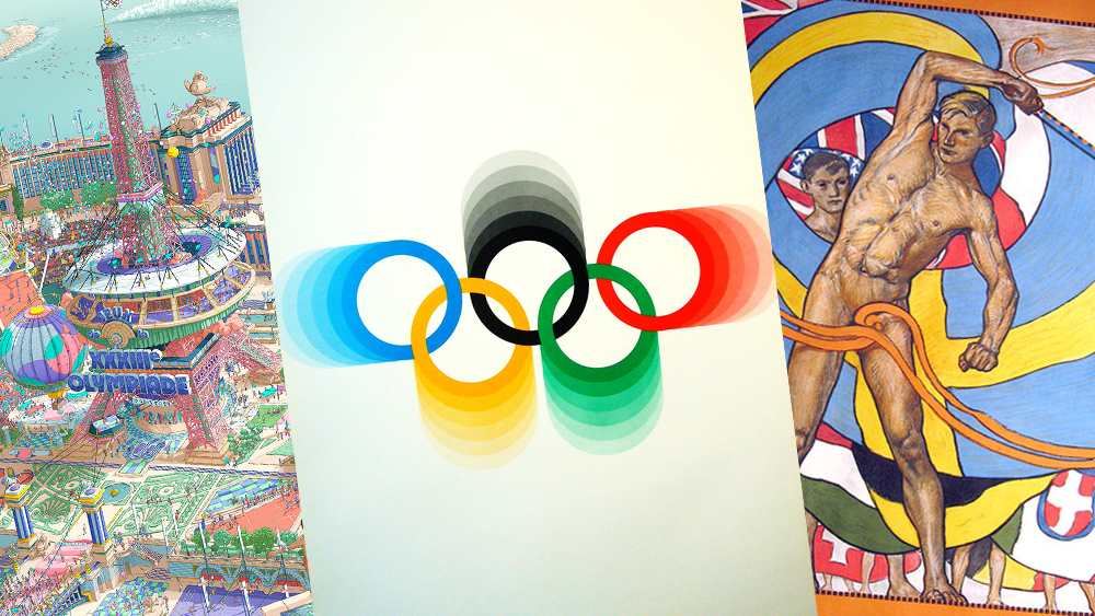
You probably know that the Paris 2024 Olympic Games start today whether you've seen the official Olympics poster design or not. Some might even argue that in an era of mass digital media, the Games no longer need much promotion at all. It was a different story in the past, when the best Olympic Games posters helped establish the event as a major global spectacle.
But even today, no Olympics branding campaign is complete without posters. They might no longer be necessary to announce the event itself, telling the world when and where it's happening, but they serve to achieve the marriage of art and sport that Pierre de Coubertin, the founder of the modern Olympic movement intended. They also promote the host city in the world, showcasing its cultural importance.
Below we pick out our favourite posters for the Olympics from the past 120 years. For more on the history of the Games' branding, see our pick of the best Olympics logos and the Olympic rings history.
The best Olympics posters from the past 100 years
The history of the modern Olympic Games began in Athens in 1896, but the first three events had no official poster designs. The Paris 1900 and St Louis 1904 events were held as part of the World's Fair and had little branding of their own, which resulted in some athletes not even knowing that they were competing in the Olympic Games.
But by the second decade of the 20th century, the International Olympic Committee had realised that poster design could be a powerful way to promote an event that was originally intended to showcase art as well as sport (there were OIympic medals for art right up until 1948). Today, each Olympics Games tends to have several poster designs commissioned to honour this historic connection.
01. Paris 2024 poster
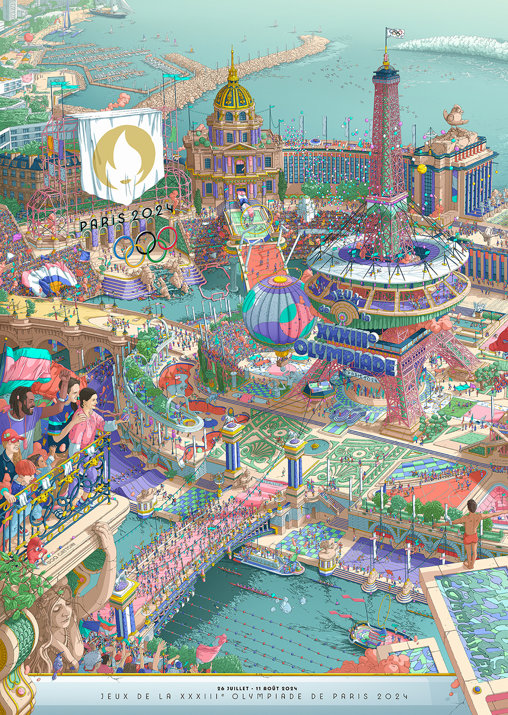
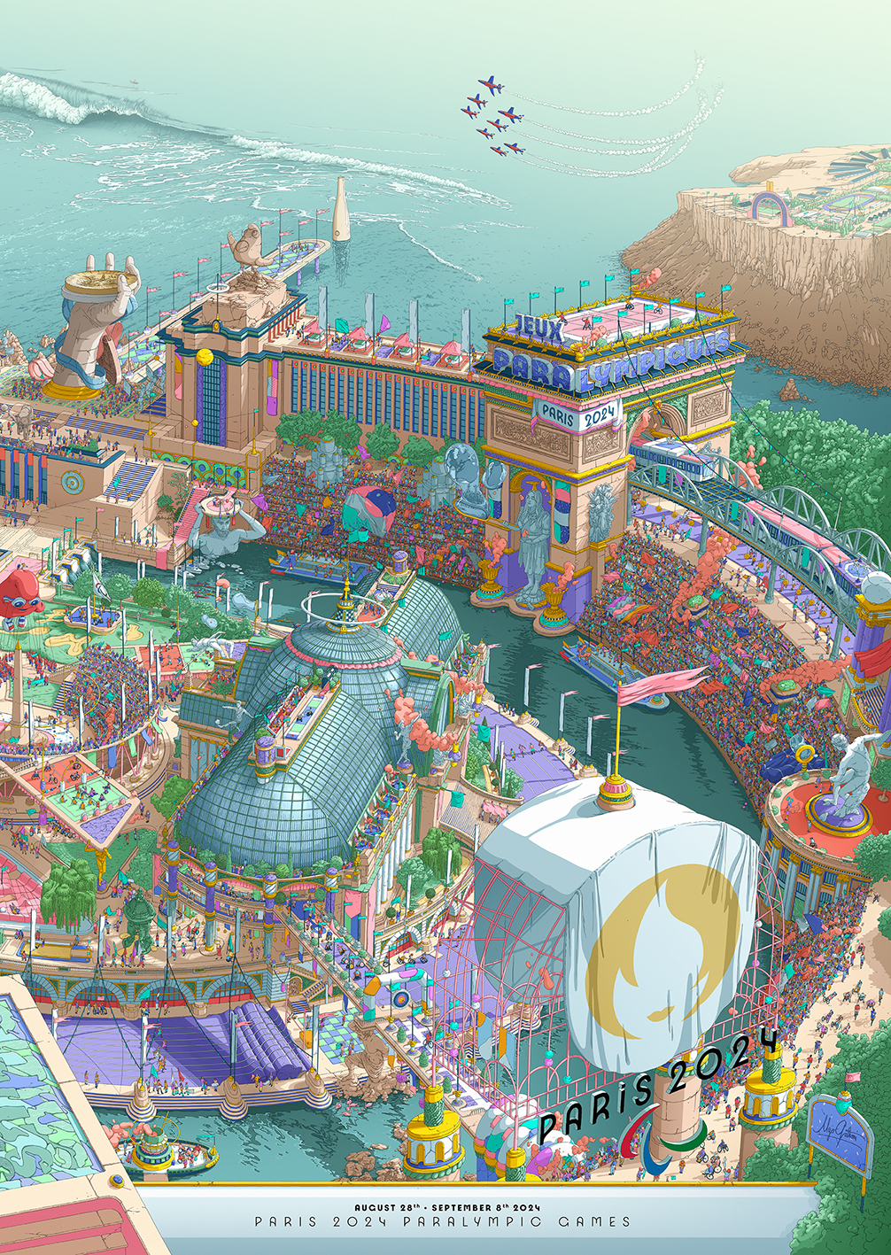
Created by French illustrator Ugo Gattoni, the diptych-inspired Paris 2024 Olympics Posters depict a stunningly detailed "fantasy city" within a stadium, blending famous Parisian monuments with motifs from the games. The illustrations feature iconic symbols from the Olympics such as medals, rings and the Olympic flame, as well as new additions like the rather unusual Paris 2024 mascots.
The highly detailed illustrations are a feast for the eyes, packed with hidden details. With so many monuments, symbols and sports to spot, they're like a classy art deco-influenced Where's Wally illustration, with a delightfully playful and immersive design. The artwork took over 2,000 hours to create over six months, making them one of the most detailed and labour-intensive Olympic posters to date. Roncin has said that his aim was to tell a story and to create something joyful, showing the games as a party rather than a logo and a date.
02. Stockholm 1912: the first Olympics poster
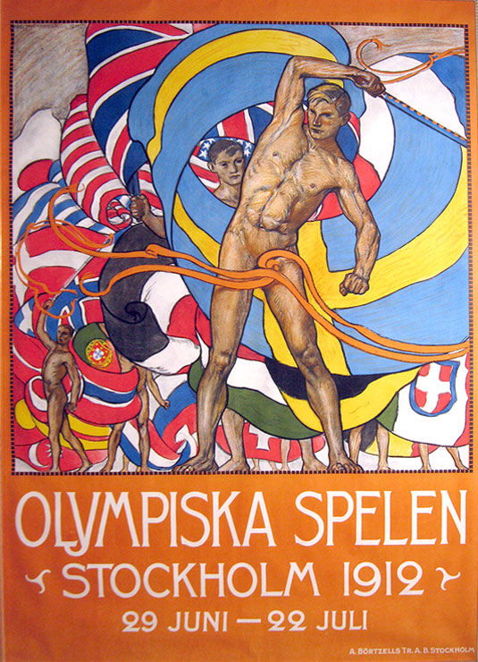
The 1912 Olympic Games in Stockholm had the first Olympics poster to officially advertise the event. The design, by the Royal Academy's Olle Hjortzberg, was sent in to the Olympic Committee in 1910 and enforced the message of Sweden as a forward-thinking sporting nation. Top ribbon placement, too.
03. London 2012 Olympics poster
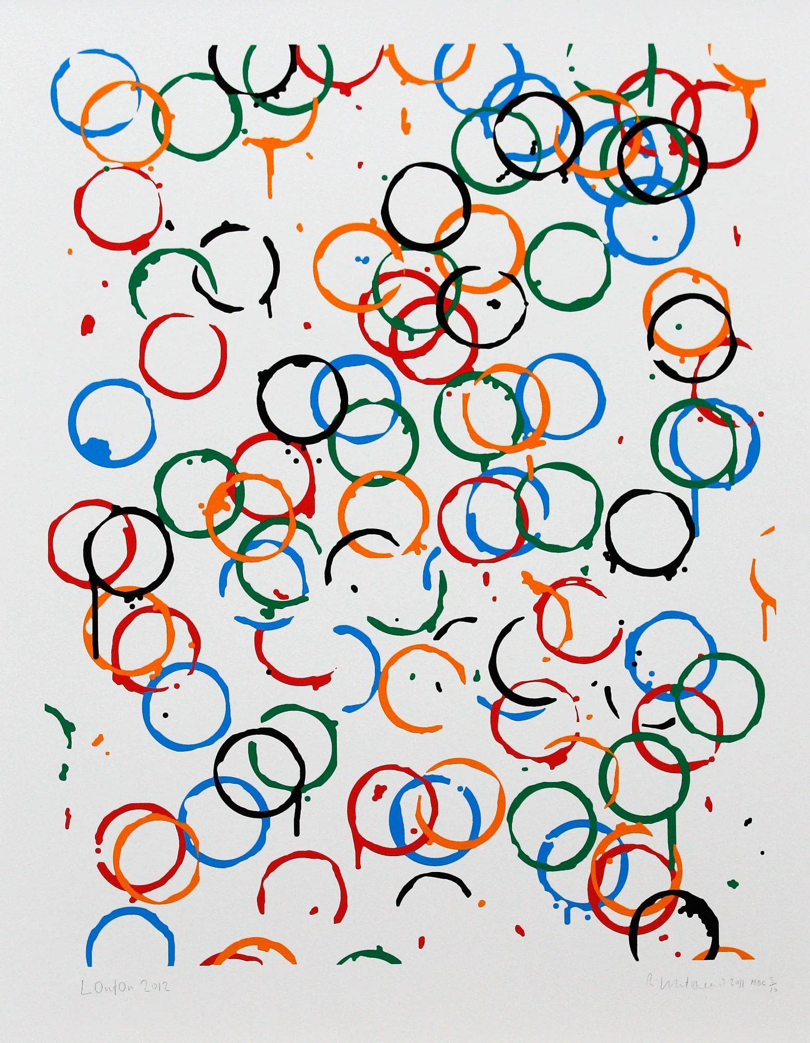
How things changed in 100 years of Olympic design! A century after the first Olympics poster, the design for London 2012 was much more abstract, with not a naked athlete in sight, but it can be considered to convey a similar message in a very different form.
Some of Britain’s best-known artist, including Tracey Emin, Bridget Riley, Chris Ofili and Howard Hodgkin, were invited to propose designs for the official poster, and the winner was this design from Rachel Whiteread. It's a colourful, abstract play on the Olympics rings that highlights their role as a symbol of unity and inclusivity. The rings are made to look like marks from cups of tea, which could perhaps be considered a more subtle and sophisticated nod to patriotism than some previous Olympic poster designs, on which note...
04. Paris 1924 Olympics poster
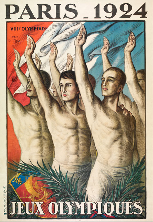
Speaking of patriotism, despite the Olympic ideal of unity in sports, many poster designs in the 20th century look unashamedly nationalistic today. through the Although the Olympic rings were in use by this point, they were nowhere to be seen in the Paris 2024 Olympic Games poster designed by Jean Droit.
The poster looks more like an advert for French nationalism than a promotional piece for an international sporting event, and a lot of subsequent Olympics branding took this approach. Having said this, the design is exceptionally striking, with the semi-naked athletes linking to the games of antiquity. Paris 2024 also saw the use of the first Olympics logo, although it doesn't look much like a logo by today's standards.
05. Los Angeles 1932 Olympics poster
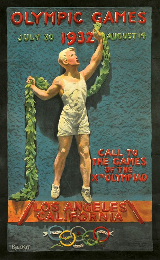
The Los Angeles poster for the Games of 1932 was notable for a number of reasons. Firstly, this was the first time the Olympic rings appeared on a poster for the Games. This poster, designed by Julio Kilenyi, was also notable for initially being modeled in clay before being reproduced. The symbolism, given the historical context, was also profound: the image depicts a Greek athlete sent to announce the Olympiad, and to request the end of hostilities for the duration of the event.
06. Los Angeles 1984 Olympics poster
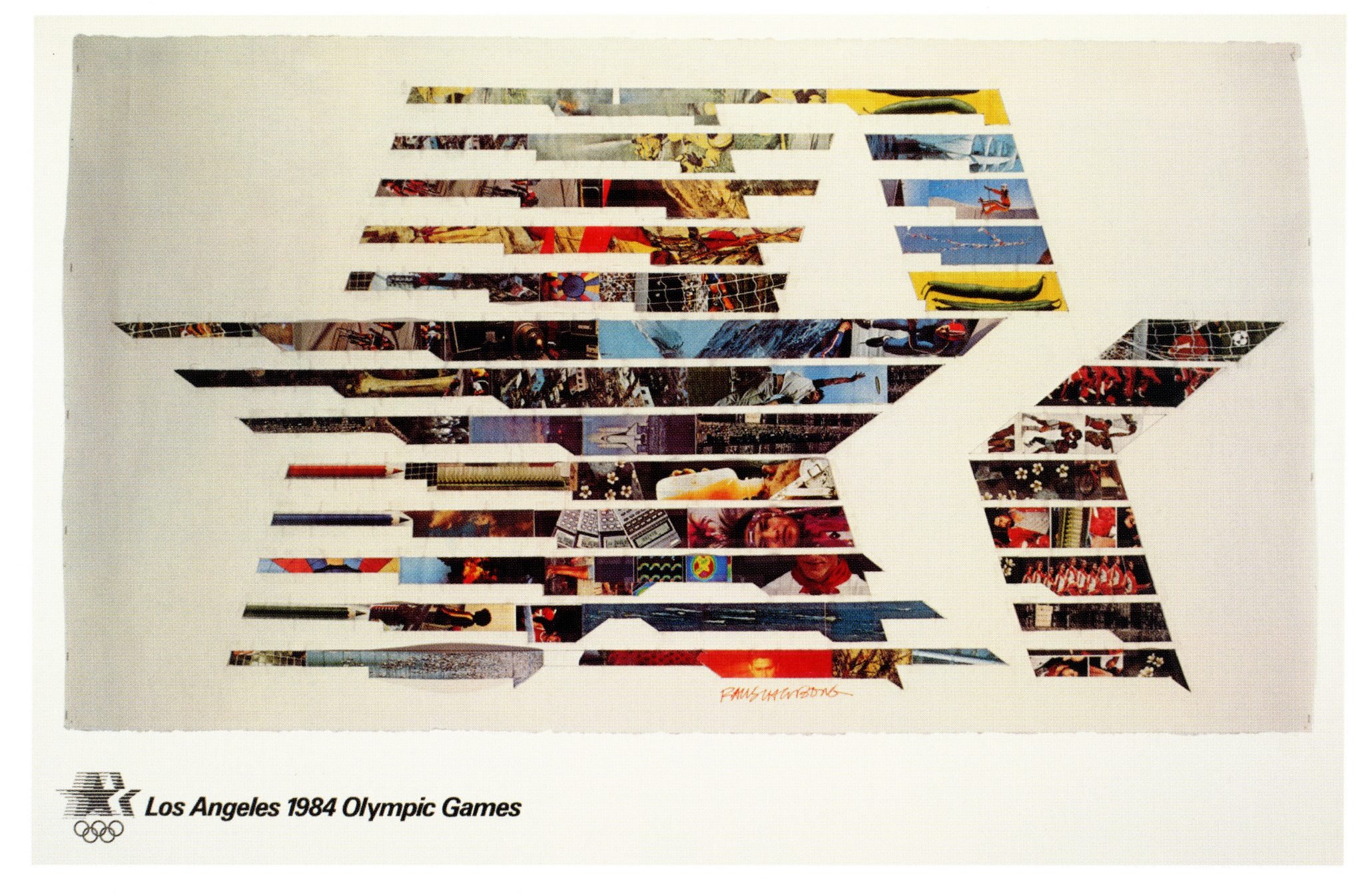
When Los Angeles hosted the games again in 1984, a host of legendary artists submitted designs, including David Hockney, Roy Lichenstein, Lynda Benglis and John Baldessari. Robert Rauschenberg's photomontage above was selected as the official poster. It uses the event's stars logo and fills the speed lines with shots of sporting actions with apparently random scenes from calculators to a rocket, linking sport to everyday 20th century life.
07. Berlin 1936 Olympics poster
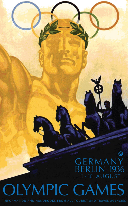
The use of the Olympics for propaganda reached a head in 1936, when Adolf Hitler attempted to take the opportunity of the Berlin Games to promote the Nazi ideology. The dramatic poster for the event, designed by Franz Würbel, pleased the Führer where some 44 of Germany's finest artists had failed, and we have to admit that it's a dramatic and iconic design, showcasing one of Berlin's most famous landmarks with an emphasis on classicism. Jesse Owens went on to win four gold medals, making Hitler look pretty stupid.
08. Tokyo 1964 Olympics poster
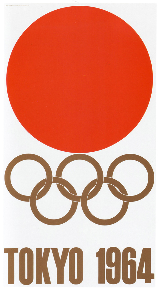
Although four posters were commissioned for the Tokyo Olympic Games of 1964, the combination of the Rising Sun emblem and golden Olympic rings was simple, impactful, and a perfect advert for a nation on the rise. Three other posters were also created by Yusaku Kamekura, all of which included photography of athletes. But it was this iconic poster that recieved international acclaim.
09. Mexico 1968 Olympics poster
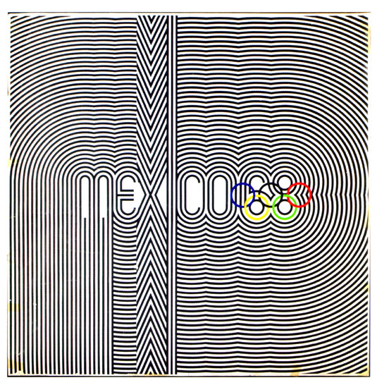
This is one of the most memorable and graphically impactful Olympic posters to date, evoking traditional forms from Mexican culture without resorting to stereotypes. This poster was a collaboration between Pedro Ramirez Vazquez, Eduardo Terrazas and Lance Wyman, who also designed the Mexico '68 logo.
10. Munich 1972 Olympics poster
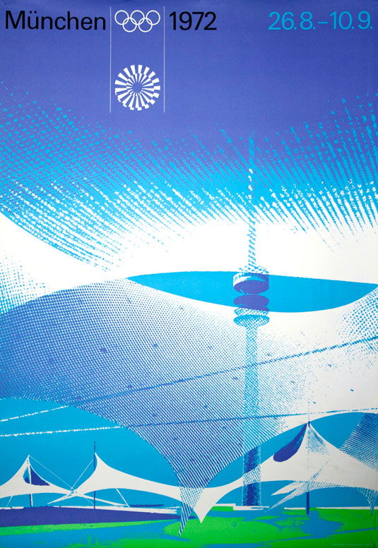
No one could have foreseen the terrible events that would take place at the 1972 Games, and prior to the Munich massacre Germany had hoped that the 1972 Olympics would showcase the country, post-WWII, to a global audience. Dubbed the "Serene Games", the Opening Ceremony was the most spectacular ever staged. Otl Aicher was a major part of Munich's plans to stage the biggest Games ever, and he created a series of graphically superb posters, as well as designing globally recognised sporting pictograms to represent each Olympic event.
11. Rio de Janeiro 2016 Olympics poster designs
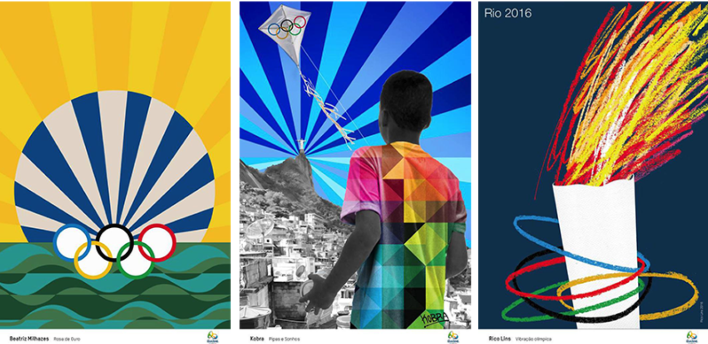
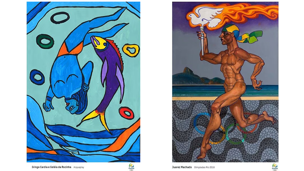
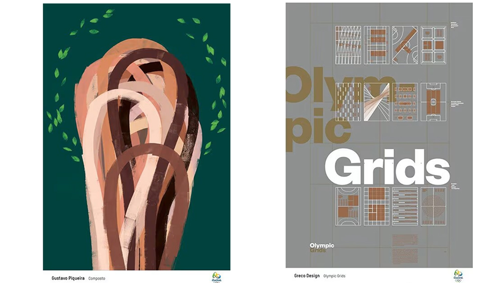
The posters for the first Olympics in South America were as vibrant and diverse as you might hope. A dozen Brazilian artists and one Colombian produced official designs for the Rio 2016 games, and I find it hard to choose a favourite. Gringo Cardia worked with street artists and took inspiration from Rio's beaches and the sea while Gustavo Piqueira went for an abstract approach incorporating Amazonian hues, Juarez Machado put a Brazilian spin on classical imagery of athletes and Gustavo Greco explored the geometry of sports fields and pitches.
12. Tokyo 2020 Olympics poster
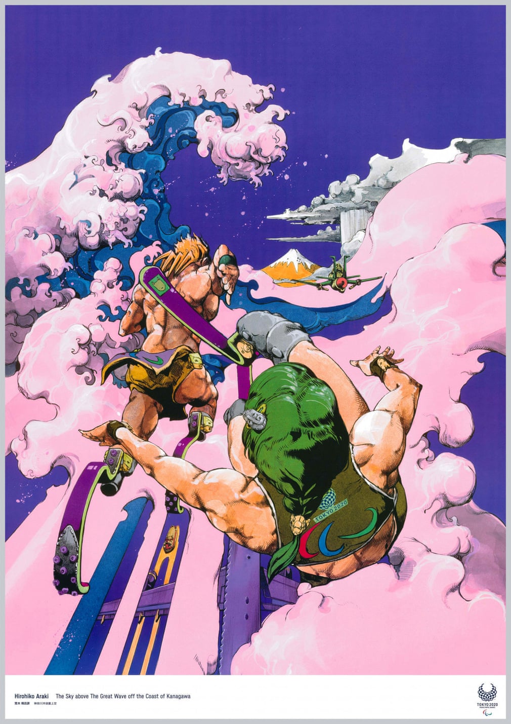
There were several posters for the Tokyo 2020 Olympics, but I love the design from Hirohiko Araki for how he depicts paralympic athletes in a style that's somewhere between manga, superhero comic art and classical representations of sport, while also getting in a nod to ukiyo-e woodblock art.
13. Montréal 1976 Olympics poster
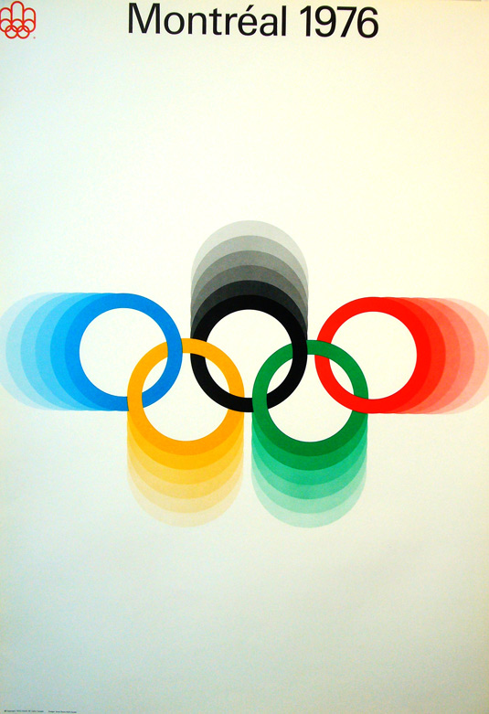
Designed by Ernst Roch, this was the official print poster for the 1976 Games, and it featured the logo for the Games in the top left, with coloured Olympic rings echoing from the centre. The poster was accompanied by a host of equally great designs for brochures and manuals which were created by Georges Huel and Pierre-Yves Pelletier.
14. Moscow 1980 Olympics poster
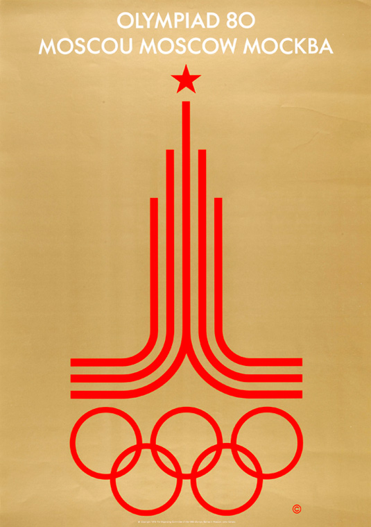
This poster was designed by Wladimir Arsentjev, and features two running tracks that combine to form a structure/flame, sitting on top of which is a red star, the emblem of the Soviet Union. It marked a return to national posturing in Olympic posters, but the restricted colour, symmetry and strong design make this an iconic poster.
15. Barcelona 1992 Olympics poster
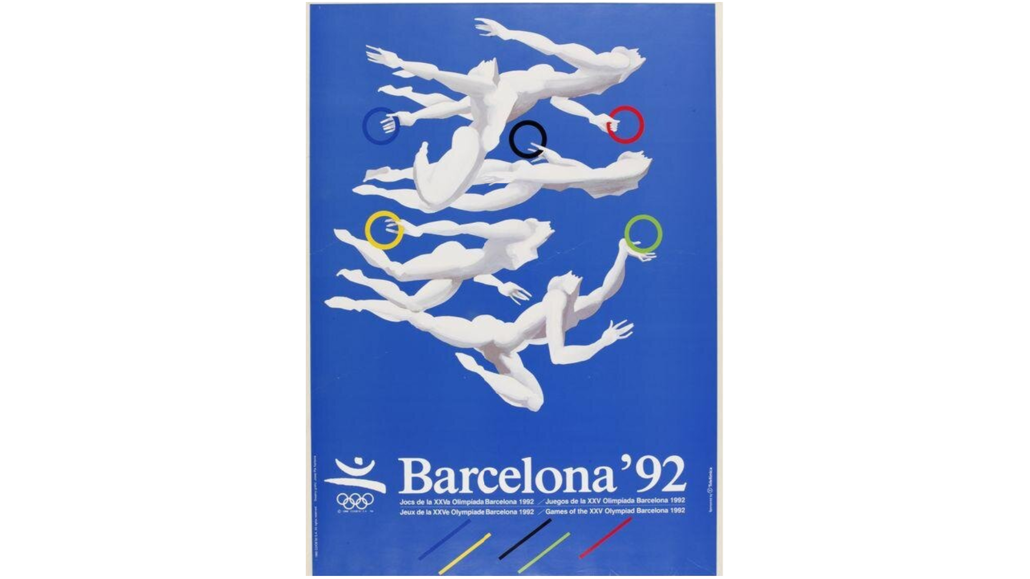
Barcelona went a bit overboard in the poster department. The project for the 1992 Games involved 58 different posters, produced by numerous artists, and grouped in four collections: the official Olympic posters, the painters' posters, the designers' posters and the photographic sports posters. All-in-all 2,940,000 posters were produced with the sponsorship of Telefónica. The design above, by Josep Pla-Narbona makes creative use of the Olympic rings. Although it wasn't the intention, I've actually associated the emblem with gymnastic rings, and Pla-Narbona makes that link in this striking design. The logo was designed by Josep M. Trias and used simple strokes in the colours of Spain to represent an athlete in action. It went on to influence how Spain branded itself for the next decade.
