
Even if you know your subject, giving a presentation in front of a bunch of strangers can often be nerve-wracking. So it helps to have a series of eye-catching slides to keep you on track and engage your audience. And key to that is picking the best fonts for presentations, which need to tick a number of boxes (you can't just pick any old free font available).
We've found a selection of fonts great for presentations. Most of these are standard system fonts in PowerPoint and many are included in the Windows or Mac operating systems, which means they're licenced for your own personal use. However, if you want to use them as web fonts on a website, or in client work, you will need to license them, so we've included download links too.
What makes a good presentation font?
First, they need to be clear and legible, even at a distance. Secondly, they need to be attractive and eye-catching. Thirdly, they need to convey a polished and appropriate tone for the context of your presentation. And fourthly, they should be widely available, or at least easy to embed, to avoid formatting issues.
In short, whether you're crafting a business pitch, an academic lecture, or a creative showcase, choosing the best font for presentations can make all the difference. In this article, we'll explore 10 great options.
01. Helvetica
- System font in Powerpoint?: Yes
- Preinstalled on Windows? No
- Preinstalled on macOS: Yes
- Download Helvetica from MyFonts
Helvetica might not be the most exciting choice of fonts. But this classic sans-serif, which is named after the Latin word for ‘Switzerland', is nothing if not reliable. Its clean, neutral and versatile nature means conveys an instant sense of professionalism, without drawing unnecessary attention to itself. And that makes it an excellent choice for presentations of all kinds
There's a reason why Helvetica remains hugely popular, 67 years on from its creation: its letterforms are well balanced are balanced between top and bottom, making them highly legible, even at smaller sizes or when projected. Moreover, its wide range of weights and styles allows for flexibility in creating visual hierarchies within your slides.
So whether you're presenting financial data, marketing strategies, or creative concepts, Helvetica will help you share your words in a way that your audience will find easy to read. And isn't that the most important thing?
In short, if you're looking for a modern, straightforward, and universally appealing typeface for your presentations, Helvetica is a worthy contender.
02. Futura
- System font in Powerpoint?: No
- Preinstalled on Windows? No
- Preinstalled on macOS: No
- Download Futura from MyFonts
Want to give a bold, dynamic edge to your presentation? Then the geometric sans-serif Futura is a good choice. Its clean lines and perfect circles are based on simple shapes, giving it a distinctive and memorable appearance, and strong visual impact. This makes it an especially good option for headlines and key points you want to emphasise.
At the same time, Futura's clarity and legibility at various sizes will ensure that your message comes across effectively, whether you're presenting on a large projector screen or remotely through your audience's laptops.
In short, when you want to convey themes such as disruption, transformation and a contemporary outlook, in fields such as technology, architecture and design, Futura can help your presentation stand out, while still being very legible and accessible.
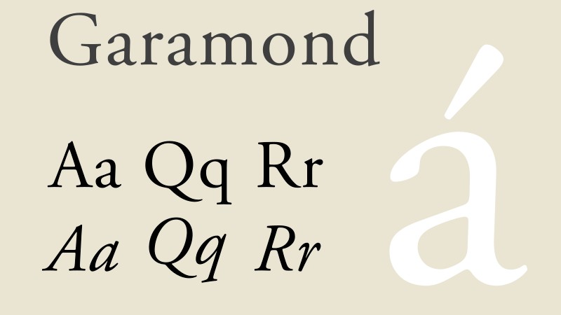
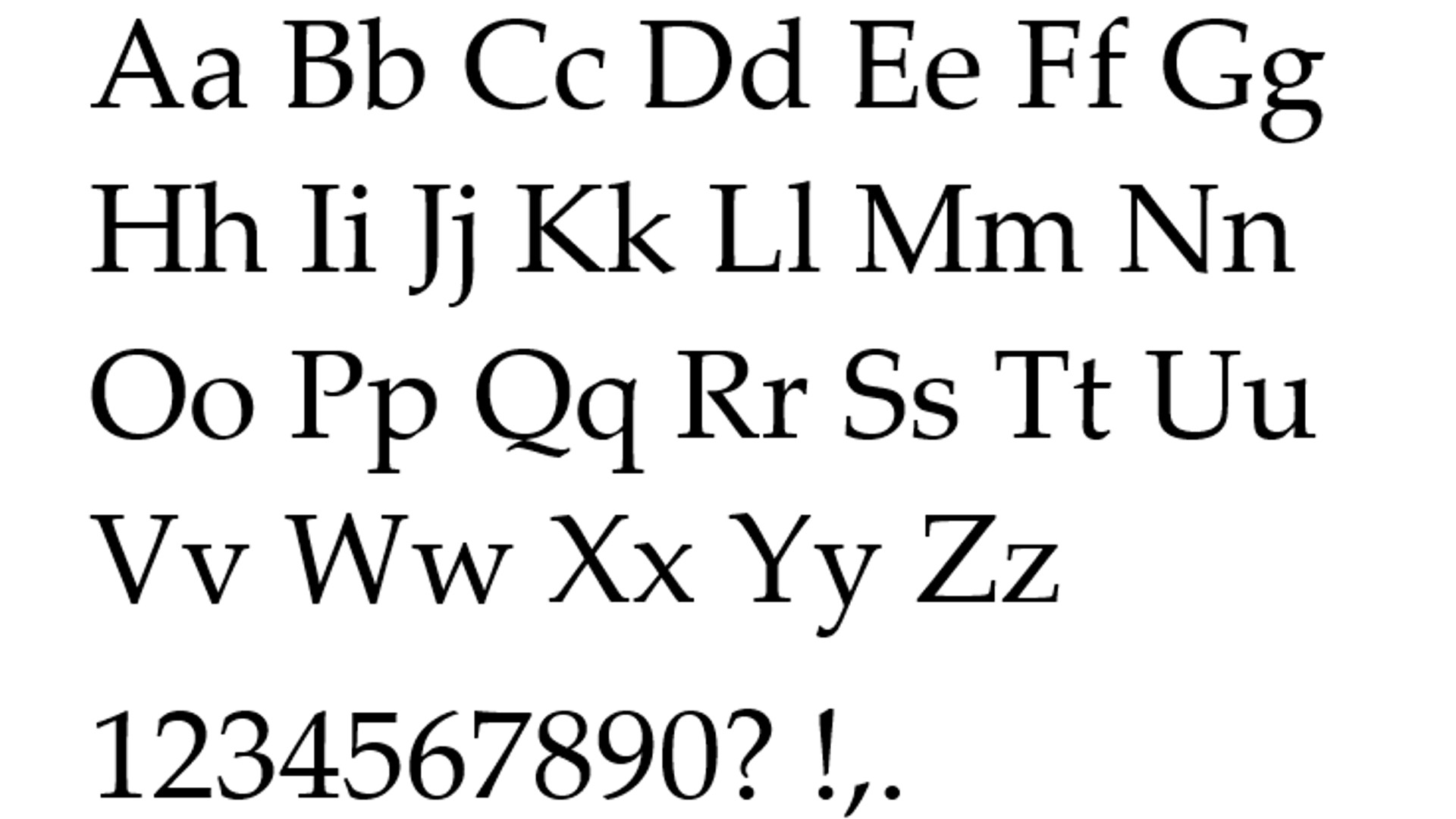
03. Garamond
- System font in Powerpoint?: Yes
- Preinstalled on Windows? No
- Preinstalled on macOS: Yes
- Download Garamond from MyFonts
Does your presentation call for a touch of elegance and tradition? Then you'll probably want to go for a serif, and Garamond is an excellent option.
With its roots in 16th-century typography, this font will instantly give a sense of sophistication and timelessness to your slides. At the same time, this iconic typeface remains highly legible, especially in its more recent digital adaptations. Its refined serifs and varied stroke weights create a pleasant rhythm that's easy on the eyes, making it work for both headlines and body text.
For these reasons, Garamond will work particularly well for academic talks, presentations on literary topics, or any content that benefits from a more formal tone. In other words, if you want to convey authority and knowledge while maintaining readability, it's a great option.
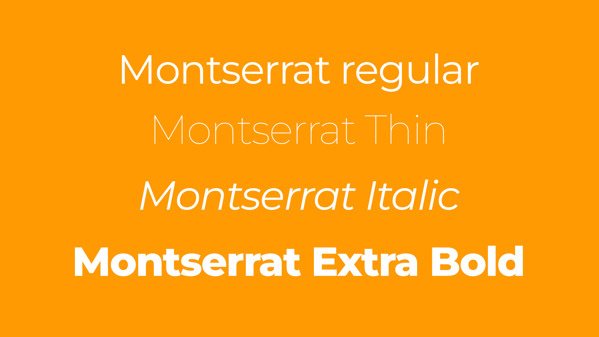
04. Montserrat
- System font in Powerpoint?: No
- Preinstalled on Windows? No
- Preinstalled on macOS: No
- Download Montserrat from Google Fonts
Is your presentation topic one that's innovative, pioneering, or even game-changing? Then you'll want a font to match, and Montserrat could fit the bill.
Inspired by old posters and signs in Buenos Aires, this eye-catching geometric sans-serif offers a combination of clean, modern letterforms and varied weights. Its crisp edges and open counters contribute to excellent legibility, while its geometric roots give it a contemporary feel. This makes it a great choice for presentations in creative industries, startups, or any other context where a fresh, dynamic tone is required.
Montserrat boasts an extensive family, including various weights and styles, allowing for a creative to typography hierarchies within your slides. So if you want your presentation to feel current and energetic while maintaining clarity and professionalism, it's well worth giving a try.
05. Palatino
- System font in Powerpoint?: Yes
- Preinstalled on Windows? No
- Preinstalled on macOS: Yes
- Download Palatino from MyFonts
If you're aiming for a balance between reassuring tradition and exciting forward-thinking in your presentation, you'll be looking for a font that sits somewhere between traditional and modern design. In which case we recommend Palatino.
This versatile book serif combines the readability of classic Roman typefaces with subtle calligraphic touches. And that makes it well positioned for presentations that require a professional, scholarly tone without appearing overly formal.
Palatino's defined letterforms ensure clarity even at smaller sizes, making it suitable for both headlines and body copy. It works well on screens, and maintains its elegance and readability when projected. And all this makes it a worthy option for presentations in fields like law, academia or the arts.
06. Calibri
- System font in Powerpoint?: Yes
- Preinstalled on Windows? Yes
- Preinstalled on macOS: Yes
- Download Calibri from MyFonts
One of the biggest stresses surrounding presentations is the idea that things will go wrong technically, especially if you're using unfamiliar equipment. So if safety is your priority then good news: Calibri isn't just the default font for Microsoft PowerPoint, it's an excellent design choice as well.
This sans-serif has a warm, soft and friendly tone without sacrificing professionalism and legibility, thanks to its slightly rounded edges and open letterforms. It's also a font that adapts easily to different themes and colour schemes. And this means it work well in both corporate and creative presentations.
Perhaps most significantly, Calibri's widespread availability across systems means you're less likely to encounter formatting issues when sharing your presentation. So if you're seeking a safe, versatile and universally compatible font that still looks current, Calibri is the one we'd recommend.
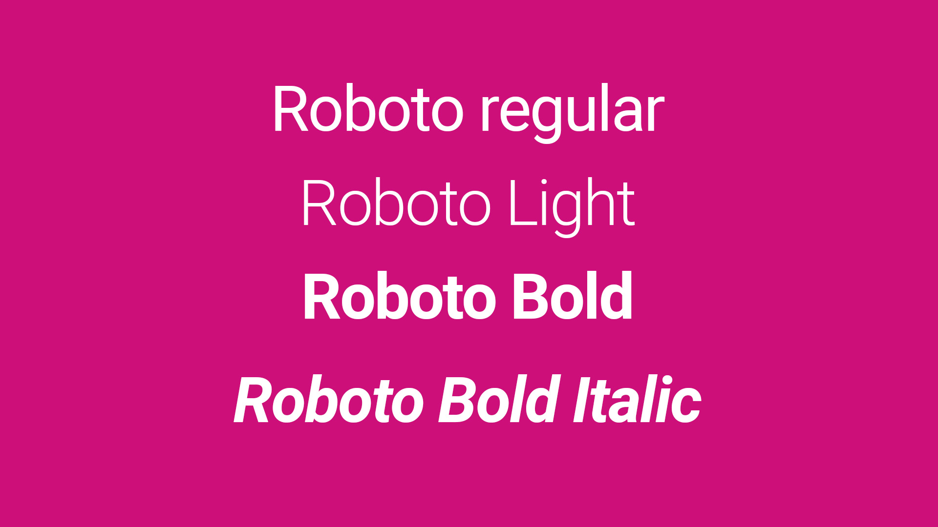
07. Roboto
- System font in Powerpoint?: Yes
- Preinstalled on Windows? No
- Preinstalled on macOS: Yes
- Download Roboto from Google Fonts
Do you value legibility above all else? Then you can't go wrong with Roboto. Developed by Google, Roboto, this neo-grotesque sans-serif is perfect for designing clear, legible text on screens that need to be readable from a distance, or at small sizes.
Roboto was developed by Google as the system font for Android, and its modern, professional appearance makes it suitable for a wide range of topics and industries. Moreover, its extensive family includes condensed and slab serif versions, which gives you a lot of flexibility in creating visual hierarchies and emphasis within your slides.
In short, Roboto is an excellent choice for presentations that need to look contemporary and function flawlessly.
08. Avenir
- System font in Powerpoint?: Yes
- Preinstalled on Windows? No
- Preinstalled on macOS: No
- Download Avenir from MyFonts
If you want to appear warm and friendly, but also cutting-edge, Avenir (meaning "future" in French) is a good font to consider. This geometric sans-serif is similar to Monserrat in that it combines modernist style with humanist touches, and its superb legibility across various sizes makes it versatile for both headlines and body copy.
As such, Avenir would works particularly well for presentations in fields such as technology, healthcare or education. When you want your slides to appear contemporary and polished, yet accessible and inviting, Avenir does a good job of squaring that particular circle.
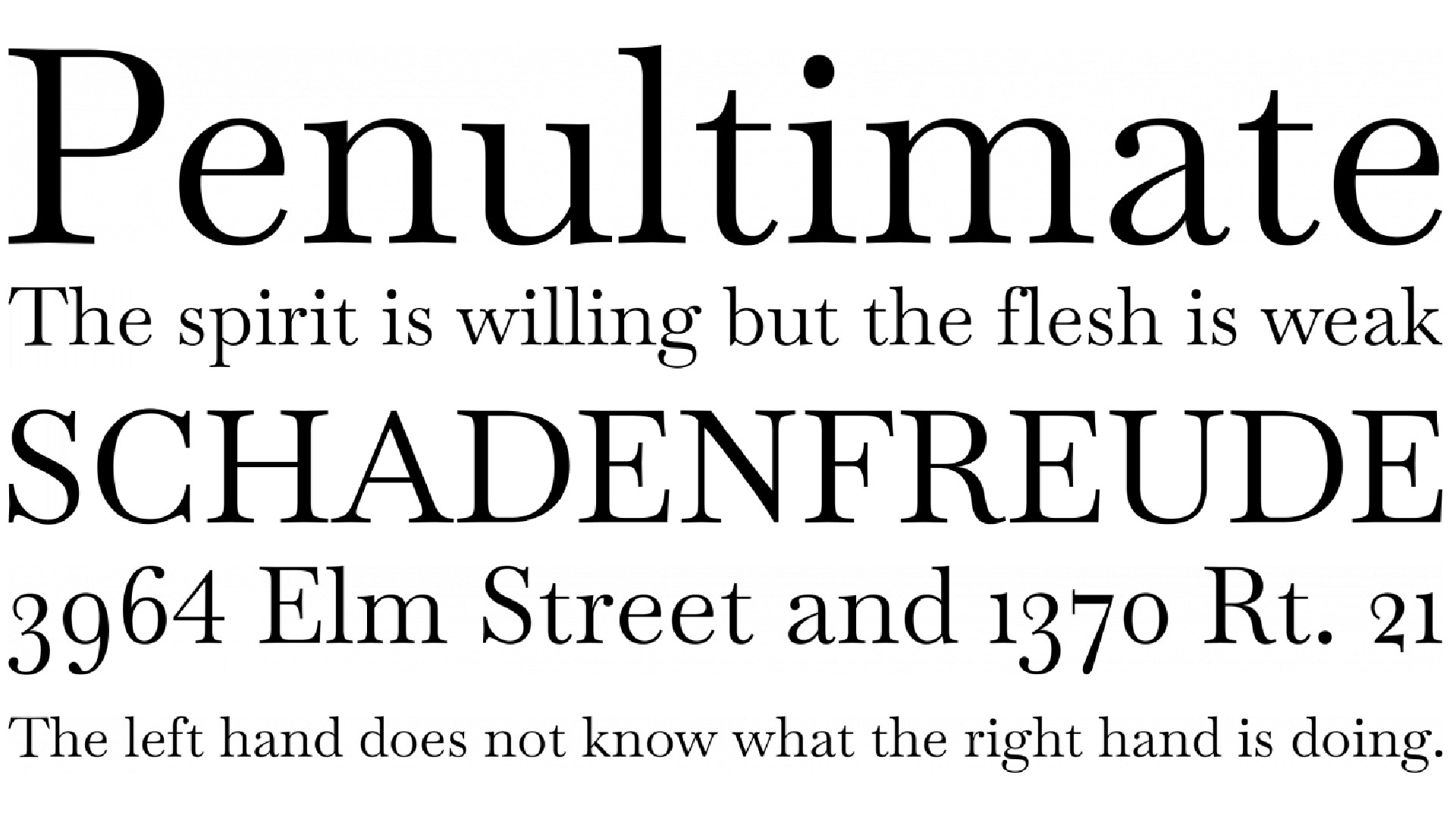
09. Baskerville
- System font in Powerpoint?: Yes
- Preinstalled on Windows? Yes
- Preinstalled on macOS: No
- Download Baskerville from FontSquirrel
Here's another great choice for excluding elegance and authority. Baskerville is a transitional serif typeface with refined forms and high contrast between thick and thin strokes. This all adds up to a dignified, sophisticated appearance, making it a good choice for conveying trustworthiness and expertise.
Baskerville clear, open letterforms ensure good readability on screens, particularly for longer text passages, and this font would works exceptionally well for academic or literary presentations, along with businesses looking to project a sense of heritage and quality.
In other words, if you want your audience to perceive your content as thoughtful, well-researched, and credible, Baskerville can help set the right tone.
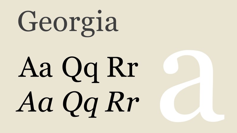
10. Georgia
- System font in Powerpoint?: Yes
- Preinstalled on Windows? Yes
- Preinstalled on macOS: Yes
- Download Georgia from MyFonts
Will your talk be viewed remotely? Then try Georgia; a serif designed specifically for on-screen readability, making it great for digital presentations. Its larger x-height and open letterforms ensure clarity even at smaller sizes, covering you if your slides are being viewed on a smaller laptop or tablet.
These letterforms are sturdy enough to render well on various screen resolutions while still providing the traditional, trustworthy feel associated with serif fonts. This makes Georgia when you require a more formal tone while remaining highly legible on a variety of screens. For talks in fields such as journalism, publishing or any other content-heavy topic, it's a good balance between classic style and readability.
Need more fonts for work? See our pick of the best professional fonts.