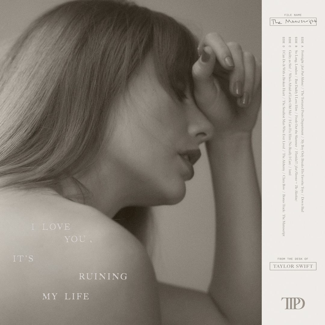
Few album announcements generate as much fervent attention as a Taylor Swift album announcement, so you've probably heard the news that the artist's 11th LP, The Tortured Poets Department, is due for release this April. But if you think the title sounds a little affected, wait till you see the logo.
Yes, said department for poets of the tortured variety appears to come with its own logo. The recently revealed album art features a curious 'TPD' monogram, which, rather than ostensibly poetic, is giving off some rather corporate vibes. One of the best logos of all time, this ain't.

The design has been described as everything from "corporate law firm core" to "family-owned funeral home letterhead". Sure, there's a nice little tear (or is it an apostrophe?) hiding inside the 'D', but the whole thing does look very business card-ready. But then again, that's probably the point. Accompanying the monogram on the album cover are the words "From the desk of Taylor Swift" – and with Swift herself signing off as "the chairman" in a recent Instagram post, it seems she's very much entering her boardroom era with this one.
Is she launching a private-equity firm https://t.co/DeG51M9dkQFebruary 5, 2024
the law firm of Tidde Tiddle Pendergast and Derrick https://t.co/PbrQJZIQMiFebruary 5, 2024
is she opening a venture capital start up https://t.co/LF4SU8lugJFebruary 5, 2024
Still, as a recent billionaire, Swift can probably shake the criticism off. A more pressing concern is likely to be the rise of AI-generated depictions of the singer, which, among other things, have recently tried to sell me a Le Creuset set.


