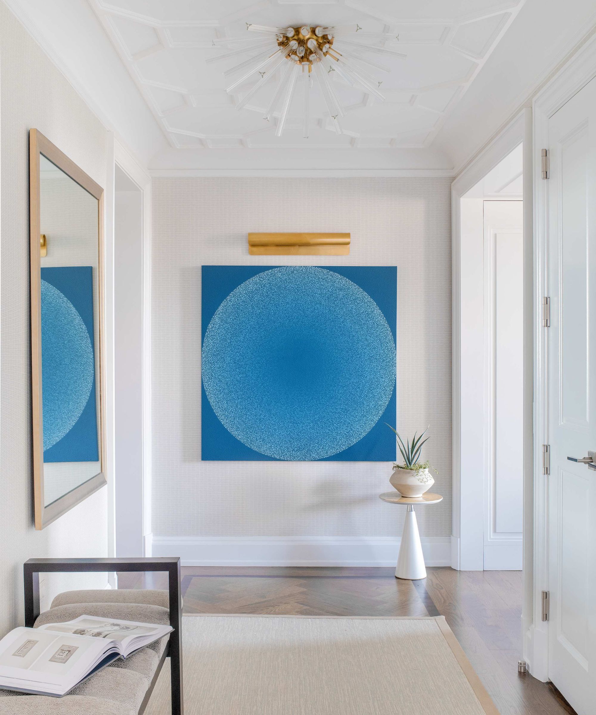
Using art to elevate an entryway is nothing unconventional – but a mural? We've only seen this in Stevie Nicks's home. While many may choose to keep the first room of their home safe and neutral (to which there are benefits, too), the singer decided to make a unique statement in the form of a landscape mural painted directly onto her curved entryway wall.
The mural, which depicts (what appears to be) a coastal landscape, fills her entrance hall with earthy shades of blue, green, and brown – creating an almost fairytale-like storybook setting that attracts instant attention. It's one of the most experimental entryway color palettes we've seen – but it's a risk that's paid off, as real estate experts explain.
'When adding artwork to an entryway, you want to create an instant connection as soon as someone steps in. This is especially true with something like a mural. Murals are fantastic for this because they have a way of filling a space with energy and story,' comments Rachel Stringer, a real estate agent at Raleigh Realty.
'I’ve seen people commission murals of landscapes, abstract patterns, or even things like florals that reflect their style, and the impact is immediate. It’s personal and memorable without feeling forced.'
Recreating a mural of Nick's scale doesn't come easily, but there are ways to draw inspiration from her room without painting to such an extent.
'If a full-scale mural feels like too much, stenciling can do the trick. A simple pattern or design gives the same wow factor without dominating the space,' Stringer comments. 'I’ve noticed people like geometric stencils in monochrome colors for a cleaner, more minimal feel. It’s a subtle touch, but it draws you in.'
However, whatever entryway wall decor we choose, mastering the correct lighting is crucial to making the first impression we want. 'Lighting is everything when it comes to showcasing art. I’ve worked with clients who thought their pieces looked flat, but just adding a few focused spotlights brought them to life,' Stringer says.
'Backlighting can work wonders, too. It’s less about overwhelming the space with bright lights and more about creating gentle highlights that make the art stand out naturally.'

If we don't opt for a mural, Stringer also recommends 'switching up artwork seasonally' to keep our entryway feeling fresh, both for guests and for ourselves. 'It’s simple yet effective, especially if you like to mix in different themes throughout the year. For example, in the fall, you might hang up moody prints, and in spring, it’s all about bright colors. It changes the entire feel without much effort,' she says.
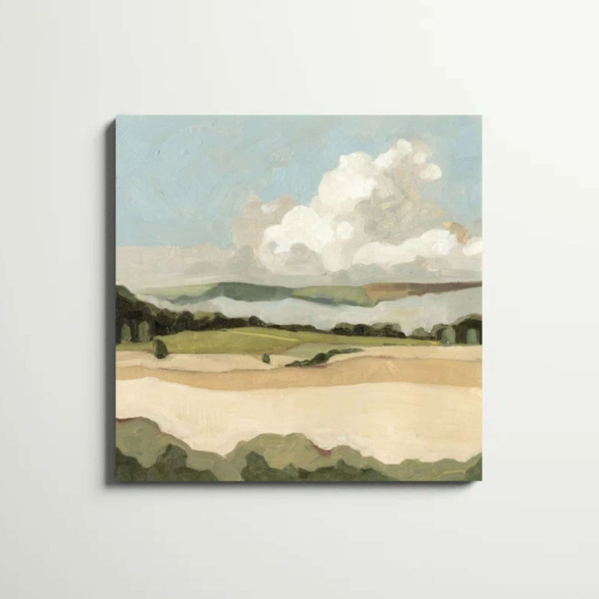
We love the idea of subtly decorating for the season. Currently, we think these three pieces are a beautiful starting point in all homes. Cumulus Landscape II by Emma Scarvey (available via Wayfair) is particularly inspired by the artwork we see in Nicks's space.

This print (on wrapped canvas) cases a rolling landscape in green and beige hues below a fluffy clouded sky.

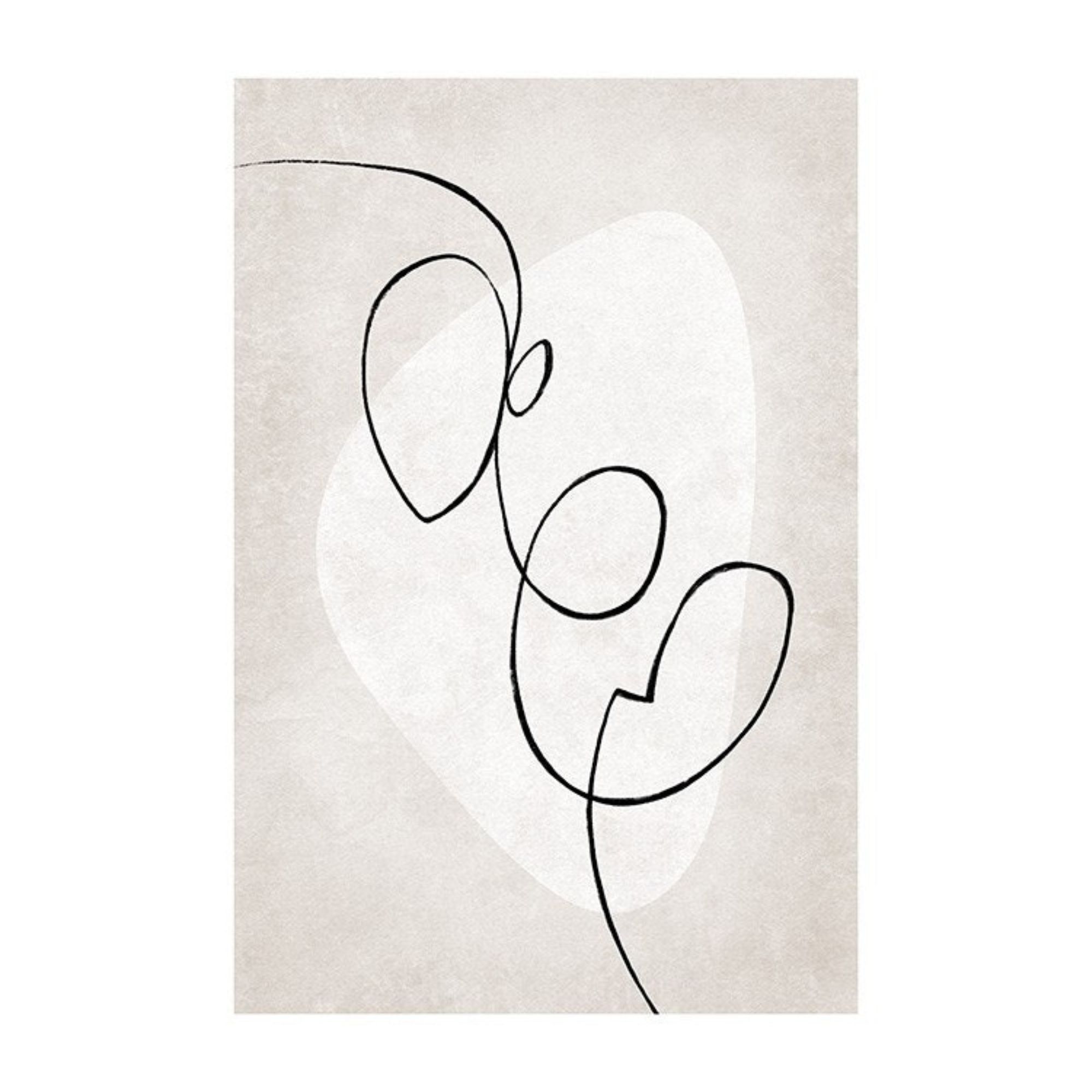
Abstract and neutral, this fine line print is the perfect pairing for a modern and minimal space.

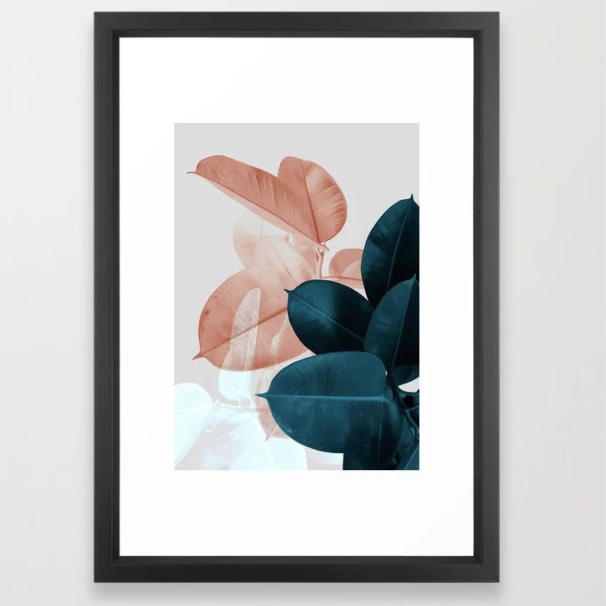
This print infuses a room with some modern yet natural elements.
'Entrance spaces are like an introduction to your home’s character,' Stringer adds. 'Whether it’s through bold murals, smart lighting, or just a place to leave a note, it’s about making that first impression genuine and welcoming.'


