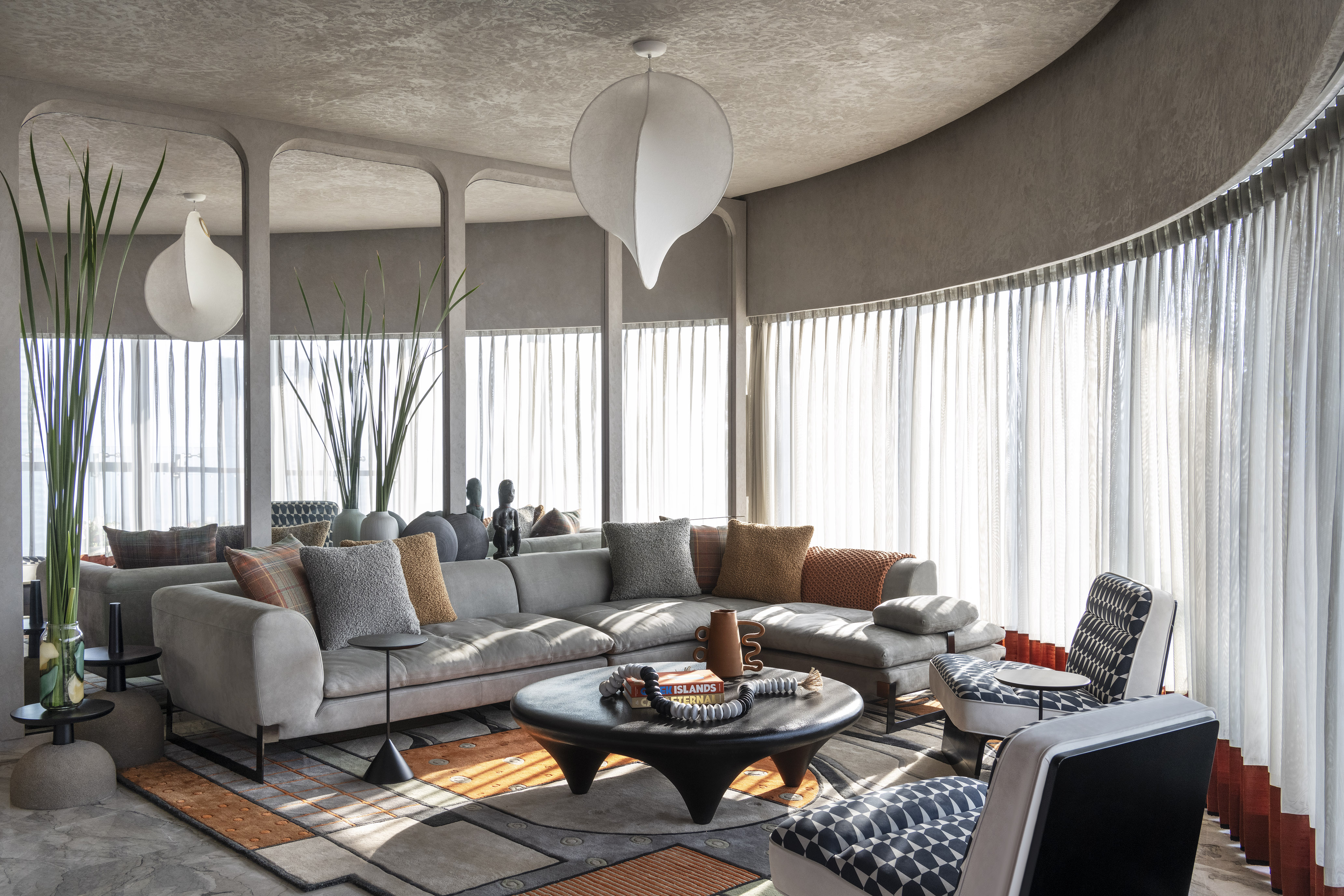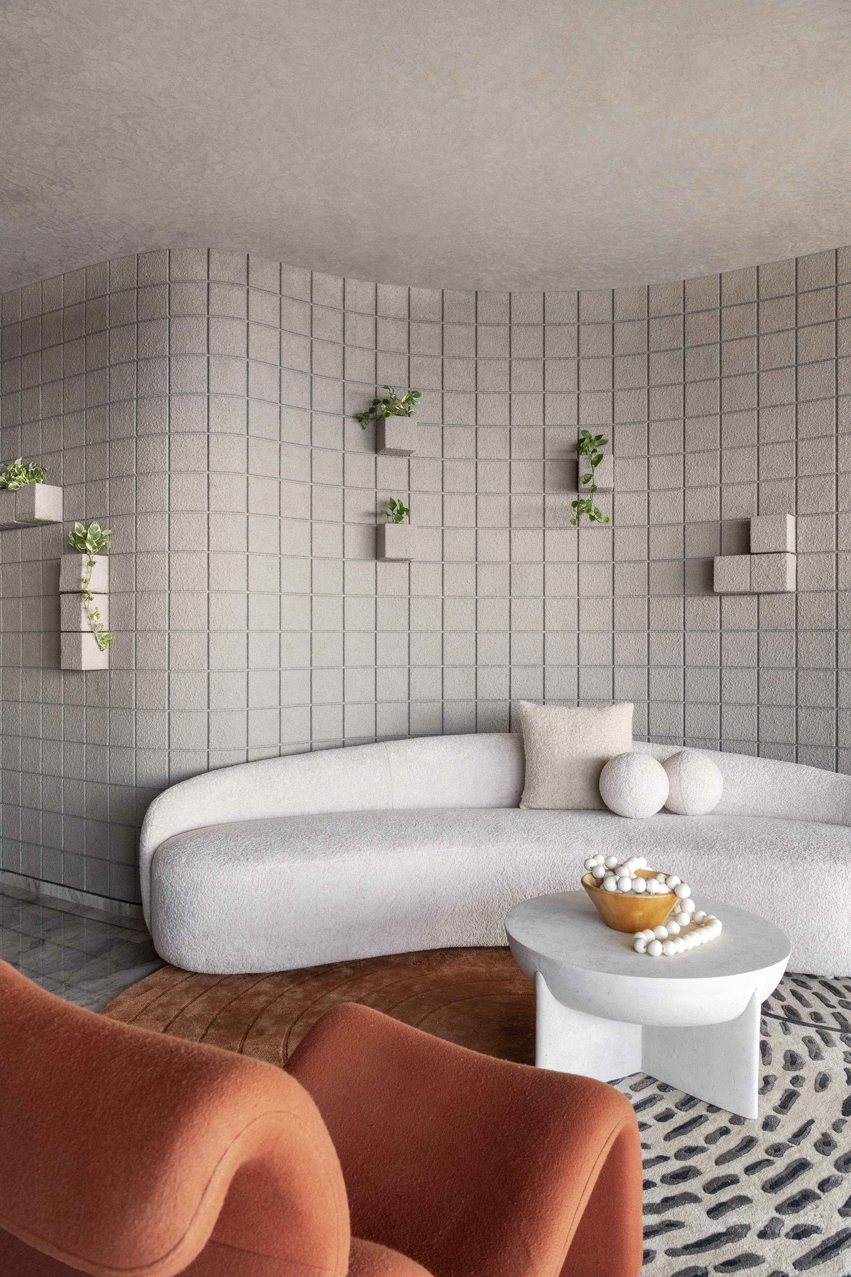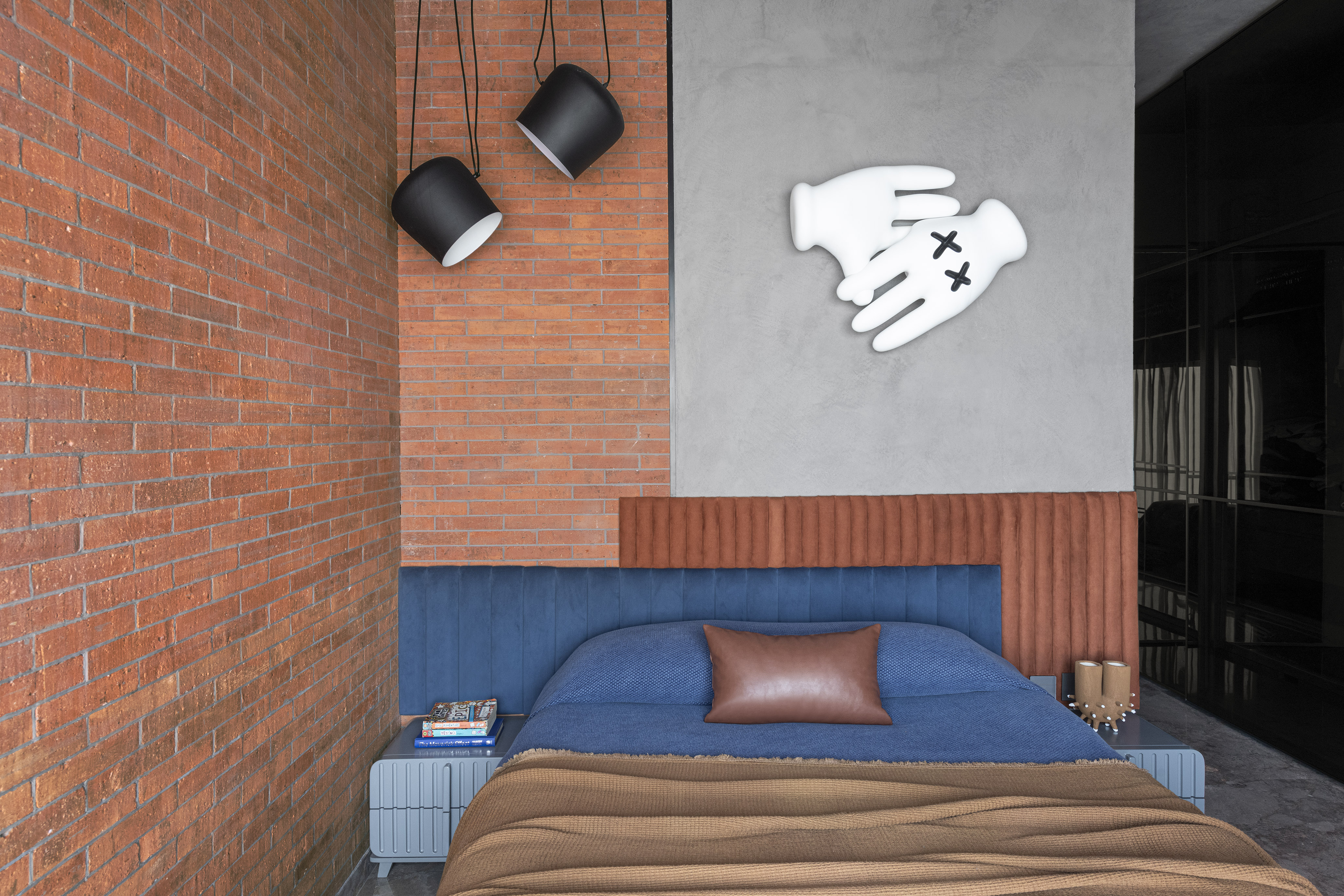
Le Harlequin in Mumbai's Lower Parel neighbourhood rises 55 levels above the city's bustling streets. It is Design Hex’s latest residential project and continues the local studio’s ongoing experimentation with bold colour splashes and fluid contours. In fact, it was these very qualities, so evident in the studio’s design for the apartment tower’s show flat, that convinced Le Harlequin’s owners to call upon Design Hex to work on their apartment.
The original seven-bedroom layout was condensed to five – more than ample for the businessman owner, his wife and two young children – with two rooms expanded into a larger living space and an AV den.

Explore Le Harlequin by Design Hex
Design Hex’s brief was to create a luxurious, yet elegantly understated, space that was anchored by a grey, muted palette over which would be layered the studio’s bold colours and textures – an unexpectedly effective reference to the apartment’s moniker and inspiration.

The result is a series of theatrical set pieces that are backdropped by the dizzying panorama of Mumbai’s glittering skyline, sea and, from one of the bedrooms, the Bandra-Worli Sea Link bridge.

‘One major challenge we faced,’ says Shimona Bhansali, Design Hex’s founder and lead designer, ‘was how the long corridors obstruct natural light.’ The solution involved not just strategically placed light to disperse the dim mood, but also adding brighter colours and light materials to create the illusion of spaciousness and light.
Which explains the palette of Bisazza tiles, greys and rustic metallic tones, and terracotta brick tiles that swathe the principal rooms, as well as bespoke rugs, asymmetrical doorways and windows.

Accommodating each family member’s distinct design preference for their personal space was another challenge, especially if the final design was to have a sense of connection as you moved from one space to the other. To achieve this elusive cohesive quality, Bhansali says she and her team ‘opted for subtle canvases and neutral room shells throughout the entire apartment’.
The apartment’s hero space, she adds, is the kitchen, where a potentially awkward circular corner has been lifted with cool green tones, modern Indian accents and wooden cabinet shutters finished in walnut to frame the ever-looming views of Mumbai and the sea far below.

For Bhansali, Le Harlequin continues her studio’s experimentation with ‘maximal bold design’, but in a way that dovetails perfectly with the needs of a sophisticated Indian household. And as if to drive home the versatility of Design Hex, up next for the the 20-strong, eight-year-old studio is a store for the high-end Indian fashion brand, Papa Don’t Preach.


