The location and provenance of this LA home are hard to beat. It was designed and built in Brentwood, LA, in 1996 by Robert L Earl, who earned himself a reputation as California's celebrity architect over the years having designed for homes for the likes of Madonna, Sylvester Stallone, Nancy Sinatra, and Warren Beatty. The architect's homes lean towards a more traditional style, and this, in the Mediterranean/Spanish Colonial Revival style, was no exception.
With such fine heritage behind it, it's no wonder that this is one of the world's best homes, but time has not stood still and a recent renovation and remodel have transformed the interiors, adding further refinements and elegance.
Interior designer, Kara Smith of KES Studio was tasked with these updates, equipping the home for a more contemporary lifestyle and bringing harmony to the original somewhat divided (by today's standards) floorplan. She shows us around, picking out the highlights.
Designer Kara Smith approached the full house remodel with characteristic pragmatism. 'We struck a balance between classic and fresh, refined but not stuffy, luxurious but approachable,' she says.
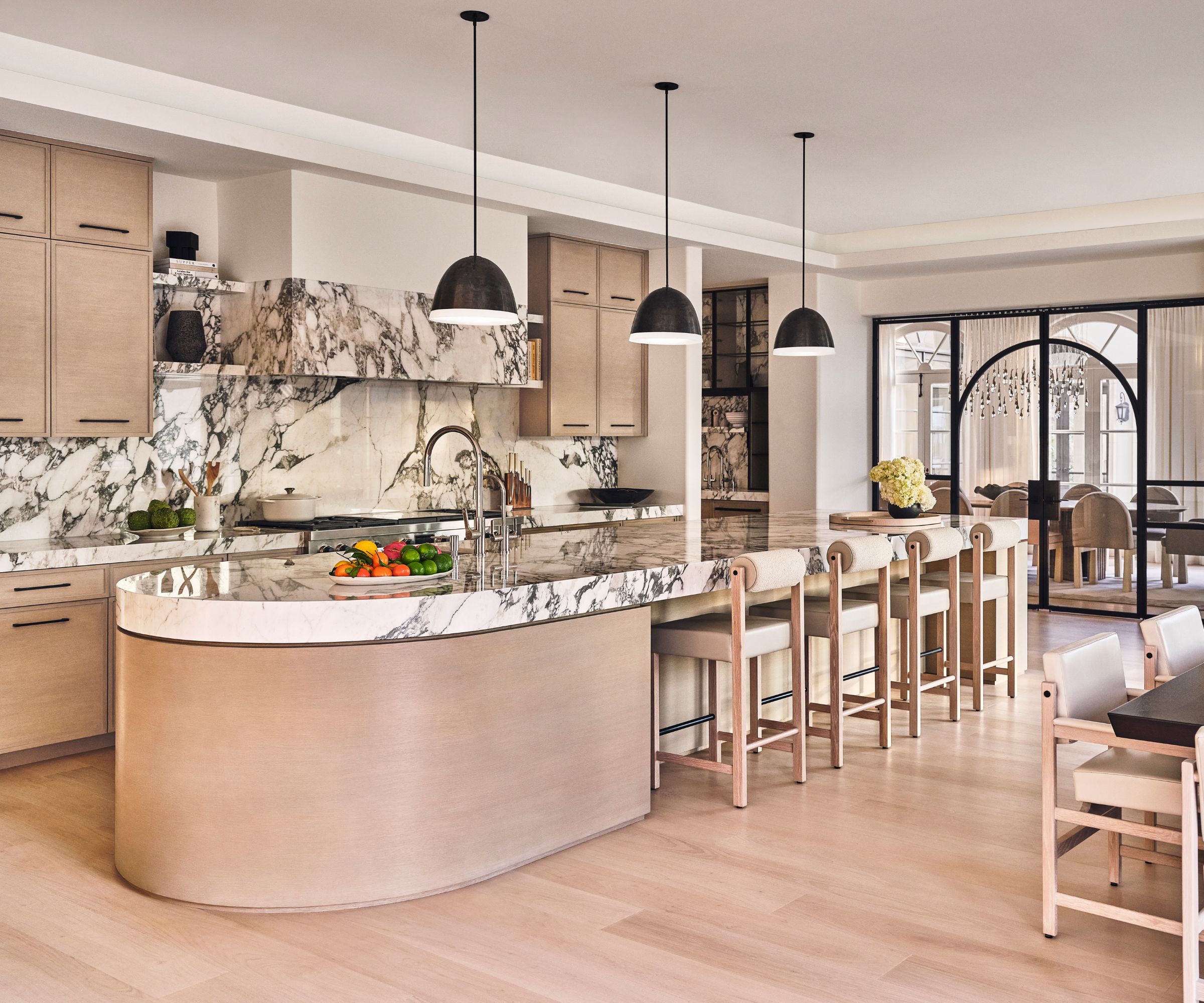
The kitchen is where she first turned her attention. Her kitchen ideas showcase luxe designs and finishes, but first there was some structural work to tackle. 'The interior spaces were very separated and enclosed,' she explains, 'So we re-planned the entire space, removing walls and opening up spaces to create a large open-plan kitchen with a huge center island, marble and plaster hood, coffee station and walk-through butler’s pantry.'
Note the smart new steel-framed glass screen that links the formal dining room to the new kitchen.
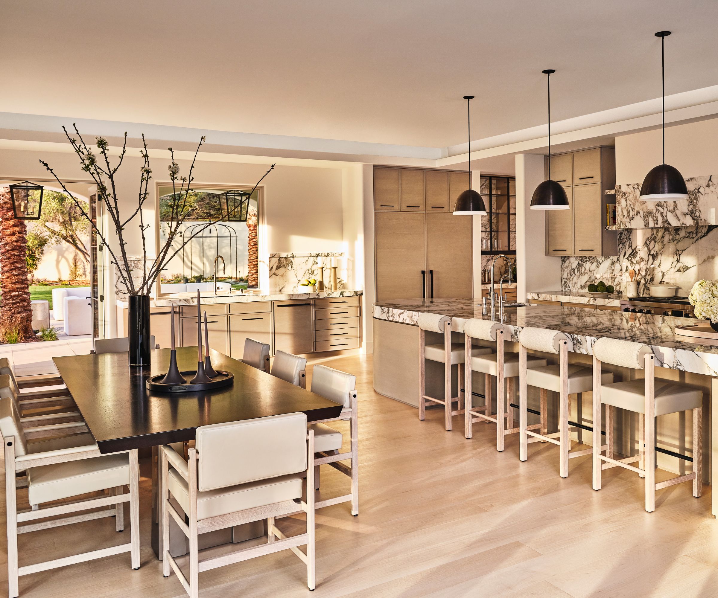
Progressing through the home, you are aware of a harmonious palette of sepia tones – soft beiges, creams, caramels, with highlights of black and white give the space a natural calm and create the perfect relaxing mood. In the kitchen, it's the bleached walnut cabinetry, striking Arabescato Vagli marble countertops, and blackened steel accents that are the key materials contributing to the sepia palette. And anyone looking for kitchen island ideas can't fail to be wowed by the stunning curved design topped with that luxurious marble.
The furniture includes a Holly Hunt dining table used for informal meals, Thomas Hayes dining chairs and counter stools, and Lawson Fenning pendant lights.
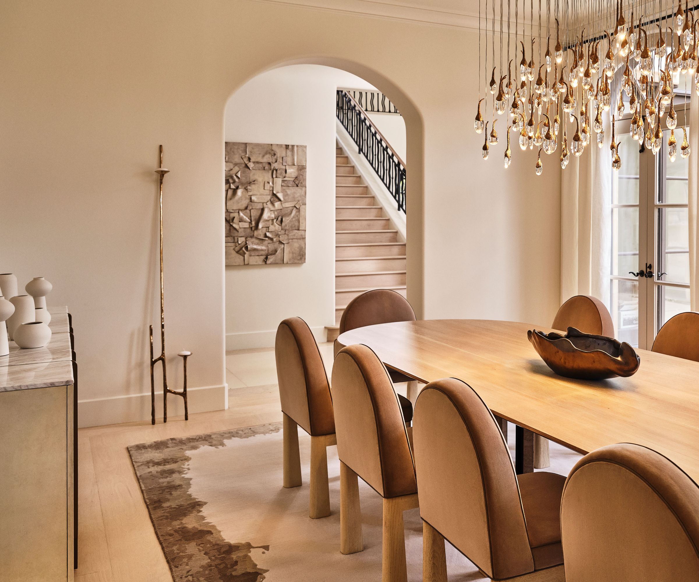
Asked about her inspiration and style for the new-look rooms, designer Kara Smith says: 'The interiors are classically modern, featuring furnishings with clean, simple lines, sumptuous fabrics and dramatic chandeliers.' Indeed, her dining room ideas for the home's formal dining space distill that style exactly.
This was an awkward space in the home's original floorplan, sandwiched between the kitchen and main entrance and staircase. It's now linked to the kitchen through a grand bifold steel and glass screen with arched doors (pictured below), and so is connected to the other spaces, but sufficiently separate to create the right atmosphere for more cozy entertaining with friends.
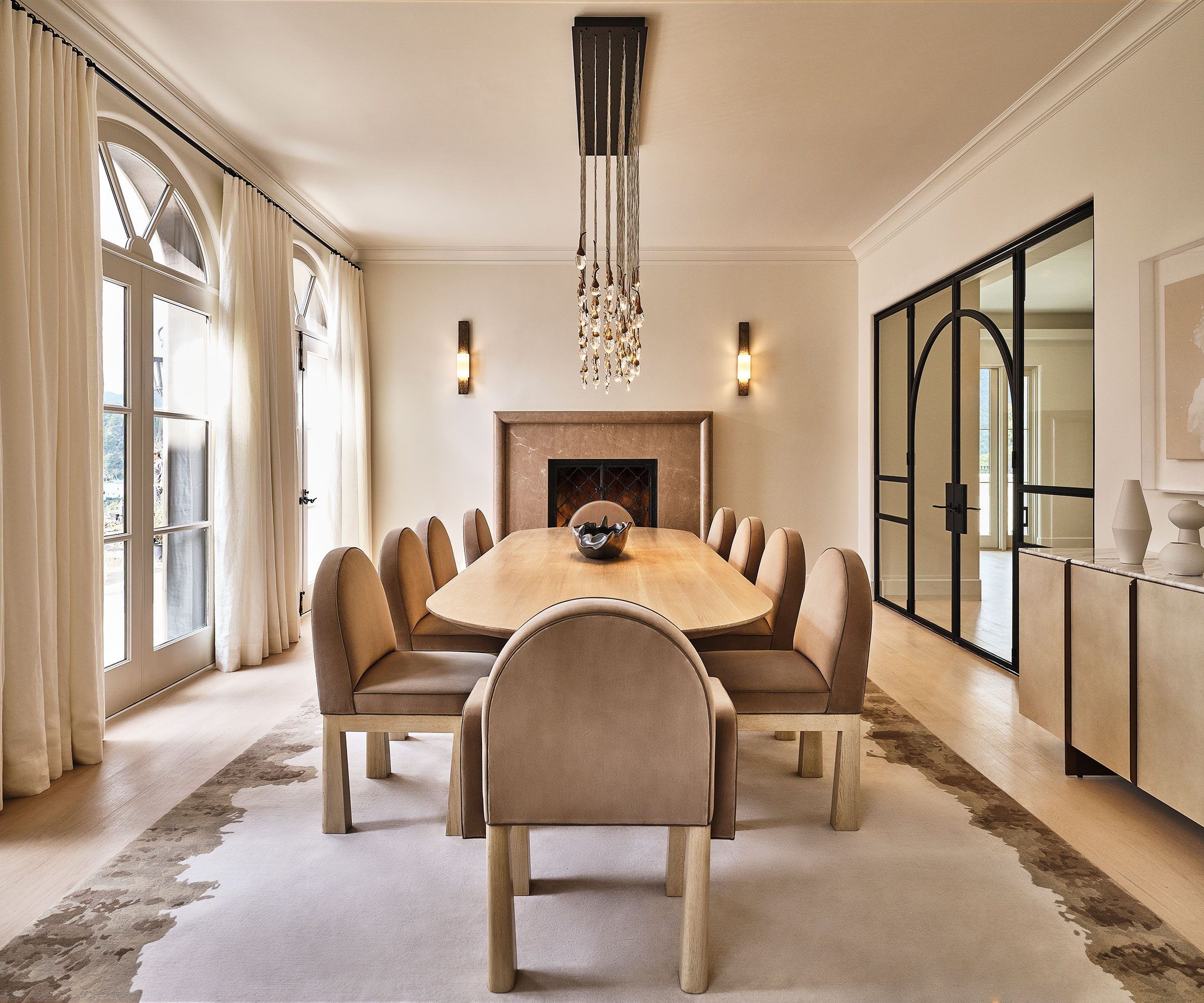
This refined space showcases some great modern dining room ideas, for instance we love the arched-back dining chairs. These subtly complement the arched openings that are a theme throughout the home and typical of its Mediterranean/Spanish Revival architecture.
Other key pieces that caught our eye include the bleached herringbone wood floors topped with a custom Art + Loom wool/silk area rug, while above the custom Una Malan dining table is a magnificent Ochre crystal chandelier. A custom marble fireplace mantel gives the room a new focus.
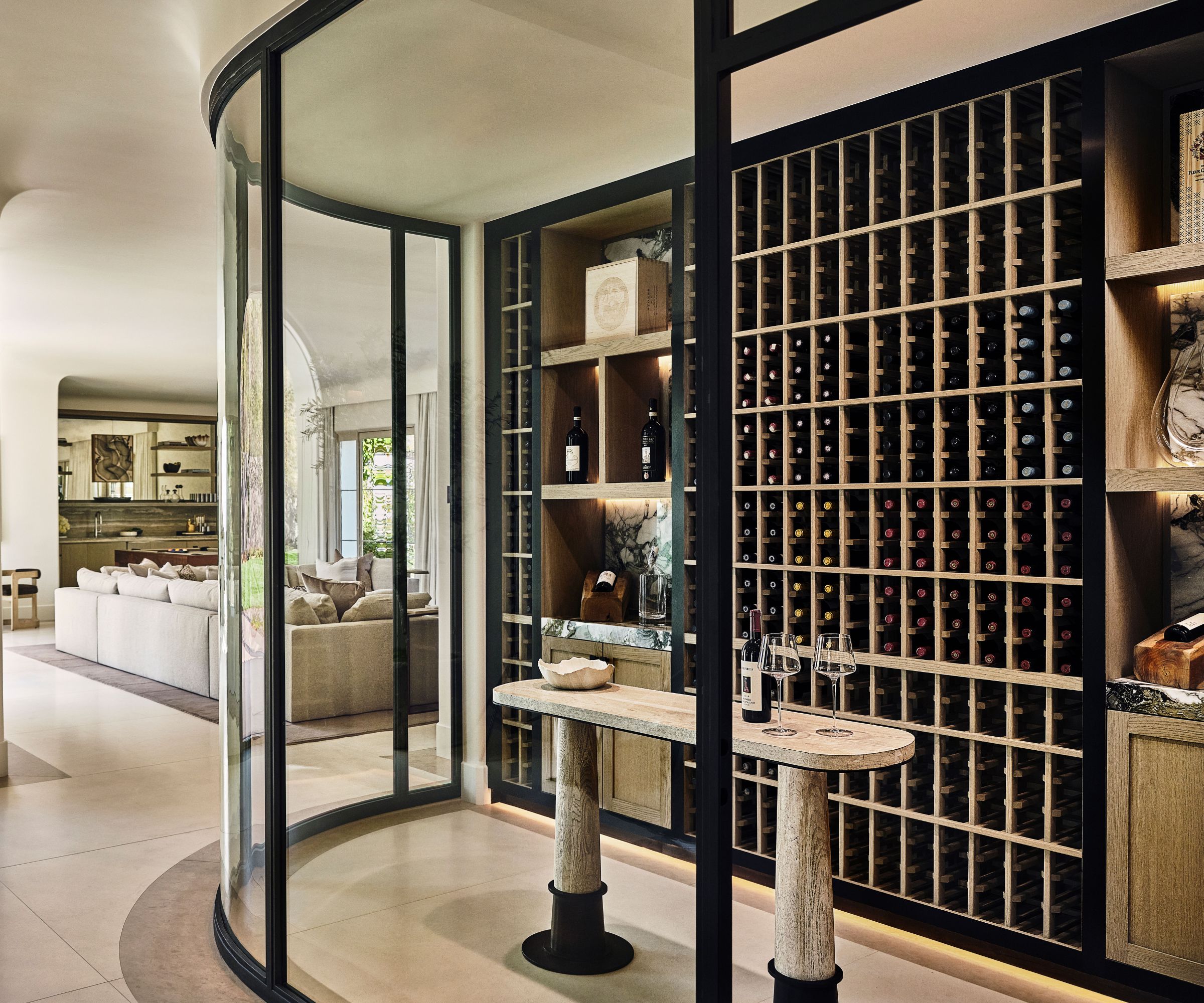
The new must-have for the home that has everything: meet the wine room, and this one is sensationally luxurious. Wine room ideas we're lusting over here include the curved glass wall which circles Breccia Capri marble panels set in custom oak wine cabinetry, and the oval Arteriors console that acts as a tasting table.
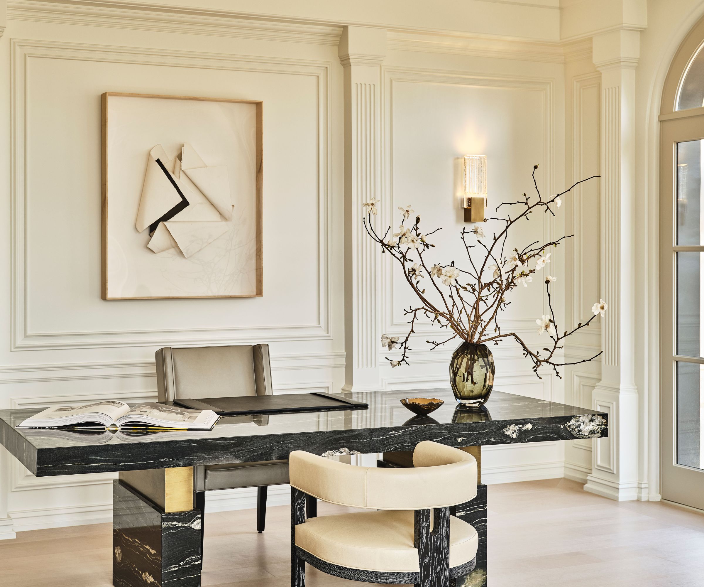
It's in the libary/home office that the home's original Robert L Earl architecture is still very much in evidence. A row of arched windows overlook the backyard and the look is enhanced with new painted molding details in the classical style.
Among her home library ideas for this elevated space, designer Kara Smith specified a custom marble and bronze executive desk with KES Studio pull-up chairs, a Manolo Ballesteros artwork, and Holly Hunt wall sconces.
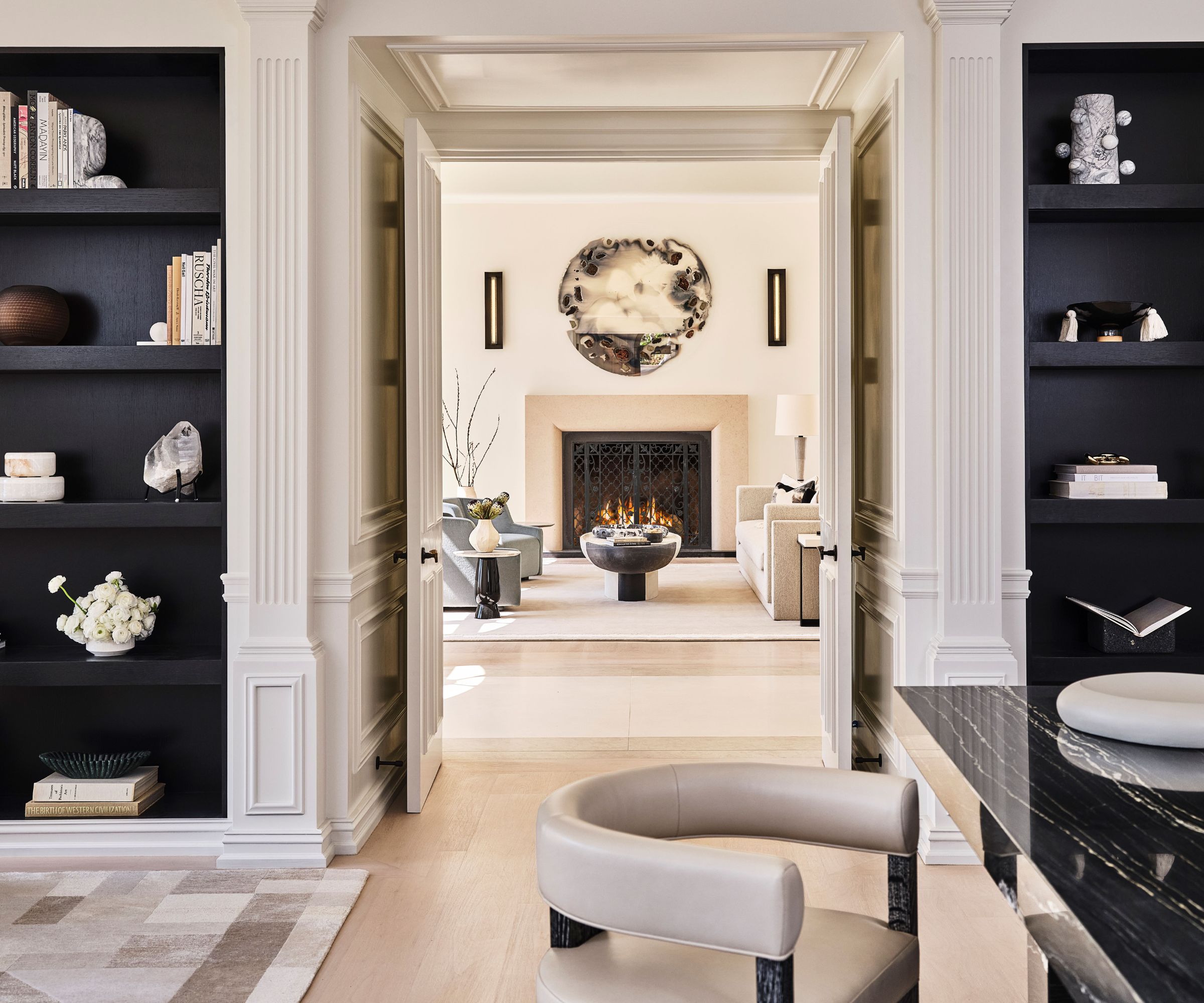
Providing a smart framework for the home library ideas, are twin custom ebonized oak built-in bookcase cabinets, set on either side of the doorway in walls with ornate classical molding details, while a KES Studio for Marc Phillips area rug keeps things soft and luxurious underfoot.
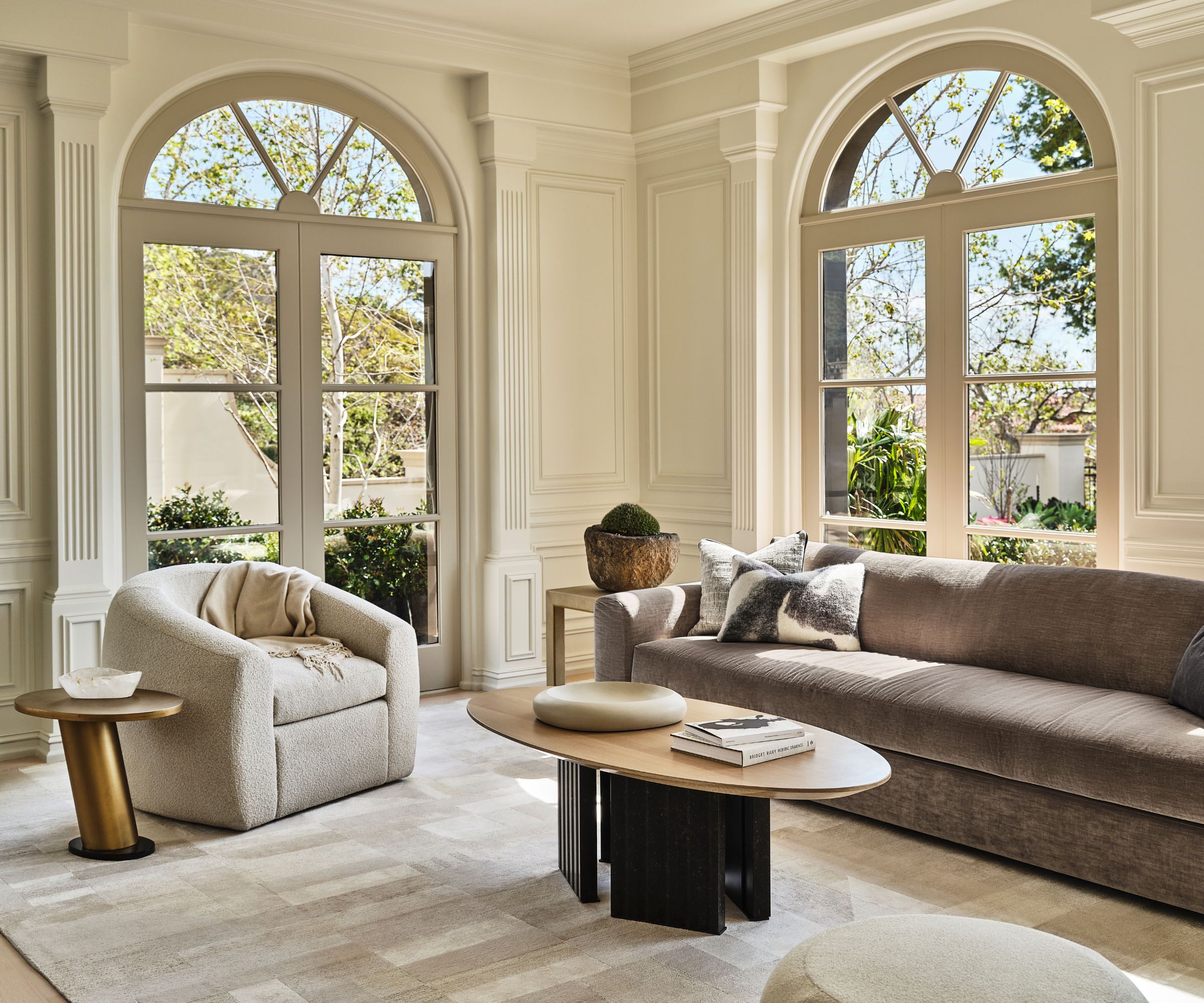
There was even space in the generously proportioned room for designer Kara Smith to indulge her home office seating ideas. An Una Malan sofa and lounge chair do the honors, matched with a Castilleja coffee table. It's the perfect spot to enjoy a good book.
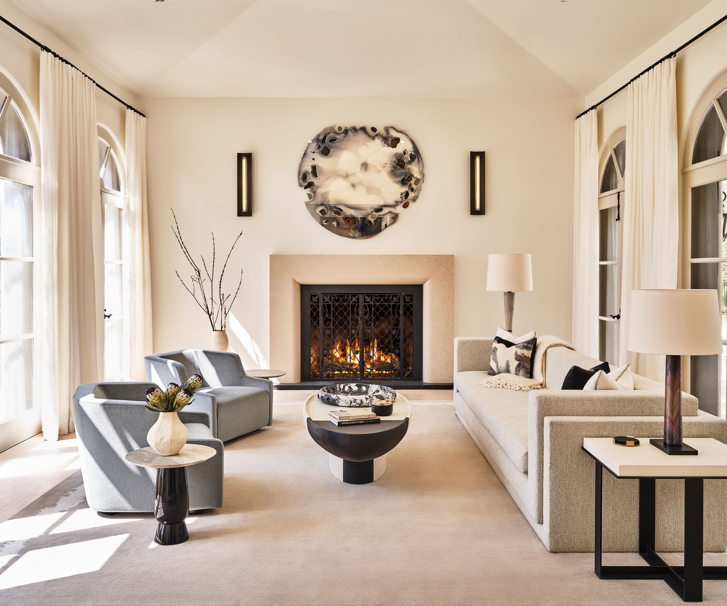
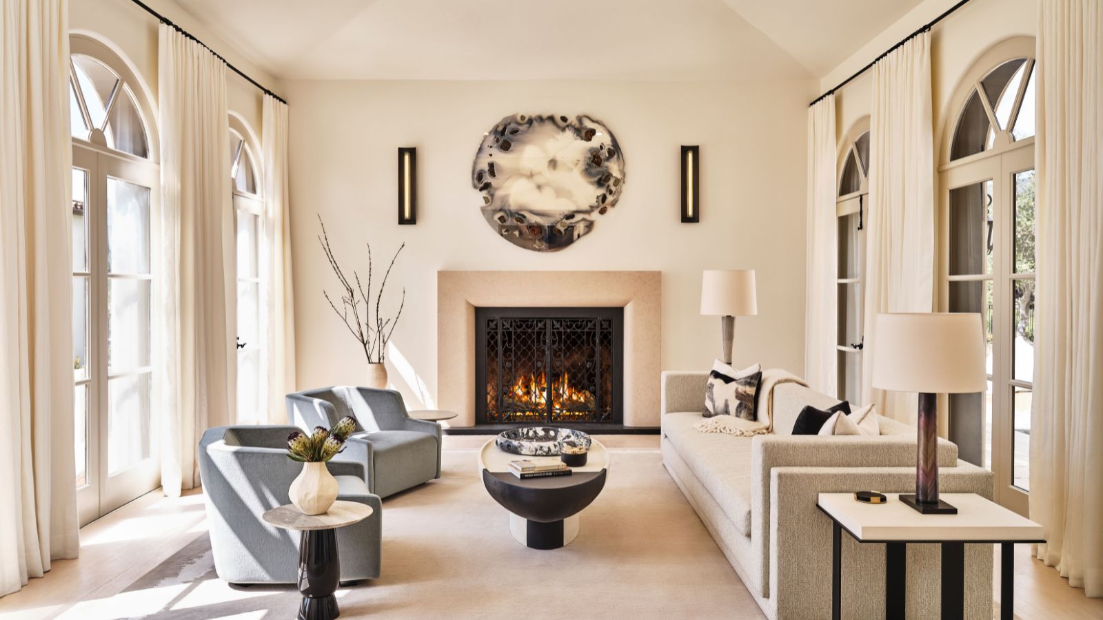
Living room ideas developed from a desire to pare back some of the 90s details. 'We respected the original architectural style of the house,' says designer Kara Smith, 'but modernized the interior architectural details by simplifying moldings, creating new stone fireplace mantels with modern profiles, and adding sculptural coved ceiling details.' There's a simple elegance to the new living room scheme, still in keeping with that sepia palette, but this time with a hint of calm gray-blue mixed in. The room features the same bleached herringbone wood floors that we see elsewhere in the main rooms.
Other key pieces include: KES Studio for Marc Phillips area rug, custom two-tone plaster coffee table, a pair of Gallotti & Radice lounge chairs, and a Chen Chen & Kai Williams Geo Transitions mirror above the fireplace.
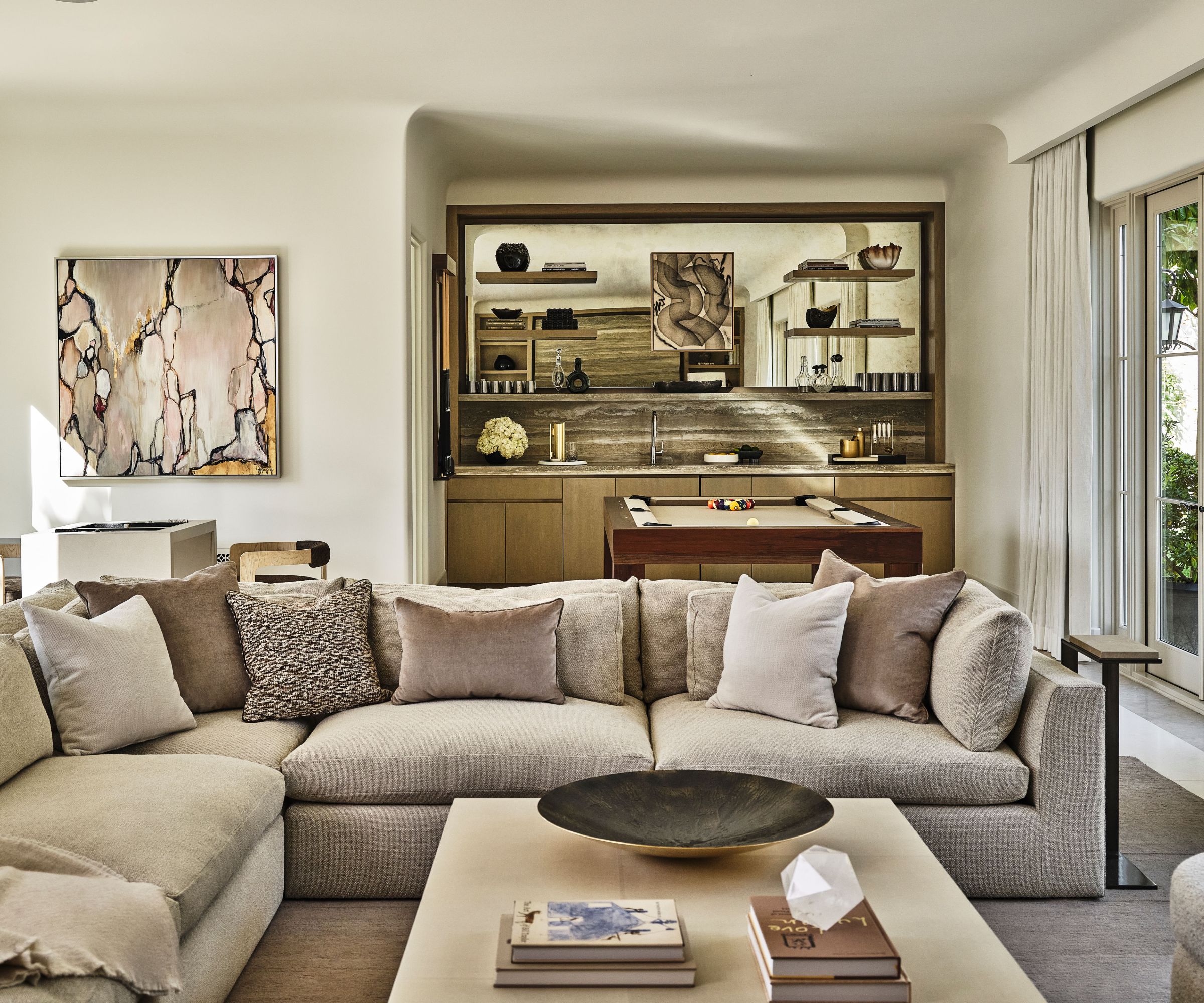
The family/entertainment room is perhaps the most surprising space in the remodeled home. The entire space was converted from the original attached 4-car garage, while a new detached garage has been built in the grounds.
The interior design of this new room is striking and though it reflects the color palette elsewhere in the house, there are daring new treatments and departures in Kara Smith's media room ideas. The custom bar is created from backlit travertine slab wall panels, and there are coved ceiling details, plus plenty of room for friends and family to gather to enjoy a movie and have fun together.
The huge sectional sofa is a custom piece, the area rug is from Erik Lindstrom, the coffee table is from Liaigre, and one of the room's most indulgent details is a bespoke leather-wrapped backgammon table.
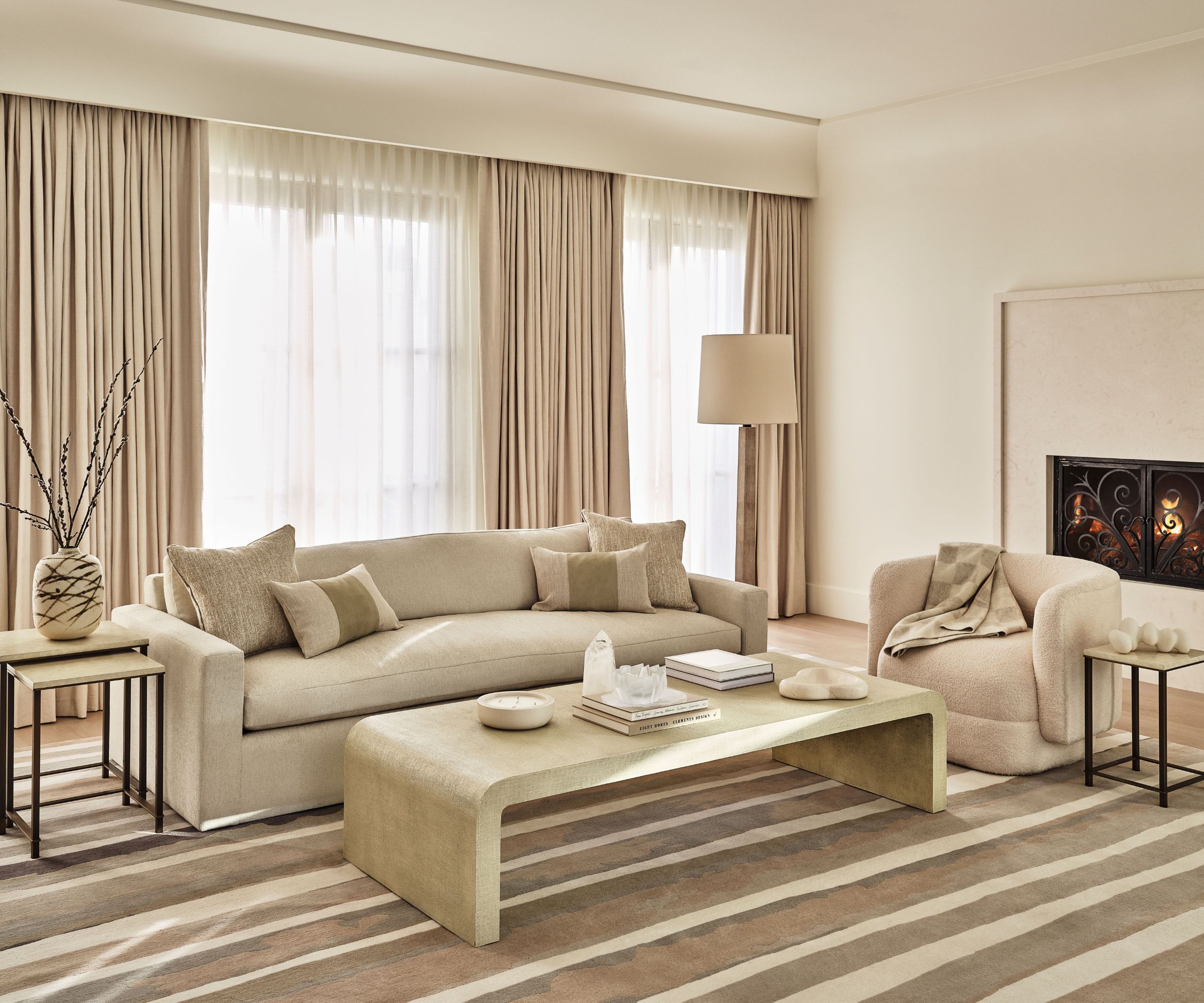
Another living room? Err, no. This cozy and tranquil seating space is part of the primary bedroom. If there's space in a bedroom for a sofa, coffee table, armchairs and a wall-mounted fireplace, well, by all means make them part of your bedroom ideas, advises designer Kara Smith. Nothing says relaxation quite like a bedroom sofa.
On a practical note, the coved ceiling features integrated drapery pockets, while there's a custom walnut TV pop-up at the foot of the bed (not pictured), the custom fireplace surround and hearth are of a sand-colored marble, and the area rug is from Art + Loom, another custom piece.
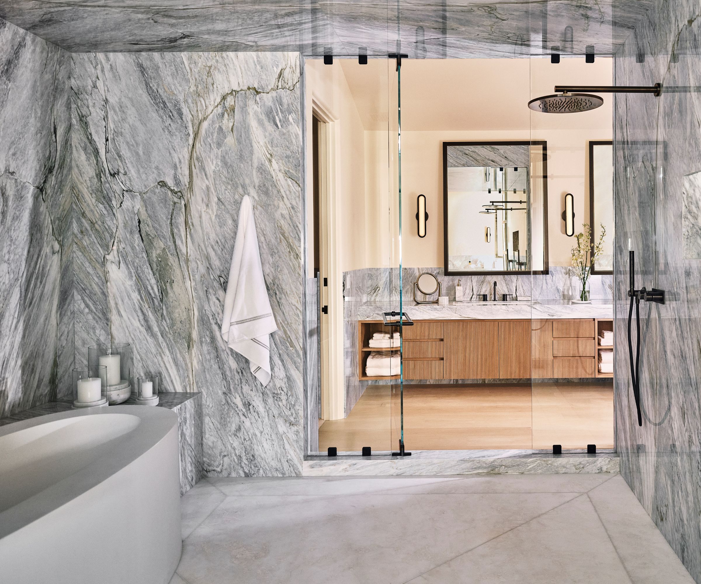
Last stop on the tour is the sumptuous bathroom, where Kara Smith totally re-planned the space.
'I created his and hers baths flanking an enormous wet room space with double shower heads and a built-in tub,' she says, 'all featuring some of the most beautiful book-matched Calacatta Manhattan marble we’ve ever seen.'
Praise indeed, but it certainly makes a lasting impression among these bathroom ideas and is a standout moment in the remodeled home as a whole.
Interior design: Kara Smith founder of KES Studio
Photography: Ingalls Photography


