Space travel in Starfield is pretty easy. Remarkably easy, actually. You just bring up the map, click a dot and go. Sure, some things might be out of immediate jump range, but if all the yawning void of the cosmos has to threaten me with is "mild inconvenience," then I'm gonna complain that documentaries like Event Horizon really overhyped the horrors that lie in the great beyond.
Things weren't always that way. For one thing, Todd Howard himself has spoken about versions of the game where it was possible to run out of fuel and find yourself stranded among the stars, a feature which ended up getting yanked out because it was a "fun killer". But now a player on Reddit (spotted by GamesRadar) has found evidence lurking in Starfield's files of a much crunchier, and riskier, kind of space travel.
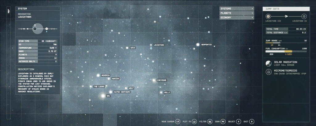
Early concept/iteration of the starmap found tucked away in data files from r/NoSodiumStarfield
I've spoken with the thread's creator—Reddit user Redsaltyborger—myself, and verified the existence of the starmap texture in Starfield's game files. I'll paste it below in convenient and parseable .jpg form. Yep, it sure does look like a relic of a different, more hardcore Starfield we never got.
The thing that leaps out to me—beyond the fuel consumption gauge, which Todd's already told us about—is the presence of environmental hazards in the game's solar systems. In the texture left lying around in the game files, you can see that Leviathan IV is home to both "Solar Radiation" and "Micrometeoroids."
The former threatens to weaken your ship's hull while the latter, enticingly, "can cause catastrophic stop." I don't know about you, but I wouldn't mind a catastrophic stop or two to spice things up a bit as I'm ticking things off my Starfield task list.

We've also got filters to see different map modes and a full-on, Mass Effect-style system description for your chosen destination, a nice bit of flavour that's sadly absent from Starfield's final version. Admittedly, Starfield has 120 systems in comparison to Mass Effect's roughly 40, but when you've already got over 250,000 lines of dialogue, what's another 120 paragraphs?
Of course, it's impossible to tell what this bit of ephemera really means for Starfield's development. It could just be a mock-up featuring ideas that were quickly discarded, or perhaps Starfield's space travel was at some point going to be a bit more fraught than it ended up being. Maybe systemic hazards—like fuel consumption—were a "fun killer" in the eyes of Bethesda decision makers.
Either way, it seems convincing that the texture was made for something larger than just "something to slap on a screen in your ship as a display prop." Redsaltyborger told me that they felt "the presence of Xbox controller buttons at the bottom of the map indicates that it was part of [the] UI concept at some point." I can't help but agree.
Other players seem to share my longing for this alternate universe Starfield. In the replies to the original Reddit thread, a user named Space_ananas wrote that, even though they like Starfield as-is, they "wish [Bethesda] continued that way. Every day [it's] more evident we had a washed version of the game."
Another user, TorrBorr, wrote that, "this little tidbit makes things seem a bit depressing with the game and just how much unfinished and/or cut stuff happened to Starfield. As much as I love this game, it needs a serious overhaul."
Alas, we got a Starfield whose easy and overabundant fast travel made its galaxy feel tiny. Perhaps features like these will make their way into the game over the course of its DLC—and plenty already have in the form of mods—but as it is, we'll have to content ourselves with picking through the data files to see the galaxy we might have got.


