Spotify has had its fair share of issues with the designs of its app. One of the most recent changes completely overhauled the mobile app, and left it looking a little less than stellar.
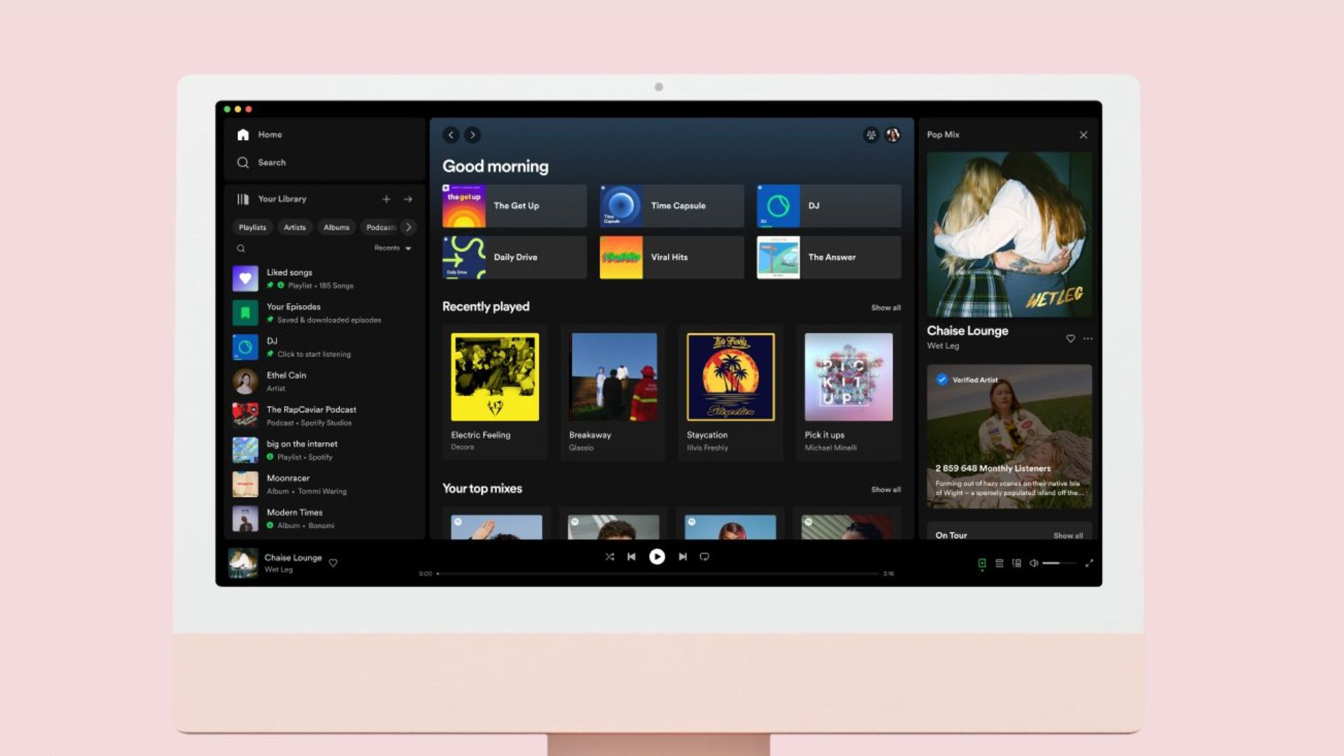
Thankfully, however, Spotify doesn't seem to have completely lost its eye for good design. The new look that it has brought to its desktop app looks to streamline users' experiences, putting more of their favorite music at their fingertips, with personal libraries and playlists more easily accessed than before. This puts the desktop app into the 'much better than the Apple Music desktop app' territory now, which continues to lag behind the mobile version.
New Spotify desktop features
There are some cool new things that you'll notice upon opening the new desktop app. First of all, the library is no longer a separate section to click through to; it's now a sidebar that can be collapsed. You can add different sections to this sidebar, allowing you to sort through different segments of your library like artists, podcasts, and albums. Like a certain album more than others? Pin it, and get easier access the next time you want to find it.
You can also add your playlists to this sidebar, making them more accessible than before. You can drag and drop songs from the central window into those playlists as well, making adding songs super easy. Those playlists can be easily reordered with a simple drop-down as well if you want to change the way that playlist looks.
The now-playing bar at the bottom remains similar, but there's now a new now-playing view on the right side of the screen. This gives more information about the song that you're listening to, such as artist bios and upcoming concert dates.
All this seems to be a step in the right direction. All the changes serve to make the app easier to use, and bring Spotify on the desktop back on top when compared to its competitors. Now we just need HiFi streaming...


